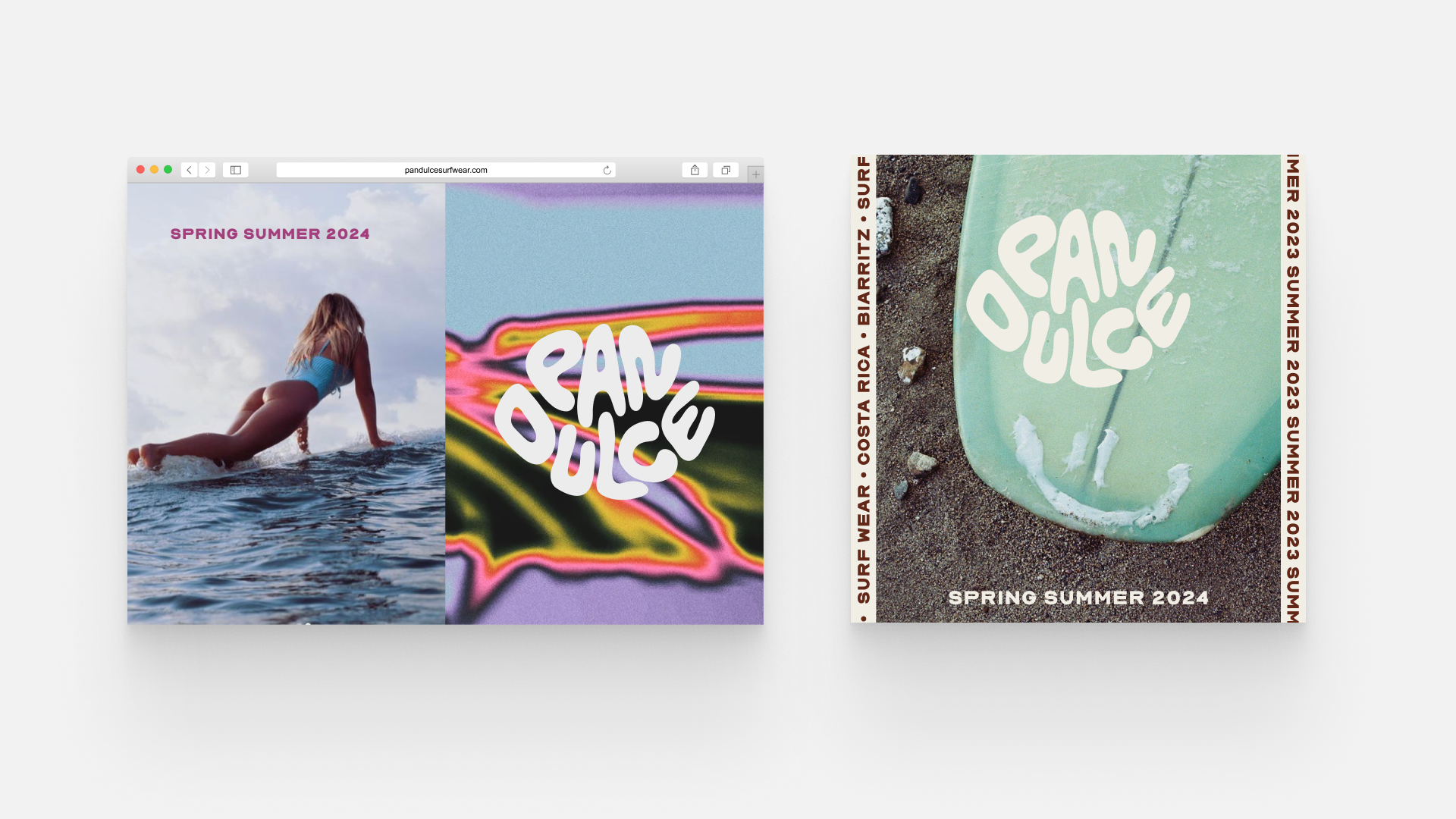

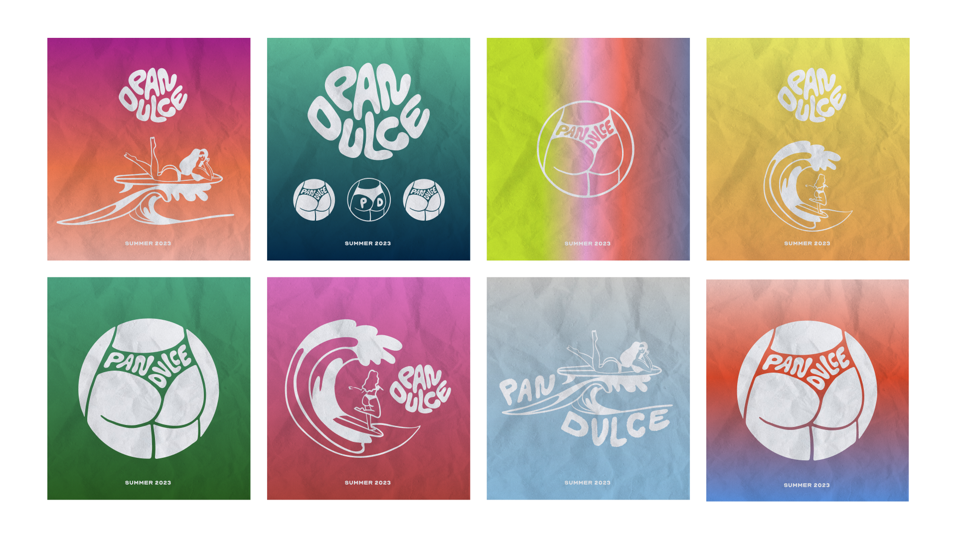
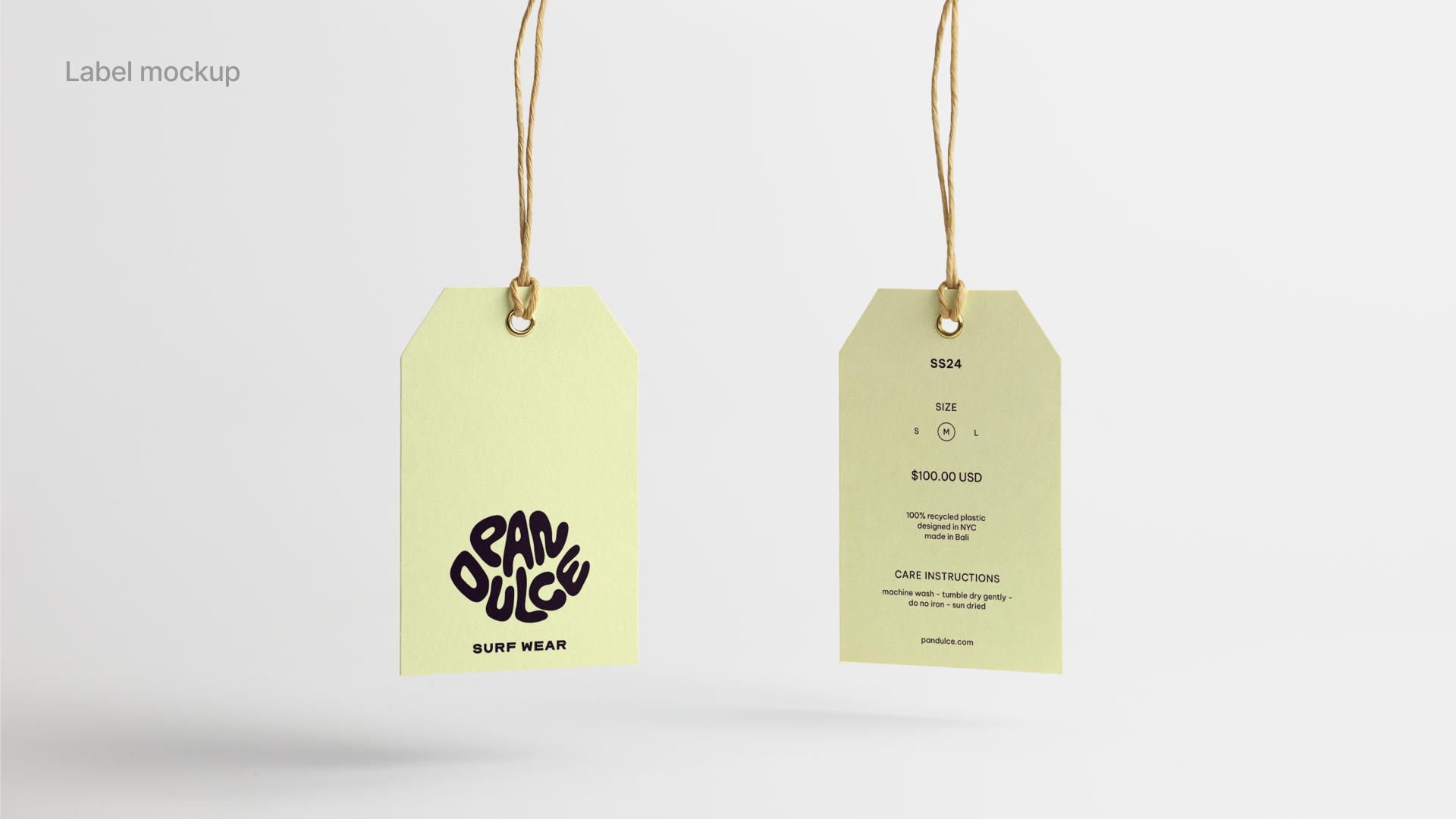
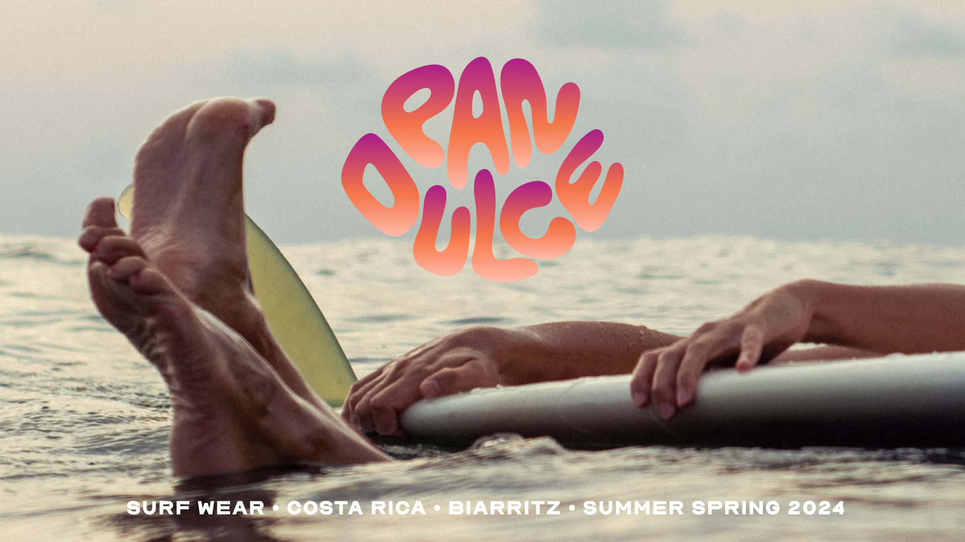
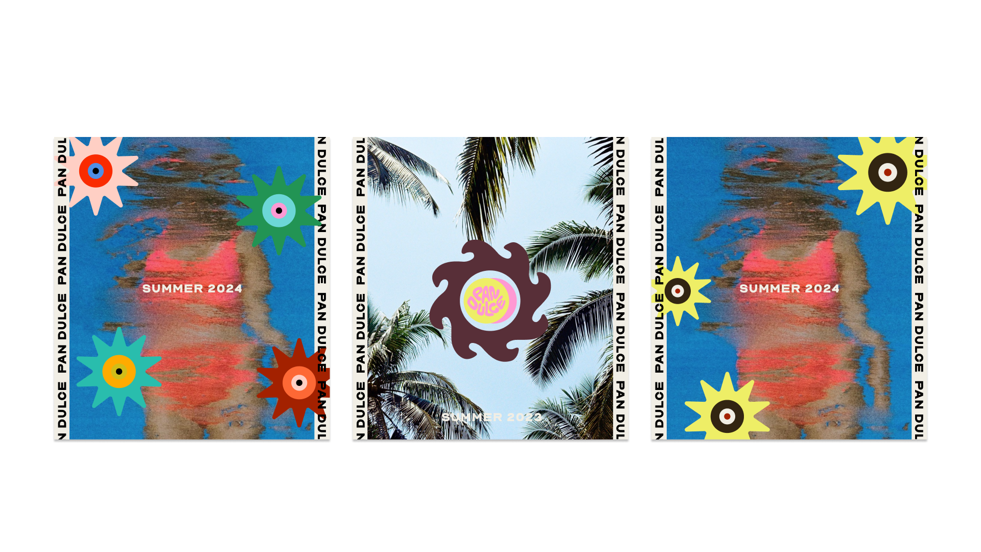
Identity, Branding and Illustrations for Pan Dulce.
Pan Dulce is a surf bikini brand, named after the creator’s favorite wave in Costa Rica. Based in NYC, launch planned in spring 2024.
Logo, Identity, Branding, Illustrations, Creative direction
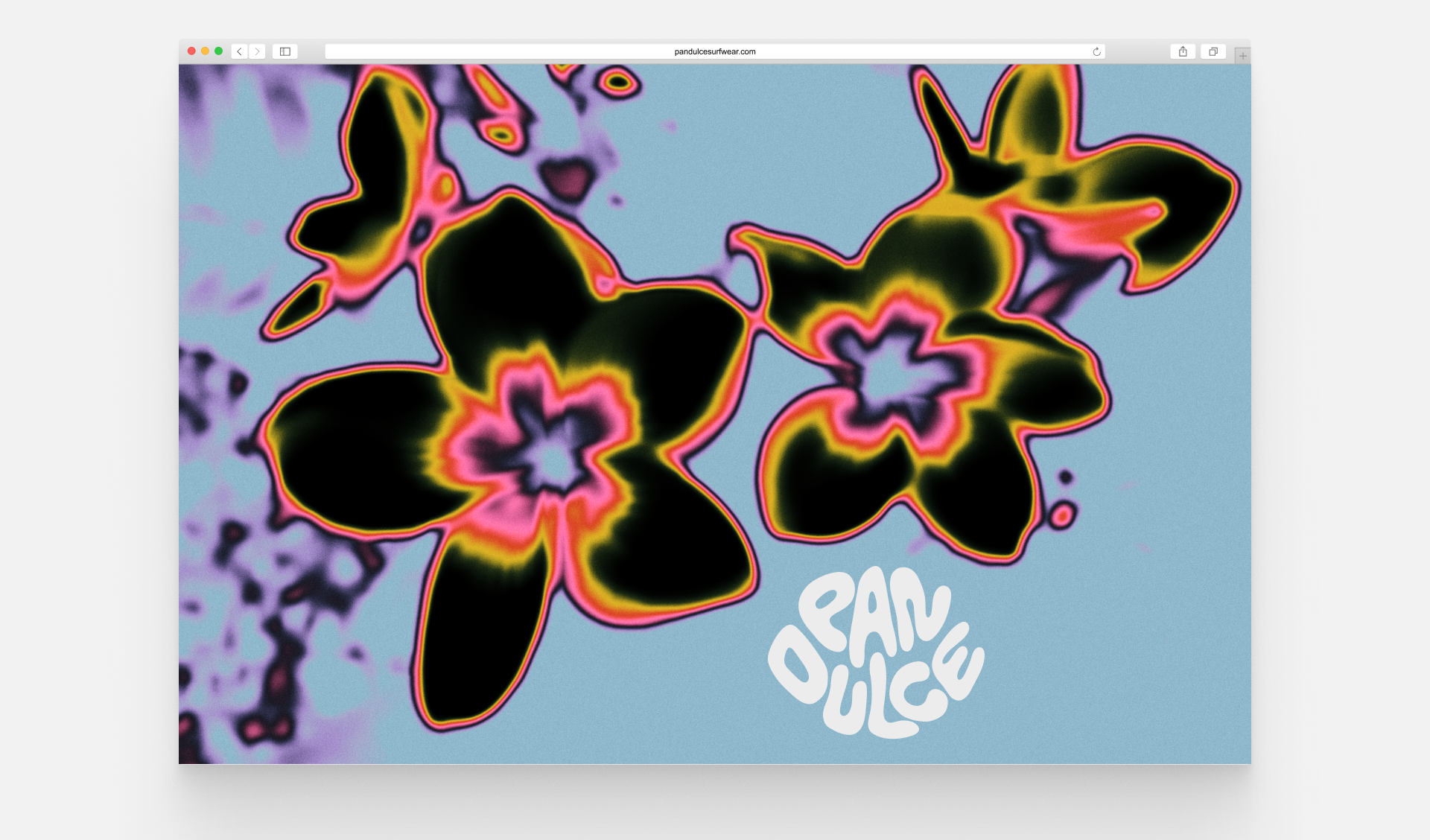
Crafted the logo and visual identity.
Hand-drawn typeface and developed a comprehensive style guide and provided branding graphics, illustrations,
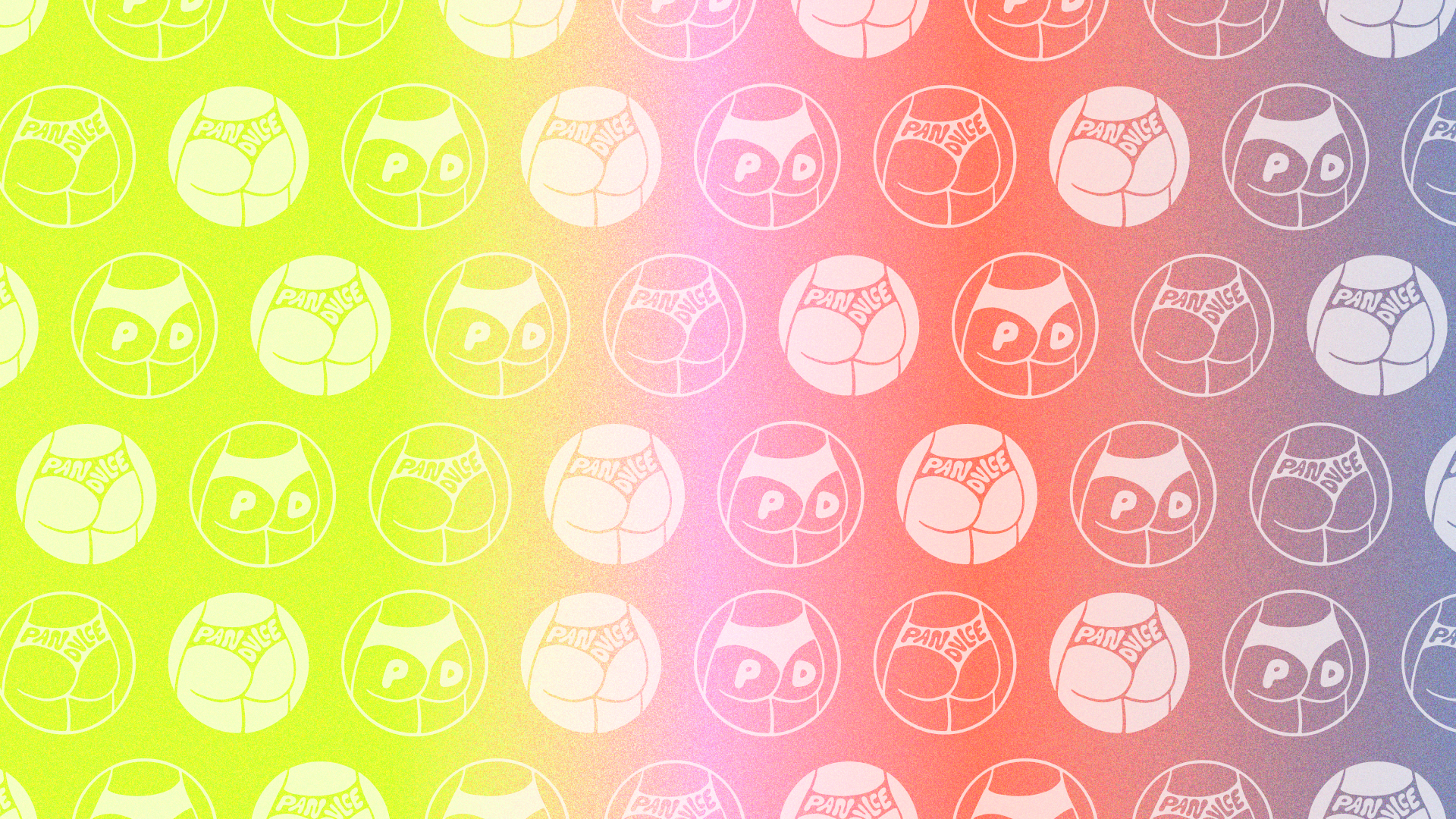
Overarching creative direction, including pattern design and selection.
Curated themes capturing the essence of Pan Dulce, drawing inspiration from the carefree beach lifestyle, surf culture, and the vibrant tropical elements.
Pictures Pan Dulce ©
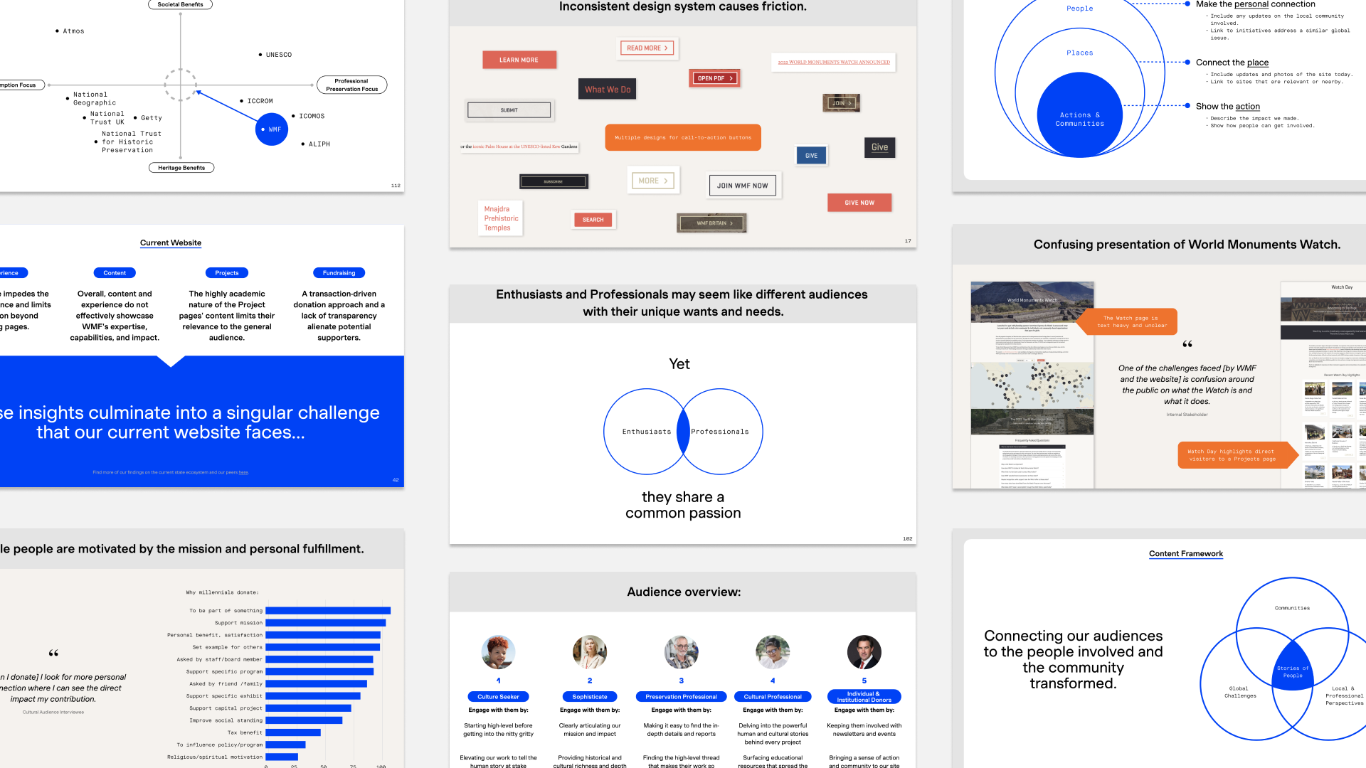
Restructured and redesigned website for The World Monument Fund.
The WMF is a nonprofit focused on conserving global monuments. Progressing from research and strategy to the ongoing UX phase, with completion slated for 2024.
Research, Strategy, IA
Content confidential.
Engaged in collaborative efforts with Base, a New York agency, to restructure and redesign the website for the WMF.
Advanced through extensive research, strategy, and the ongoing UX phase.
Anticipated delivery set for spring 2024.
For Base Design, NYC.
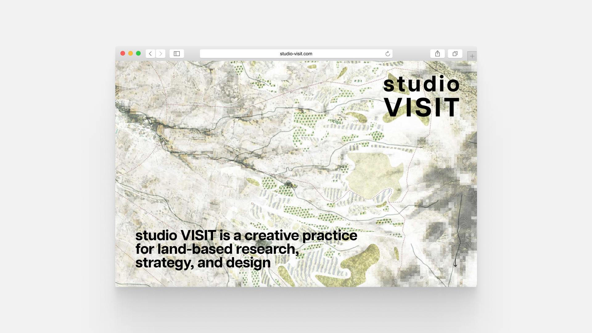
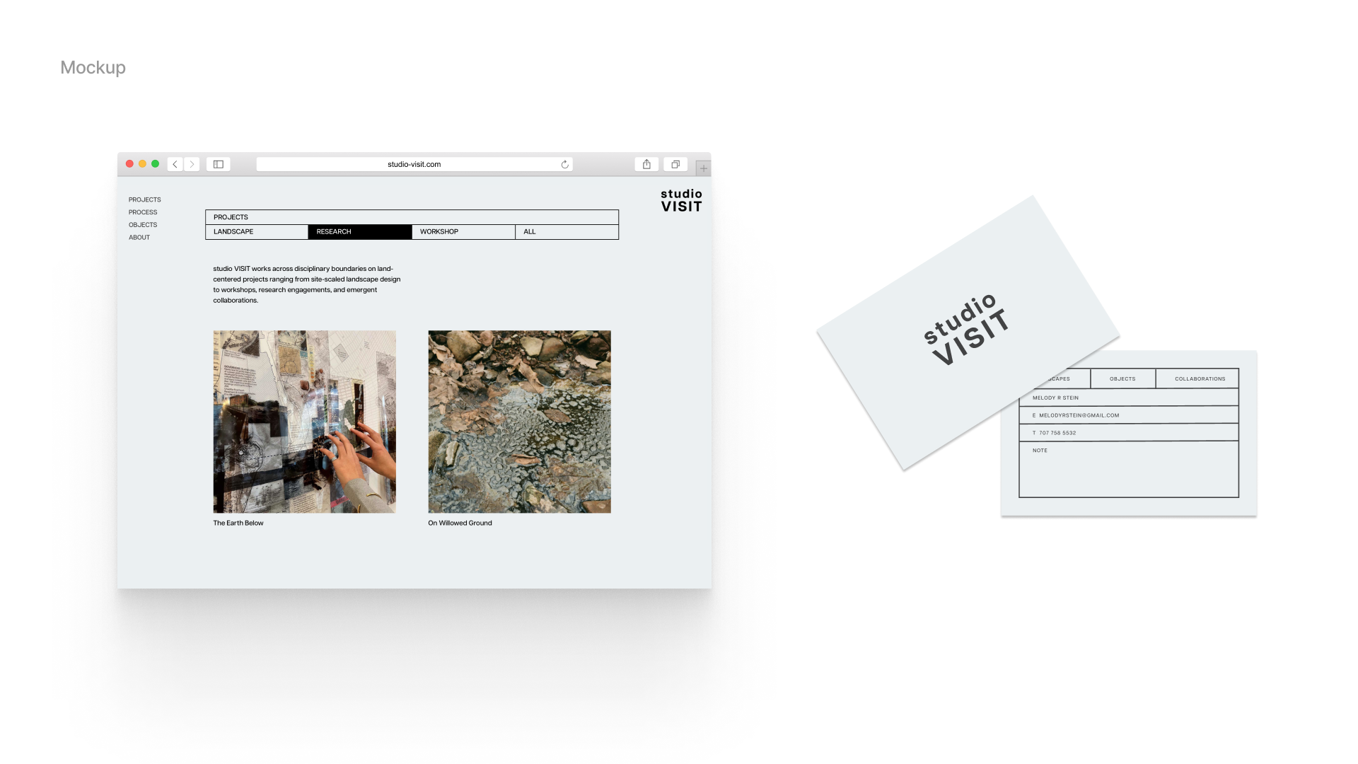
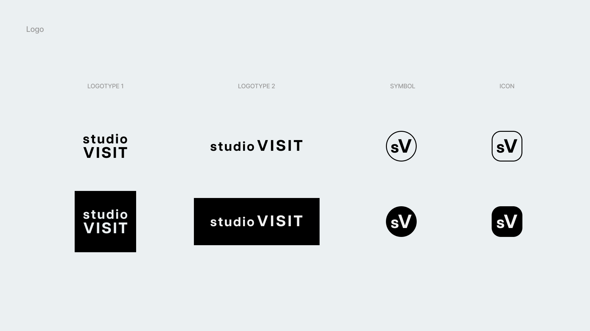
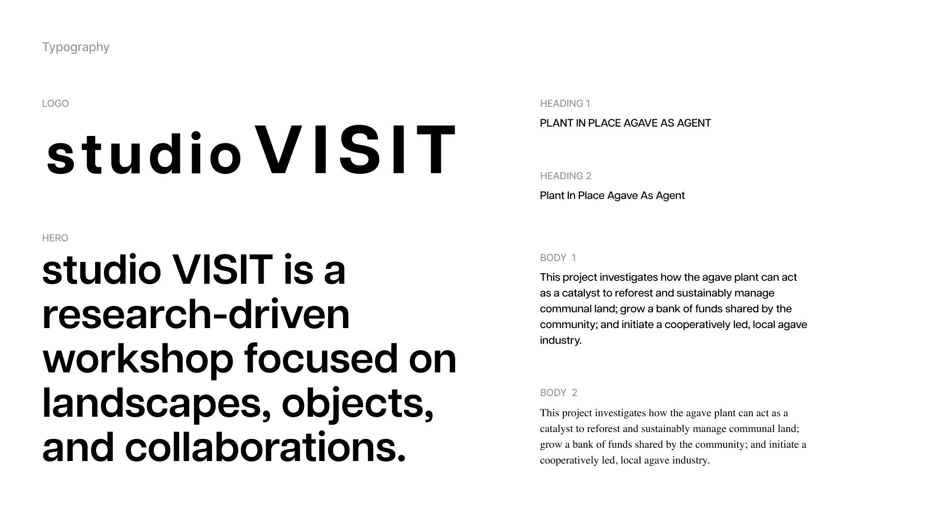
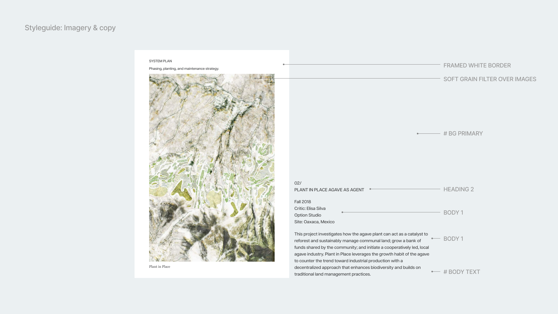
Web and identity design for studio VISIT.
A unique identity and responsive website for a New York Landscape Design firm.
Identity, web design, UX
Developed logos and curated typography and color scheme to enhance brand identity.
Created a comprehensive style guide governing imagery and copy to maintain visual consistency.
Contributed strategically with visual direction through adept handling of design elements.
Web design and guided visual direction for both desktop and mobile including Figma protoype, while collaborating closely with a development team to finalize the website
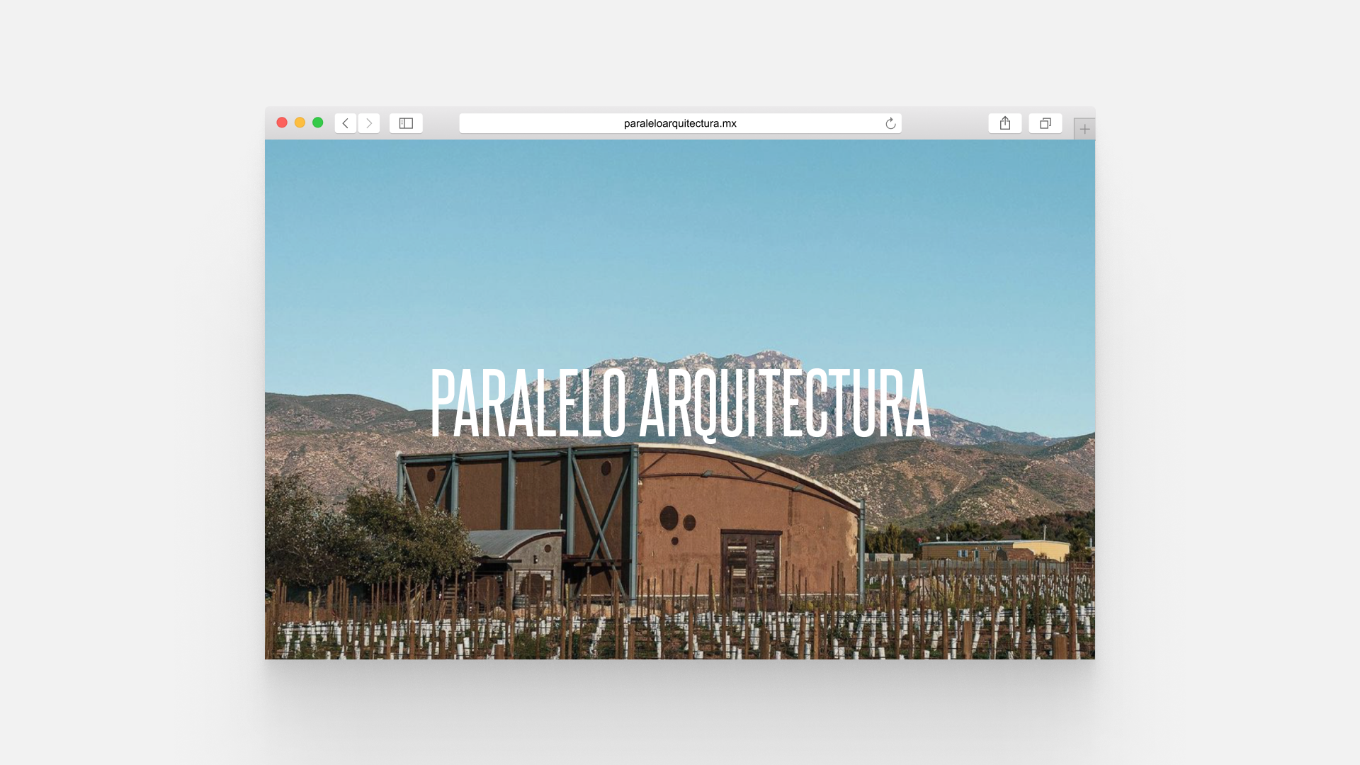
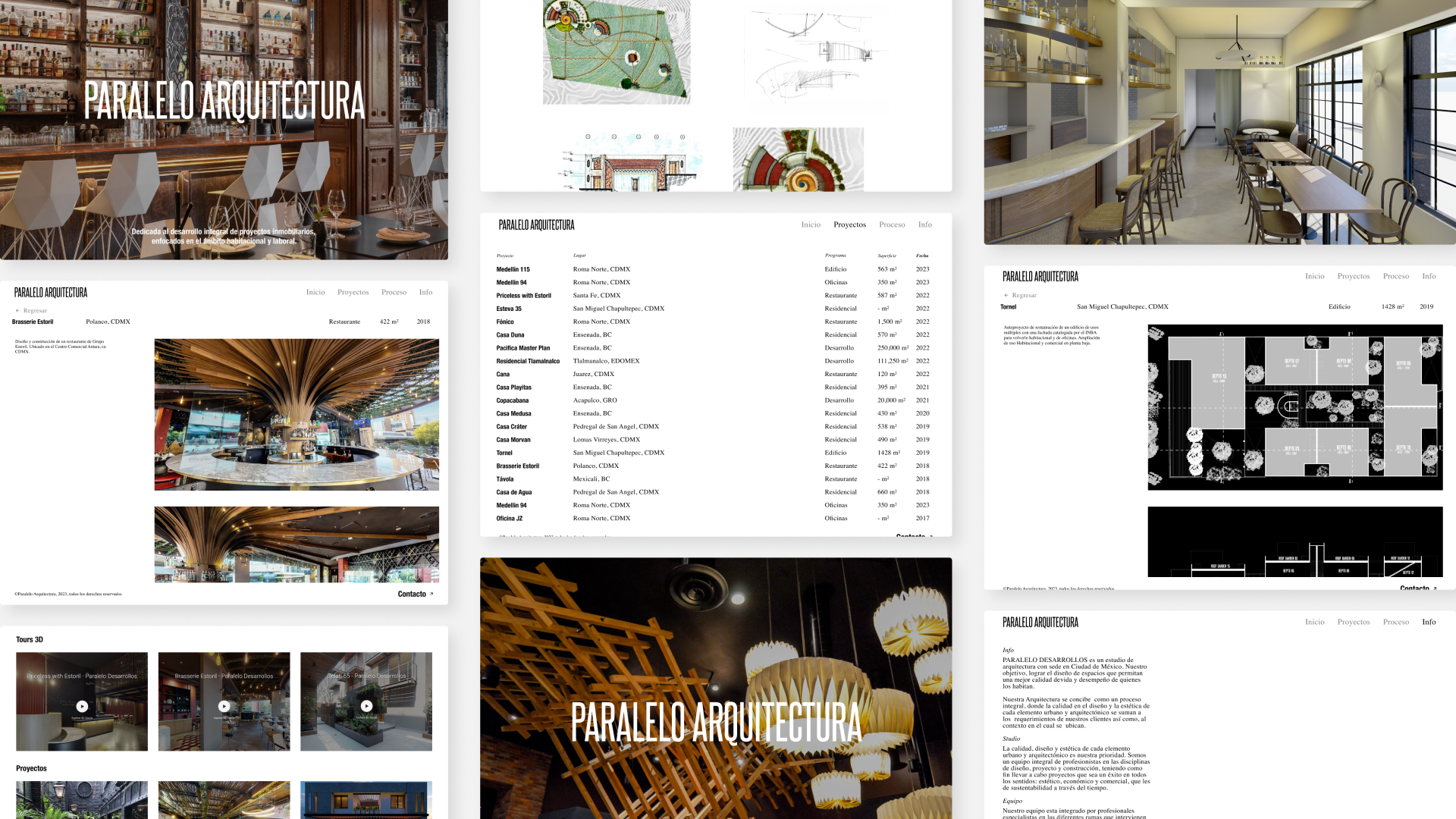
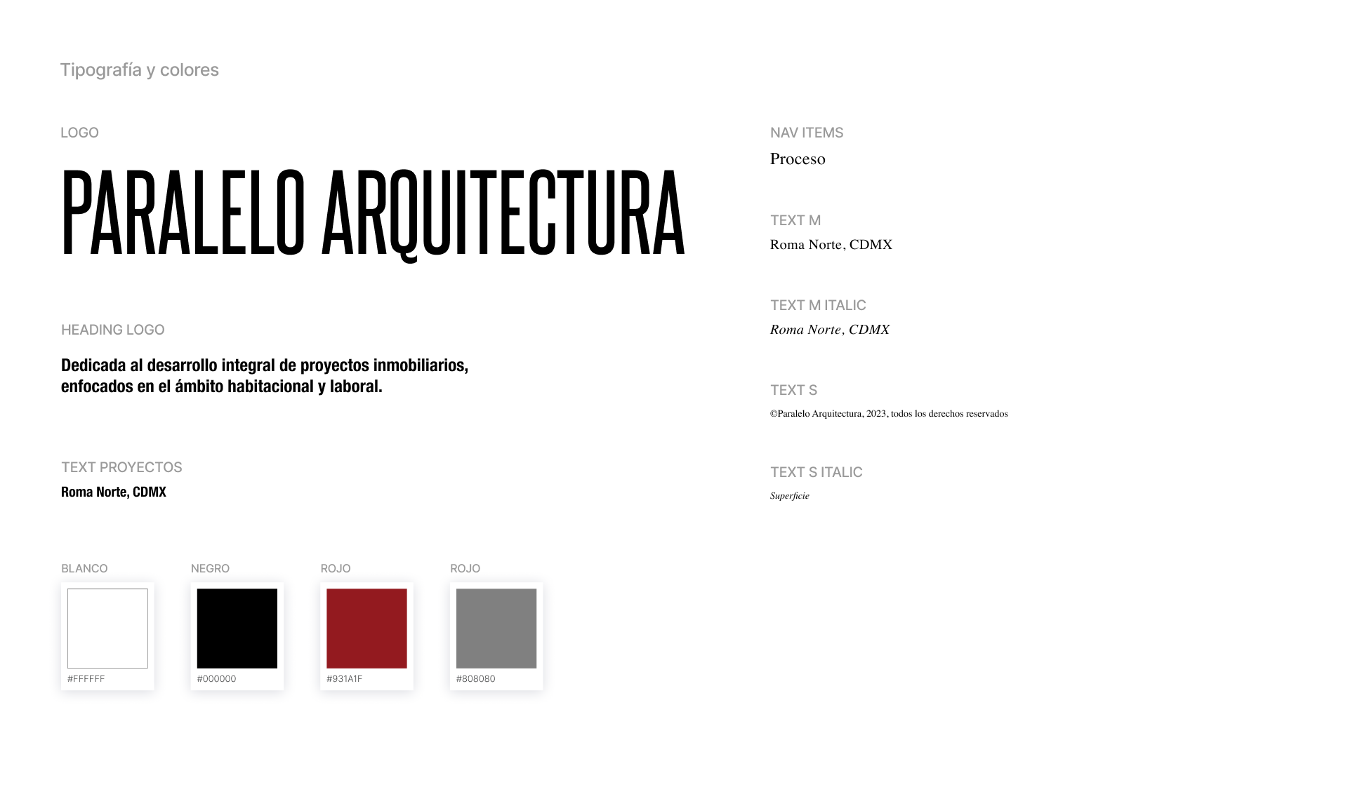
Web design for Paralelo Arquitectura.
Website for a Mexican architecture studio, with completion scheduled for early 2024.
Web design, UX, art direction.
Web design and conducted content selection and editing as part of the project.
In close collaboration with a development team.
Planned completion targeted for the beginning of 2024.
Web development by Cuarto Negro.
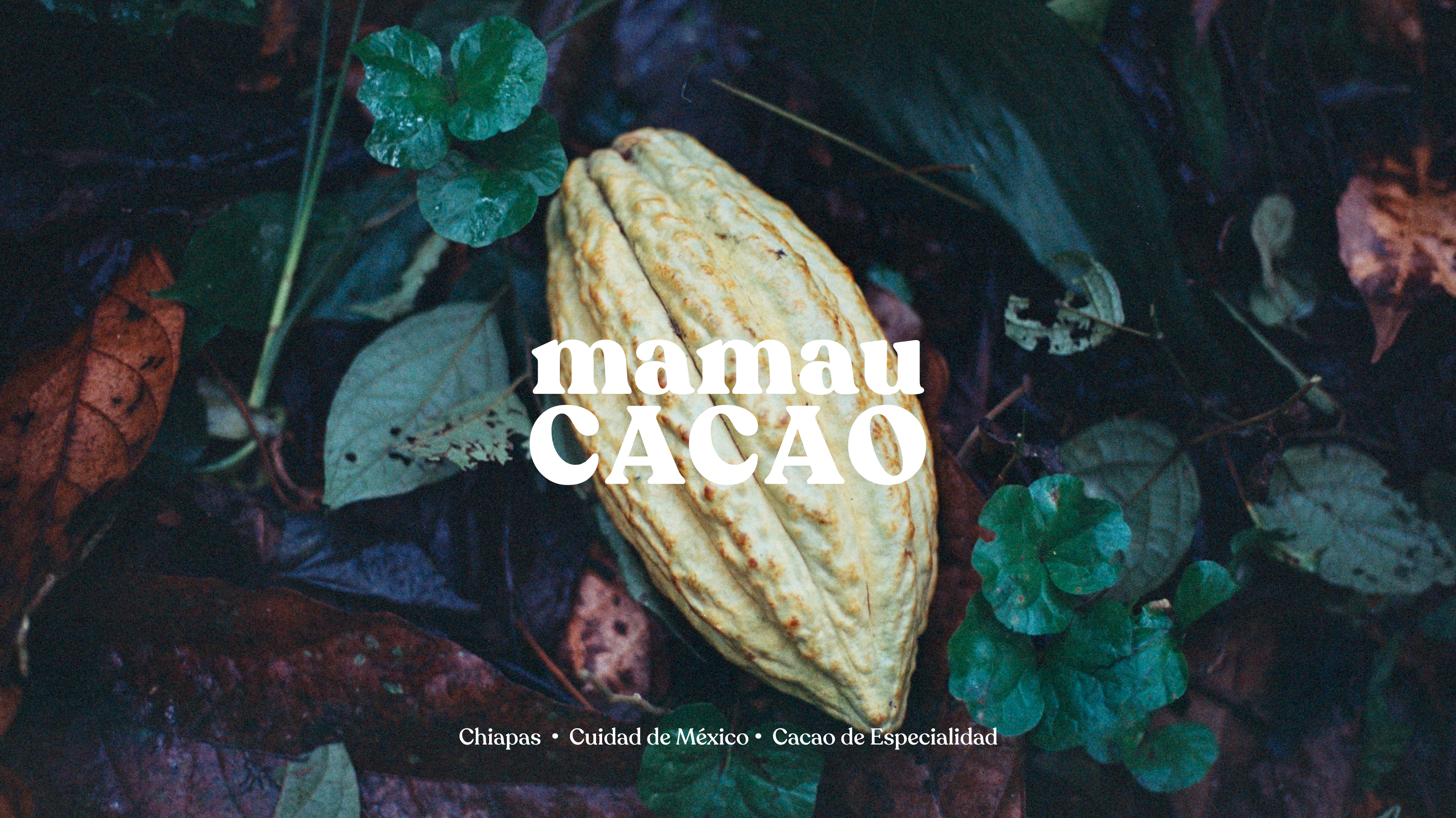
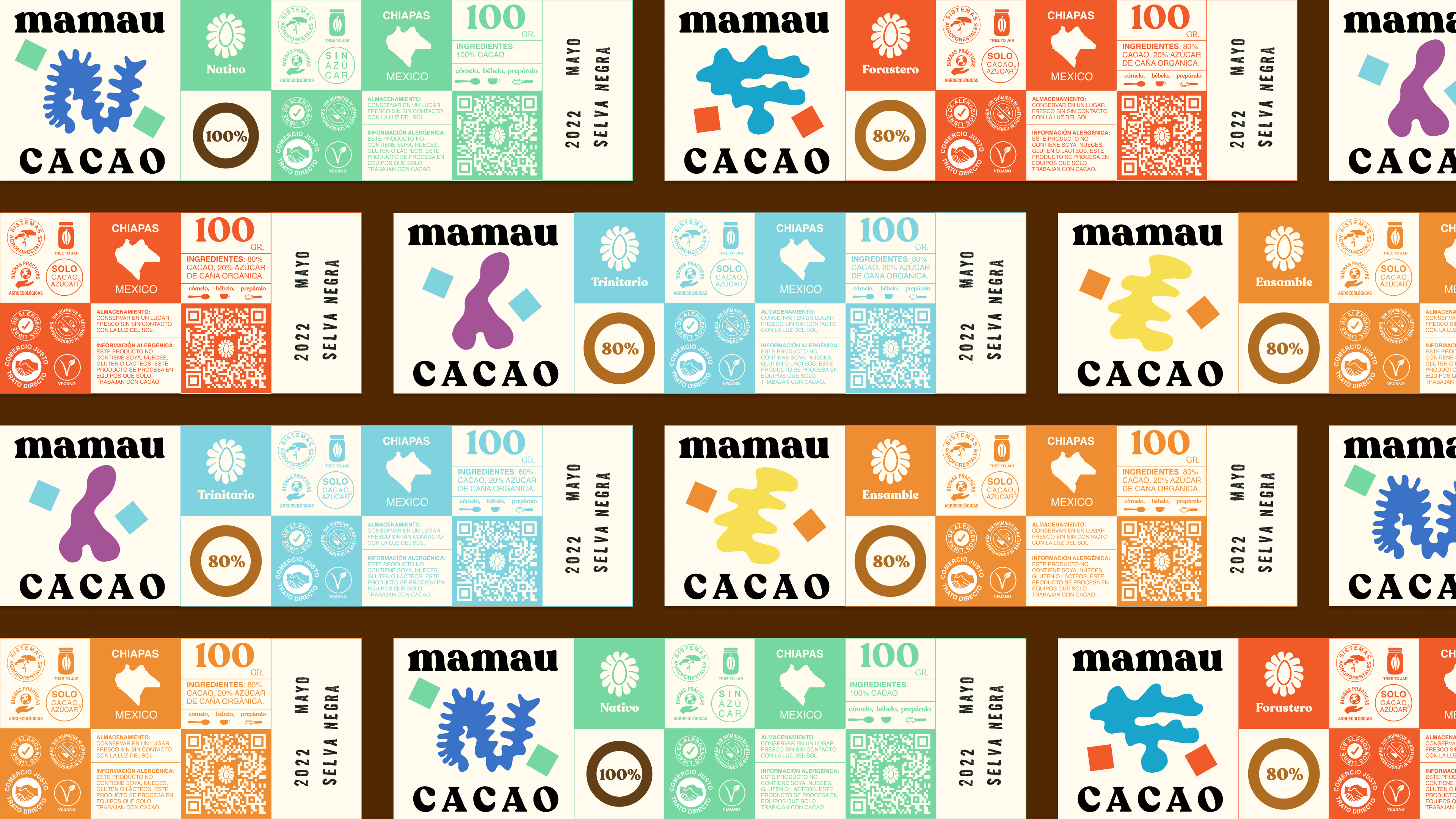
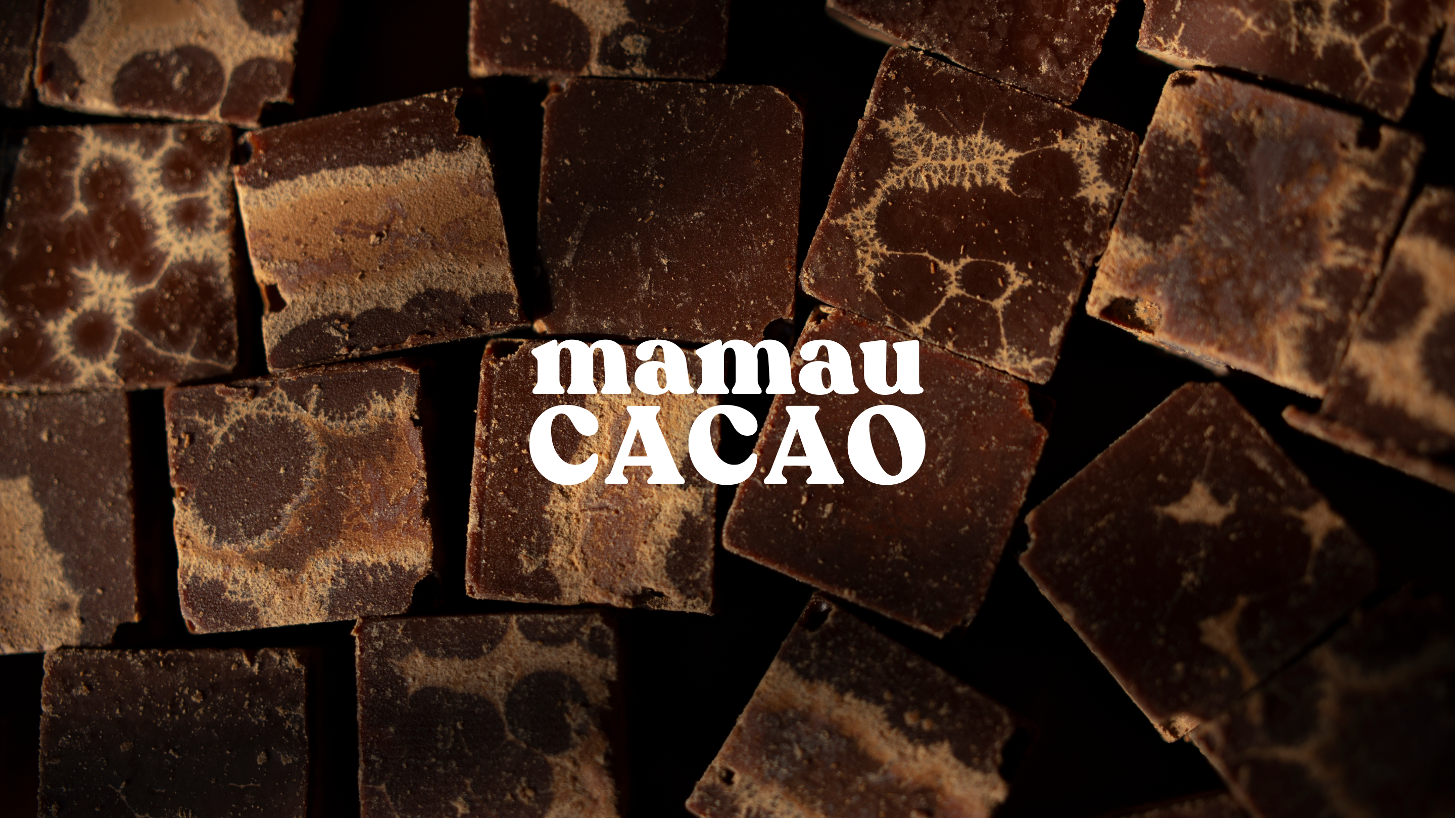
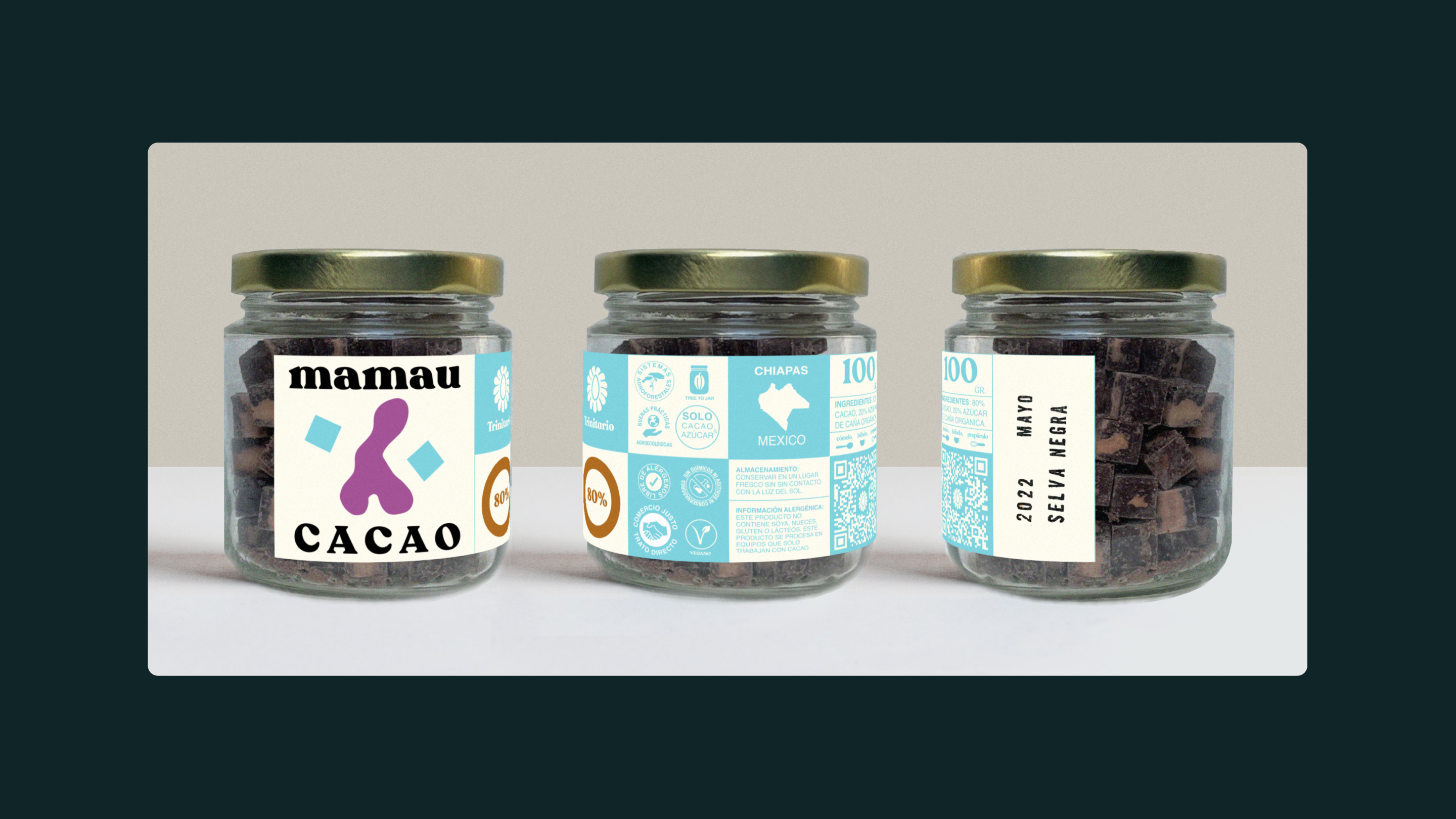
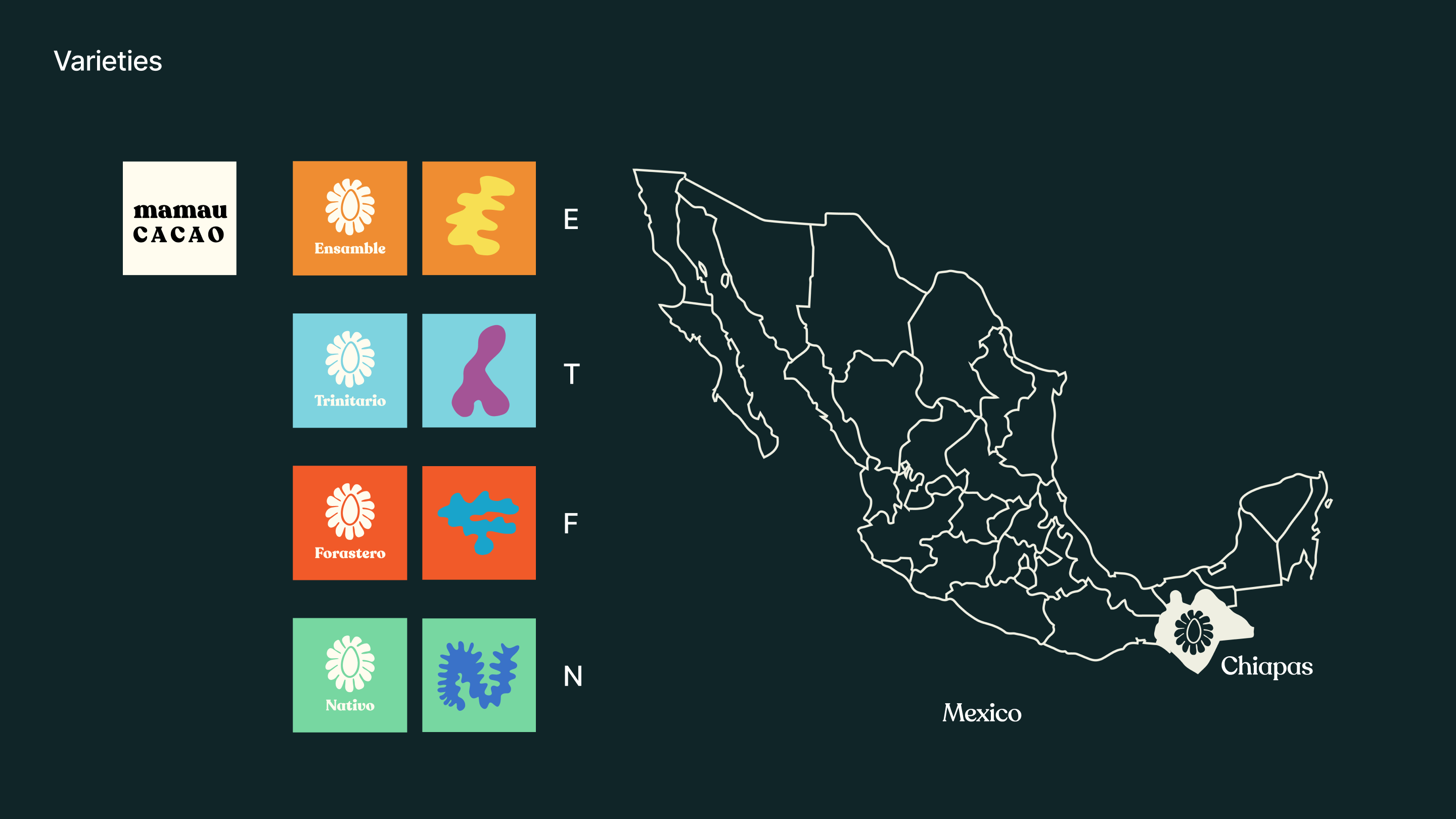
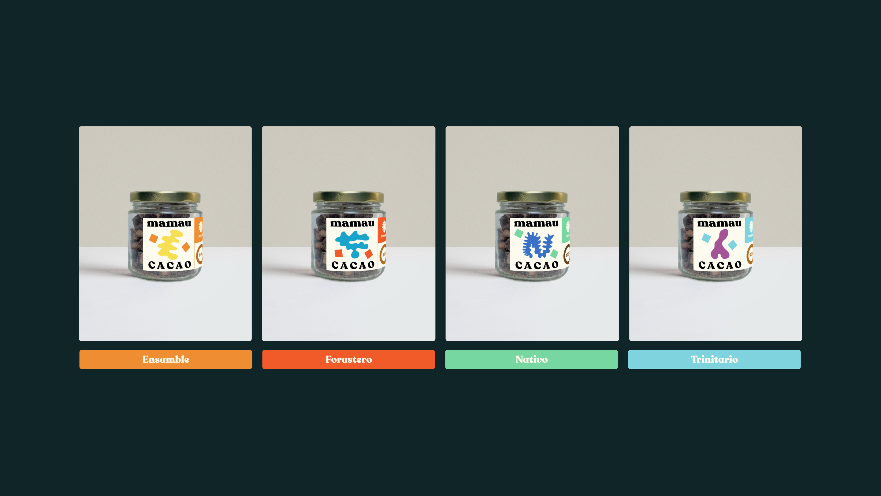
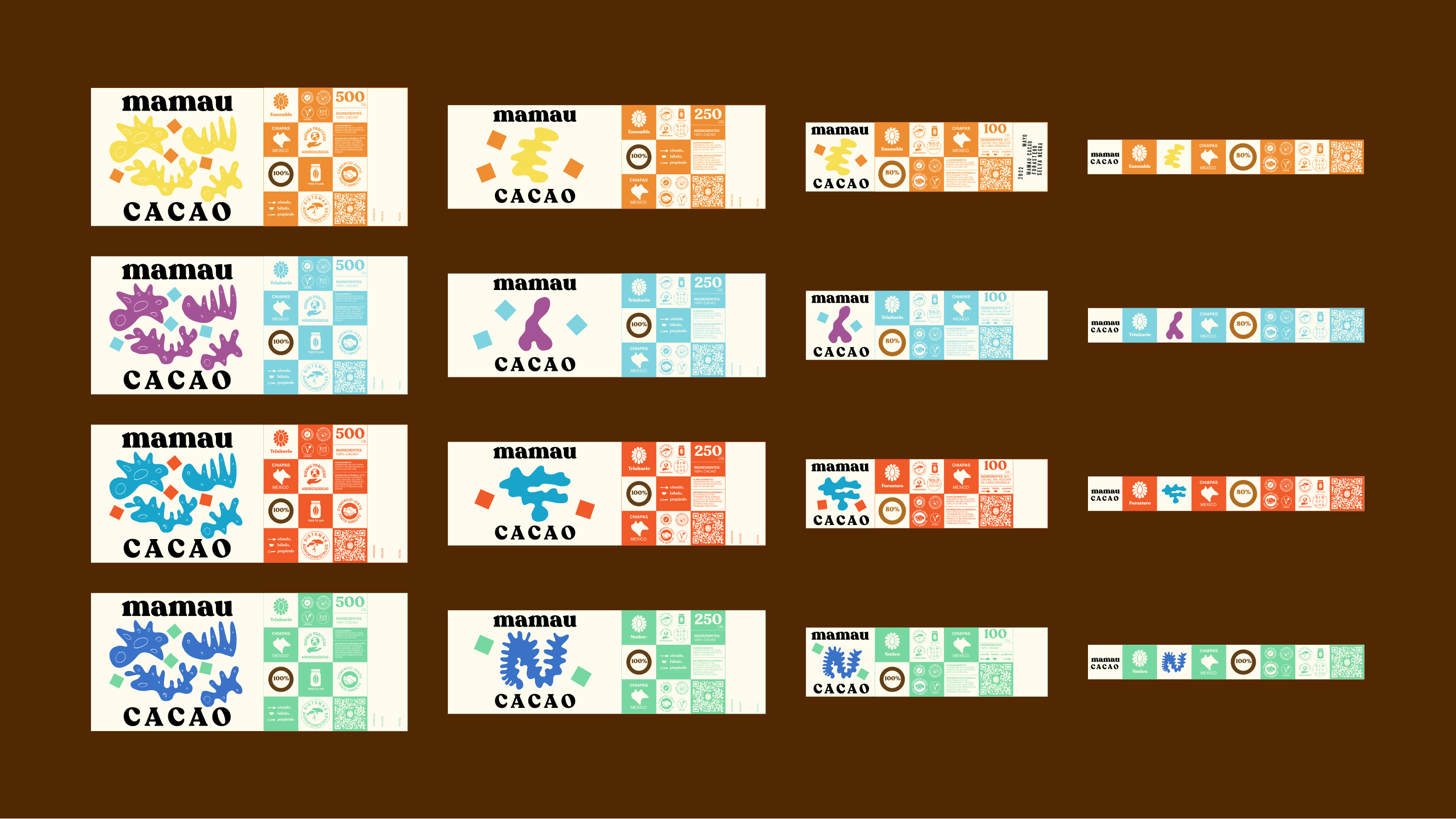
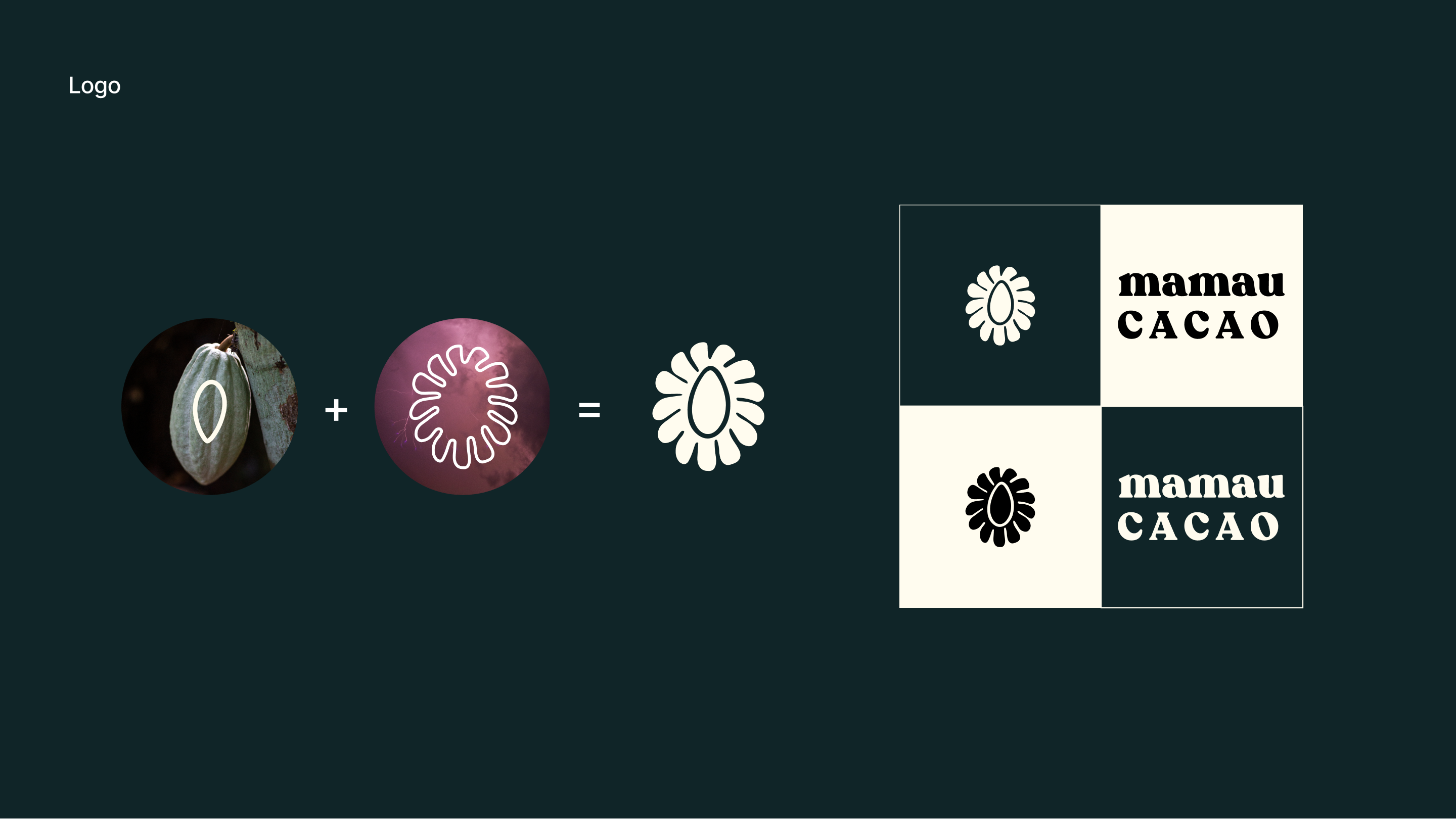
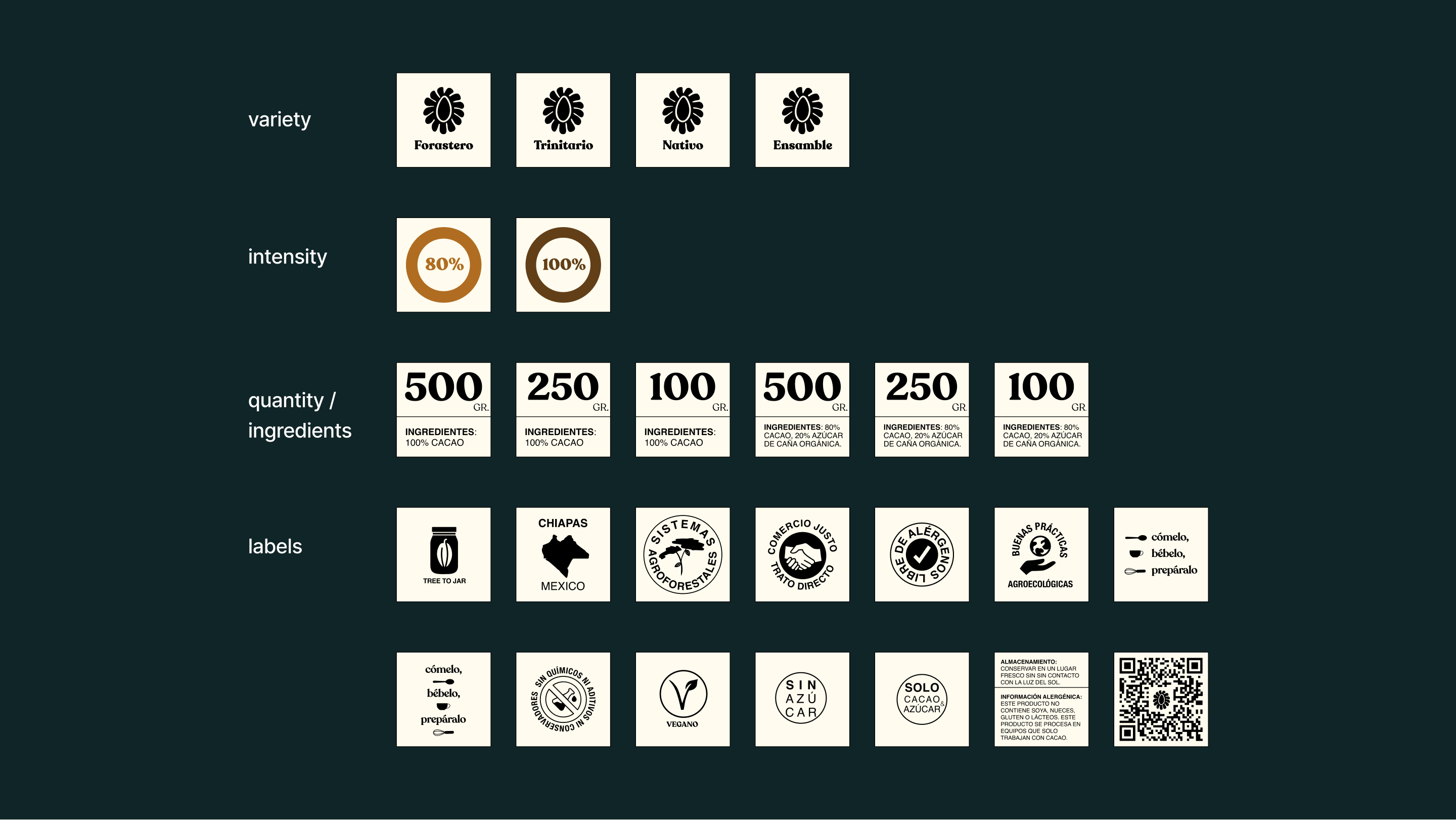
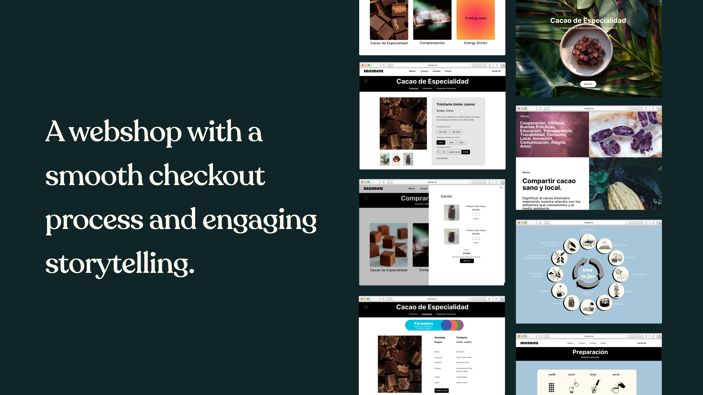
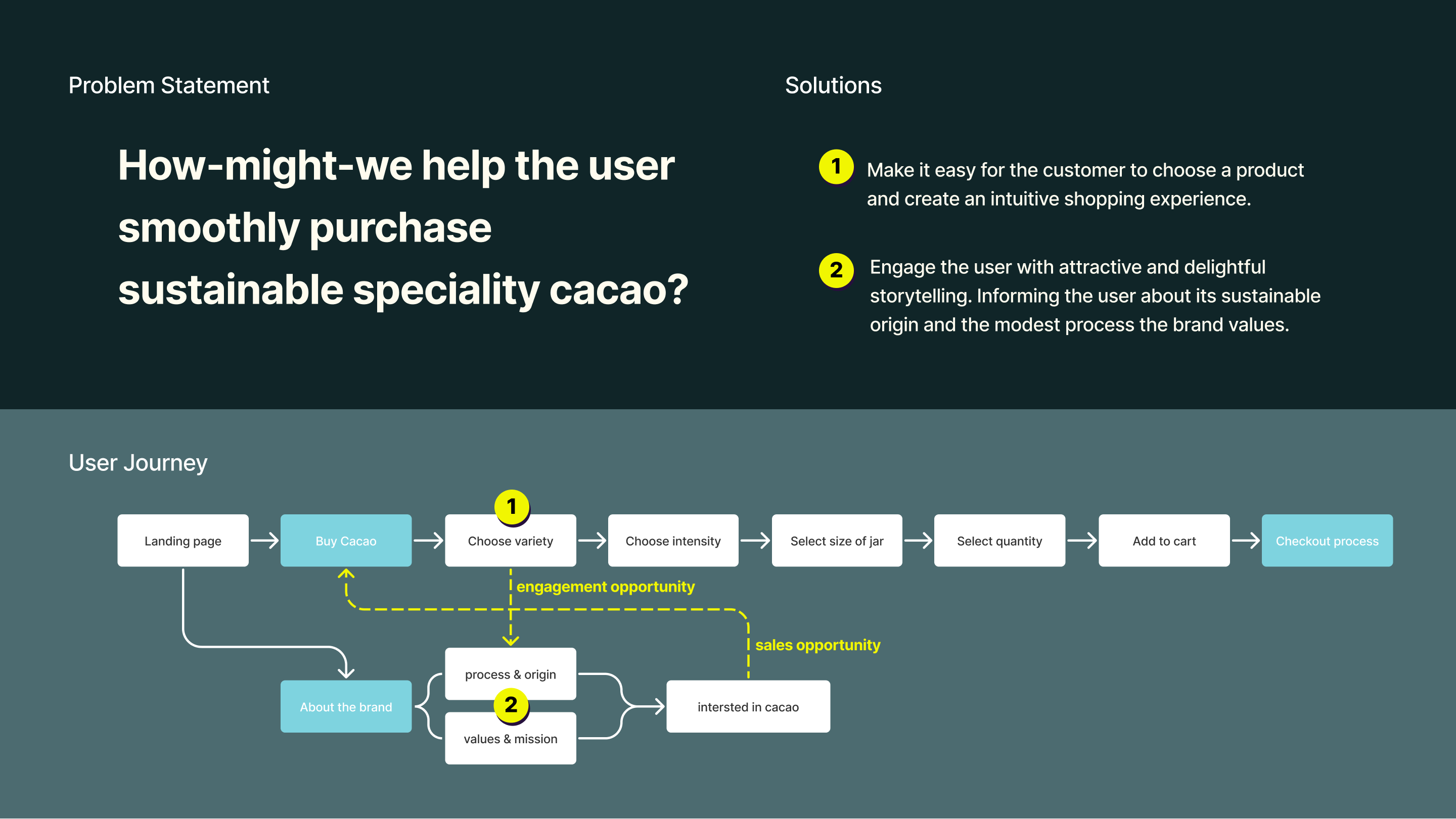
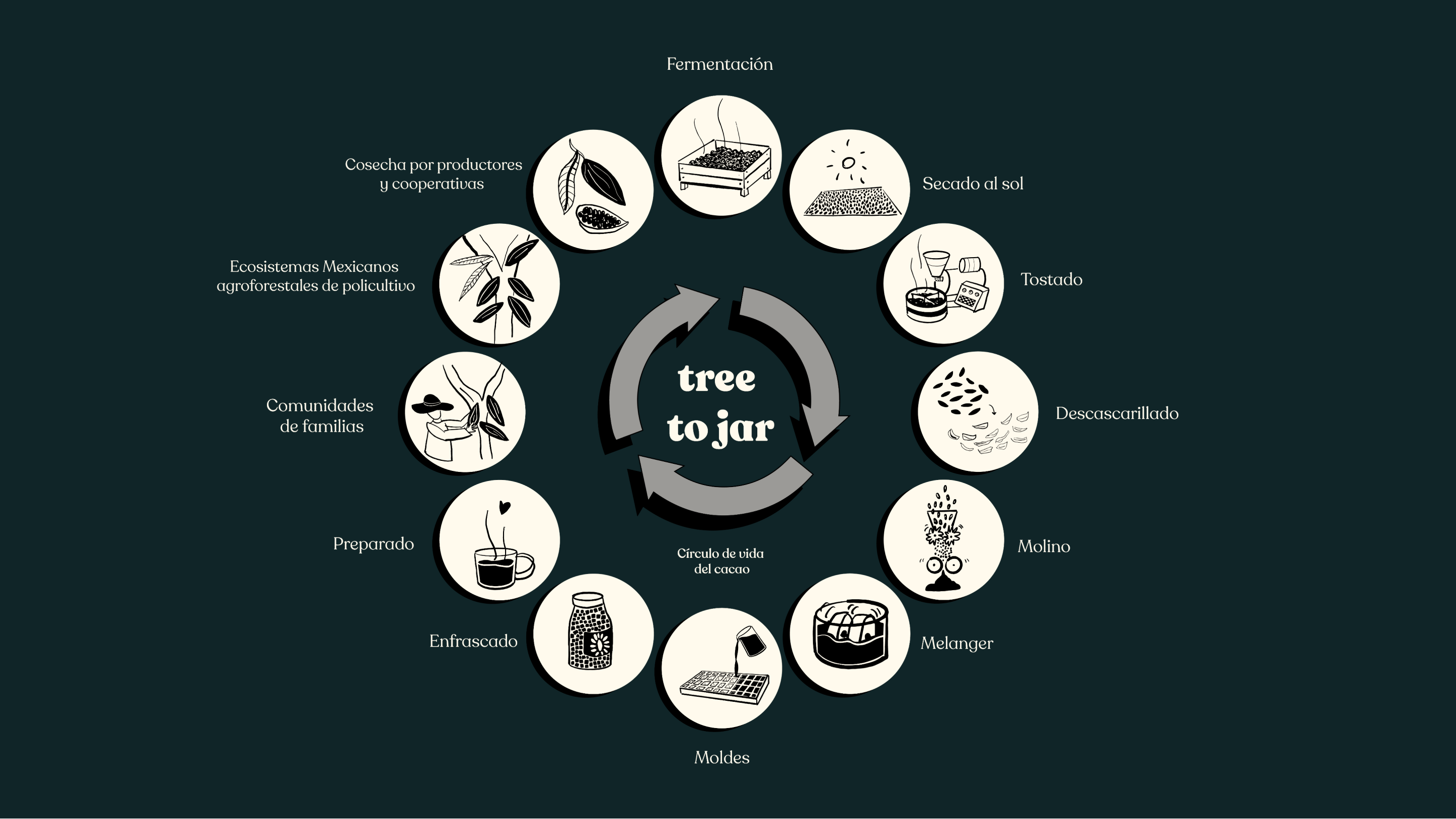
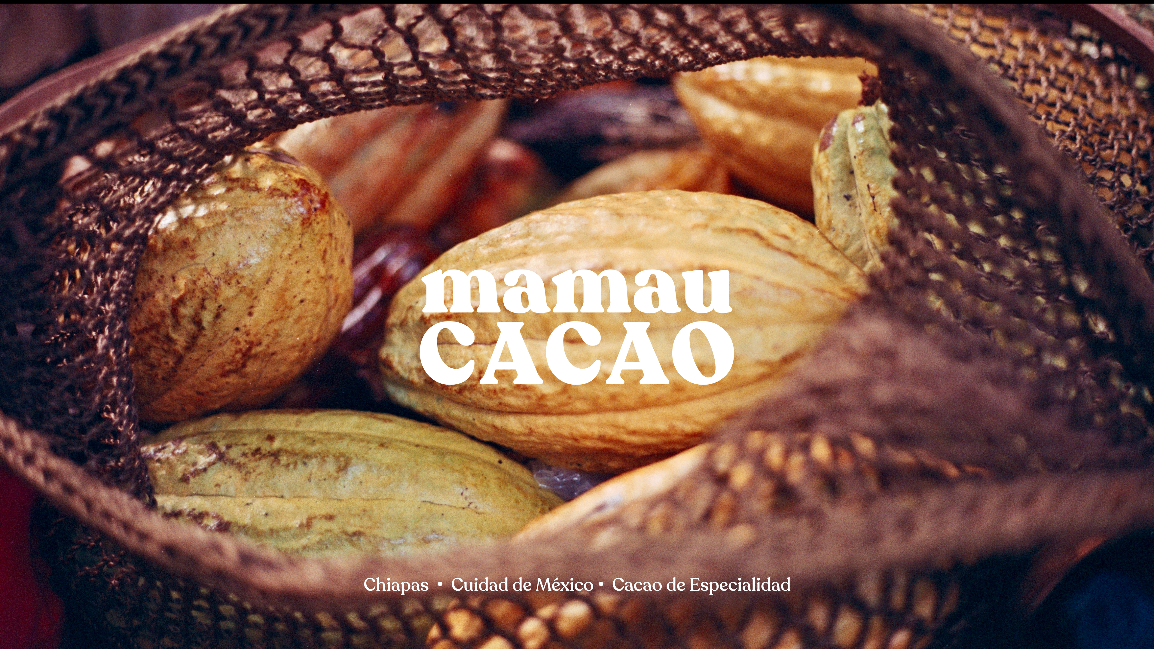
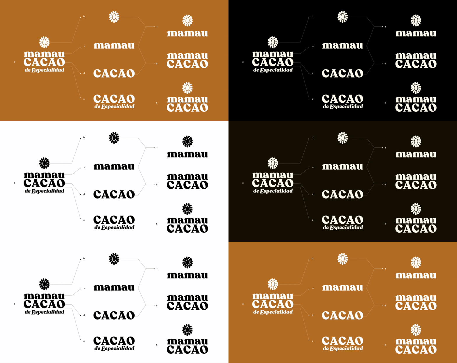
Strategic brand definition, logo design, systematic packaging design, UX website, and a mid-fi prototype of the website with webshop.
Mamau Cacao is a Mexican start-up business offering a forgotten native super food, specialty cacao. The product comes in little cubes, packed in glass jars.
Brand Strategy, Identity, Packaging, UX, Website
Founded the visual presence of the brand and helped the start-up get started with a solid UX and IA foundation with a Plan of Action for their website with a webshop.
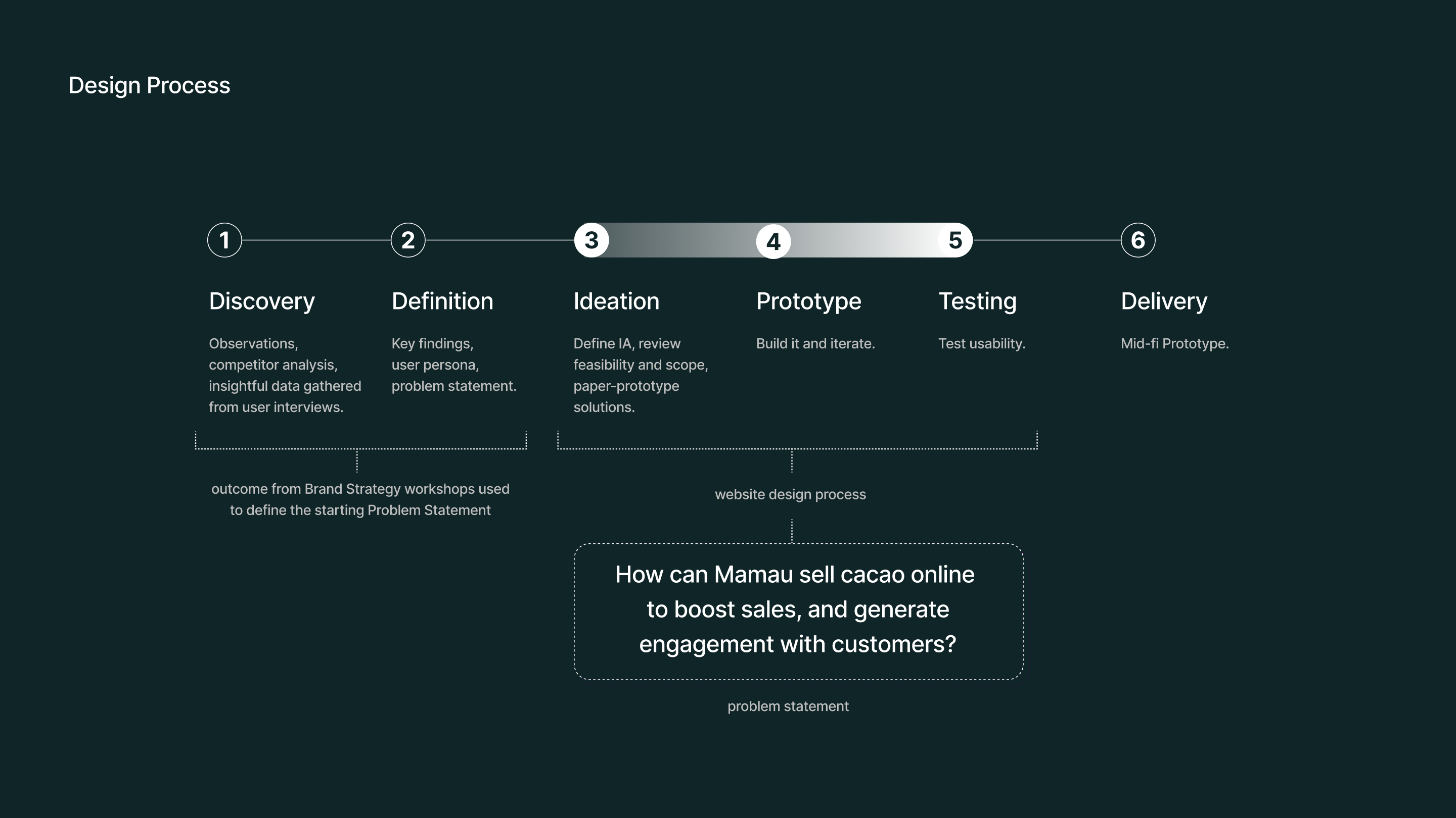
Organized constructive workshops with the team to define competent brand strategies, conducted research, designed the logo, a systematic packaging system, and a style guide, mapped user-friendly IA, created effective UX wireframes, and delivered a mid-fi prototype
tools: Figma, Adobe Ai, Ps, Id
role: Lead Designer
Pictures by Eusebio Balmori Vildosola and Moïs Roditi.
Special thanks to Izzy Aspeling-Jones
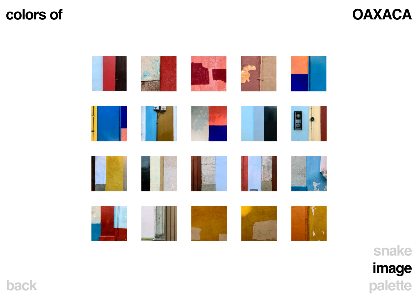
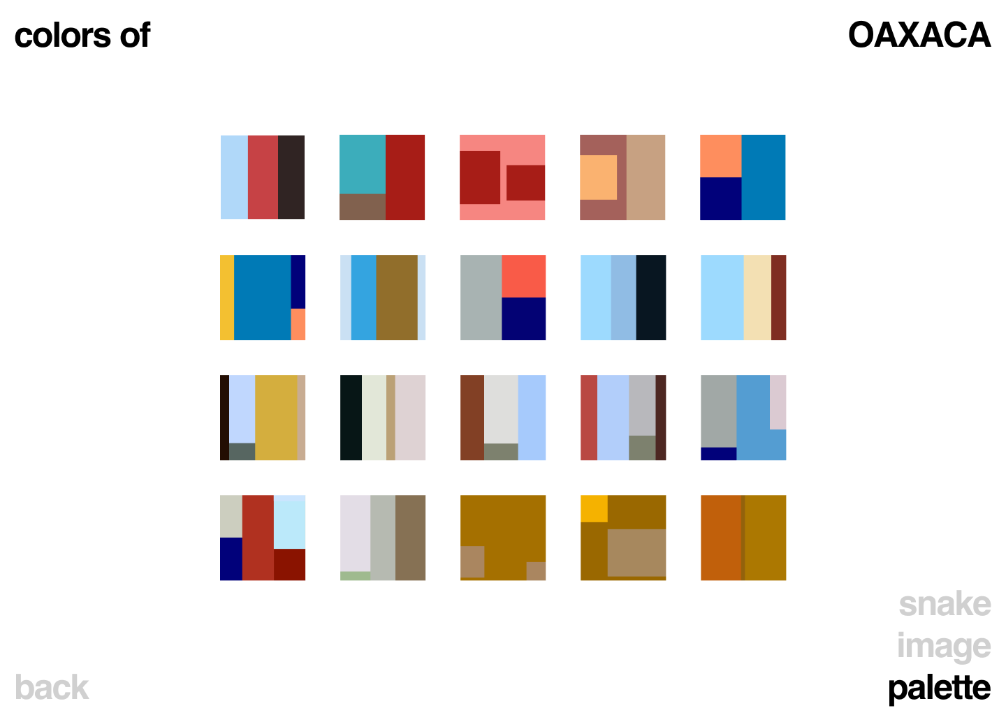
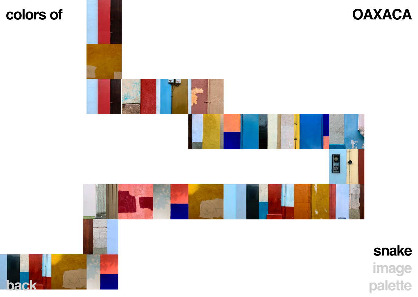
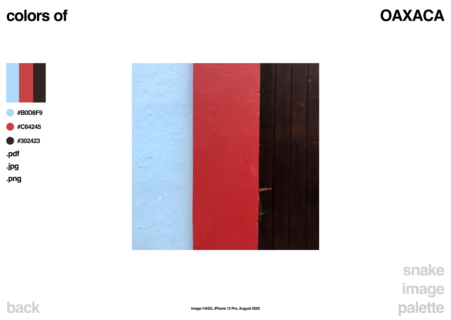
Open source color pallete library, with real colors from real places.
Discover, download, use, and enjoy real colors from real places.
Coming soon.
UX/UI, Design
UX/UI, Front End Dev,
Art, Photography
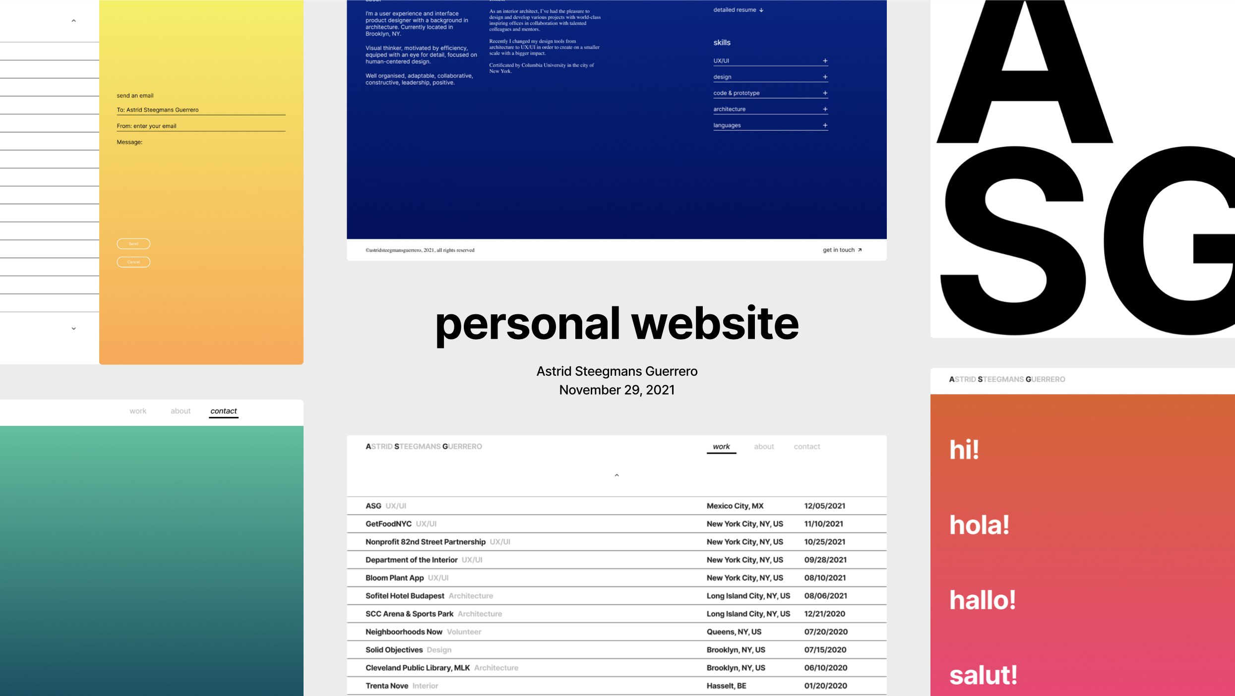
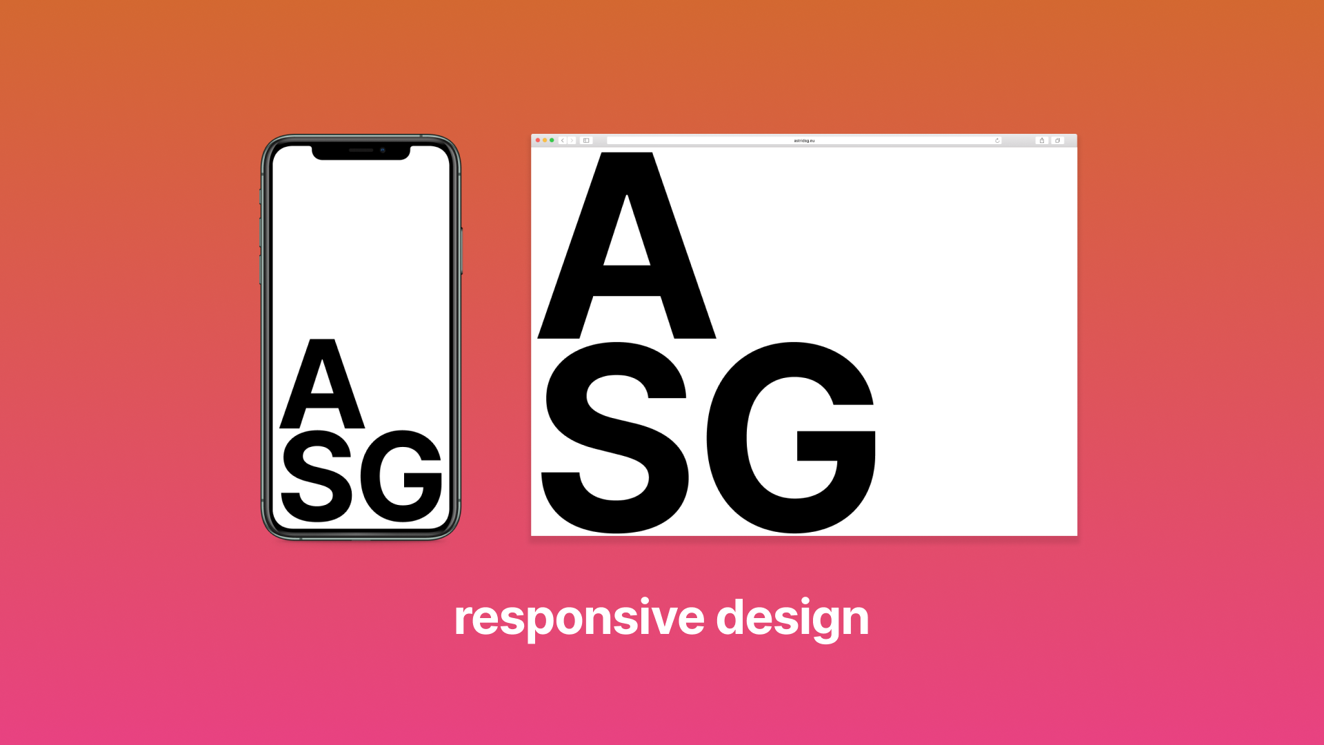
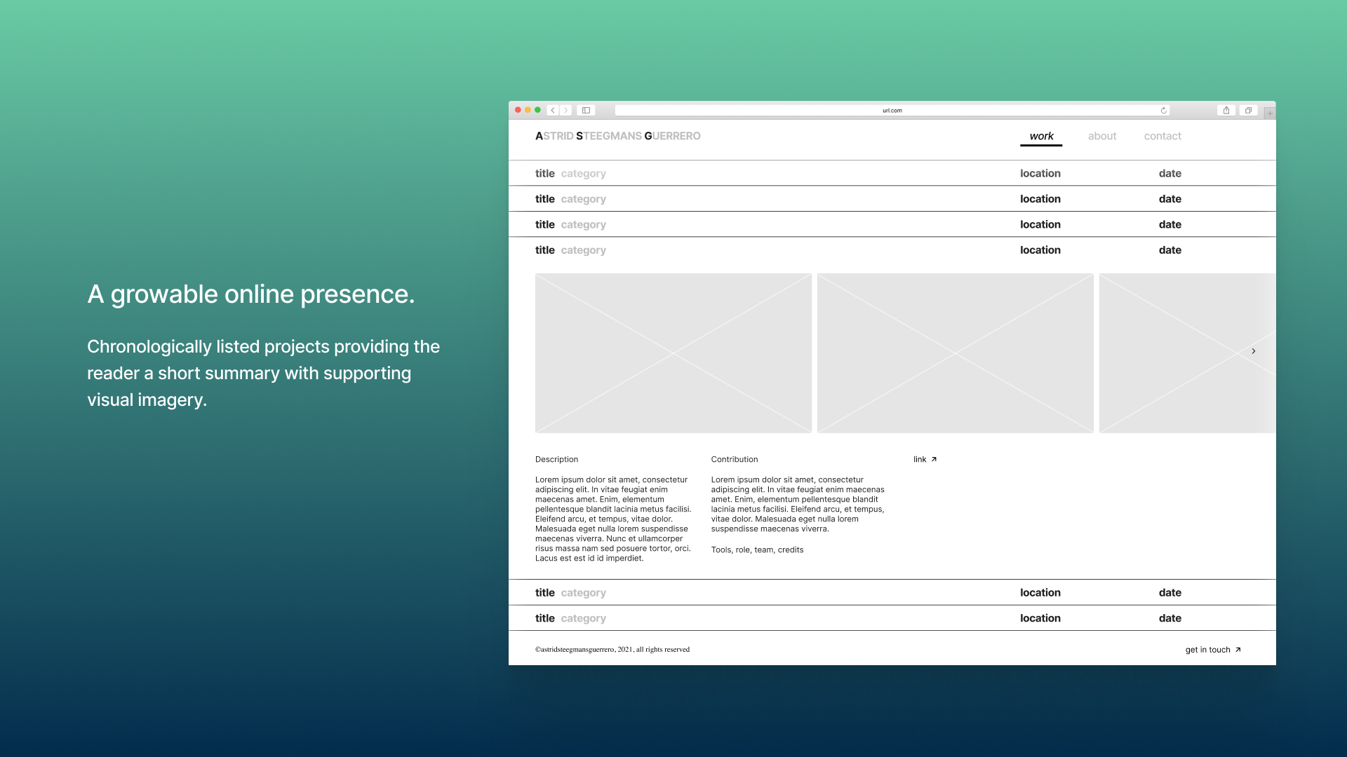
Portfolio website
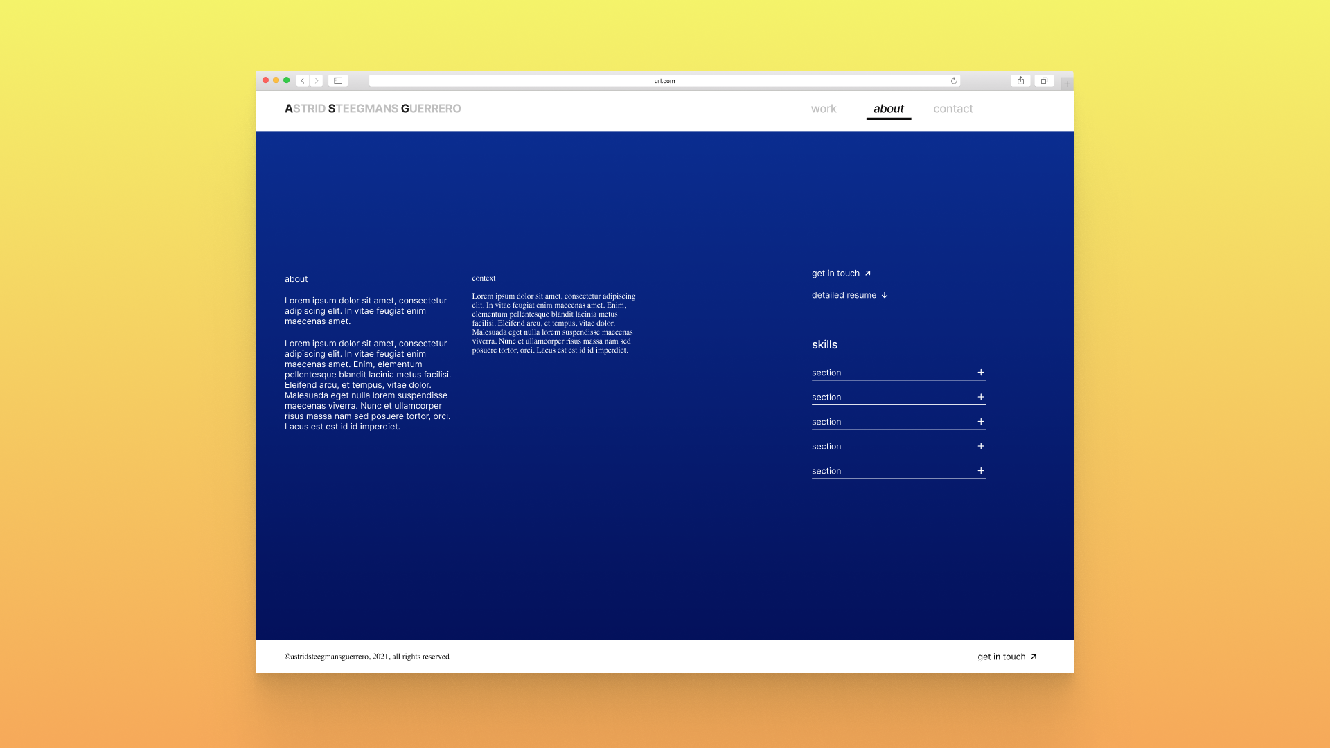
A website to showcase personal work that will grow over time. Expandability and a neutral UI style are key in the design direction.
UX/UI Design
UX wireframes, complete UI design style guide and components.
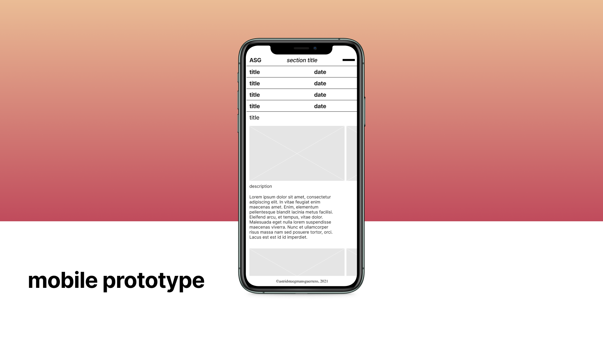
Responsive prototypes for mobile and desktop.
From scratch-built an online prototype using HTML, CCS, Javascript, jQuery, and GitHub.
Tools: Figma, VS Code, Github, Elementor
Role: Designer, Solo project
Developped and built by Cuarto Negro
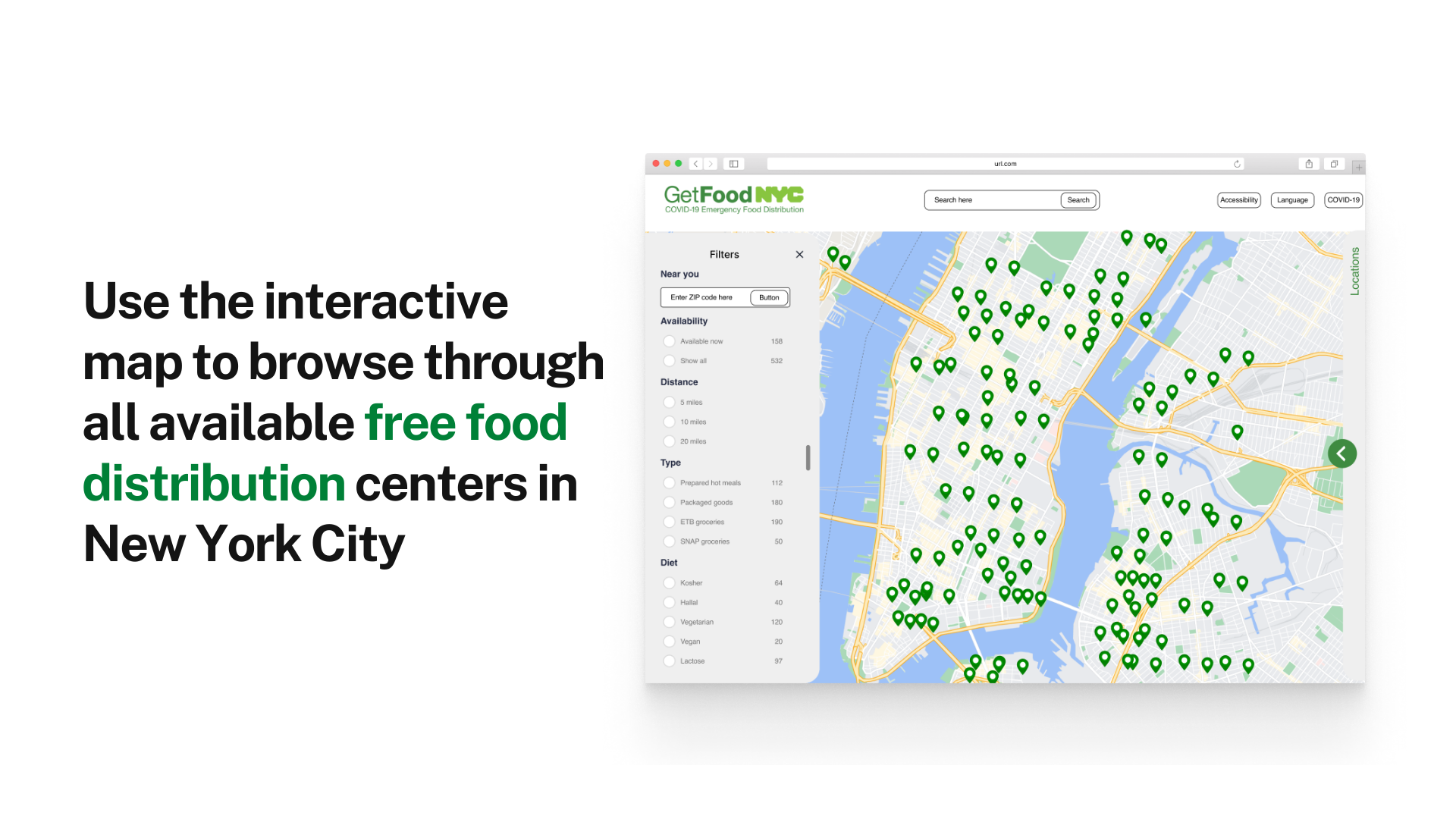
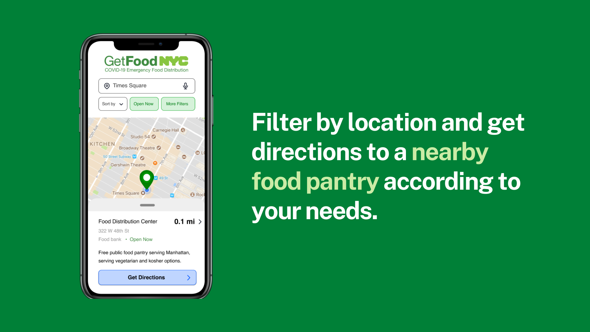
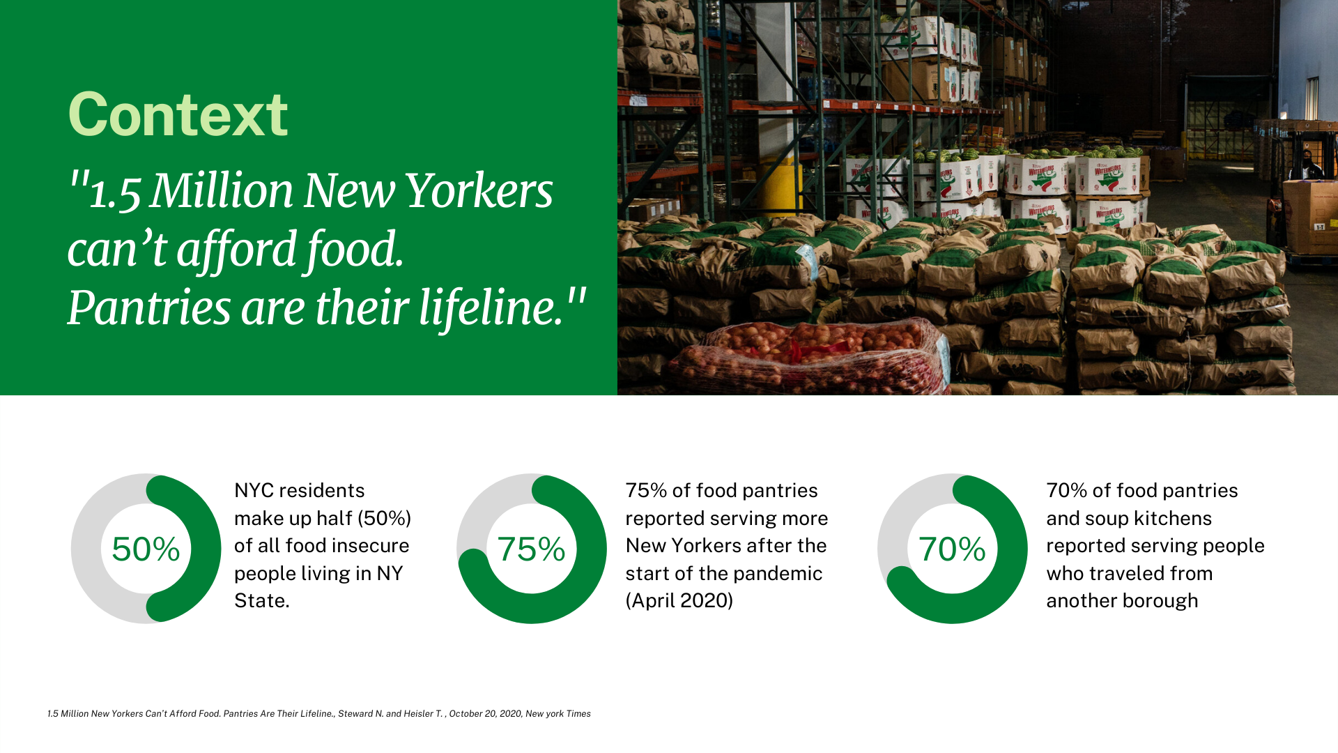
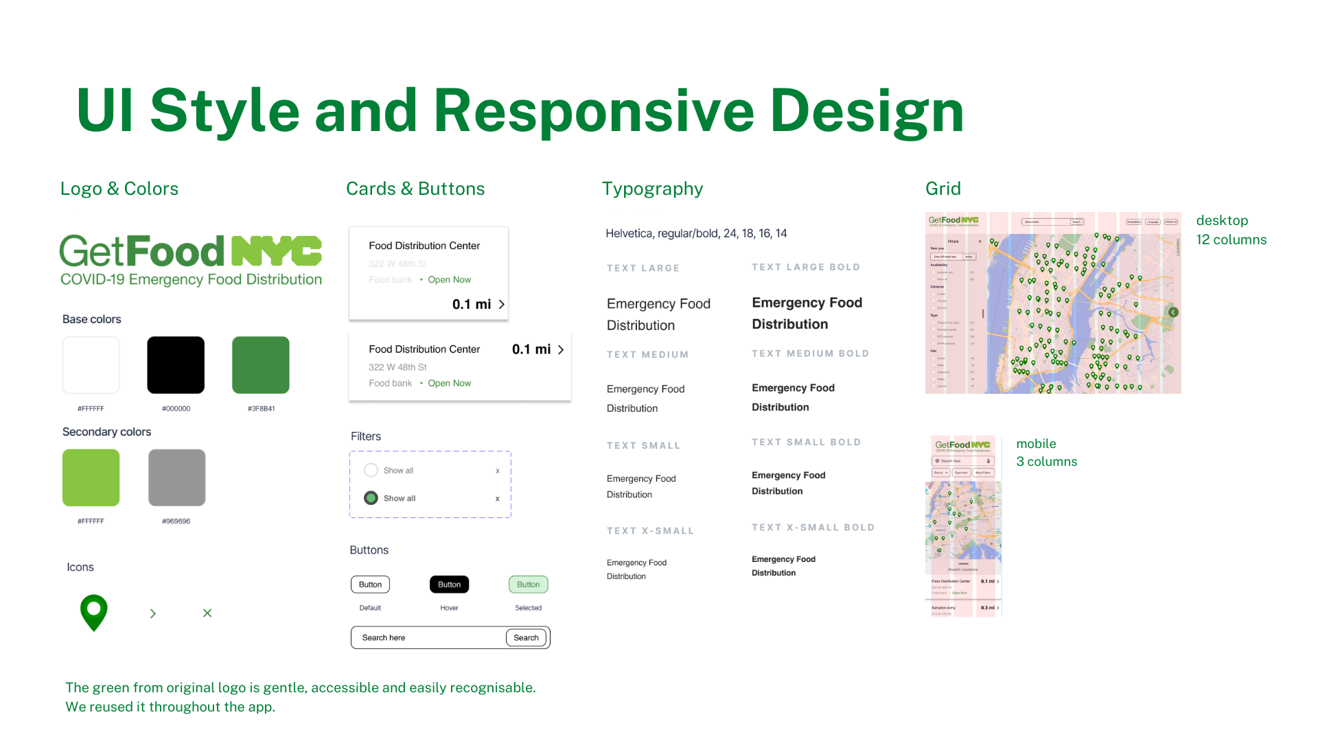
An interactive map to fight food security in New York City.
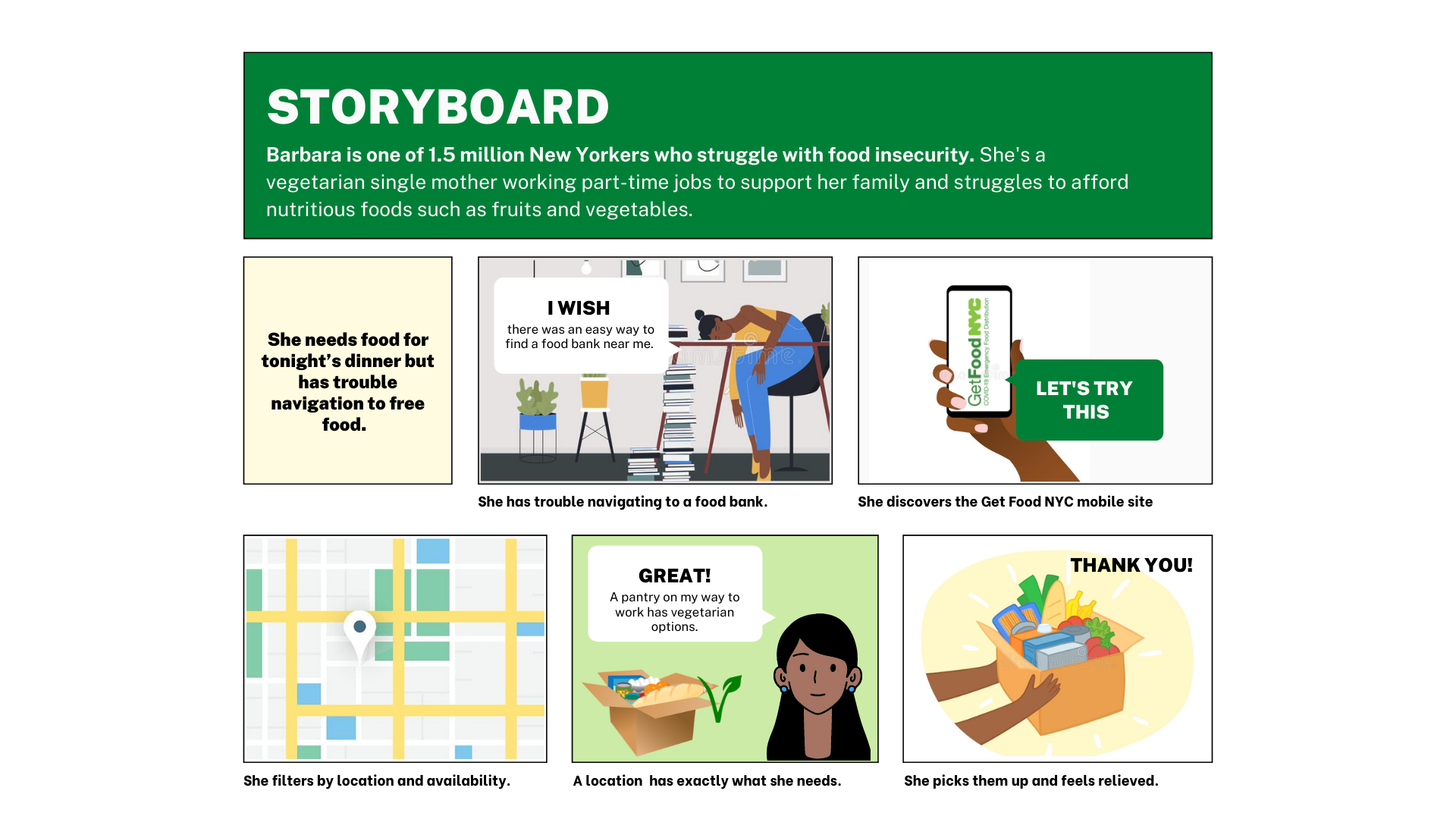
“The problem: The GetFoodNYC government site is difficult to navigate, inefficient, and suffers from a lack of accessibility and options for users.
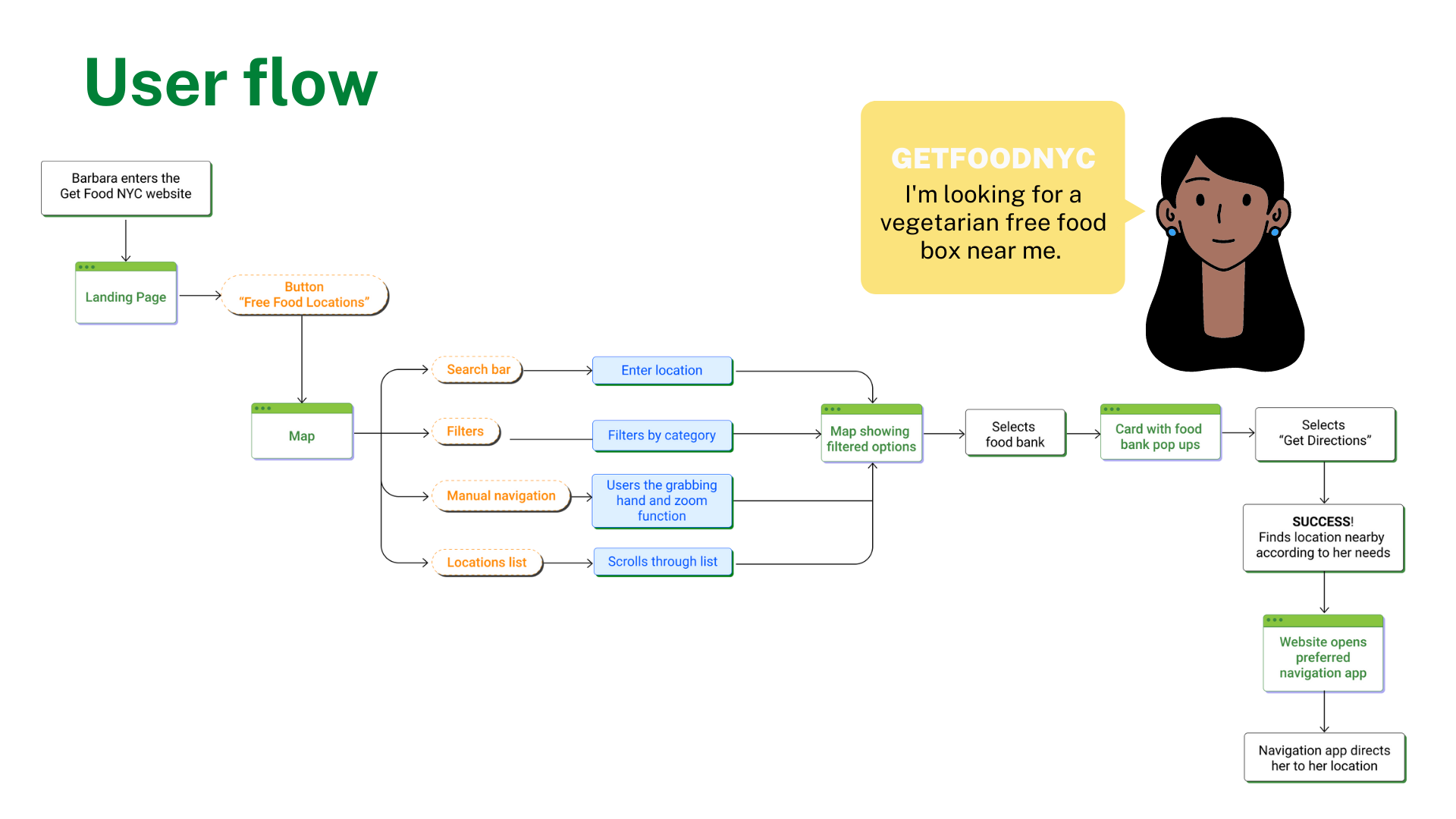
Our solution: We provided a mobile app for New Yorkers who need to quickly find and navigate to free food distribution centers that can cater to their needs.”
UX/UI redesign case study
“Research and definition of persona, pain points and solutions.
Ideation and development of features for responsive interfaces.
Iterations on prototypes from low to high fidelity, based on test results.”
Tools: Figma, VS Code
Role: Researcher, designer
Team of 3: with Mai Hirose & Johnathan Lerman
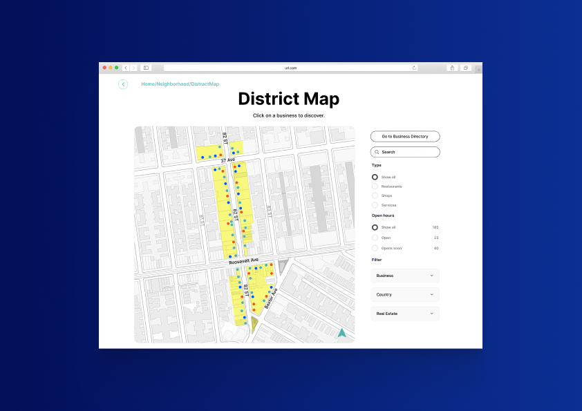
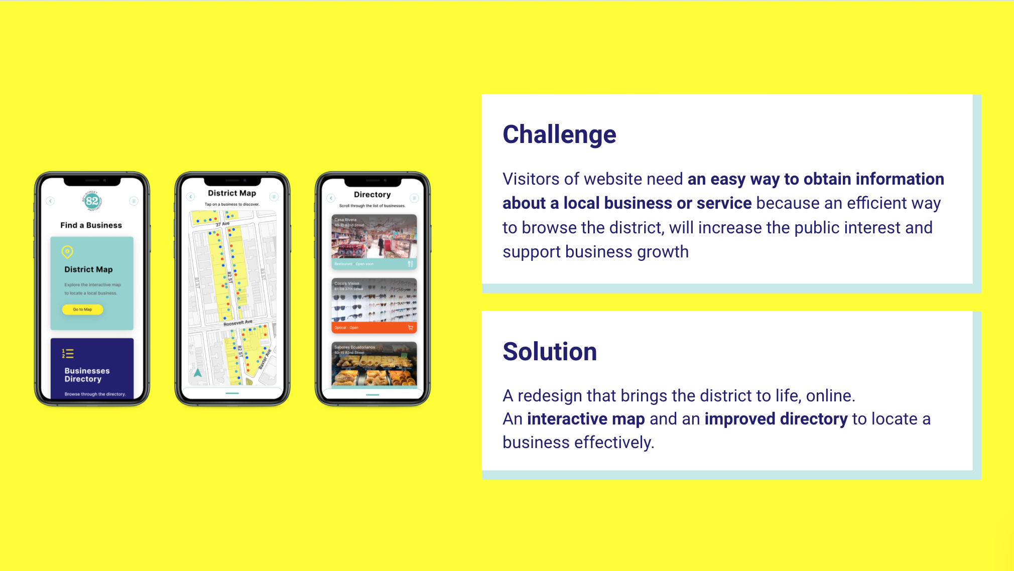
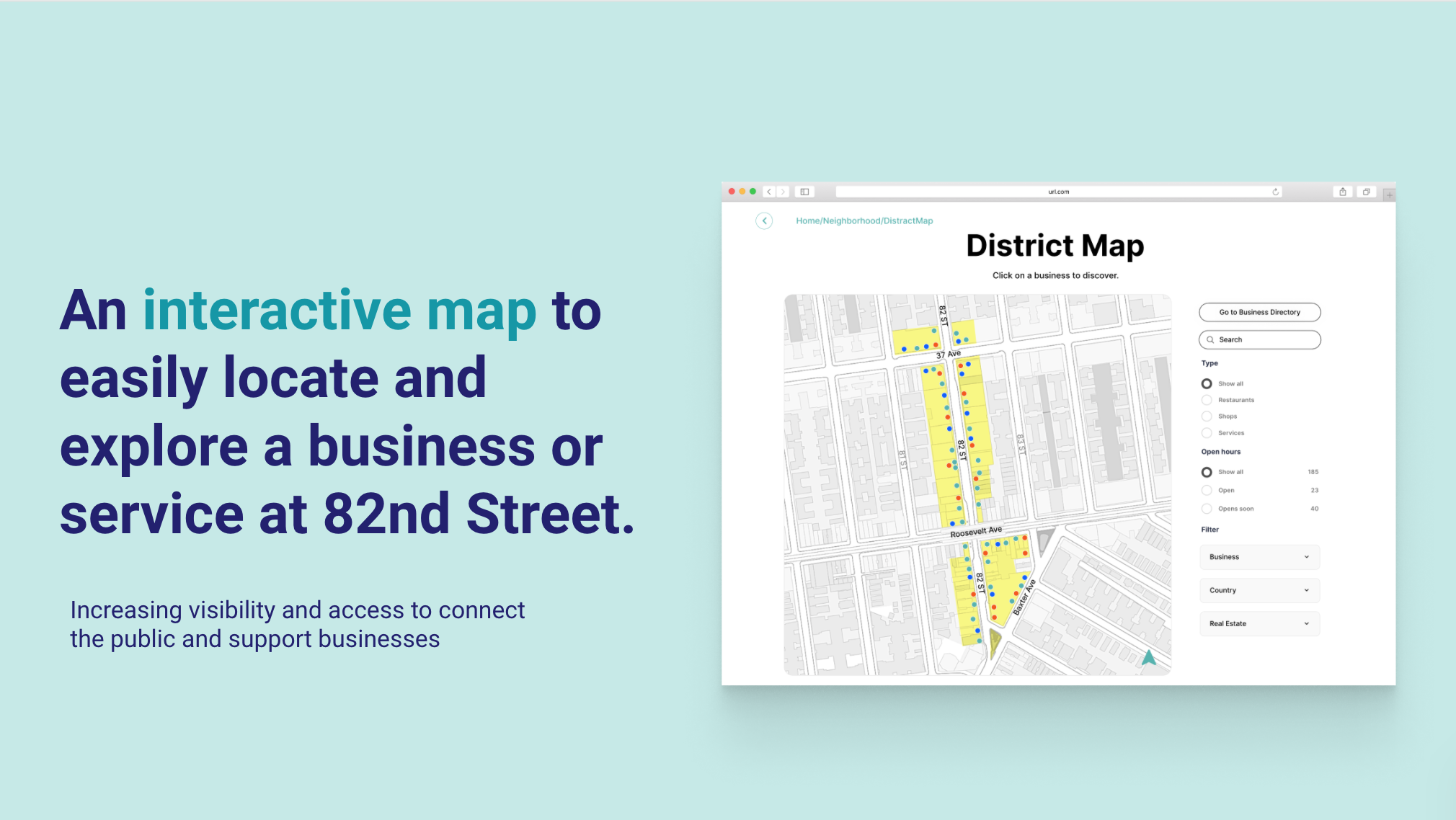
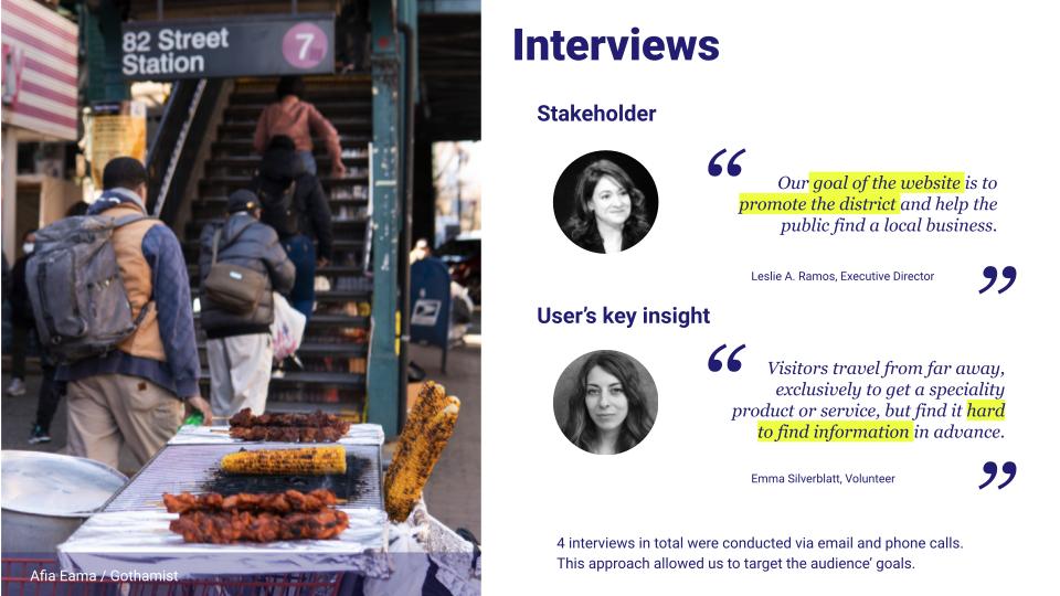
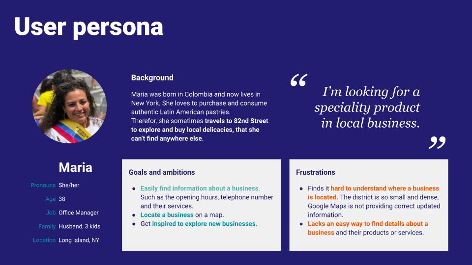
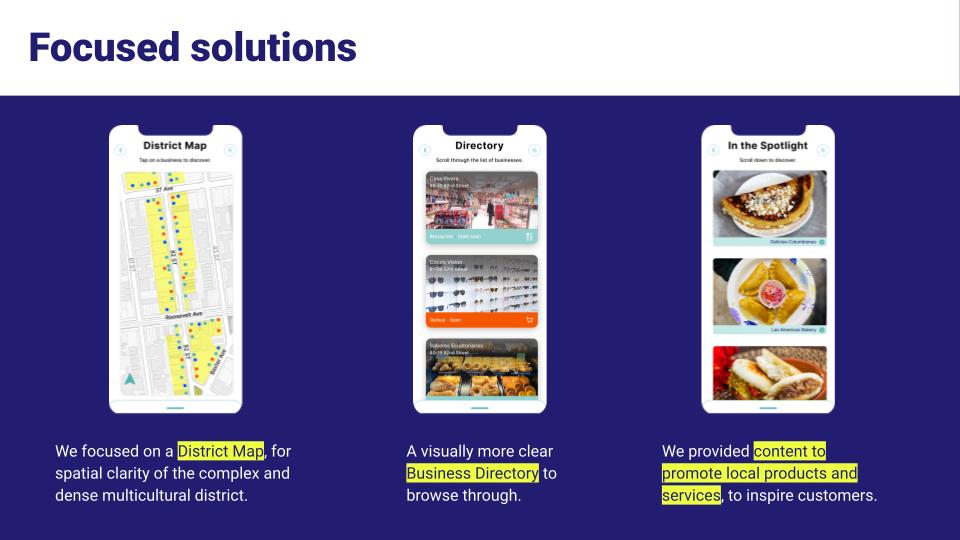
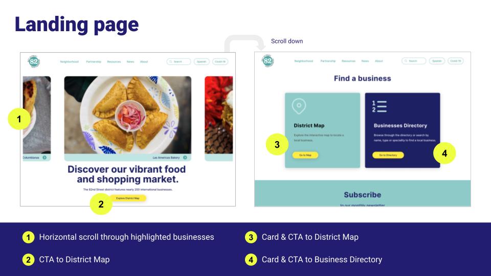
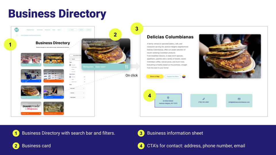
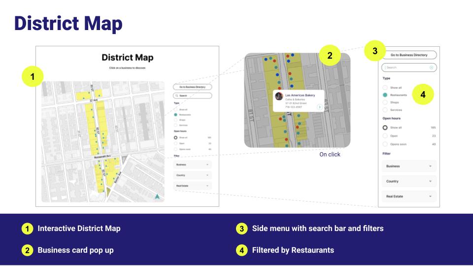
An interactive map and business directory for a local nonprofit that promotes a district.
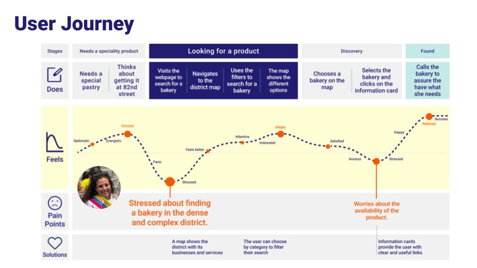
“The challange: Visitors of website need an easy way to obtain information about a local business or service because an efficient way to browse the district, will increase the public interest and support business growth
Our solution: A redesign that brings the district to life, online. An interactive map and an improved directory to locate a business effectively.”
UX/UI redesign case study
Research, interviewing stakeholders, usability testing, new IA, lo-fi UX wireframe development, ideation, definition, new UI style guide, components, final interactive map design, Hi-fi prototyping, and user testing.
Tools: Figma
Role: Researcher, designer
Solo project
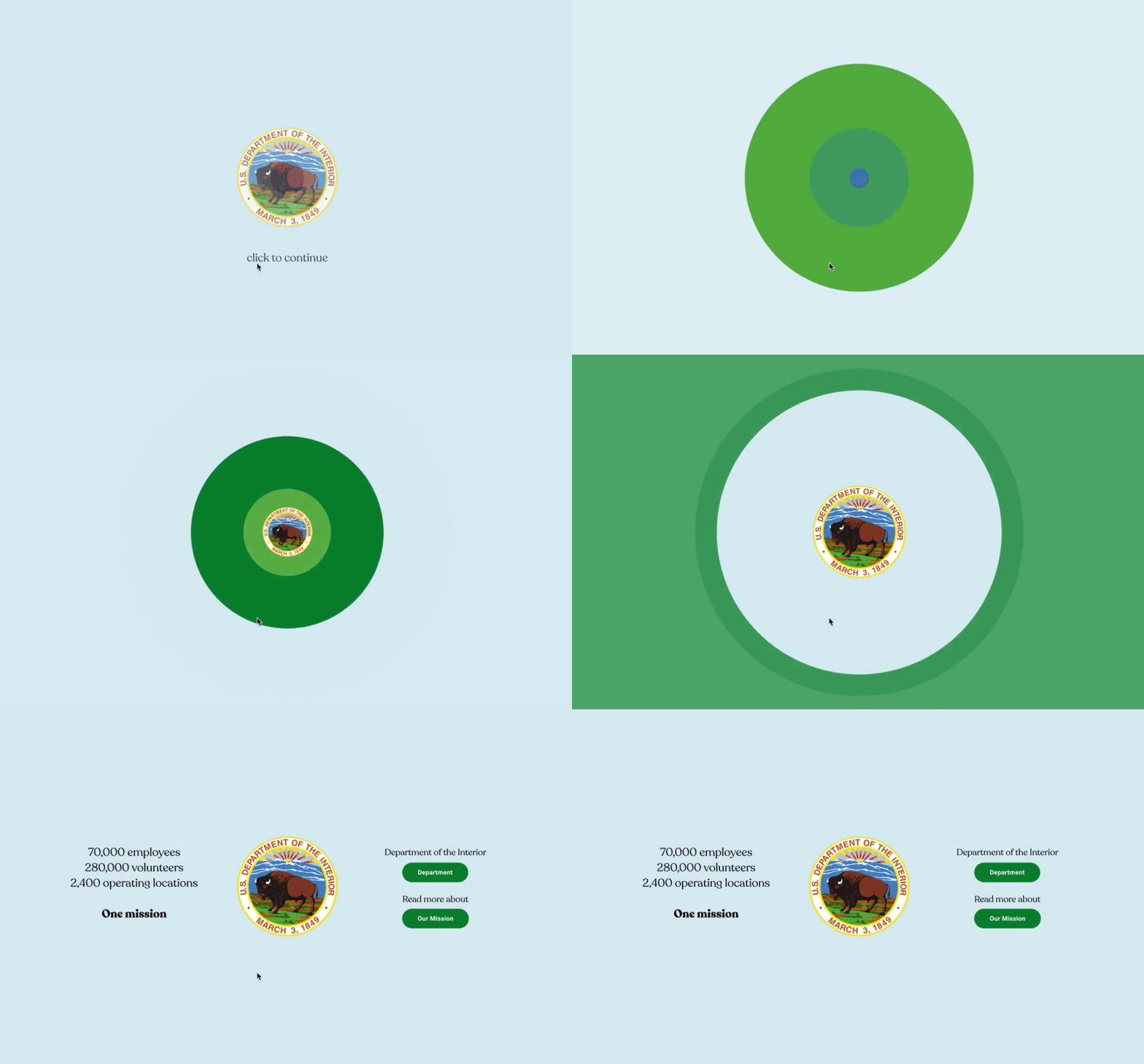
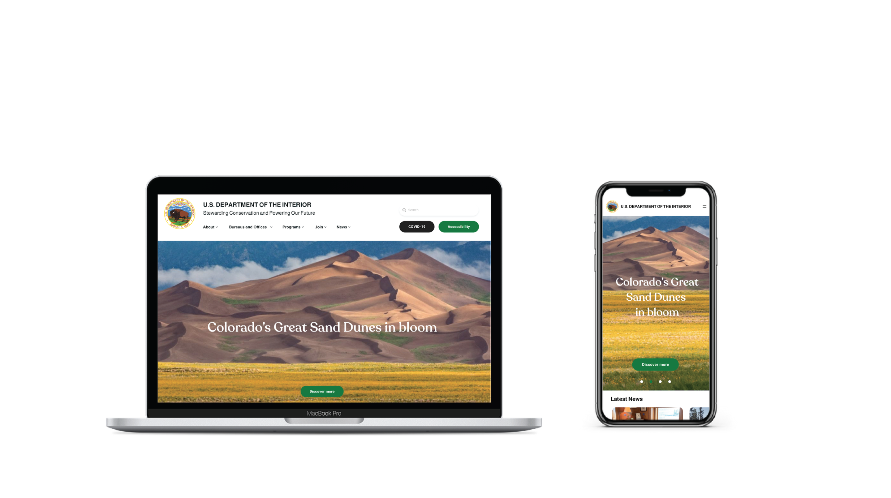
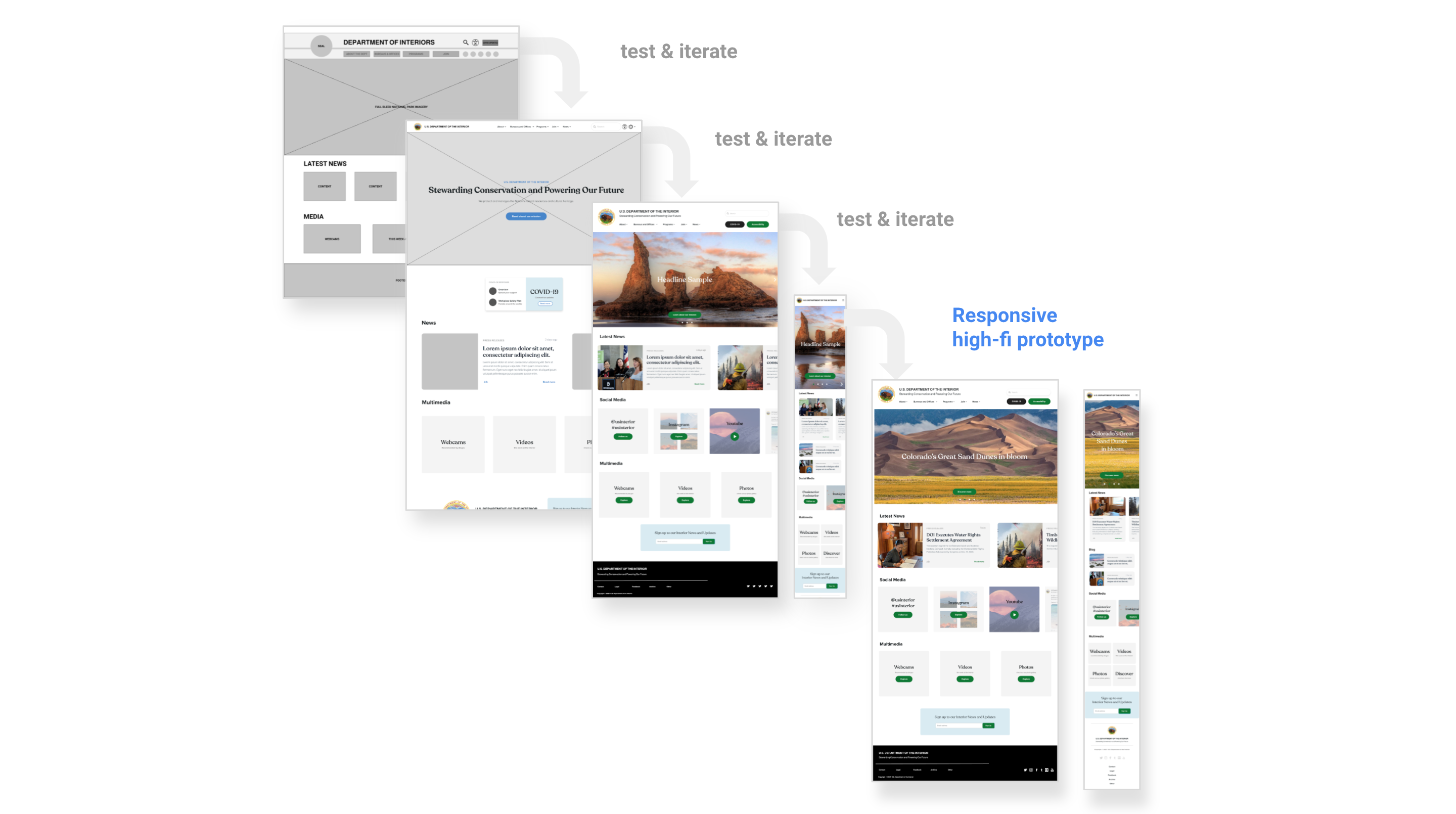
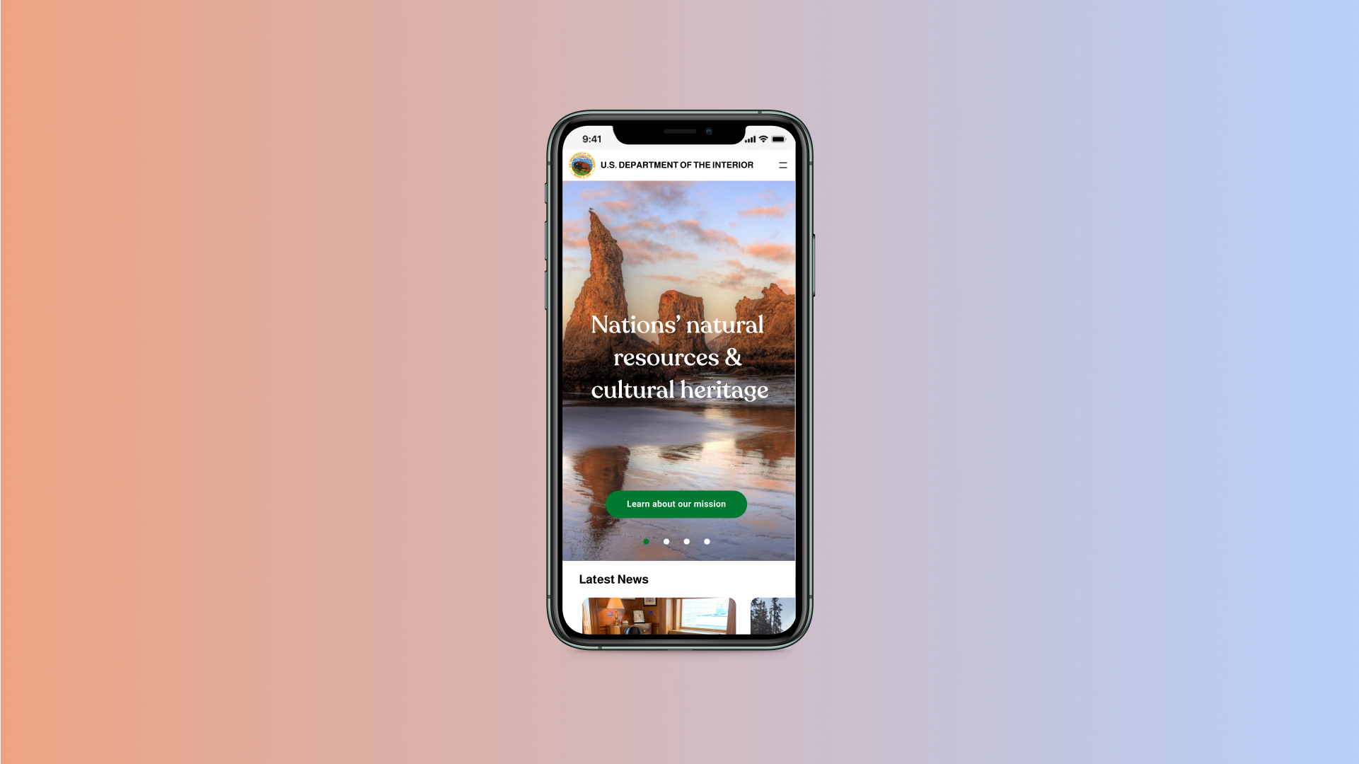
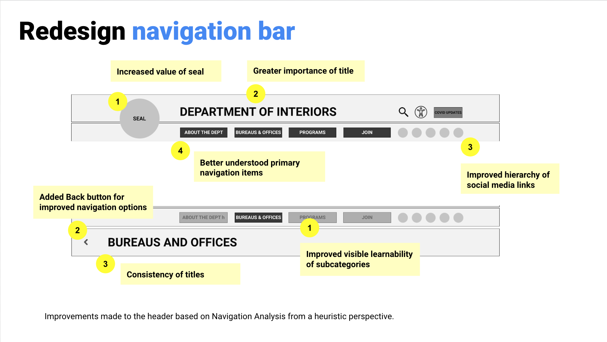
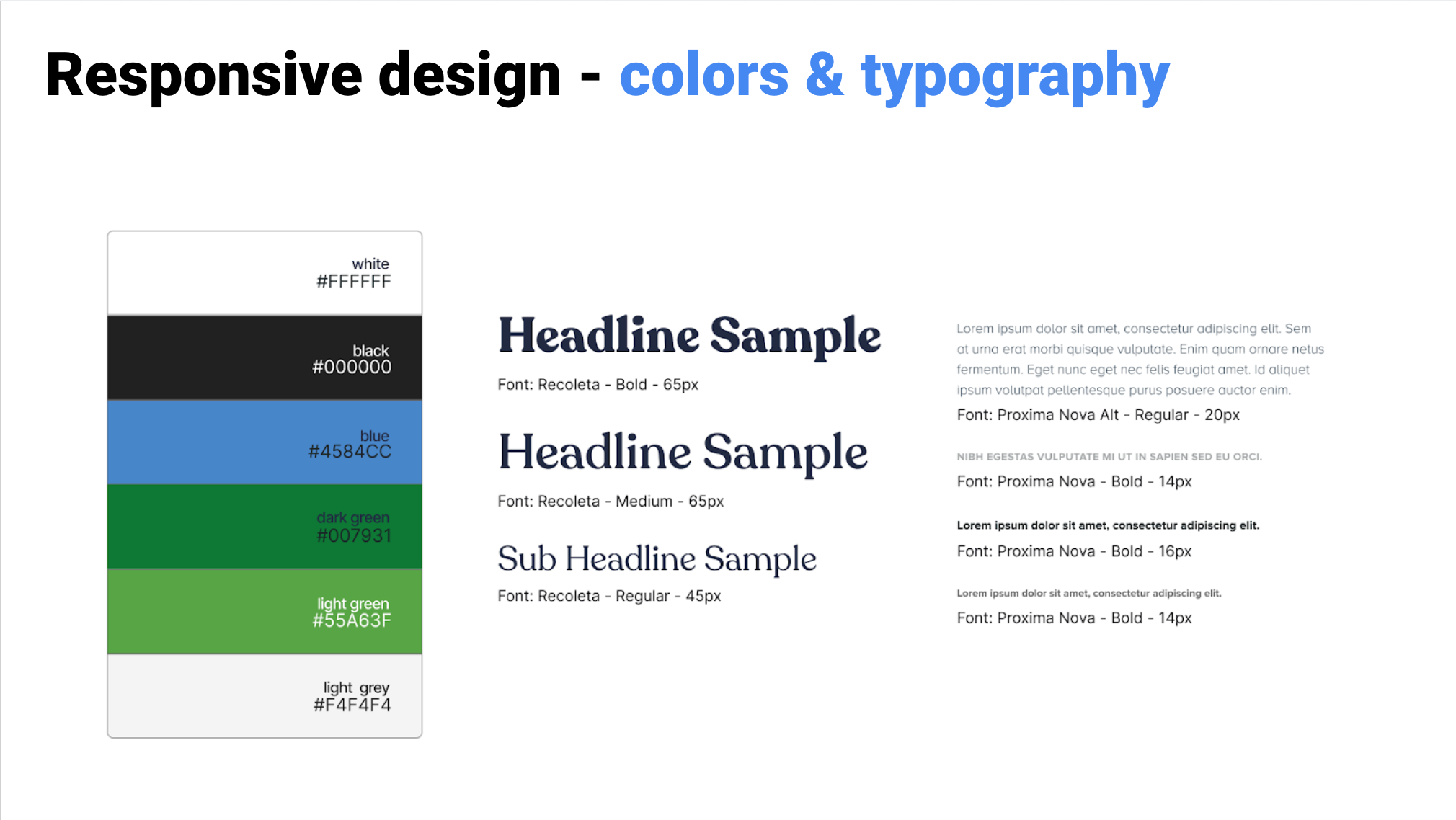
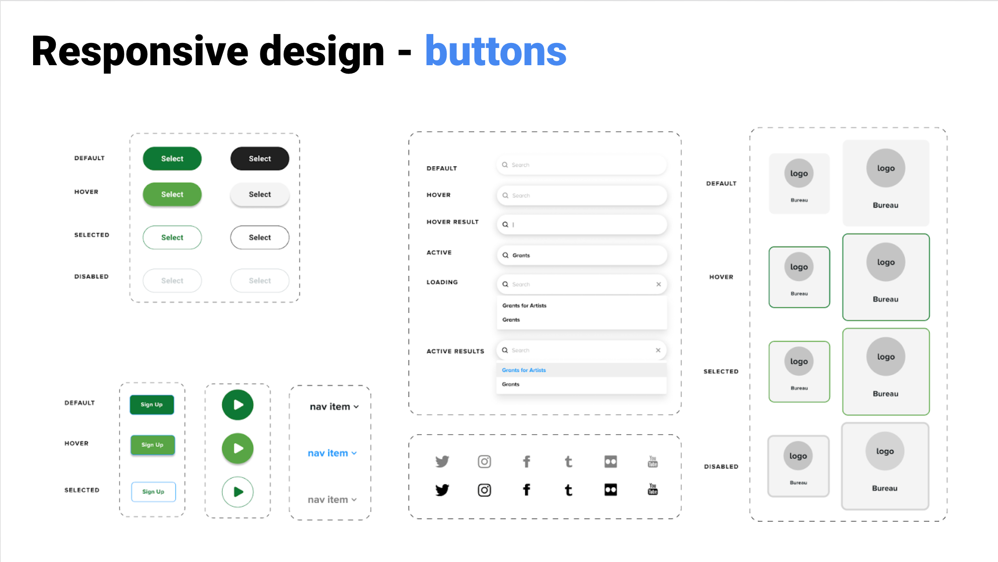
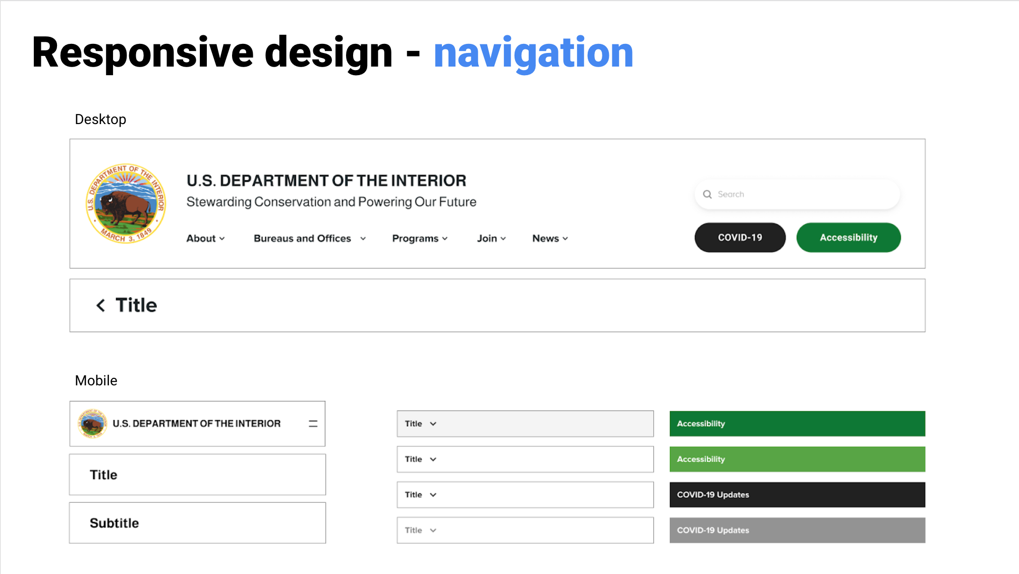
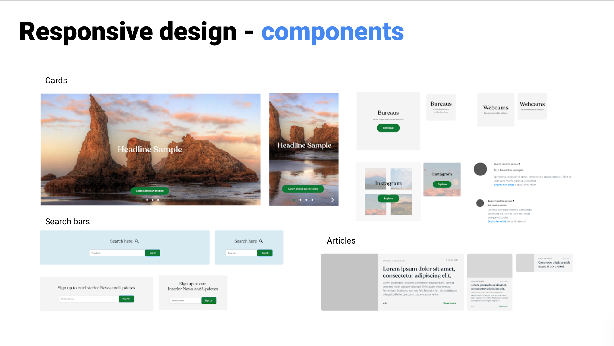
A responsive redesigned website for a U.S government department with a complex IA.
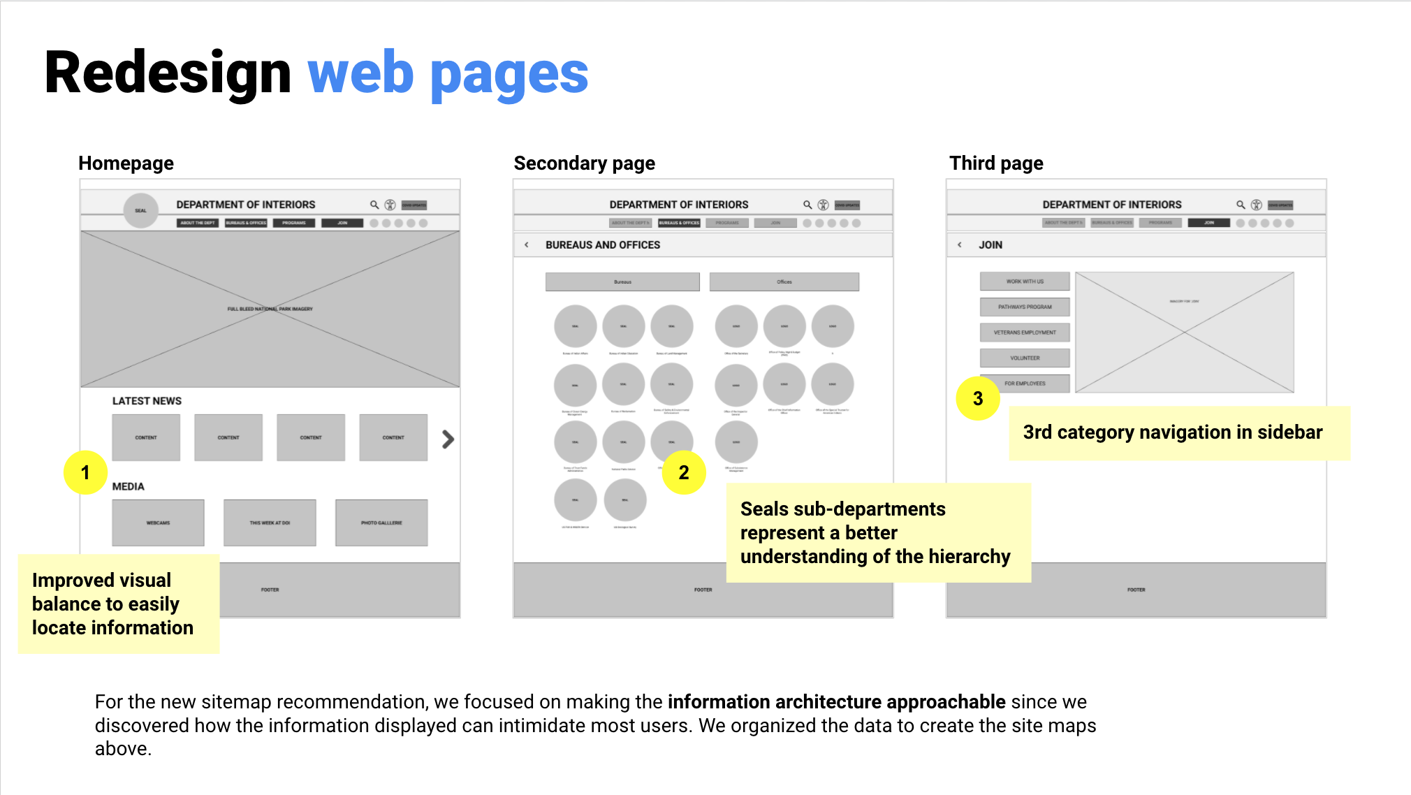
The problem: The U.S Department of the Interior website has a confusing navigation and hierarchy resulting in confused users and abandonment of the site.
Our solution: A redesigned responsive UI for desktop and mobile that clearly explains the complex substructure of the offices and bureaus, to find information efficiently.
UX/UI redesign case study
Tools: Figma
Role: Researcher, designer
Research & definition team: with Tay Abad & Lance Joseph
Ecommerce website
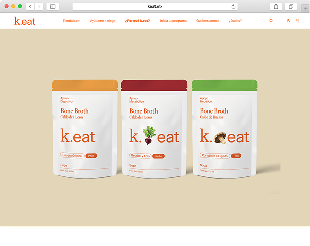
k.eat is a Mexican company, offering natural food products and health programs.
Digital direction, UX/UI Design
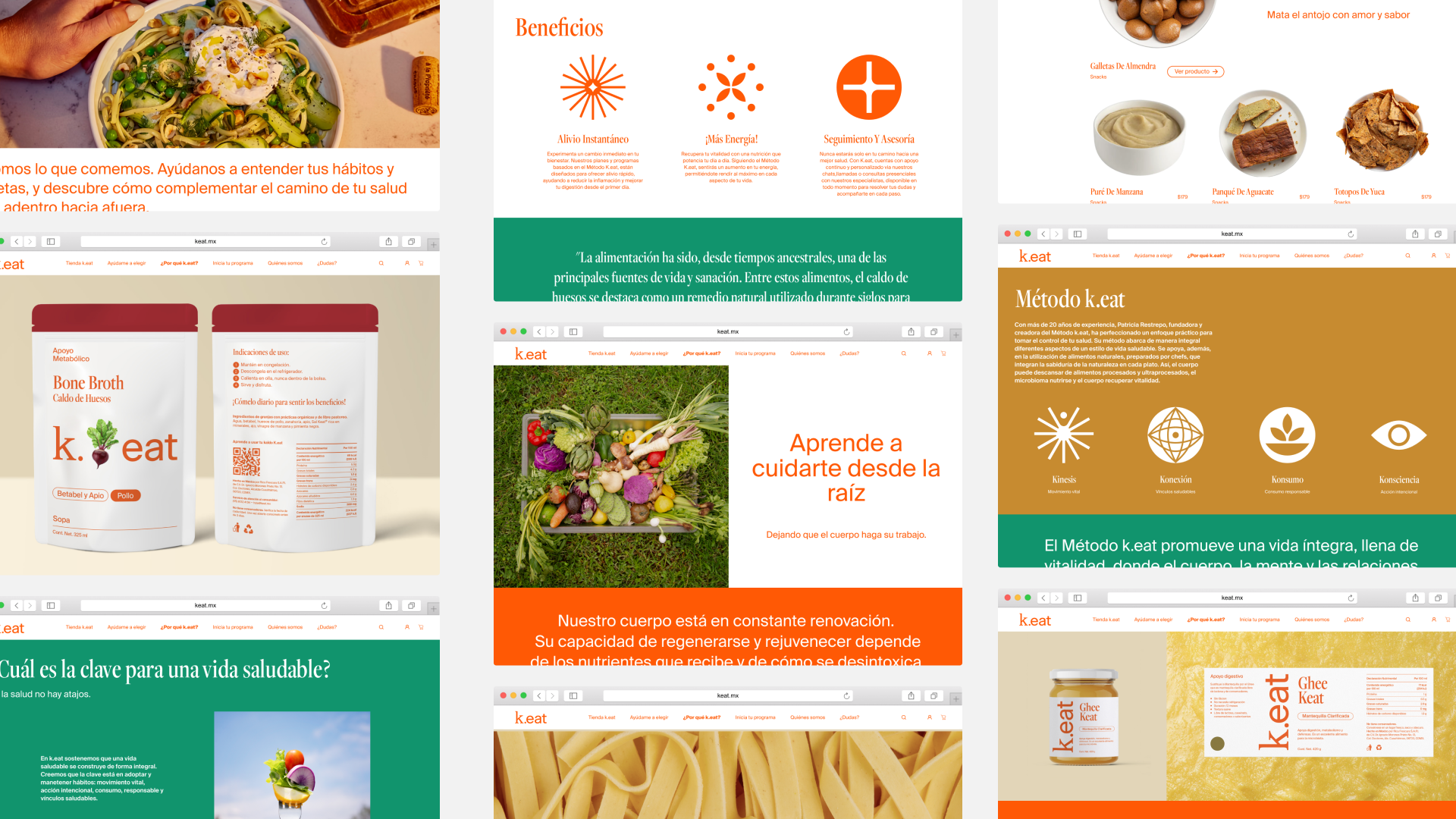
Led the creation of a new ecommerce website, focused on a simplified site navigation & content structure, creating improved IA, templates, wireframes, and prototypes for intuitive UX.
Developed a product recommendation quiz to guide users toward tailored options, simplifying selection for k.eat’s extensive product range.
Directed content creation, copywriting, and imagery.
Managed the Dev team to translate designs into a fully functional Shopify e-commerce website.
In collaboration with Cuarto Negro, for ©k.eat


Identity, Branding and Illustrations for Pan Dulce.
Pan Dulce is a surf bikini brand, named after the creator’s favorite wave in Costa Rica. Based in NYC, launch planned in spring 2024.
Logo, Identity, Branding, Illustrations, Creative direction
Crafted the logo and visual identity.
Hand-drawn typeface and developed a comprehensive style guide and provided branding graphics, illustrations,
Overarching creative direction, including pattern design and selection.
Curated themes capturing the essence of Pan Dulce, drawing inspiration from the carefree beach lifestyle, surf culture, and the vibrant tropical elements.
Pictures Pan Dulce ©

Restructured and redesigned website for The World Monument Fund.
The WMF is a nonprofit focused on conserving global monuments. Progressing from research and strategy to the ongoing UX phase, with completion slated for 2024.
Research, Strategy, IA
Content confidential.
Engaged in collaborative efforts with Base, a New York agency, to restructure and redesign the website for the WMF.
Advanced through extensive research, strategy, and the ongoing UX phase.
Anticipated delivery set for spring 2024.
For Base Design, NYC.


Web and identity design for studio VISIT.
A unique identity and responsive website for a New York Landscape Design firm.
Identity, web design, UX
Developed logos and curated typography and color scheme to enhance brand identity.
Created a comprehensive style guide governing imagery and copy to maintain visual consistency.
Contributed strategically with visual direction through adept handling of design elements.
Web design and guided visual direction for both desktop and mobile including Figma protoype, while collaborating closely with a development team to finalize the website


Web design for Paralelo Arquitectura.
Website for a Mexican architecture studio, with completion scheduled for early 2024.
Web design, UX, art direction.
Web design and conducted content selection and editing as part of the project.
In close collaboration with a development team.
Planned completion targeted for the beginning of 2024.
Web development by Cuarto Negro.
Open source color pallete library, with real colors from real places.
Discover, download, use, and enjoy real colors from real places.
Coming soon.
UX/UI, Design
UX/UI, Front End Dev,
Art, Photography


Strategic brand definition, logo design, systematic packaging design, UX website, and a mid-fi prototype of the website with webshop.
Mamau Cacao is a Mexican start-up business offering a forgotten native super food, specialty cacao. The product comes in little cubes, packed in glass jars.
Brand Strategy, Identity, Packaging, UX, Website
Founded the visual presence of the brand and helped the start-up get started with a solid UX and IA foundation with a Plan of Action for their website with a webshop.
Organized constructive workshops with the team to define competent brand strategies, conducted research, designed the logo, a systematic packaging system, and a style guide, mapped user-friendly IA, created effective UX wireframes, and delivered a mid-fi prototype
tools: Figma, Adobe Ai, Ps, Id
role: Lead Designer
Pictures by Eusebio Balmori Vildosola and Moïs Roditi.
Special thanks to Izzy Aspeling-Jones
Portfolio website
A website to showcase personal work that will grow over time. Expandability and a neutral UI style are key in the design direction.
UX/UI Design
UX wireframes, complete UI design style guide and components.
Responsive prototypes for mobile and desktop.
From scratch-built an online prototype using HTML, CCS, Javascript, jQuery, and GitHub.
Tools: Figma, VS Code, Github, Elementor
Role: Designer, Solo project
Developped and built by Cuarto Negro
An interactive map to fight food security in New York City.
“The problem: The GetFoodNYC government site is difficult to navigate, inefficient, and suffers from a lack of accessibility and options for users.
Our solution: We provided a mobile app for New Yorkers who need to quickly find and navigate to free food distribution centers that can cater to their needs.”
UX/UI redesign case study
“Research and definition of persona, pain points and solutions.
Ideation and development of features for responsive interfaces.
Iterations on prototypes from low to high fidelity, based on test results.”
Tools: Figma, VS Code
Role: Researcher, designer
Team of 3: with Mai Hirose & Johnathan Lerman
An interactive map and business directory for a local nonprofit that promotes a district.
“The challange: Visitors of website need an easy way to obtain information about a local business or service because an efficient way to browse the district, will increase the public interest and support business growth
Our solution: A redesign that brings the district to life, online. An interactive map and an improved directory to locate a business effectively.”
UX/UI redesign case study
Research, interviewing stakeholders, usability testing, new IA, lo-fi UX wireframe development, ideation, definition, new UI style guide, components, final interactive map design, Hi-fi prototyping, and user testing.
Tools: Figma
Role: Researcher, designer
Solo project
A responsive redesigned website for a U.S government department with a complex IA.
The problem: The U.S Department of the Interior website has a confusing navigation and hierarchy resulting in confused users and abandonment of the site.
Our solution: A redesigned responsive UI for desktop and mobile that clearly explains the complex substructure of the offices and bureaus, to find information efficiently.
UX/UI redesign case study
Tools: Figma
Role: Researcher, designer
Research & definition team: with Tay Abad & Lance Joseph

