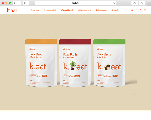
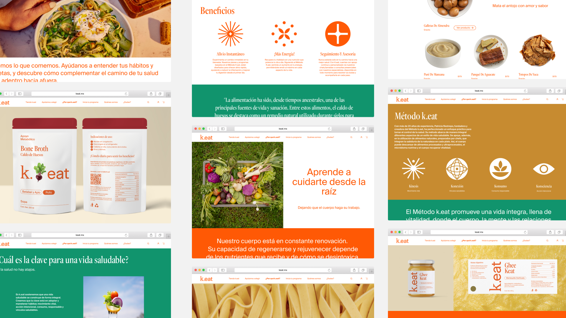
Ecommerce website
k.eat is a Mexican company, offering natural food products and health programs.
Digital direction, UX/UI Design
Led the creation of a new ecommerce website, focused on a simplified site navigation & content structure, creating improved IA, templates, wireframes, and prototypes for intuitive UX.
Developed a product recommendation quiz to guide users toward tailored options, simplifying selection for k.eat’s extensive product range.
Directed content creation, copywriting, and imagery.
Managed the Dev team to translate designs into a fully functional Shopify e-commerce website.
In collaboration with Cuarto Negro, for ©k.eat
Renewed website
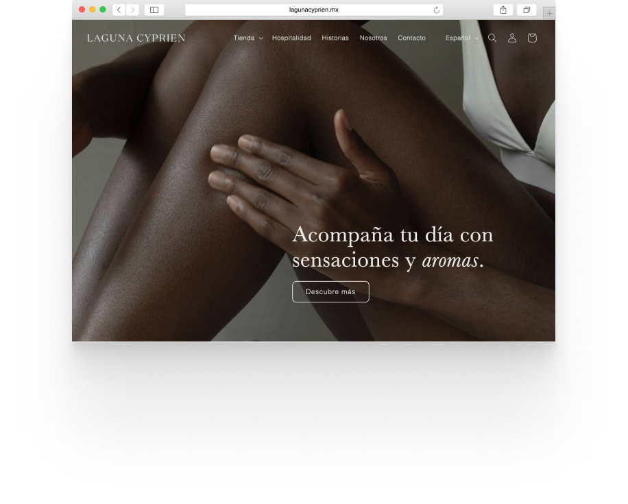
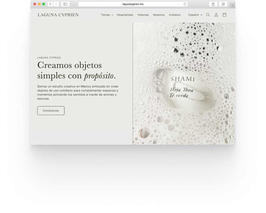
Laguna Cyprien is a Mexican B-corp creative studio focused on creating everyday objects.
IA, Content Strategy, UX
An optimized Information Architecture, a conversion-driven content strategy, and implemented UX best practices, leading to improved user experience – based on thorough market and audience research.
© Laguna Cyprien
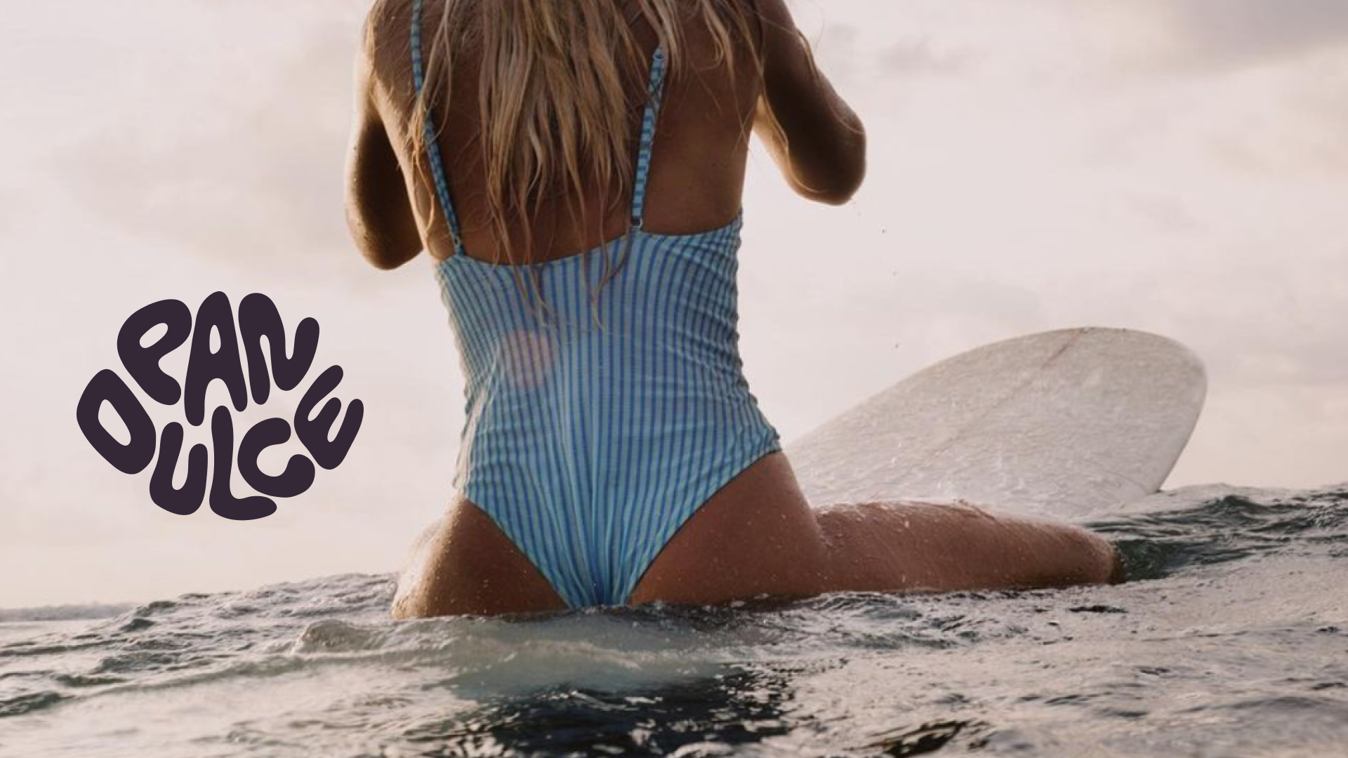
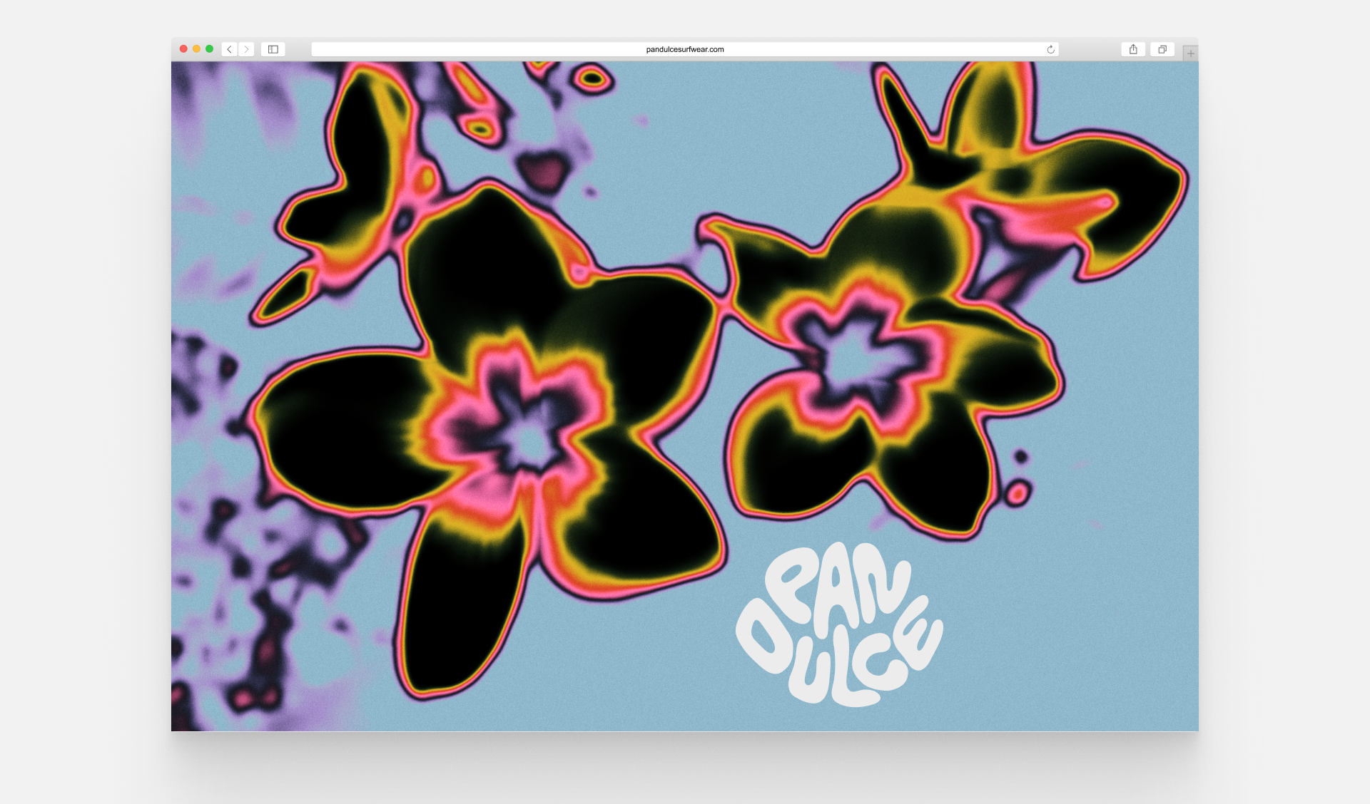
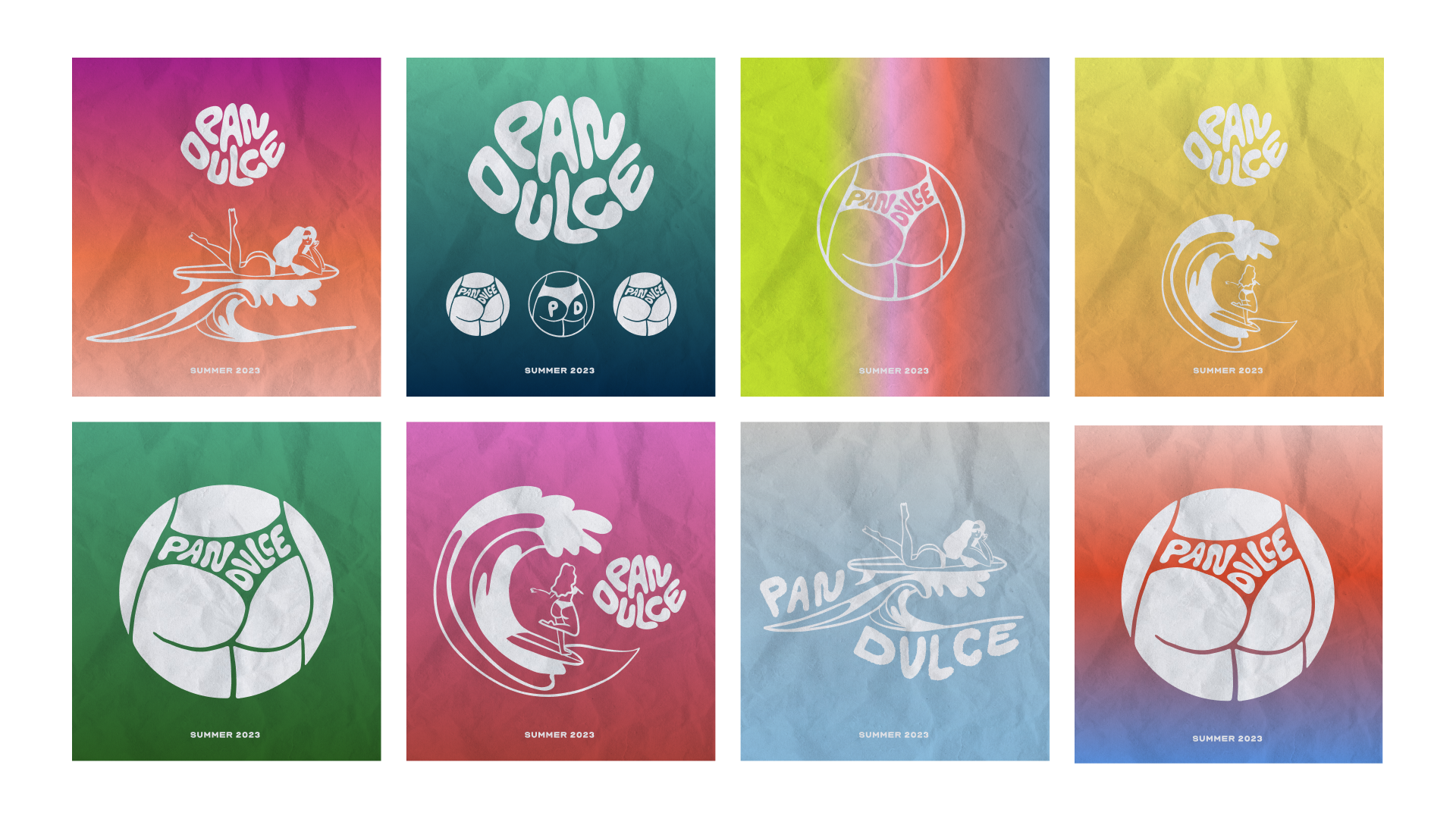
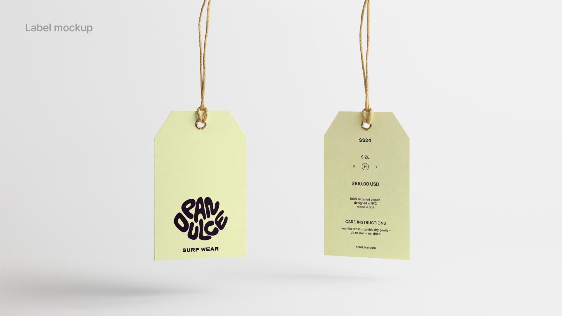
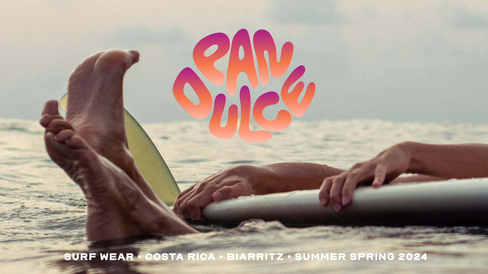
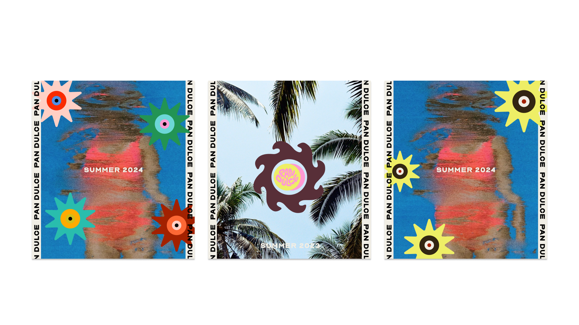
Identity, Branding and Illustrations for Pan Dulce.
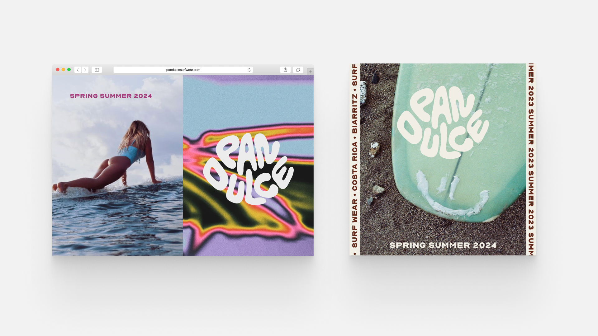
Pan Dulce is a surf bikini brand, named after the creator’s favorite wave in Costa Rica. Based in NYC, launch planned in spring 2024.
Logo, Identity, Branding, Illustrations, Creative direction
Crafted the logo and visual identity.
Hand-drawn typeface and developed a comprehensive style guide and provided branding graphics, illustrations,
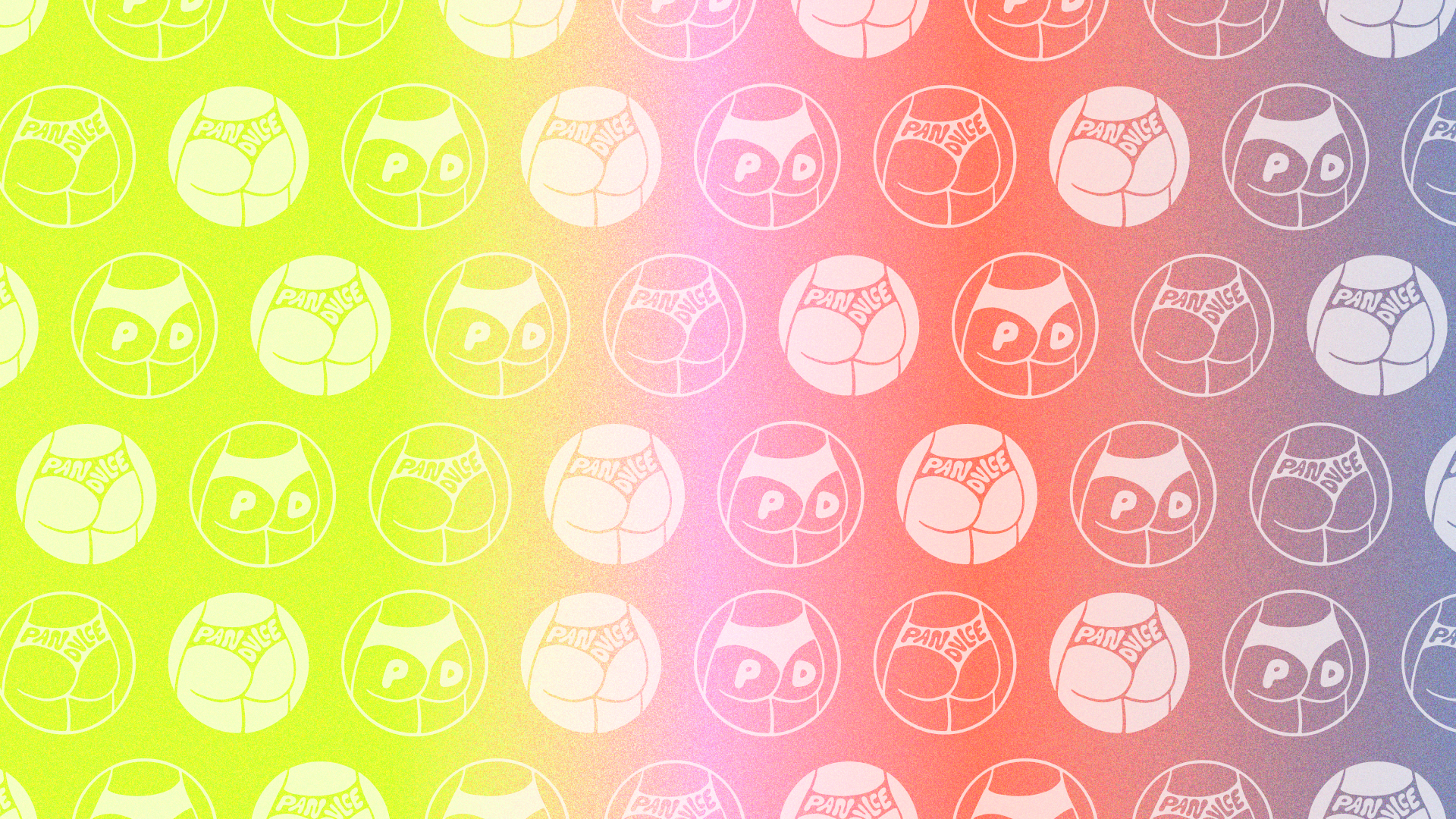
Overarching creative direction, including pattern design and selection.
Curated themes capturing the essence of Pan Dulce, drawing inspiration from the carefree beach lifestyle, surf culture, and the vibrant tropical elements.
Pictures Pan Dulce ©
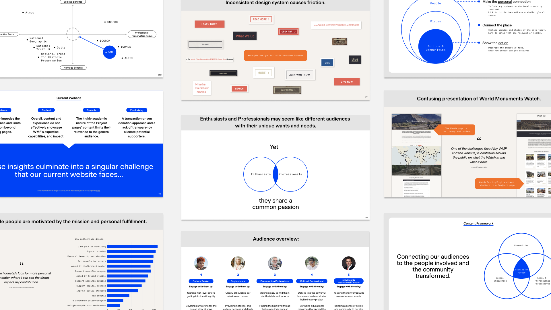
Restructured and redesigned website for The World Monument Fund.
The WMF is a nonprofit focused on conserving global monuments. Progressing from research and strategy to the ongoing UX phase, with completion slated for 2024.
Research, Strategy, IA
Content confidential.
Engaged in collaborative efforts with Base, a New York agency, to restructure and redesign the website for the WMF.
Advanced through extensive research, strategy, and the ongoing UX phase.
Anticipated delivery set for spring 2024.
For Base Design, NYC.
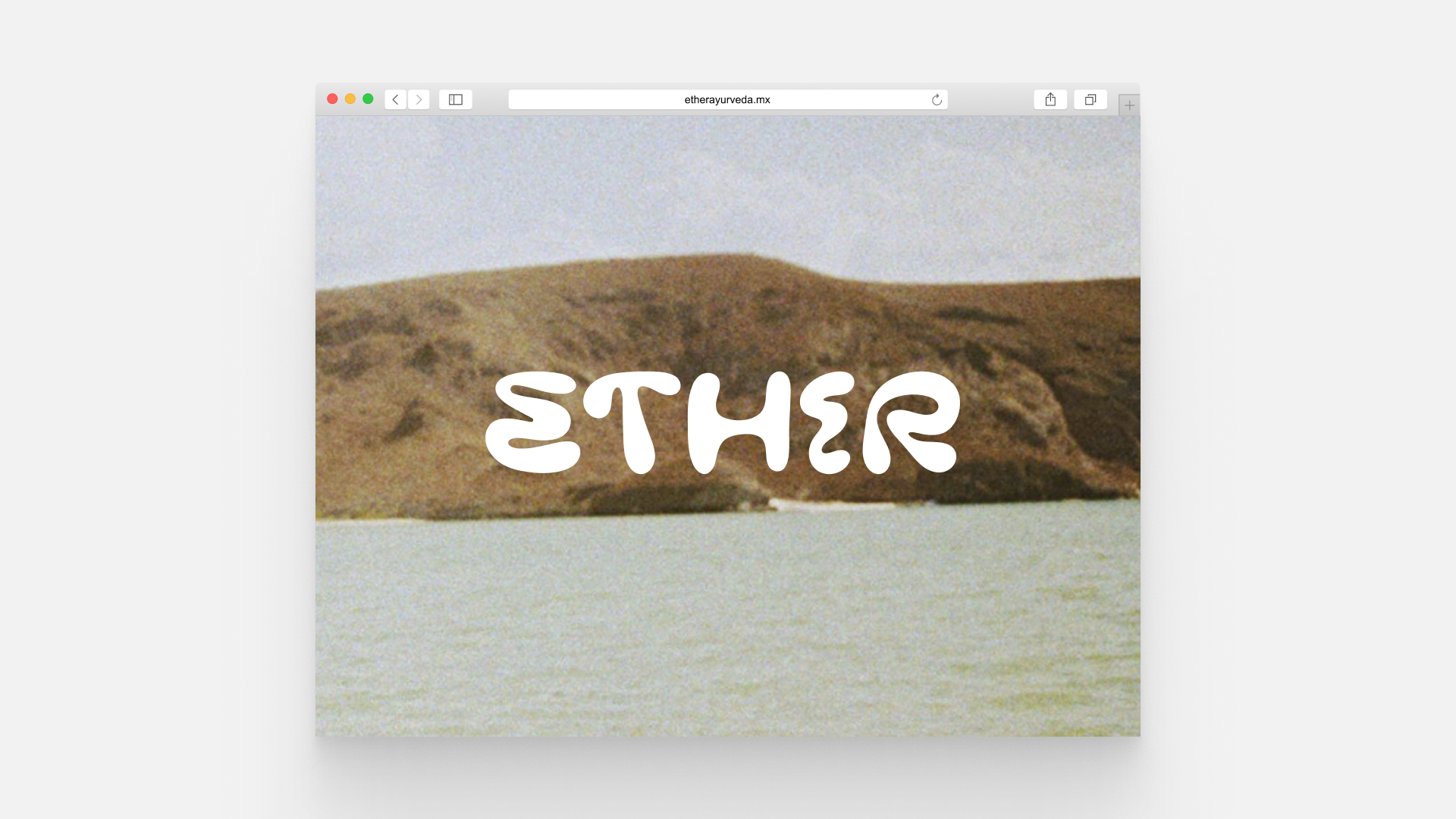
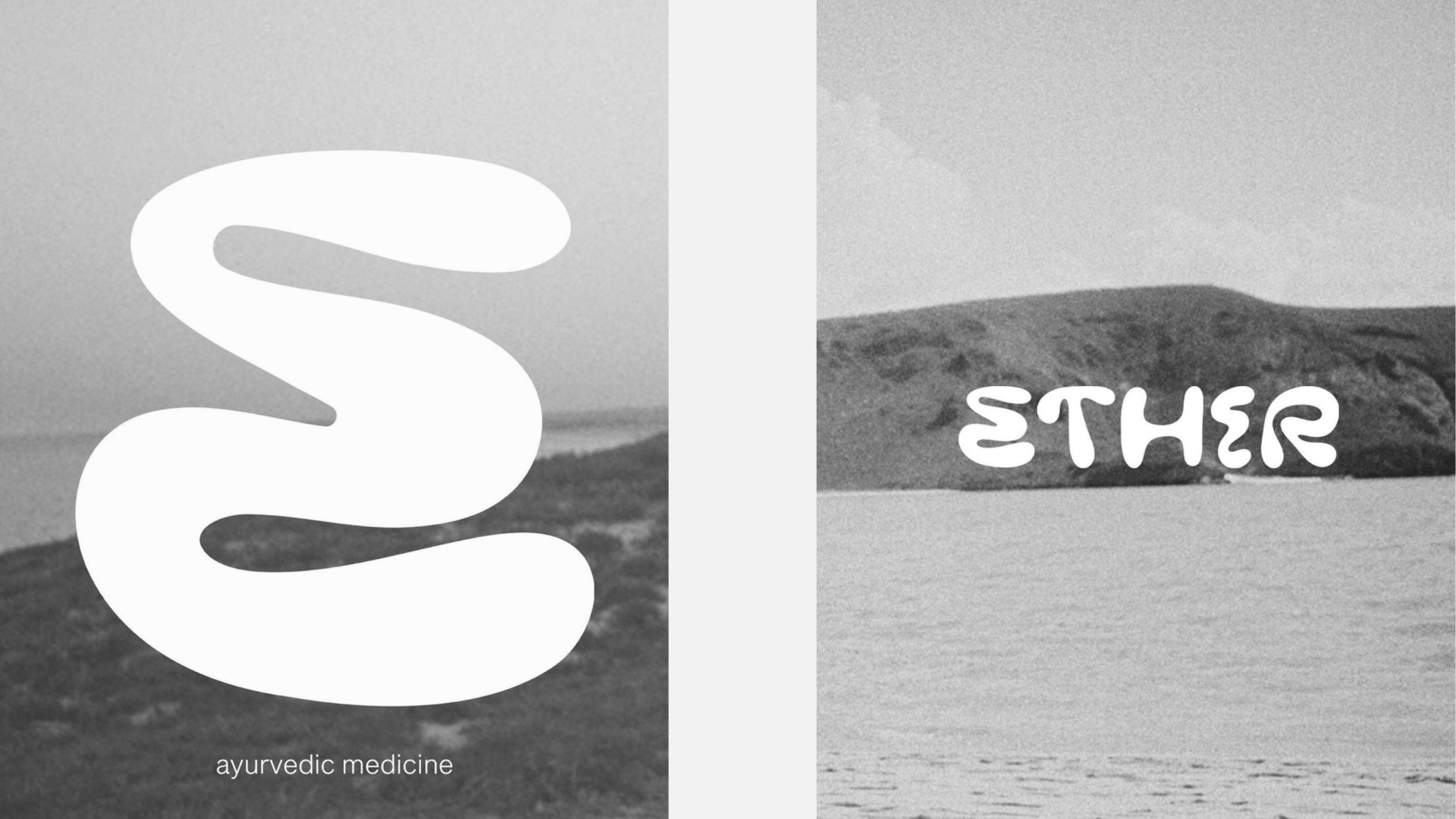
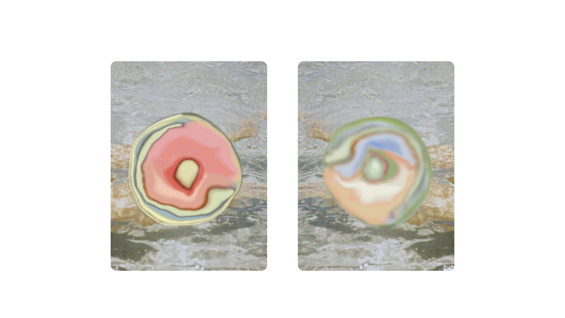
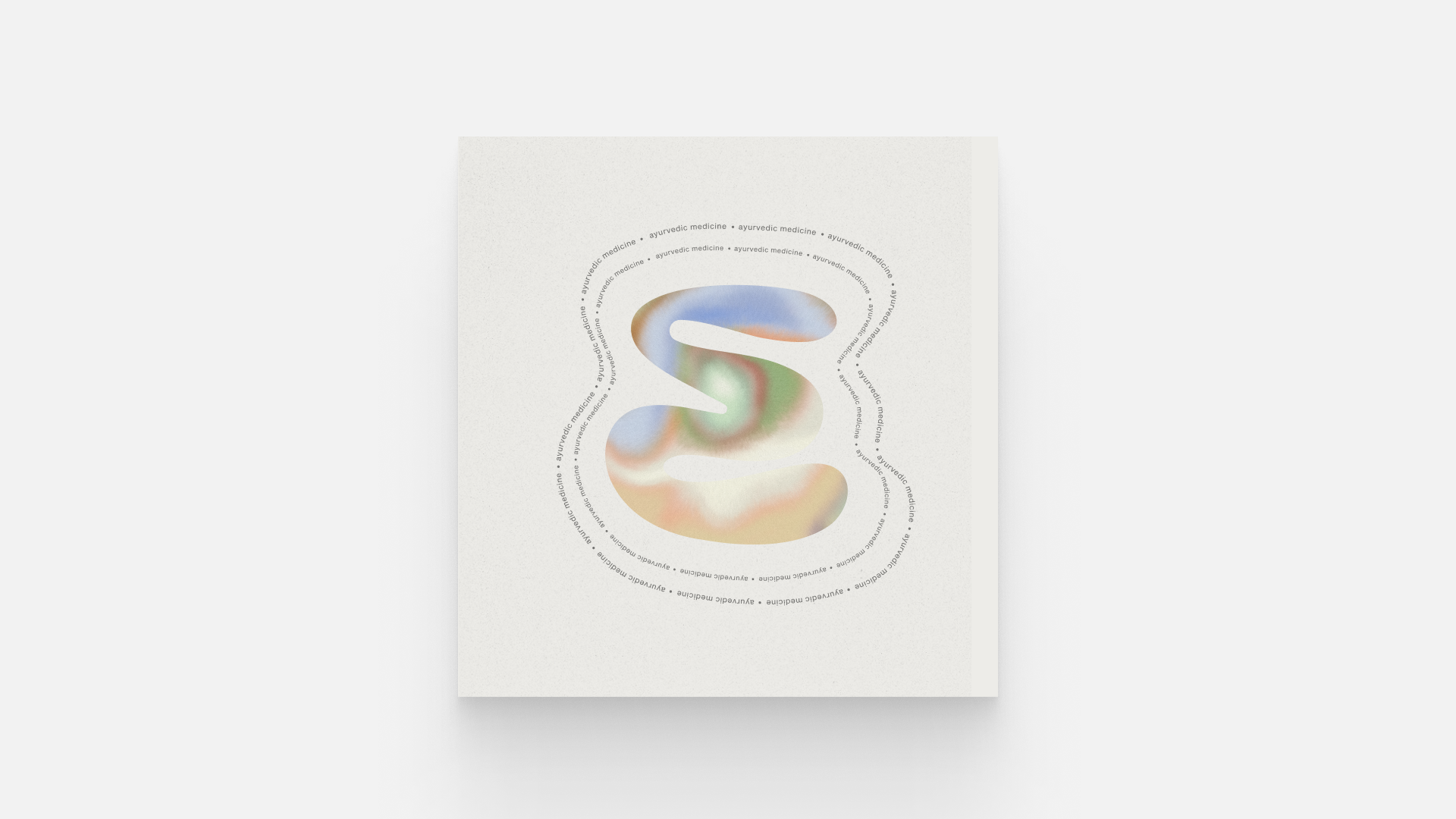
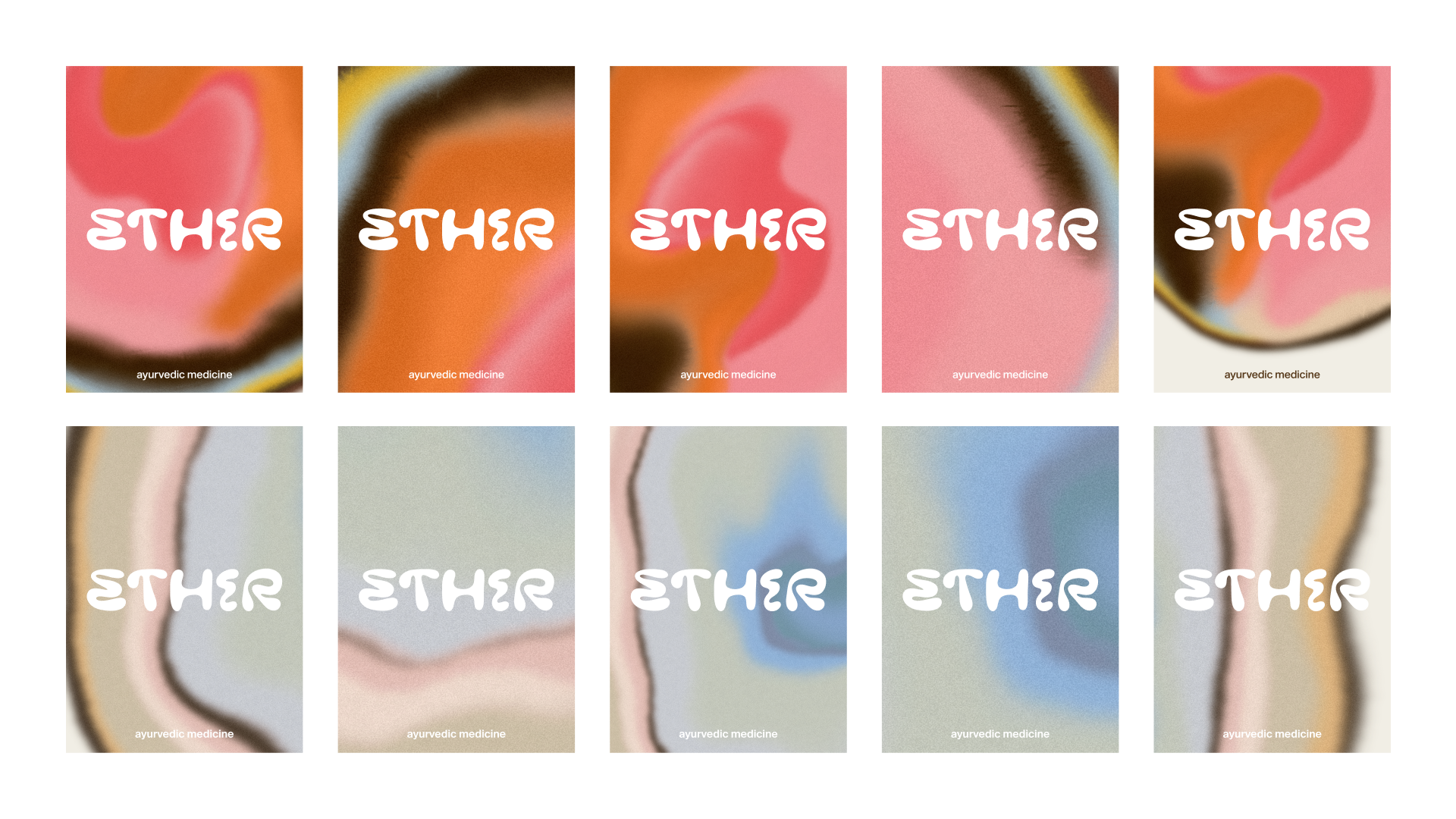
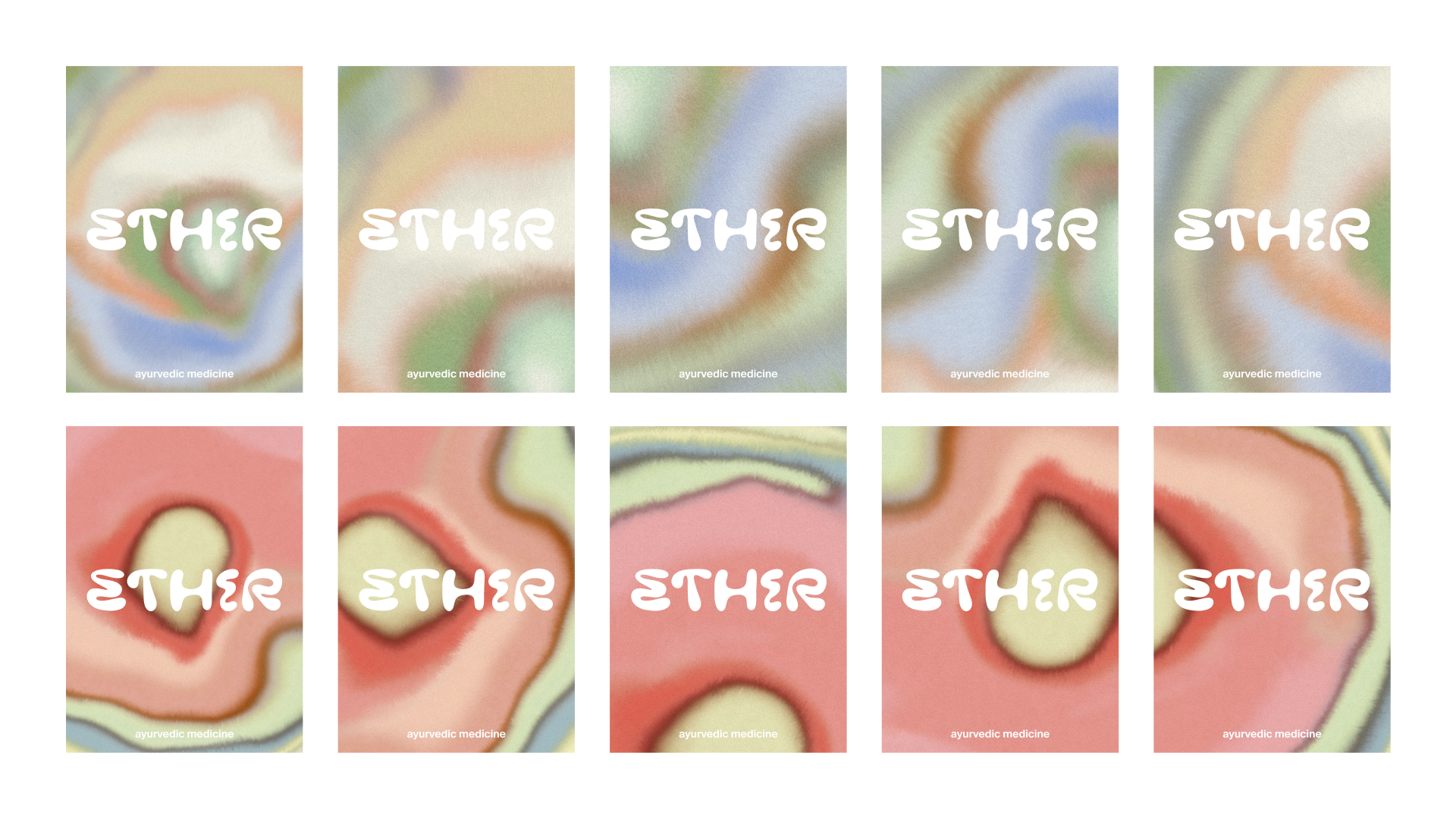
Visual identity and logo of Ether.
Ether is a Mexican and French Ayurvedic medicine brand. To be launched 2024.
Logo, Graphics
Hand-drawn logos and energy-infused blobs.
Developed and delivered a comprehensive style guide along with user-friendly Ai files, facilitating seamless branding implementation.
Pictures by Camille Cipriano
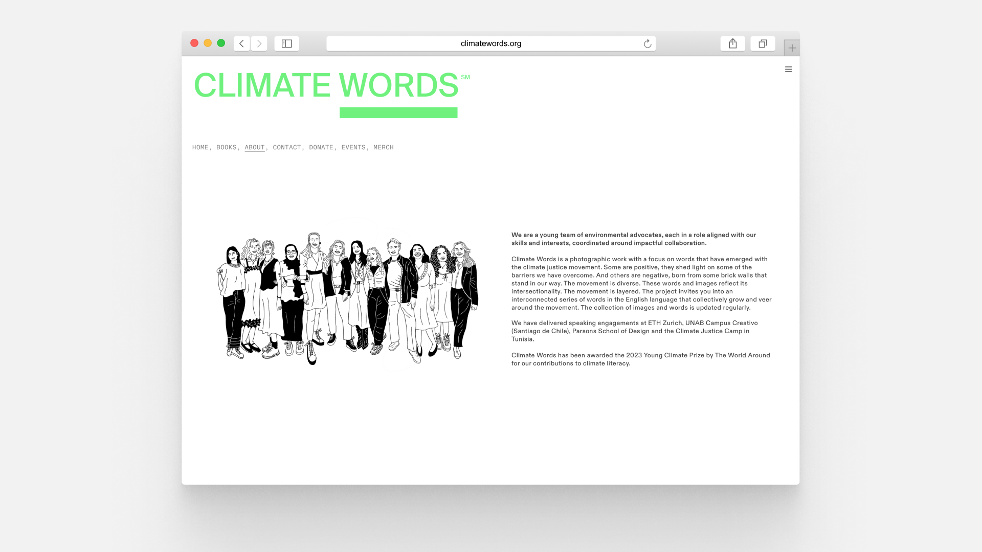
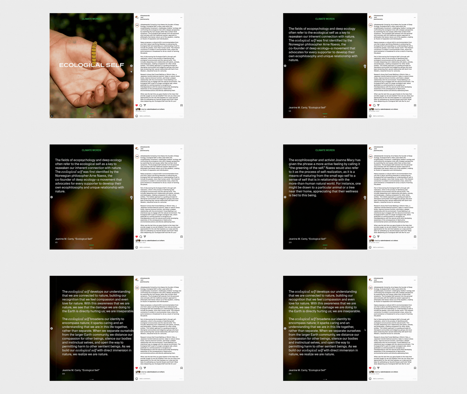
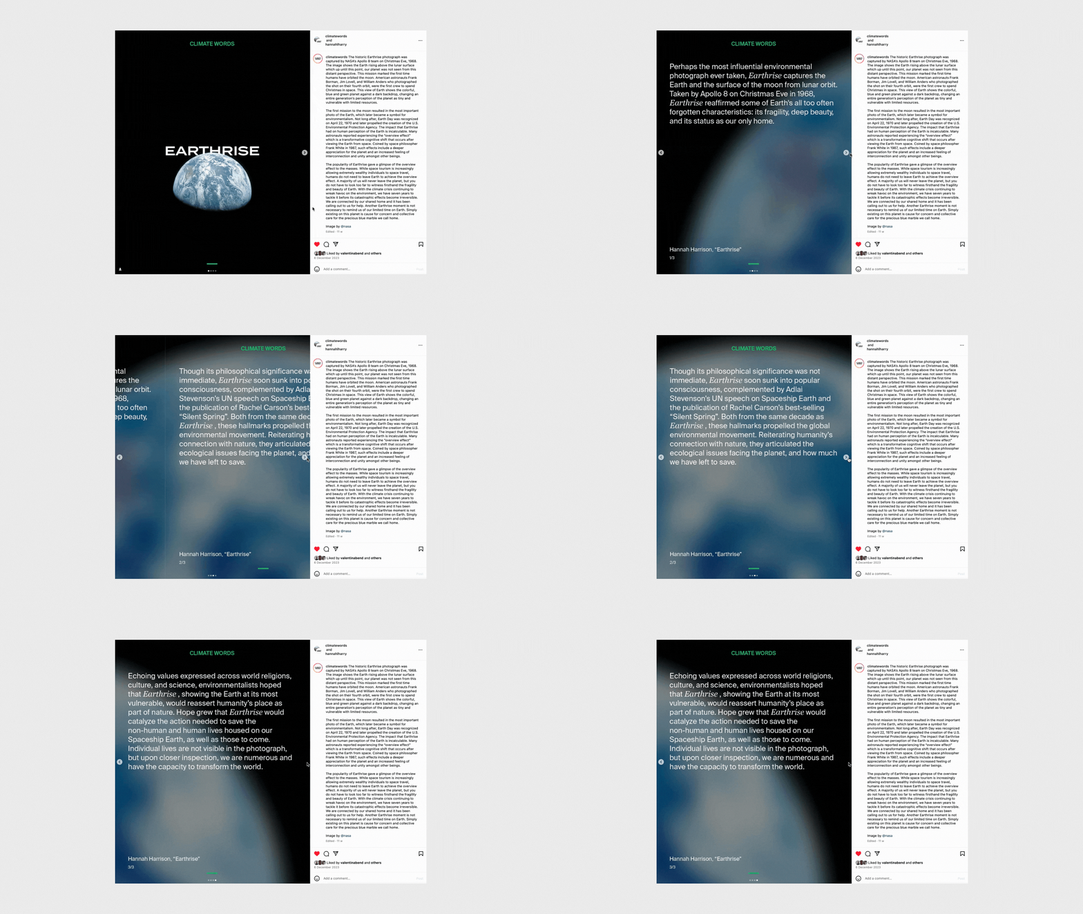
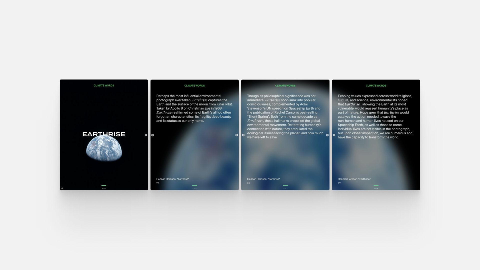
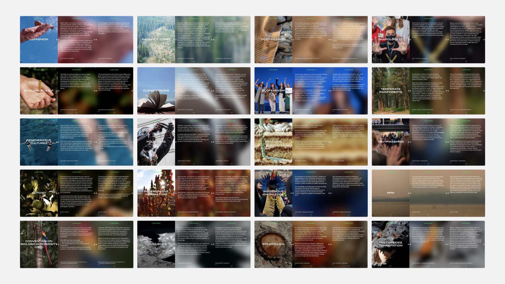
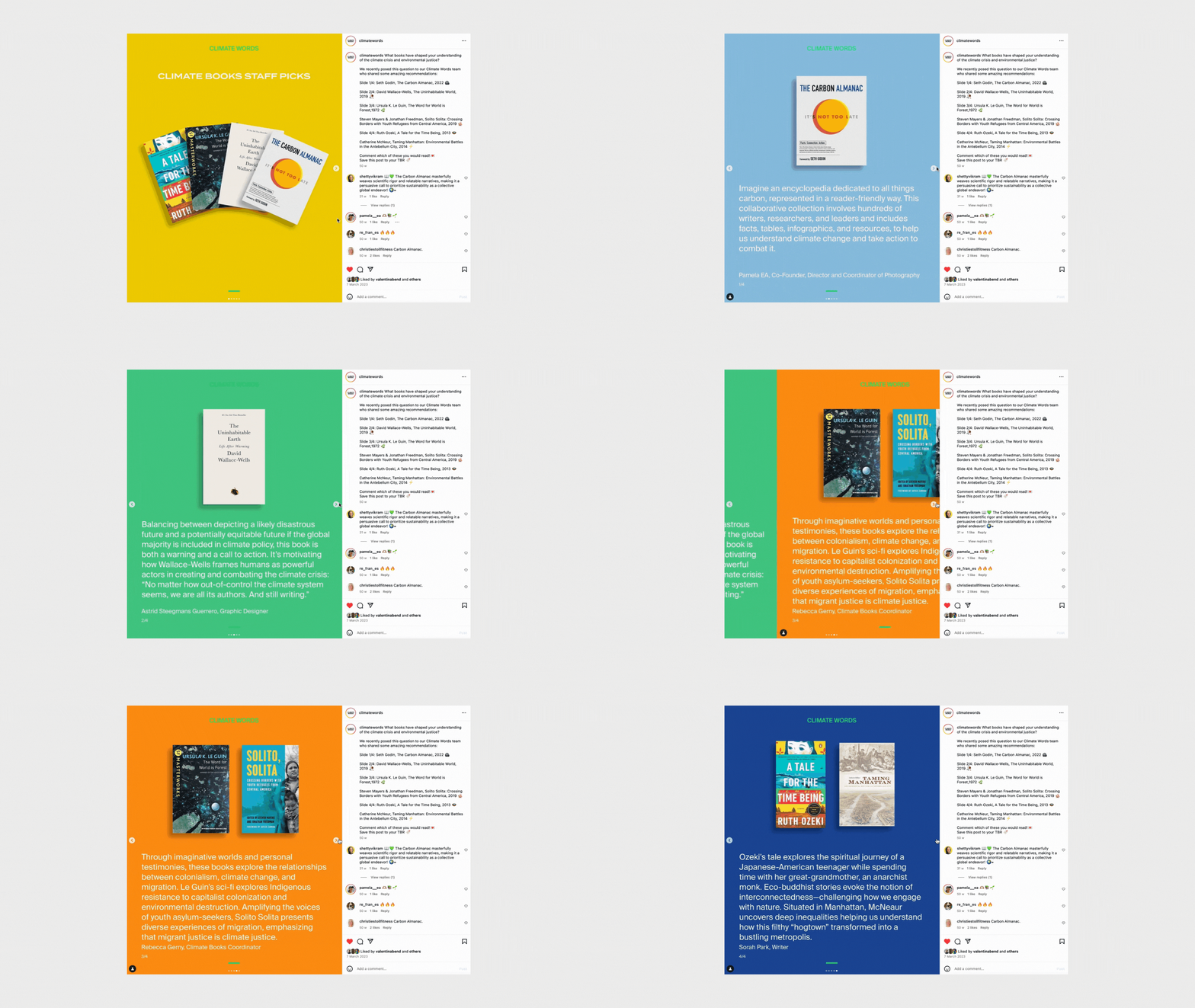
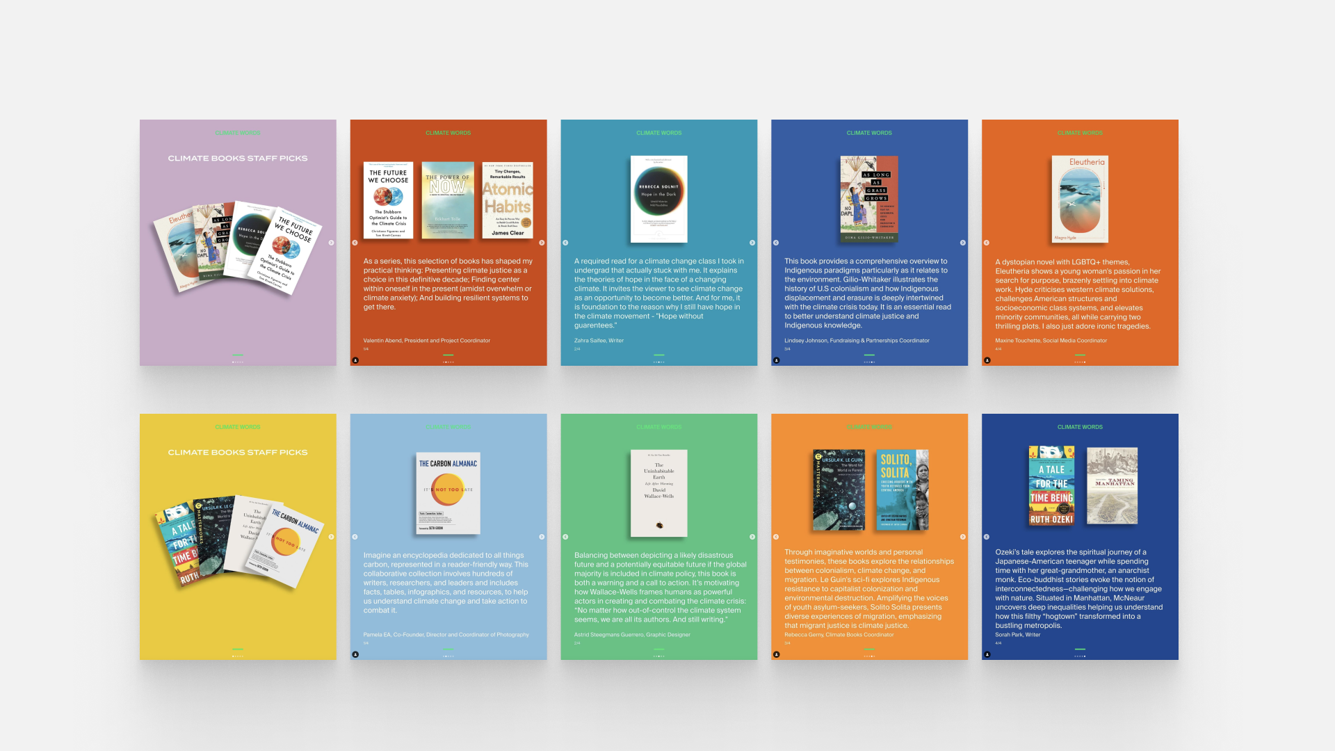
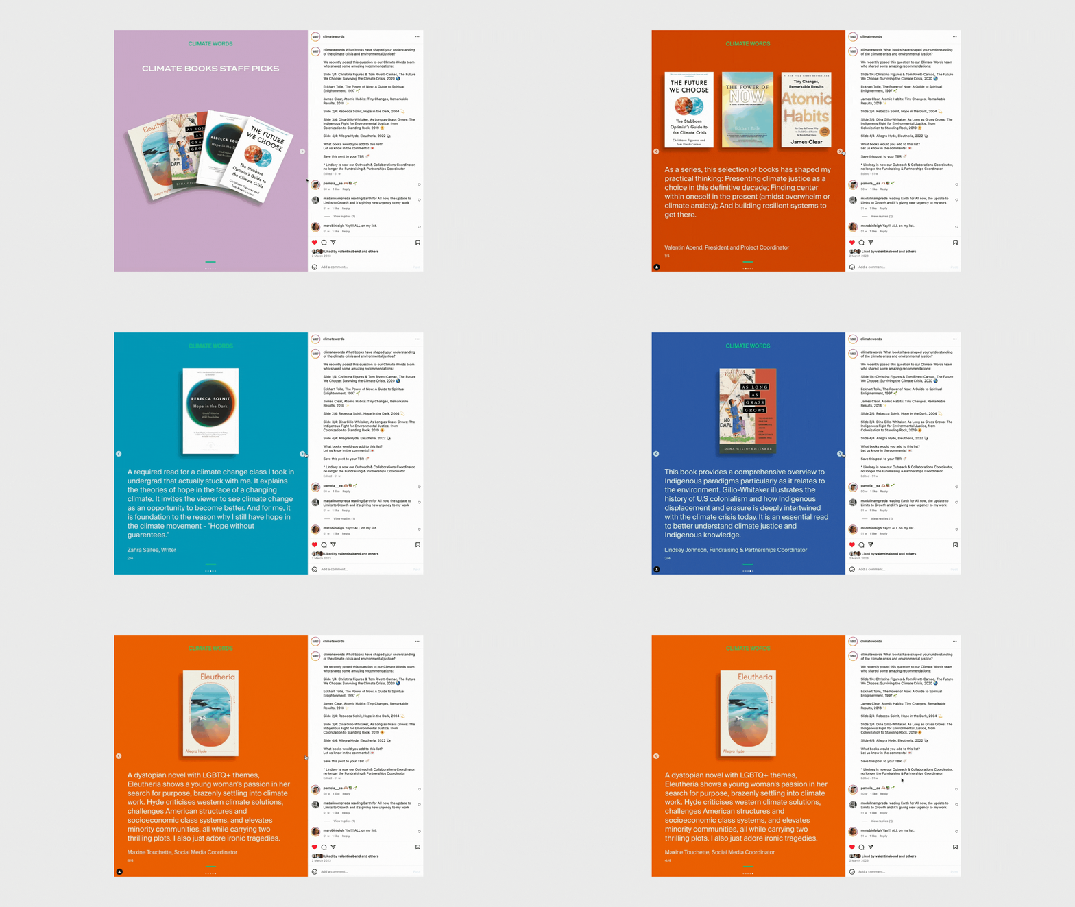
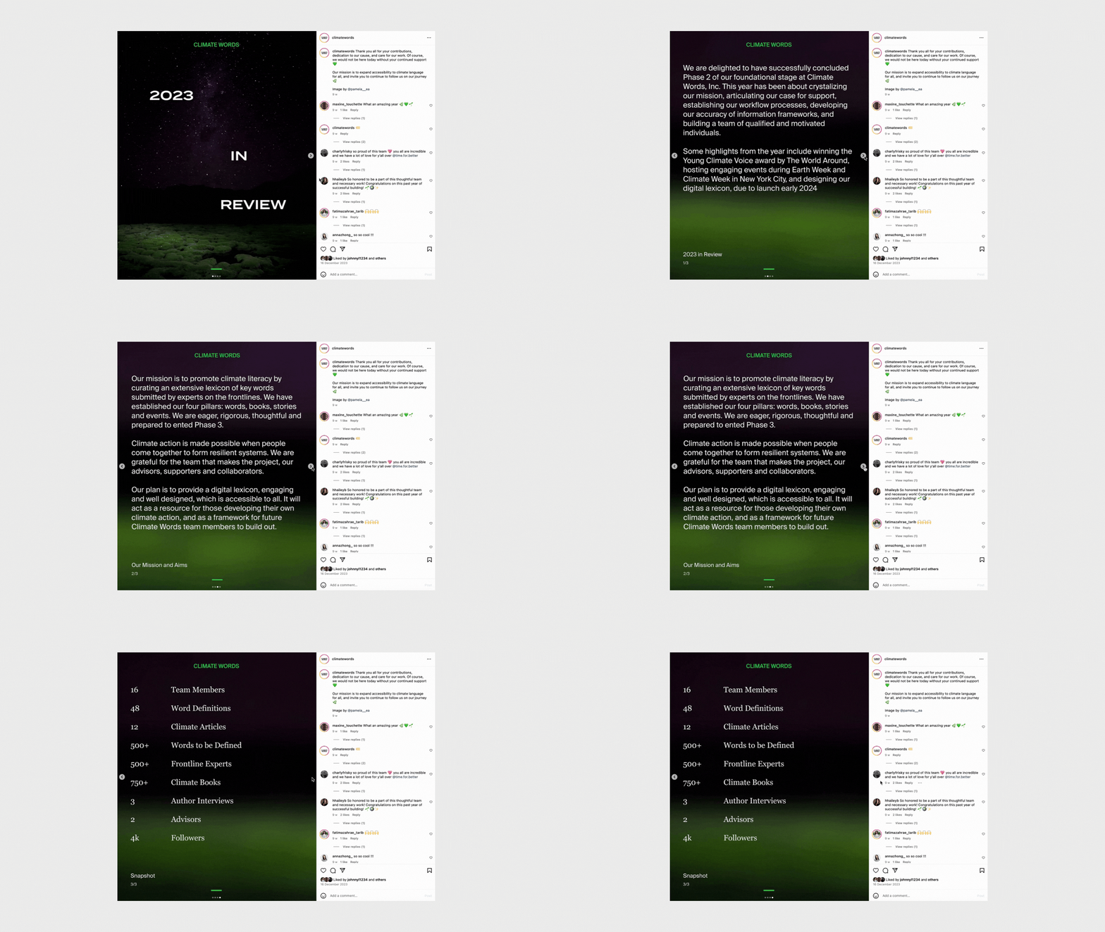
Graphic design for Climate Words.
A NYC non-profit creating an accessible database for effective climate communication, by building a climate lexicon and promoting climate literacy.
Graphic Design
Created visual communication assets primarily for Climate Words digital platforms, such as Instagram.
Maintained file templates for key graphic design types.
Coordinated information flow among internal working groups, including Social Media and Climate Books.
Maintained a unified brand voice.
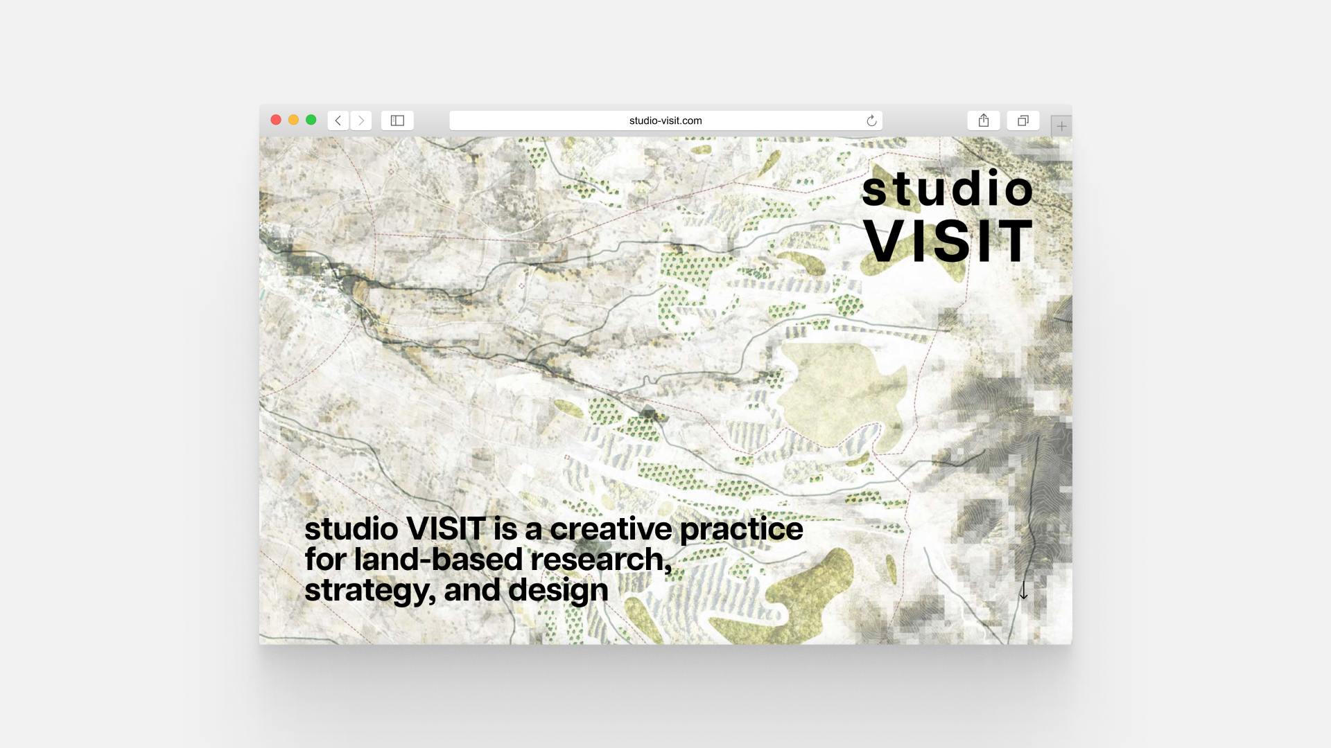
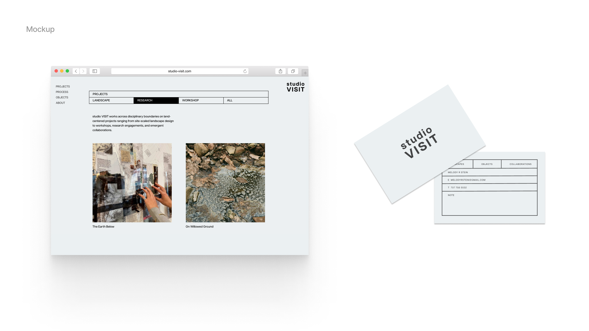
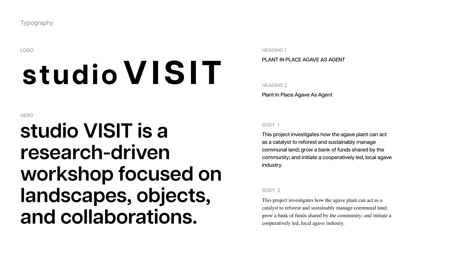
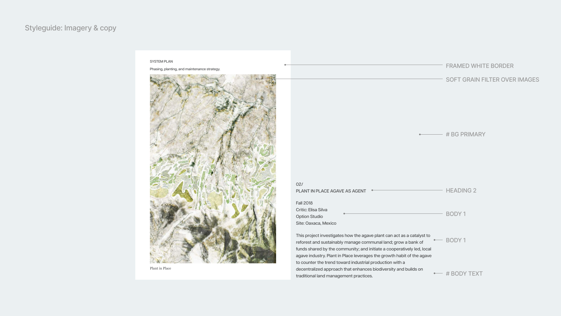
Web and identity design for studio VISIT.
A unique identity and responsive website for a New York Landscape Design firm.
Identity, web design, UX
Developed logos and curated typography and color scheme to enhance brand identity.
Created a comprehensive style guide governing imagery and copy to maintain visual consistency.
Contributed strategically with visual direction through adept handling of design elements.
Web design and guided visual direction for both desktop and mobile including Figma protoype, while collaborating closely with a development team to finalize the website
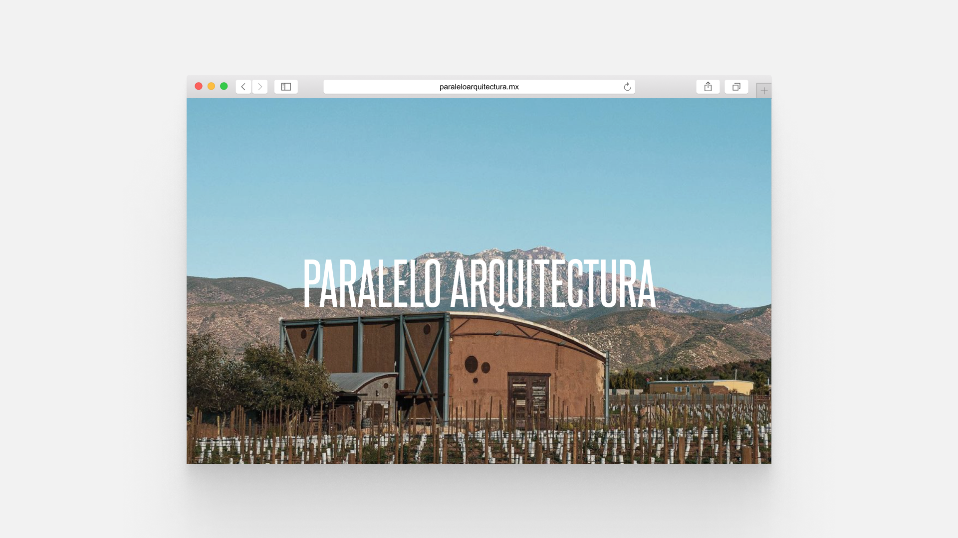
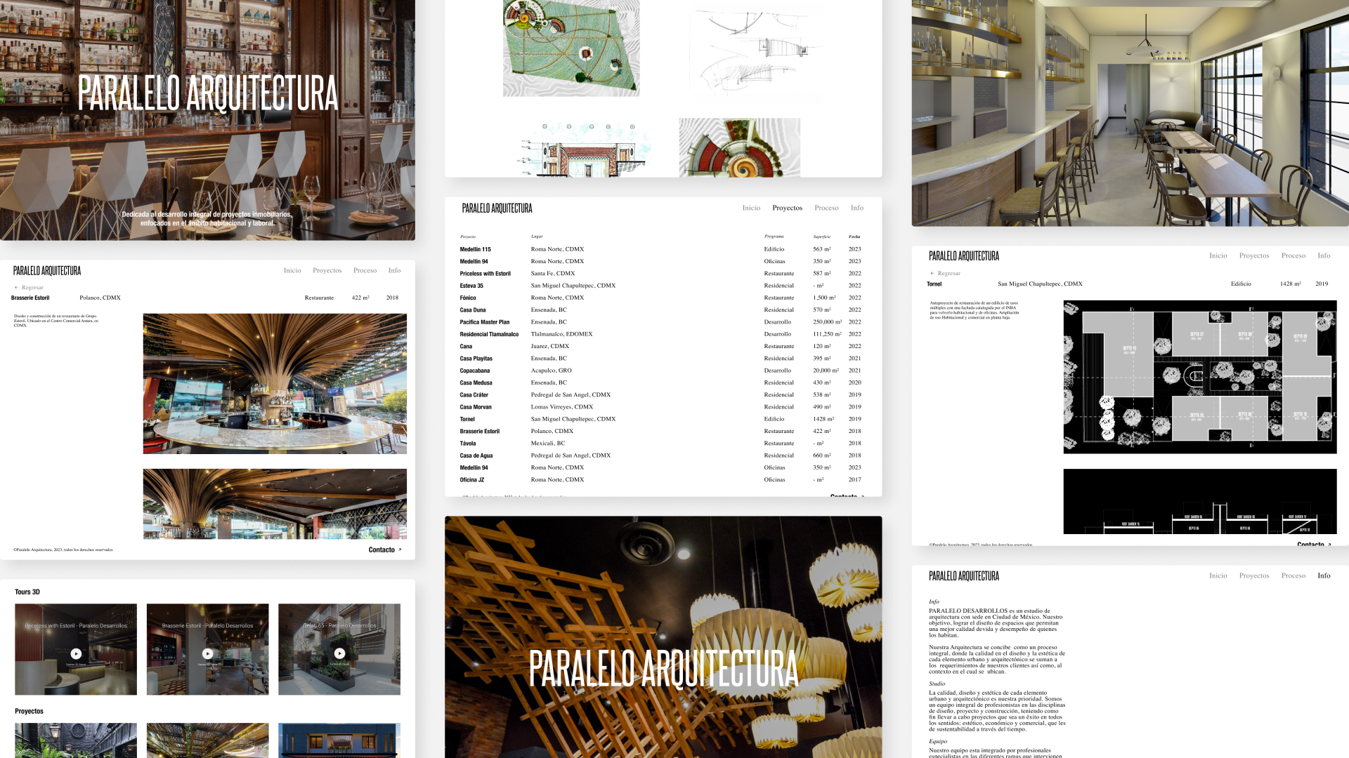
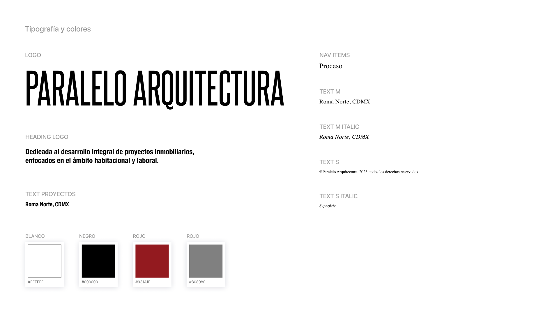
Web design for Paralelo Arquitectura.
Website for a Mexican architecture studio, with completion scheduled for early 2024.
Web design, UX, art direction.
Web design and conducted content selection and editing as part of the project.
In close collaboration with a development team.
Planned completion targeted for the beginning of 2024.
Web development by Cuarto Negro.
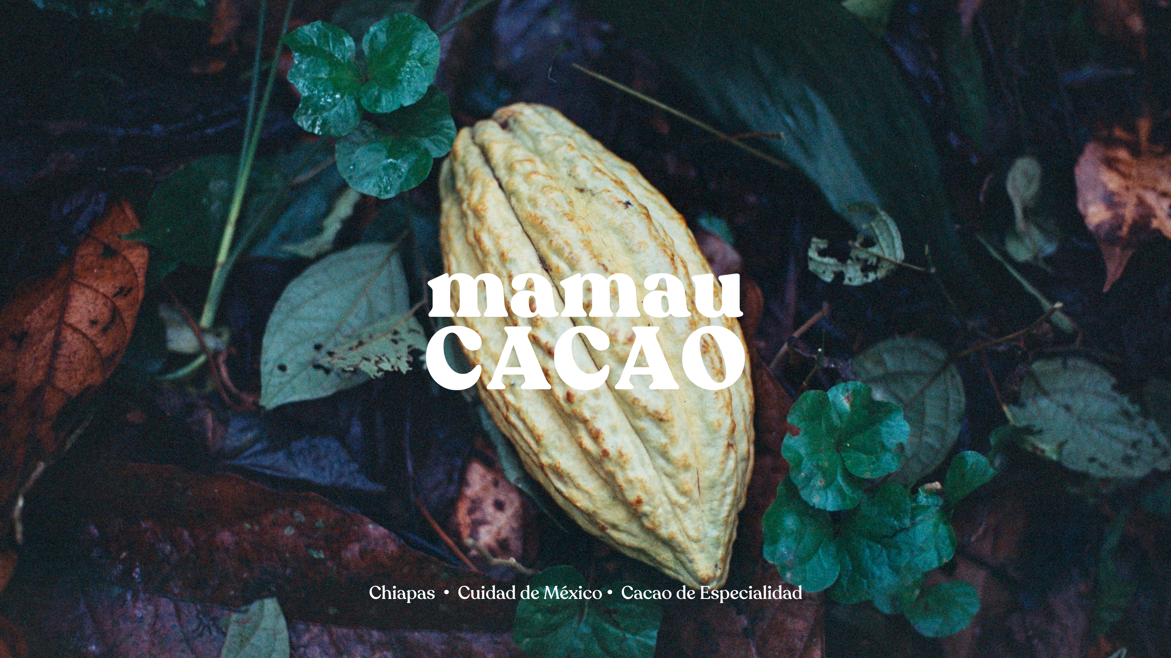
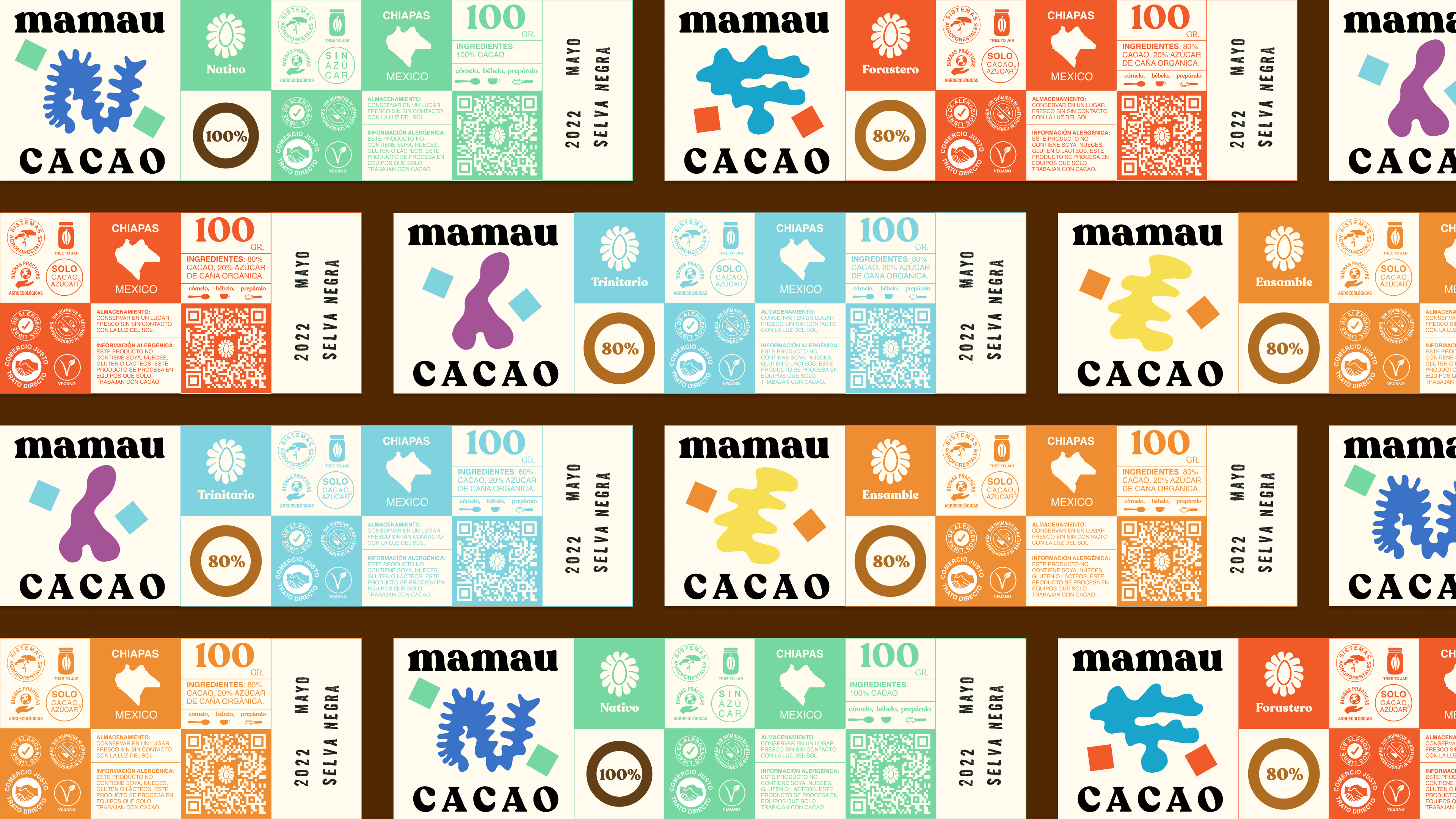
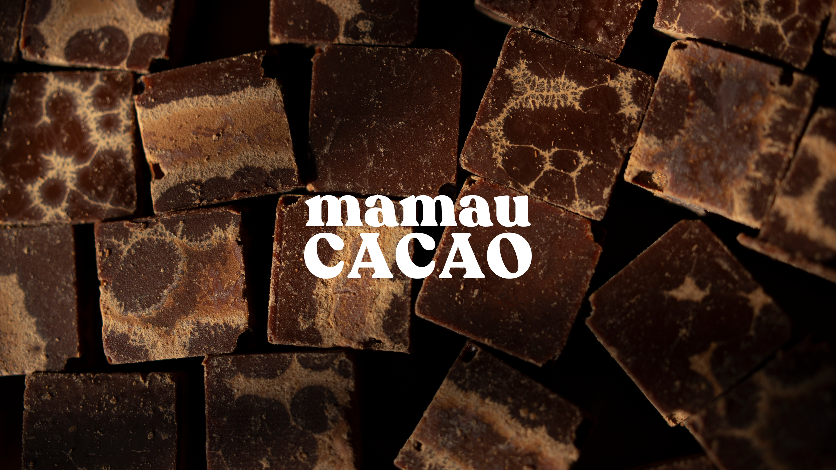
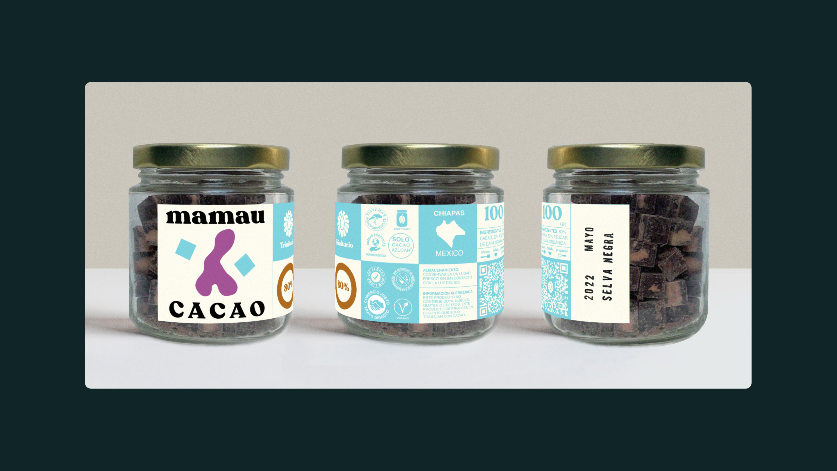
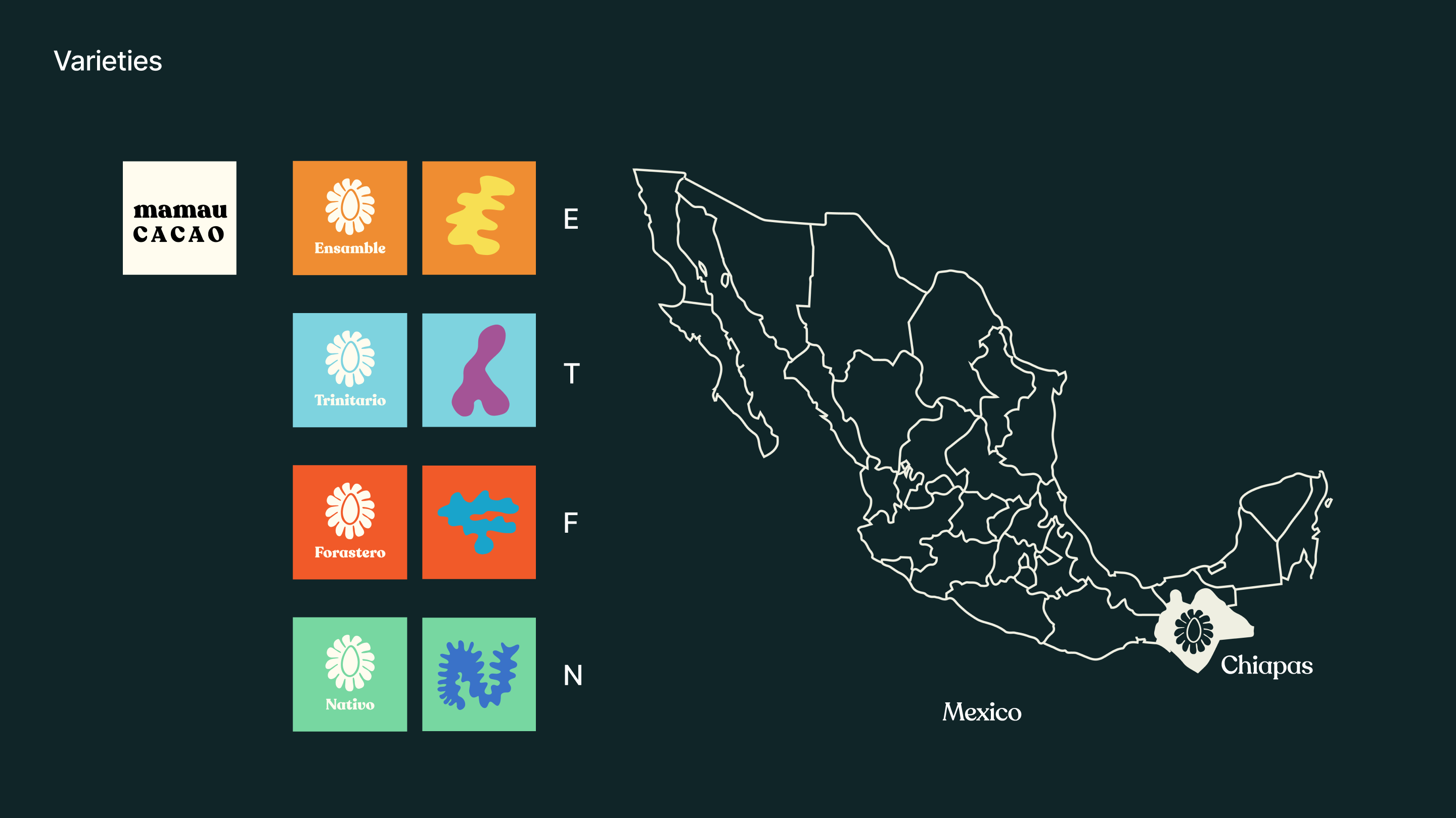
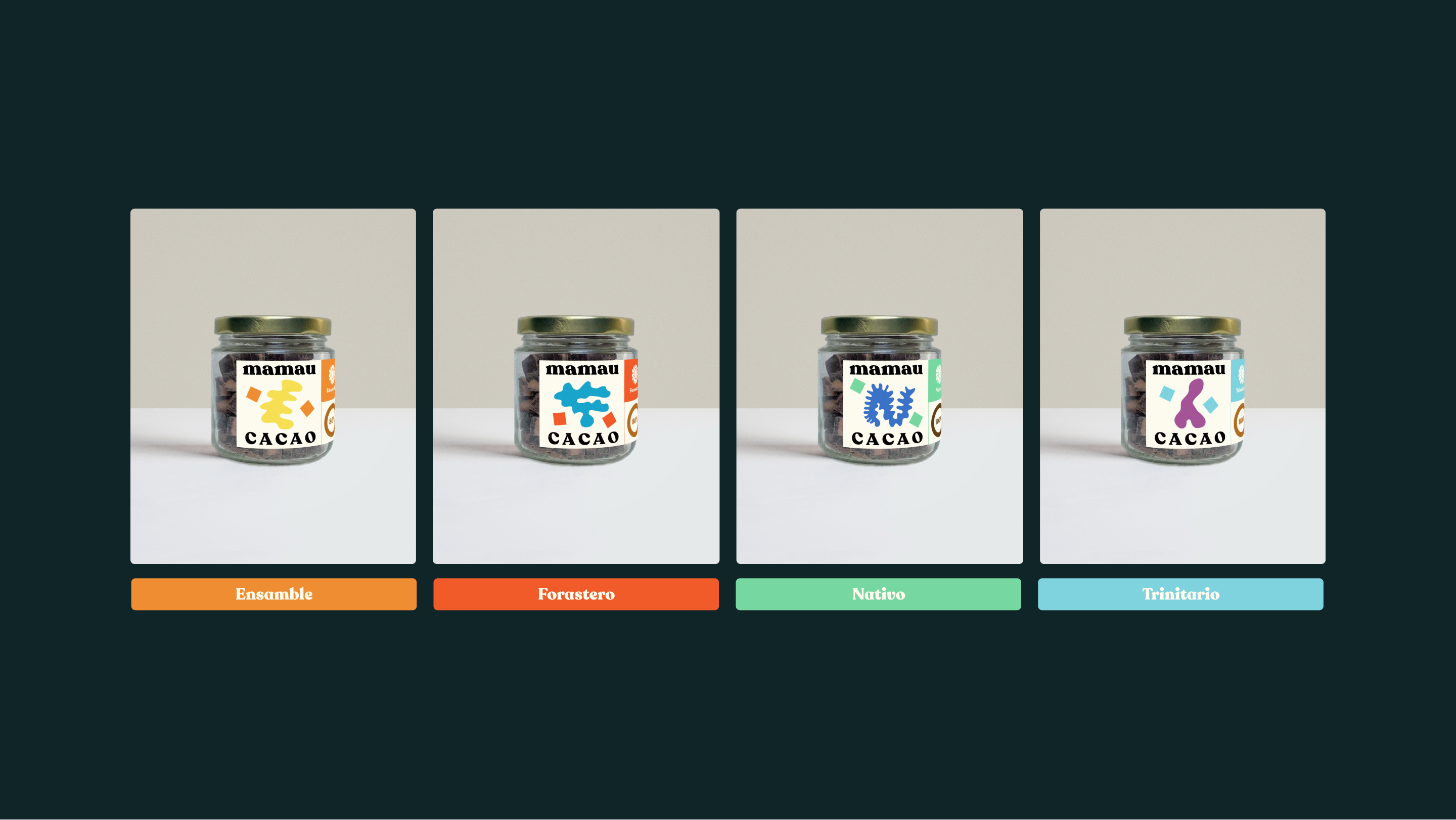
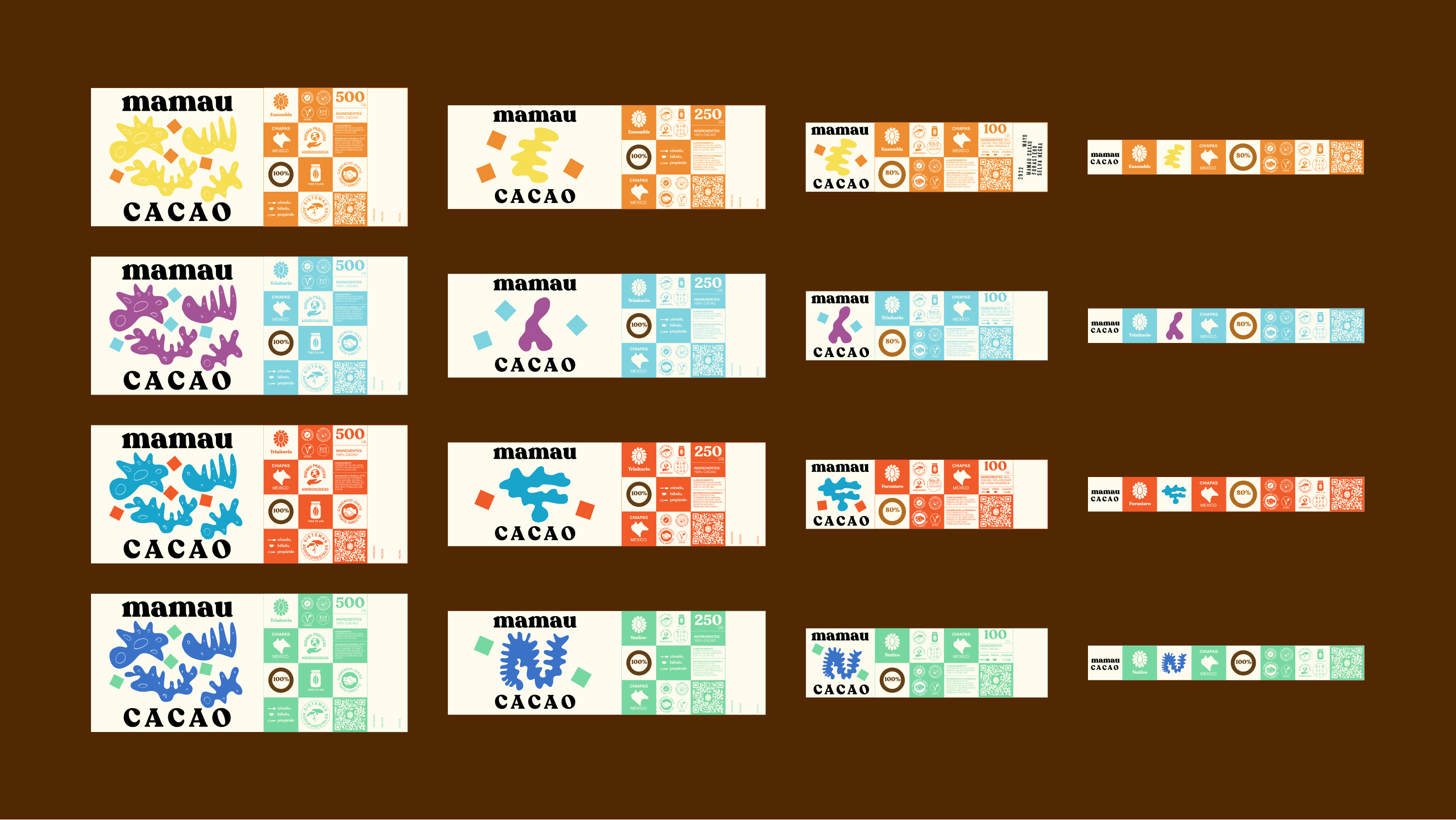
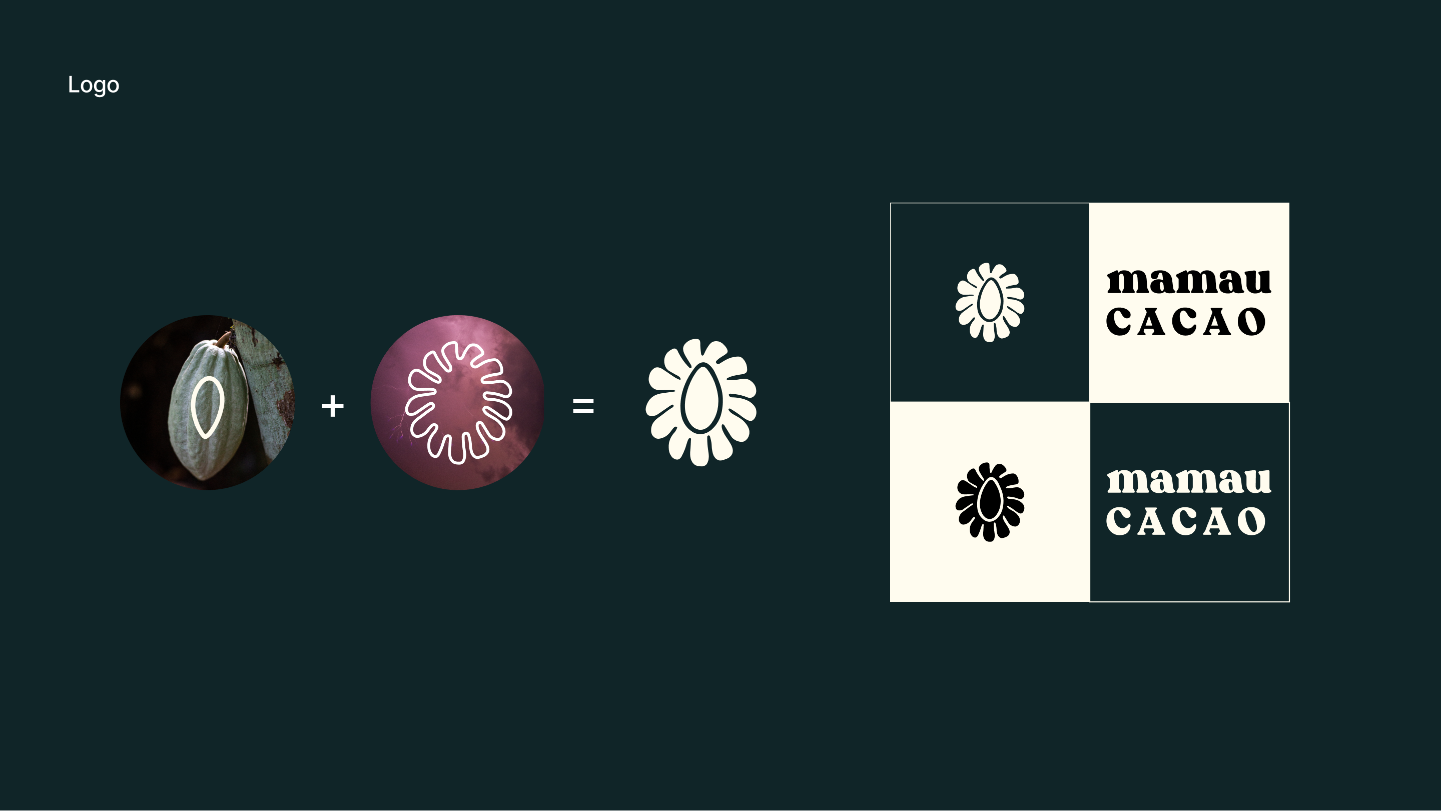
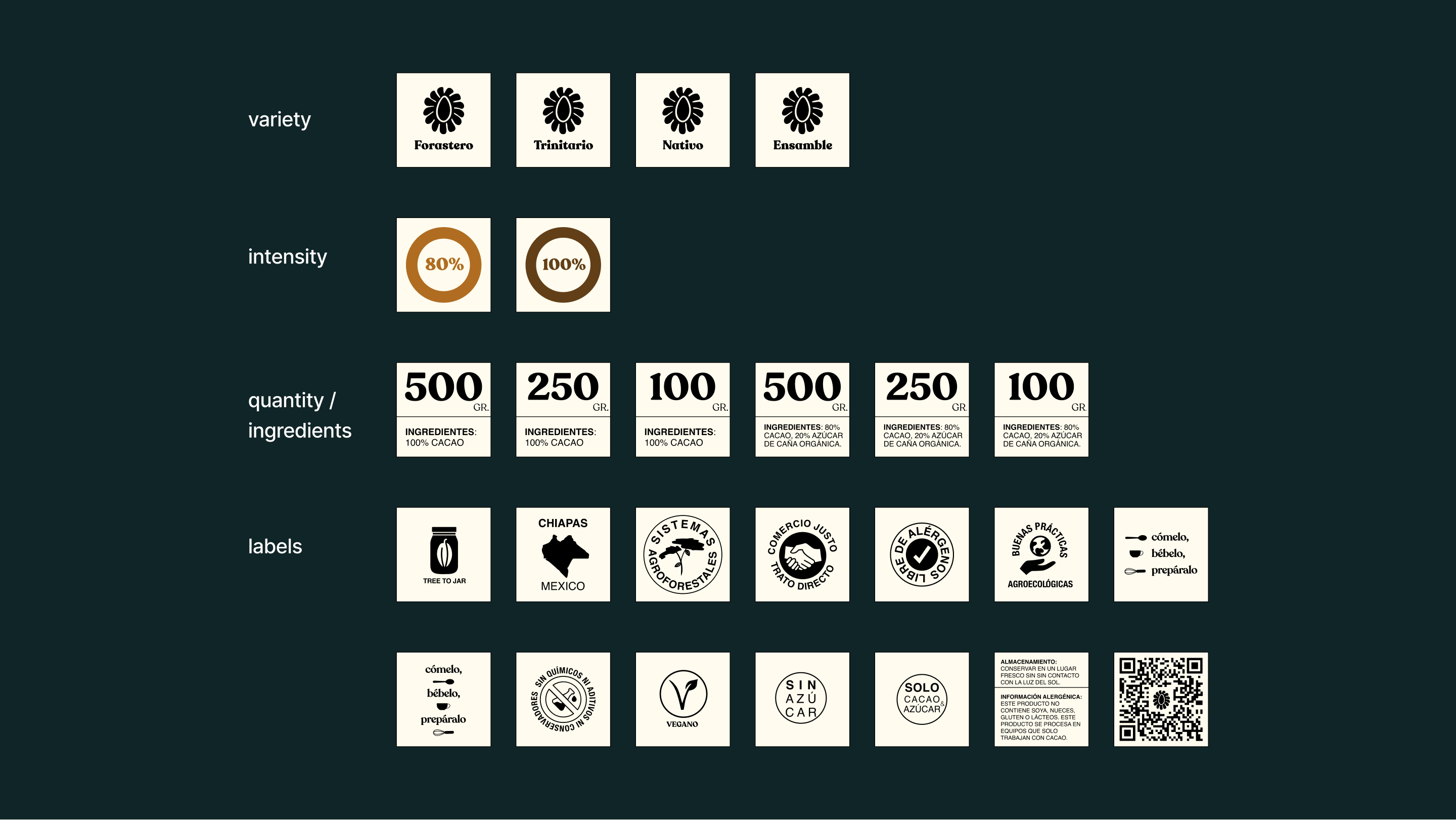
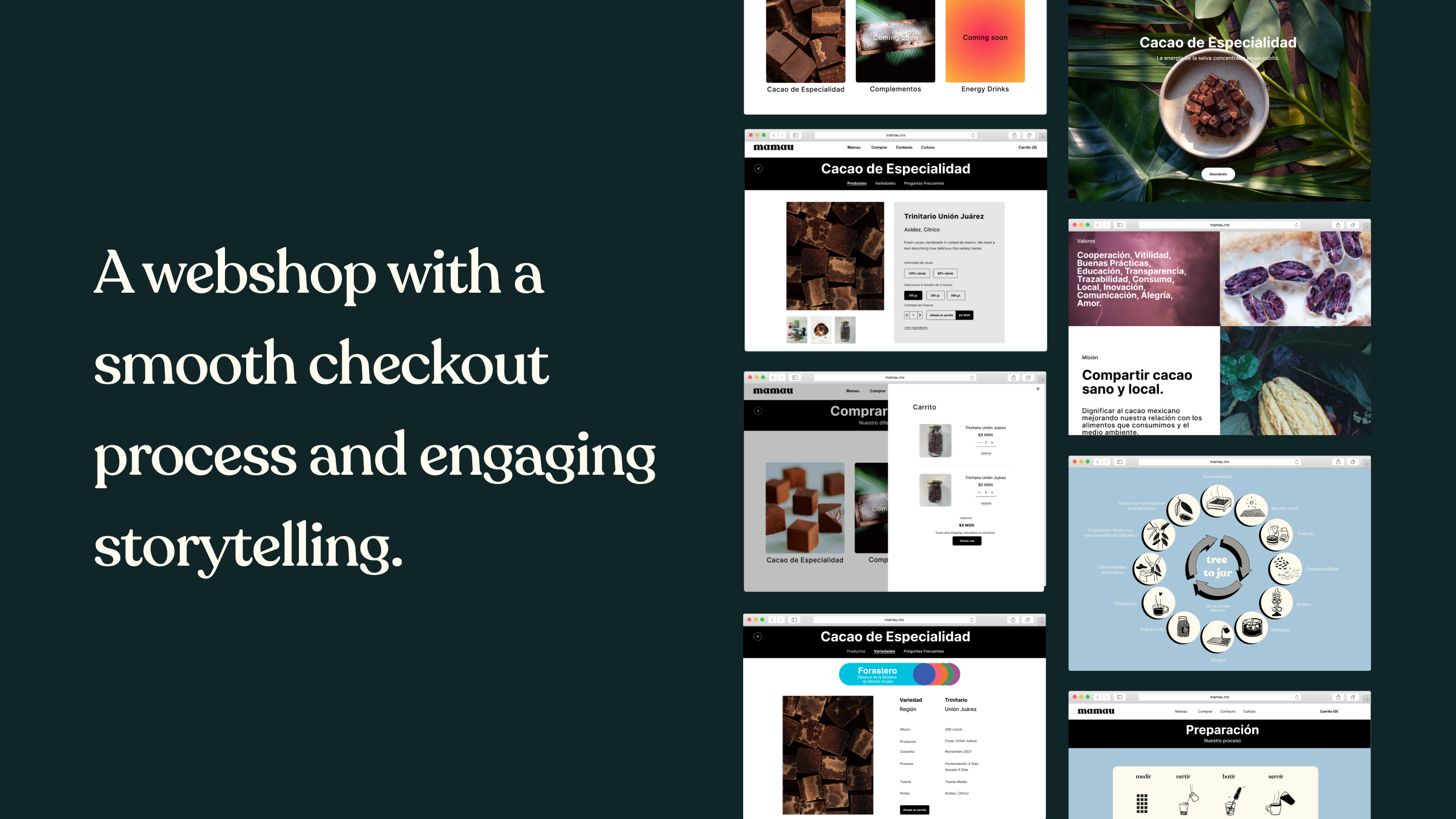
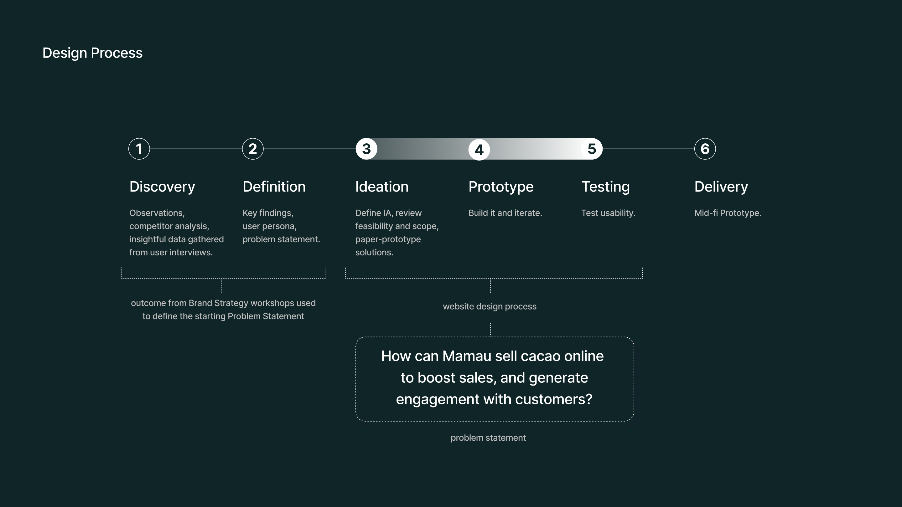
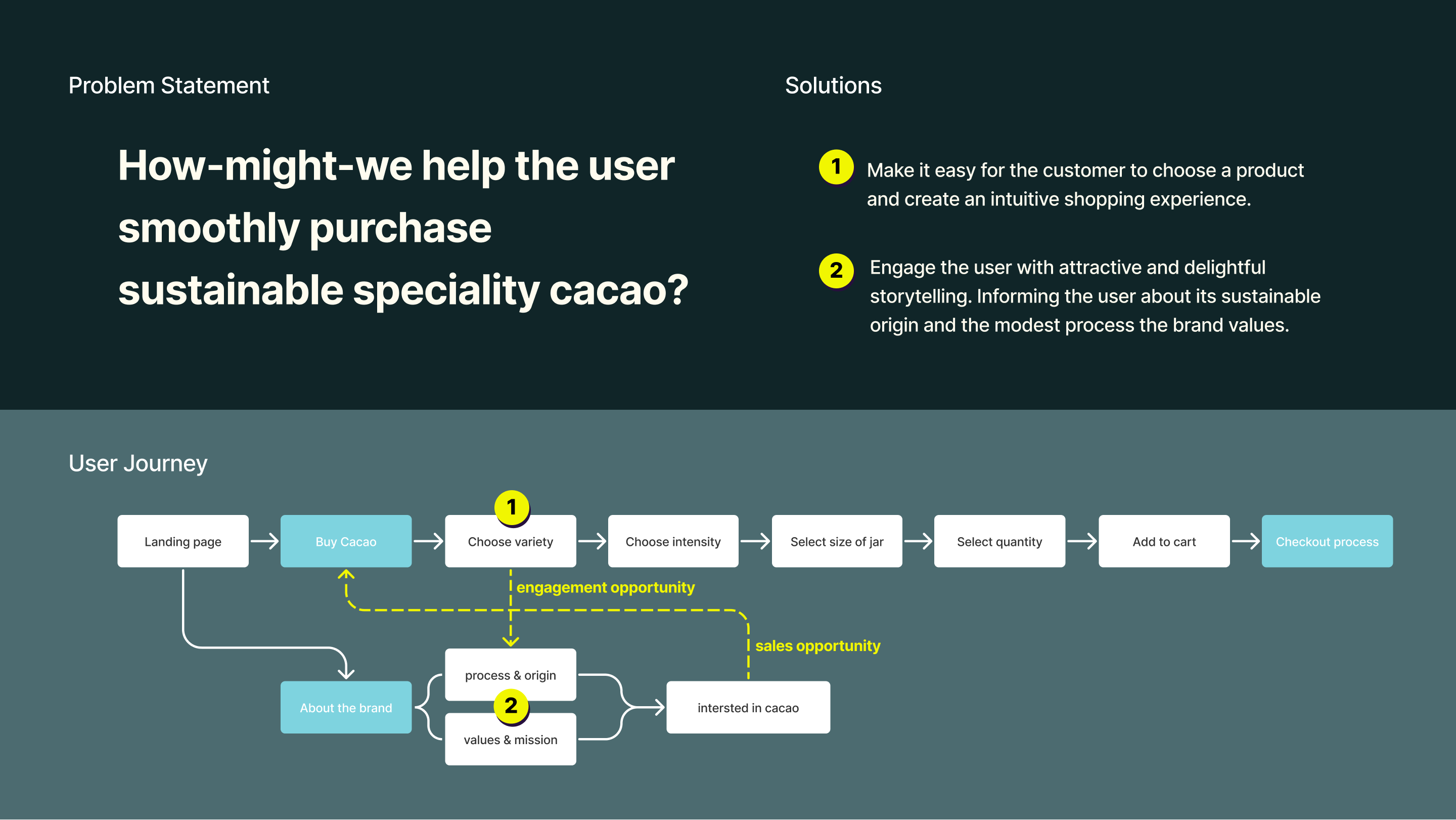
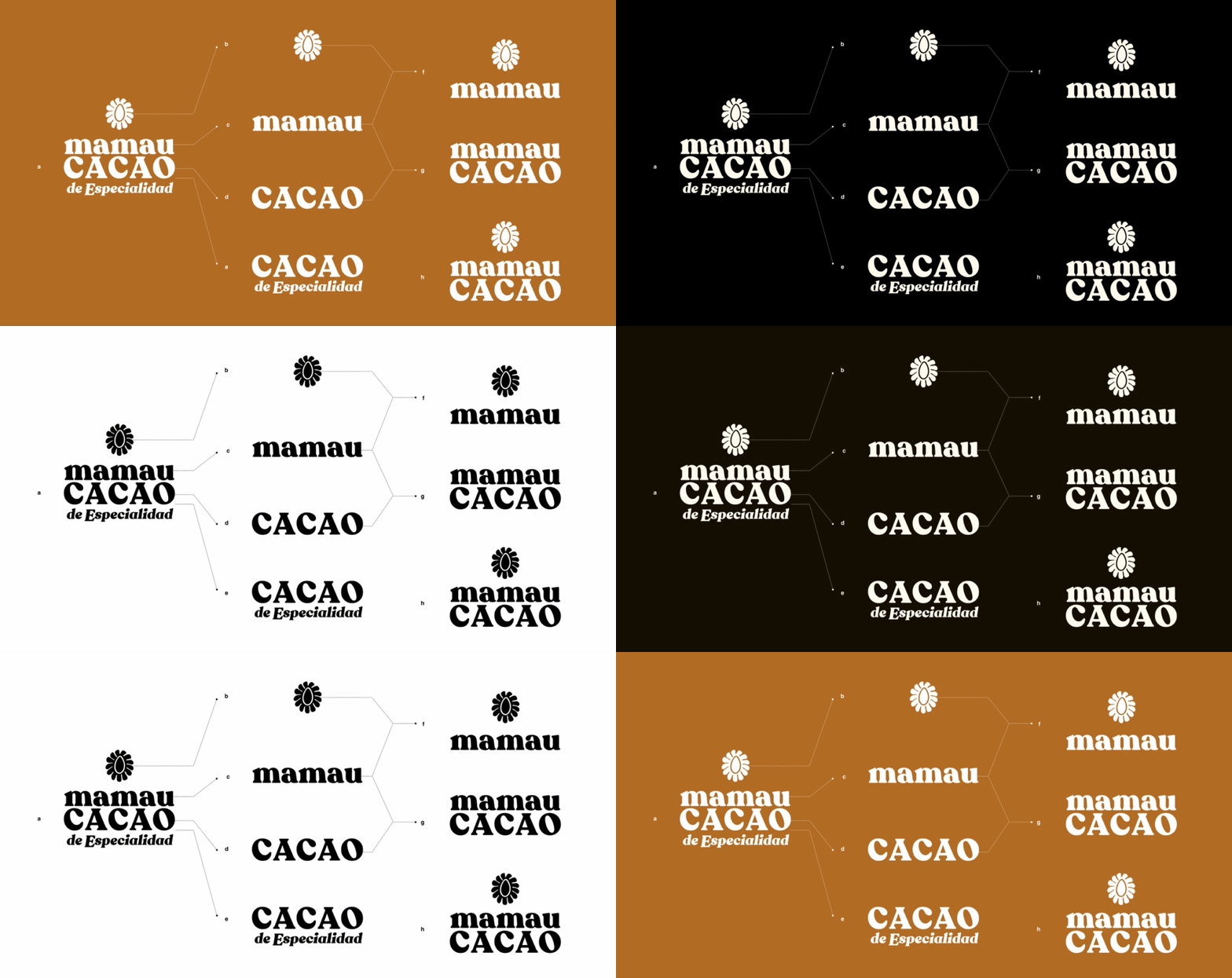
Strategic brand definition, logo design, systematic packaging design, UX website, and a mid-fi prototype of the website with webshop.
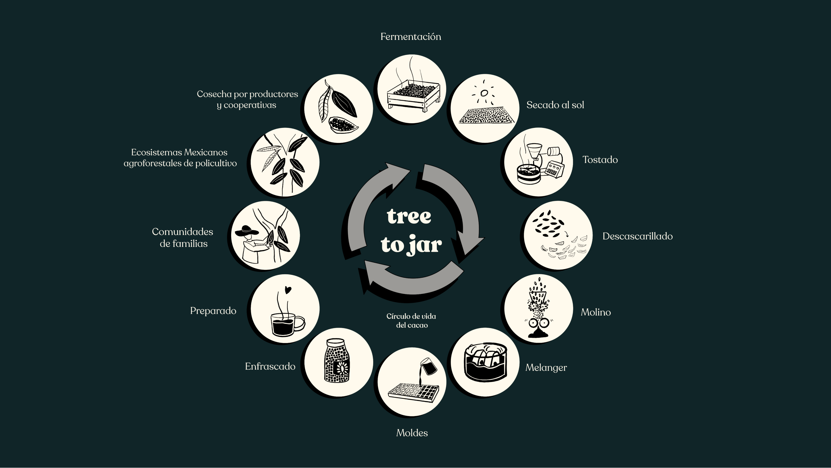
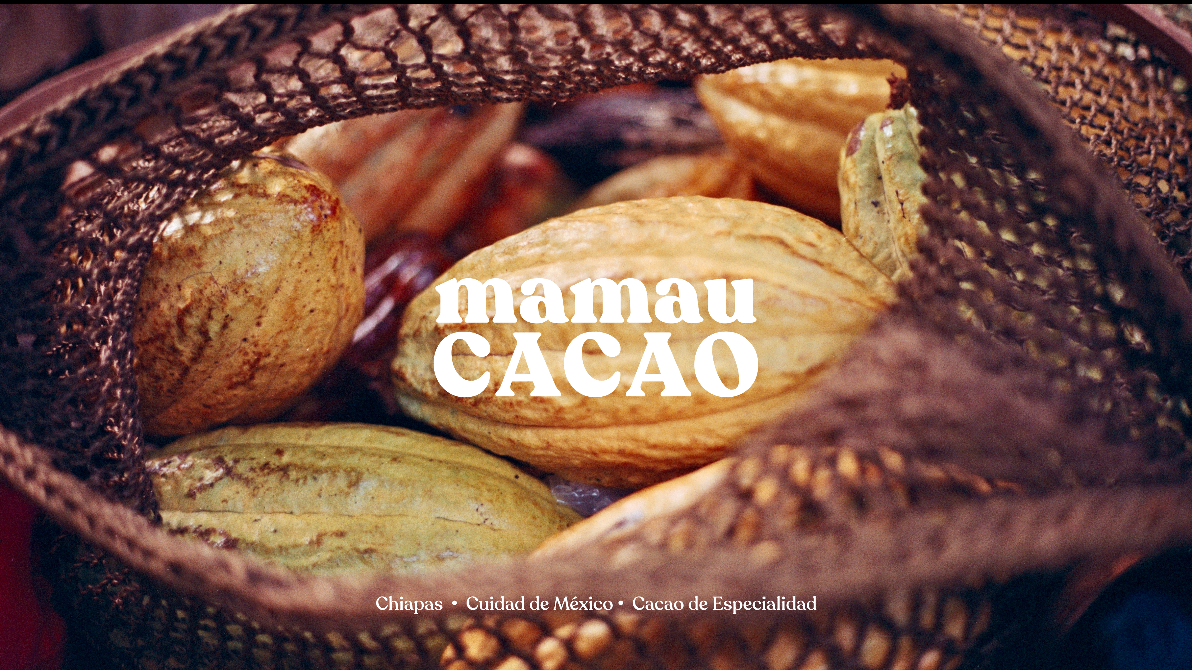
Mamau Cacao is a Mexican start-up business offering a forgotten native super food, specialty cacao. The product comes in little cubes, packed in glass jars.
Brand Strategy, Identity, Packaging, UX, Website
Founded the visual presence of the brand and helped the start-up get started with a solid UX and IA foundation with a Plan of Action for their website with a webshop.
Organized constructive workshops with the team to define competent brand strategies, conducted research, designed the logo, a systematic packaging system, and a style guide, mapped user-friendly IA, created effective UX wireframes, and delivered a mid-fi prototype
tools: Figma, Adobe Ai, Ps, Id
role: Lead Designer
Pictures by Eusebio Balmori Vildosola and Moïs Roditi.
Special thanks to Izzy Aspeling-Jones
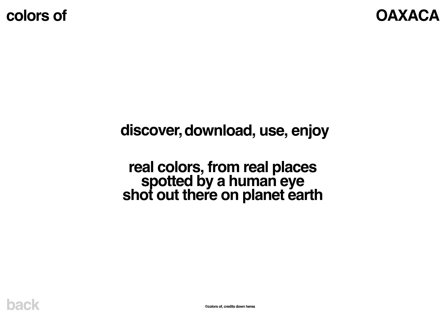
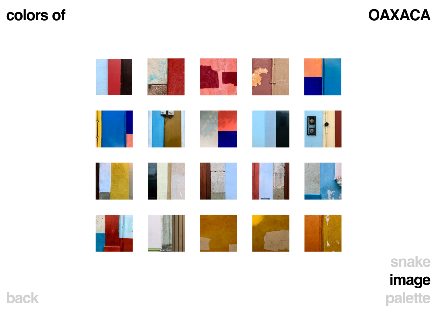
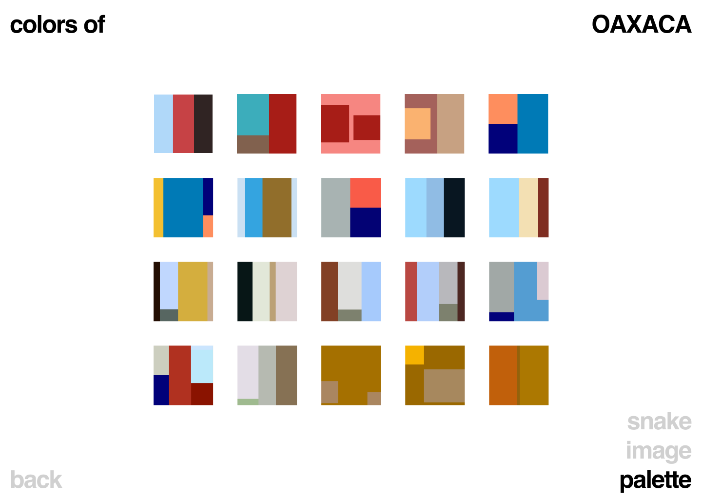
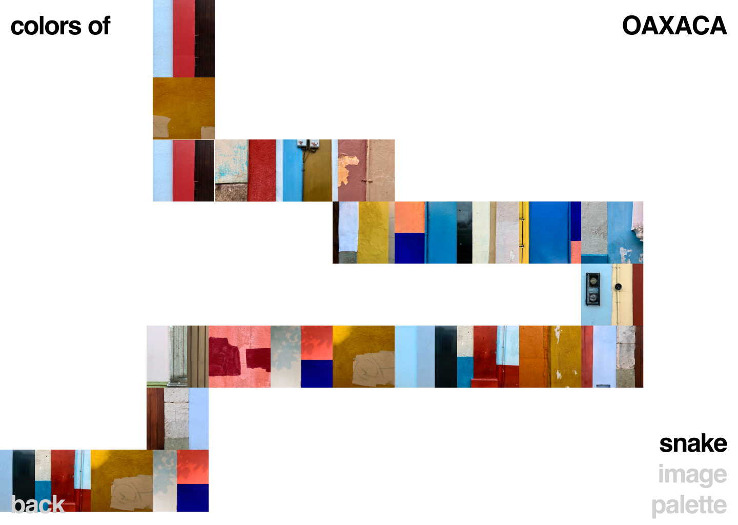
Open source color pallete library, with real colors from real places.
Discover, download, use, and enjoy real colors from real places.
Coming soon.
UX/UI, Design
UX/UI, Front End Dev,
Art, Photography
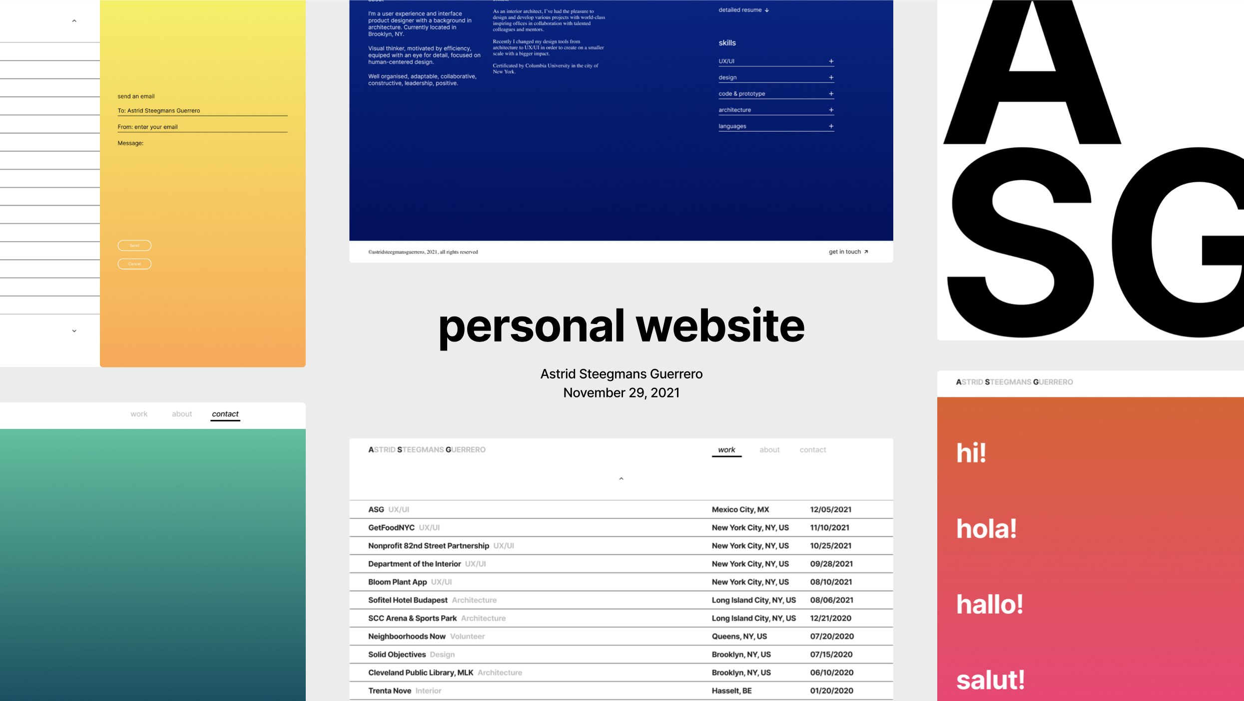
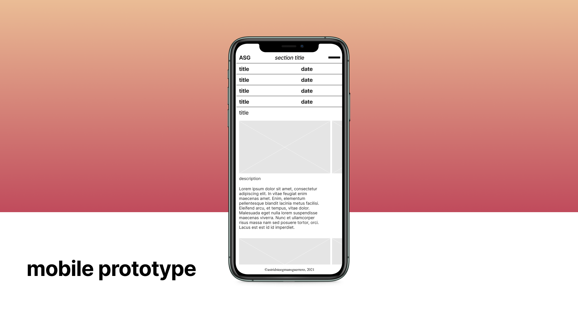
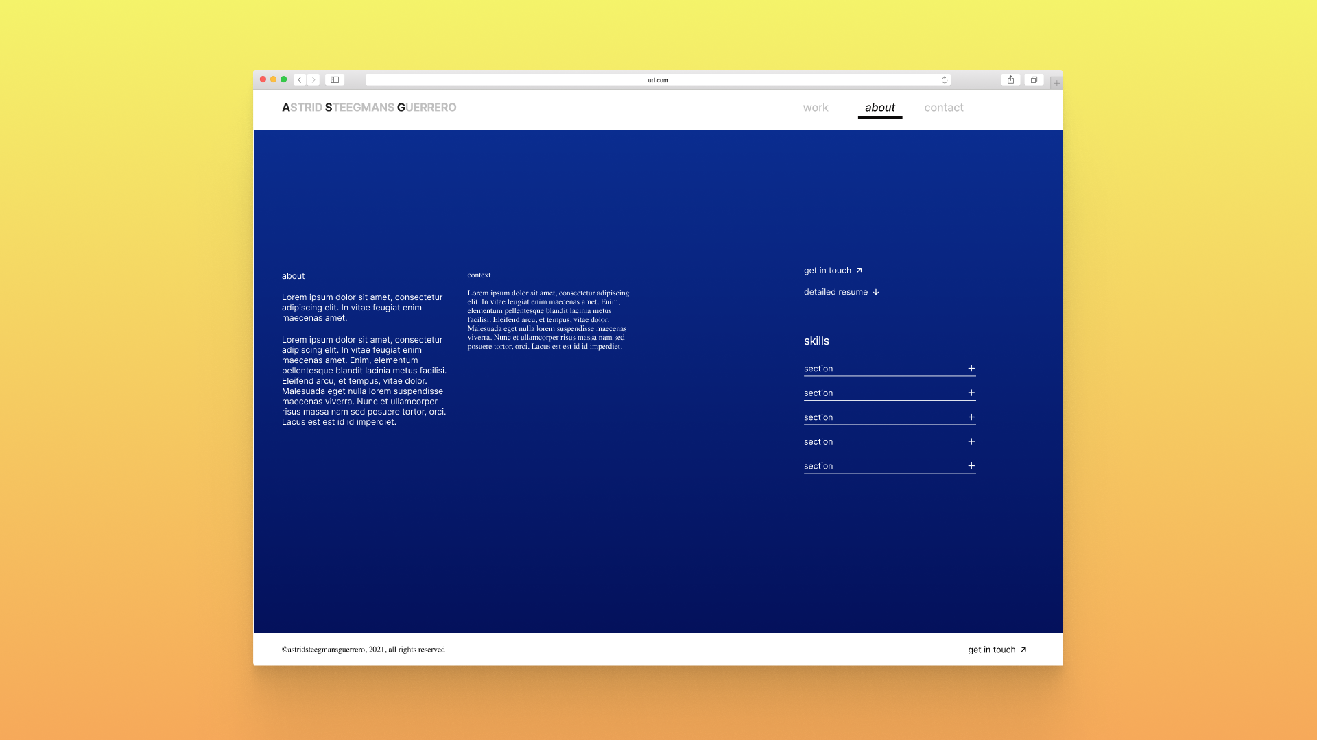
Portfolio website
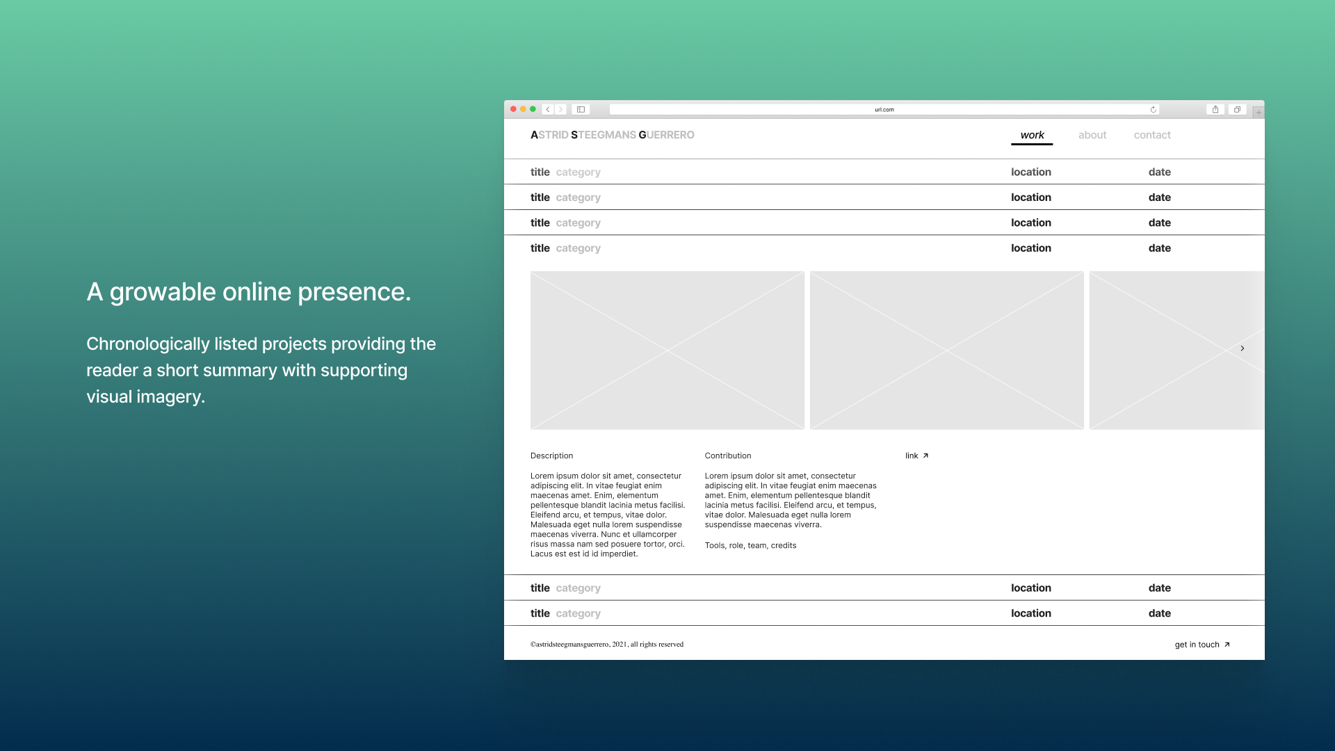
A website to showcase personal work that will grow over time. Expandability and a neutral UI style are key in the design direction.
UX/UI Design
UX wireframes, complete UI design style guide and components.
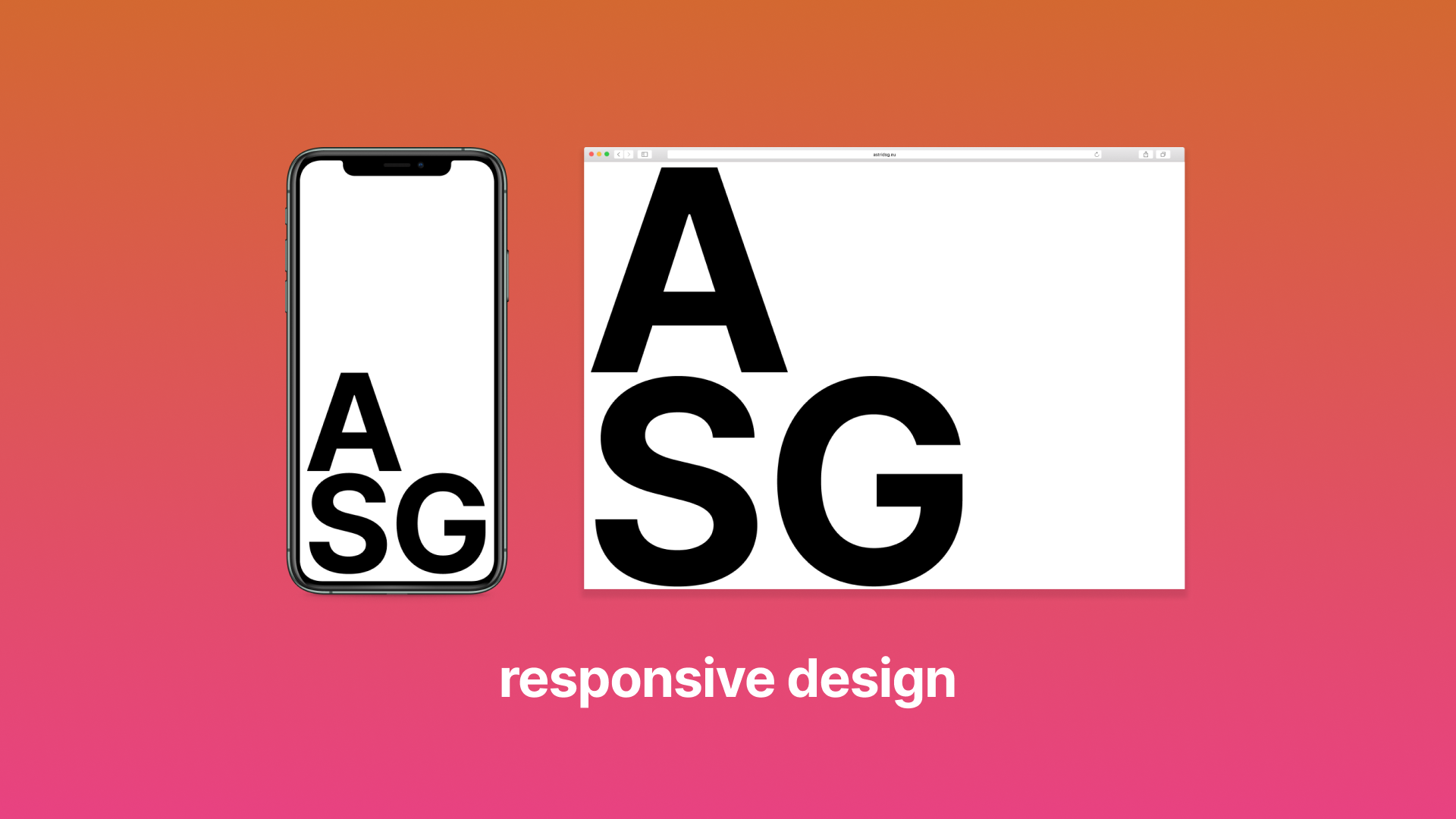
Responsive prototypes for mobile and desktop.
From scratch-built an online prototype using HTML, CCS, Javascript, jQuery, and GitHub.
Tools: Figma, VS Code, Github, Elementor
Role: Designer, Solo project
Developped and built by Cuarto Negro
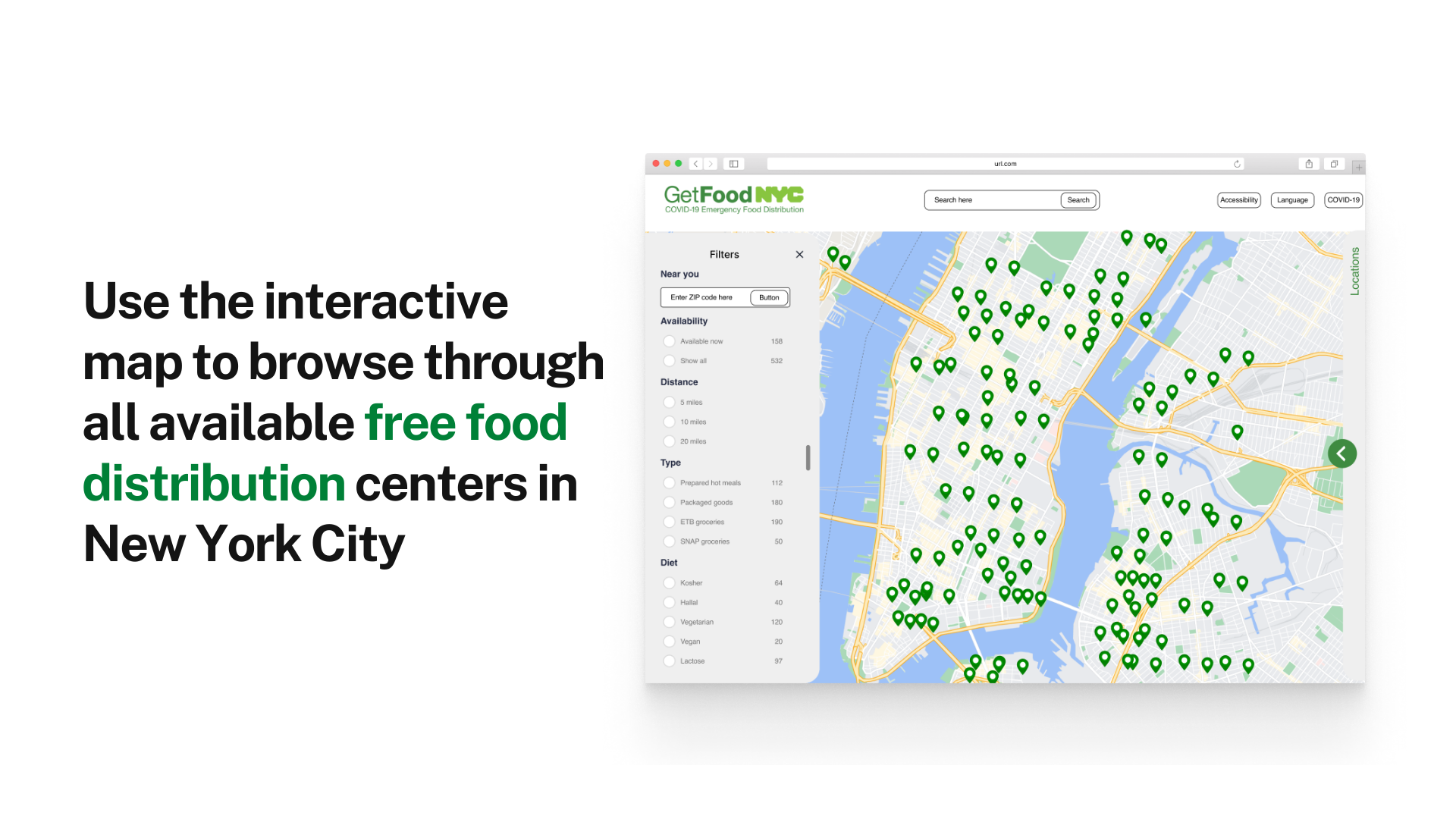
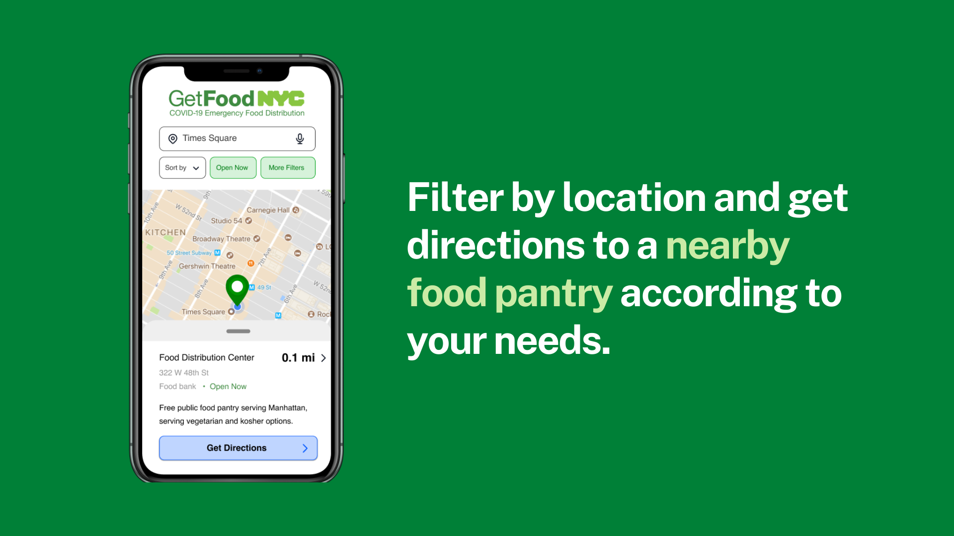
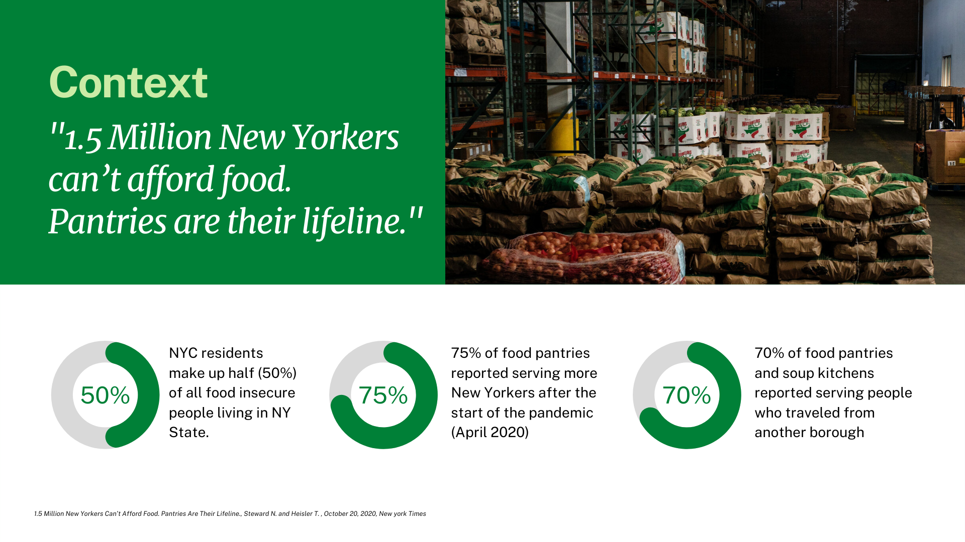
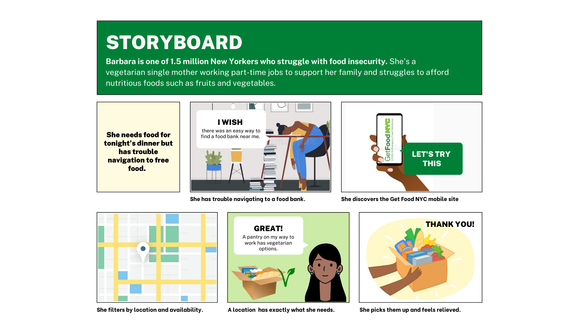
An interactive map to fight food security in New York City.
“The problem: The GetFoodNYC government site is difficult to navigate, inefficient, and suffers from a lack of accessibility and options for users.
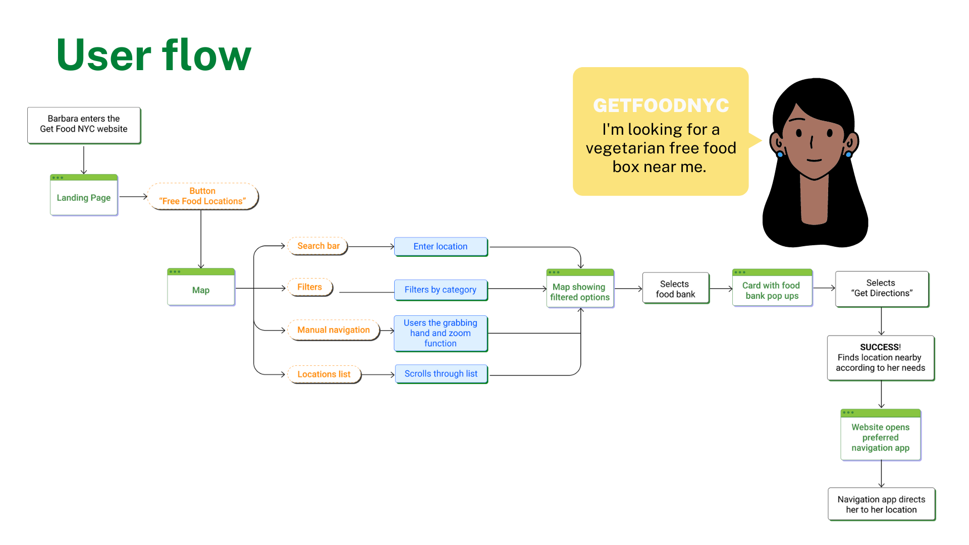
Our solution: We provided a mobile app for New Yorkers who need to quickly find and navigate to free food distribution centers that can cater to their needs.”
UX/UI redesign case study
“Research and definition of persona, pain points and solutions.
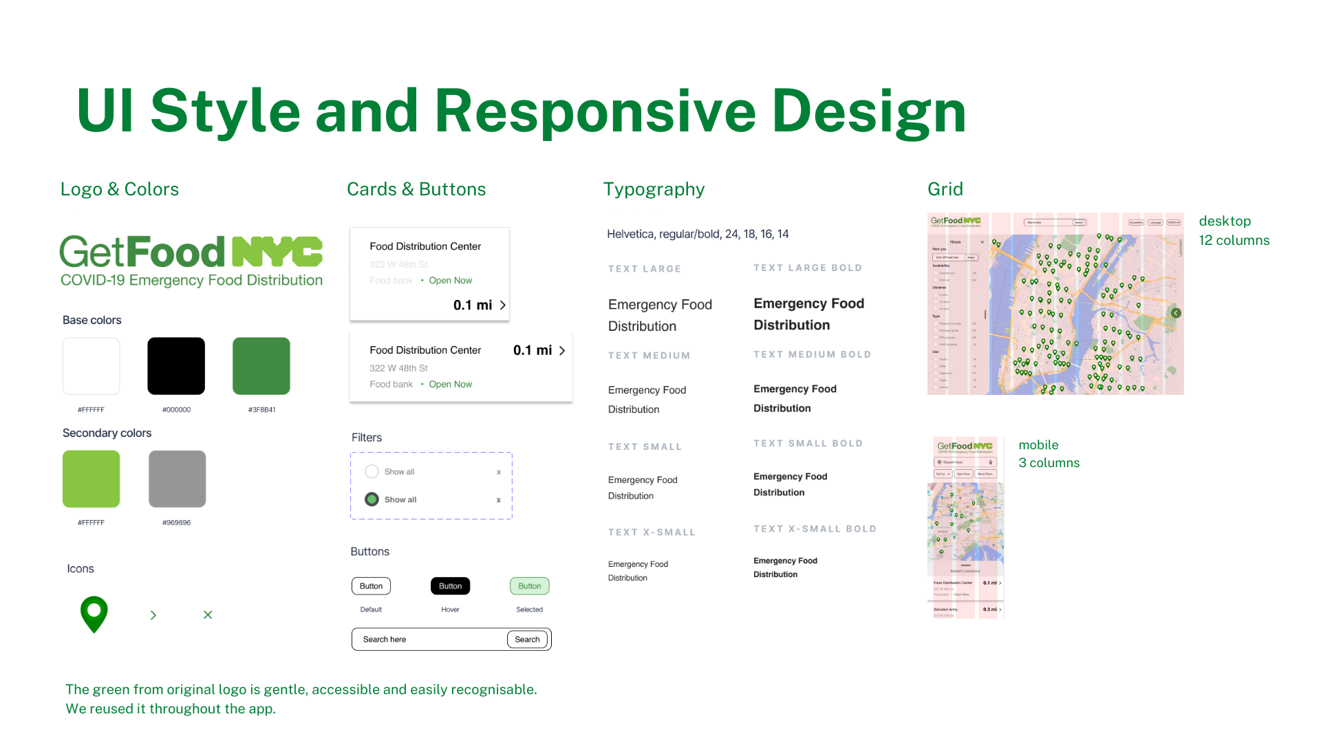
Ideation and development of features for responsive interfaces.
Iterations on prototypes from low to high fidelity, based on test results.”
Tools: Figma, VS Code
Role: Researcher, designer
Team of 3: with Mai Hirose & Johnathan Lerman
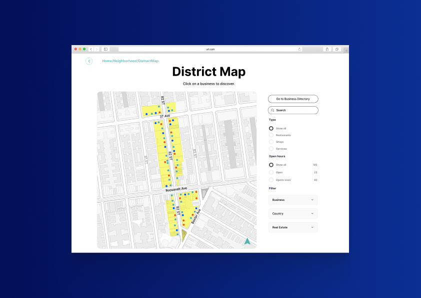
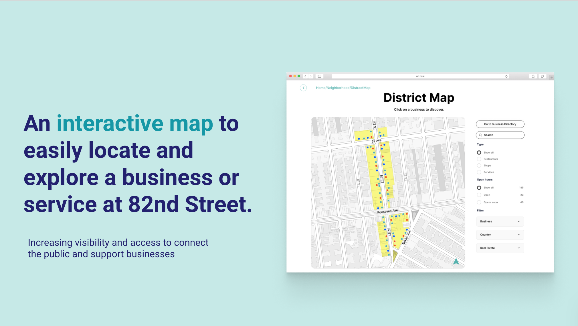
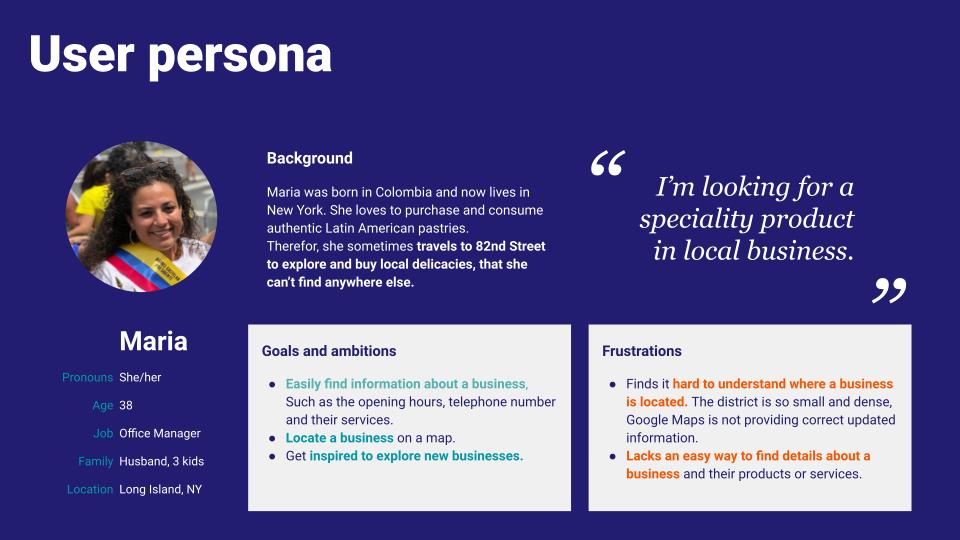
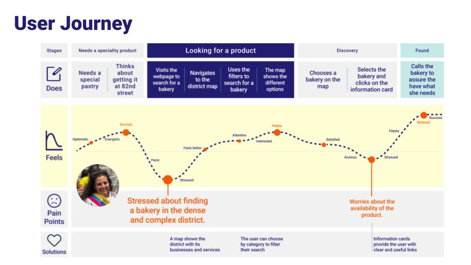
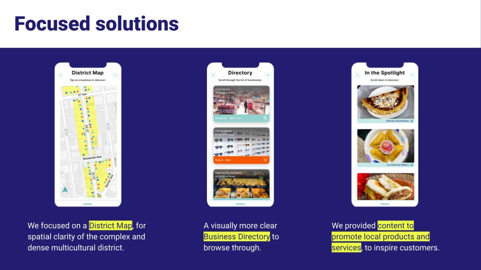
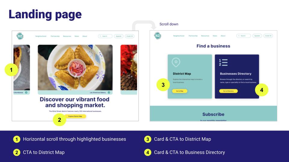
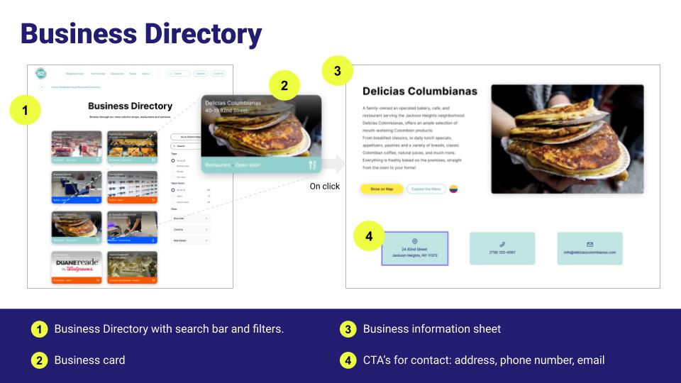
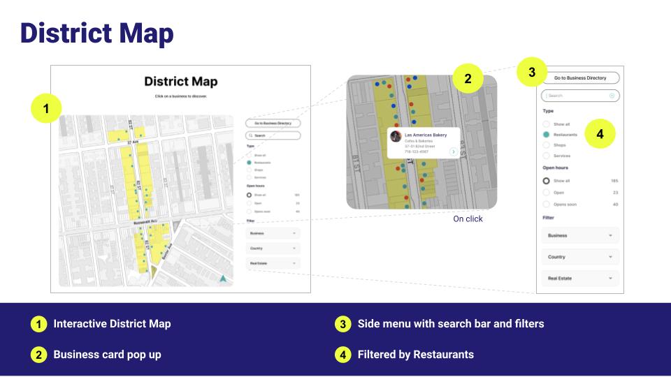
An interactive map and business directory for a local nonprofit that promotes a district.
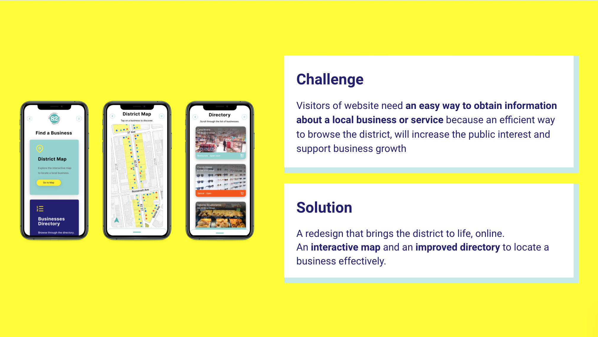
“The challange: Visitors of website need an easy way to obtain information about a local business or service because an efficient way to browse the district, will increase the public interest and support business growth
Our solution: A redesign that brings the district to life, online. An interactive map and an improved directory to locate a business effectively.”
UX/UI redesign case study
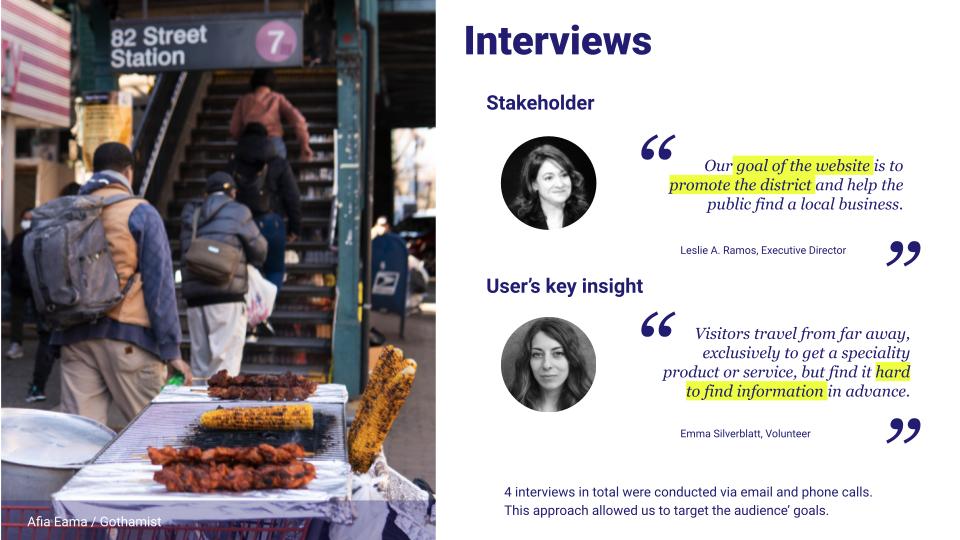
Research, interviewing stakeholders, usability testing, new IA, lo-fi UX wireframe development, ideation, definition, new UI style guide, components, final interactive map design, Hi-fi prototyping, and user testing.
Tools: Figma
Role: Researcher, designer
Solo project
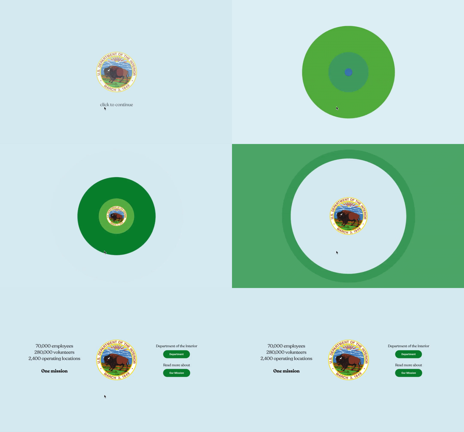
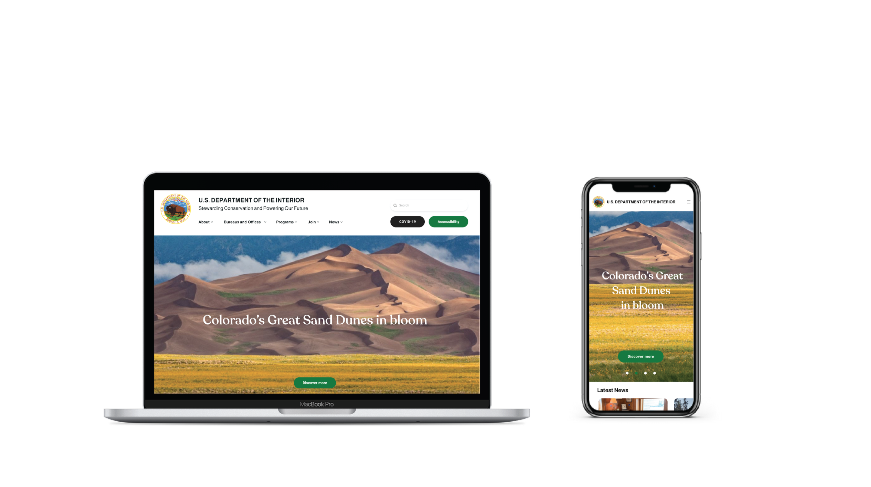
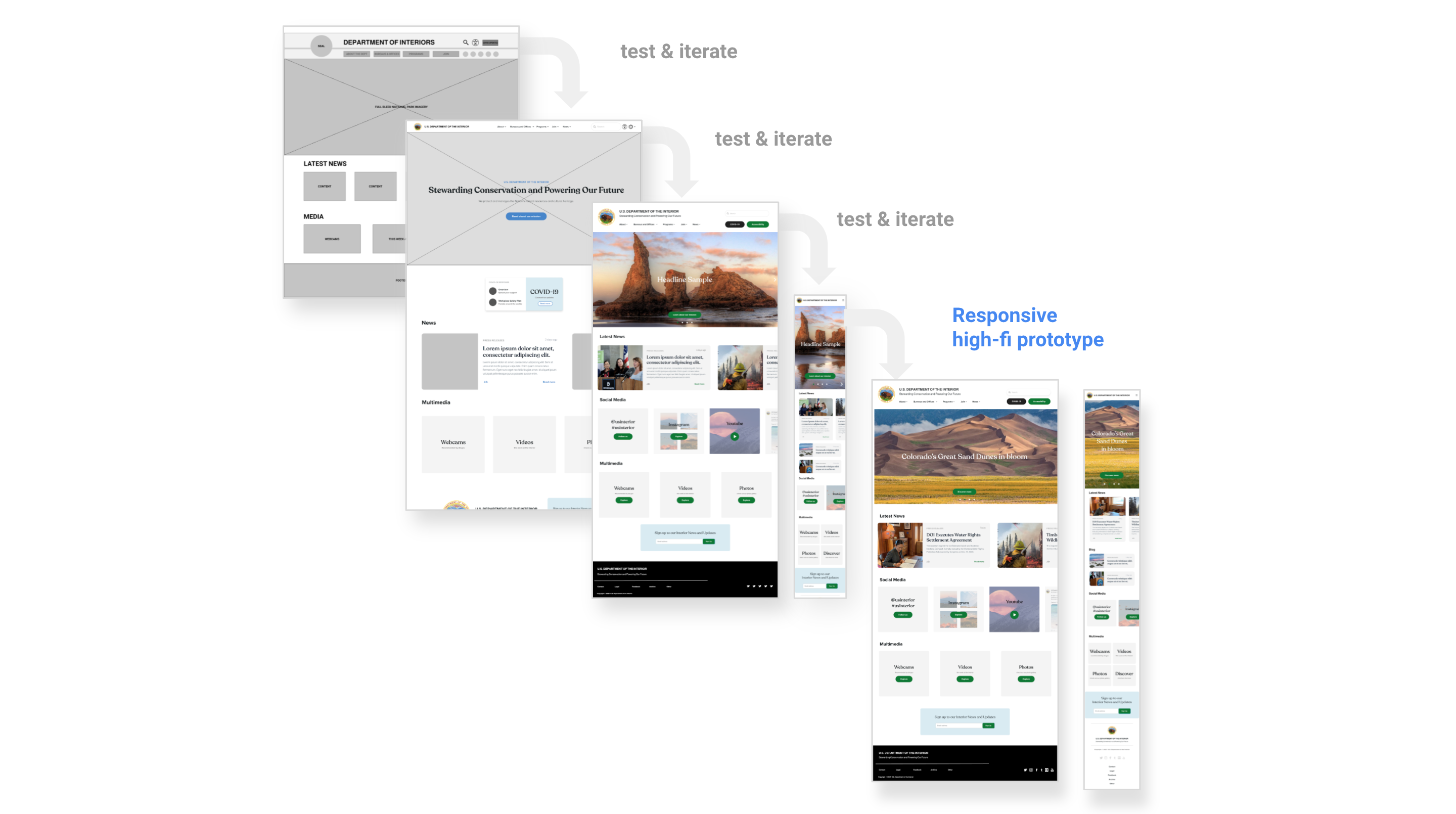
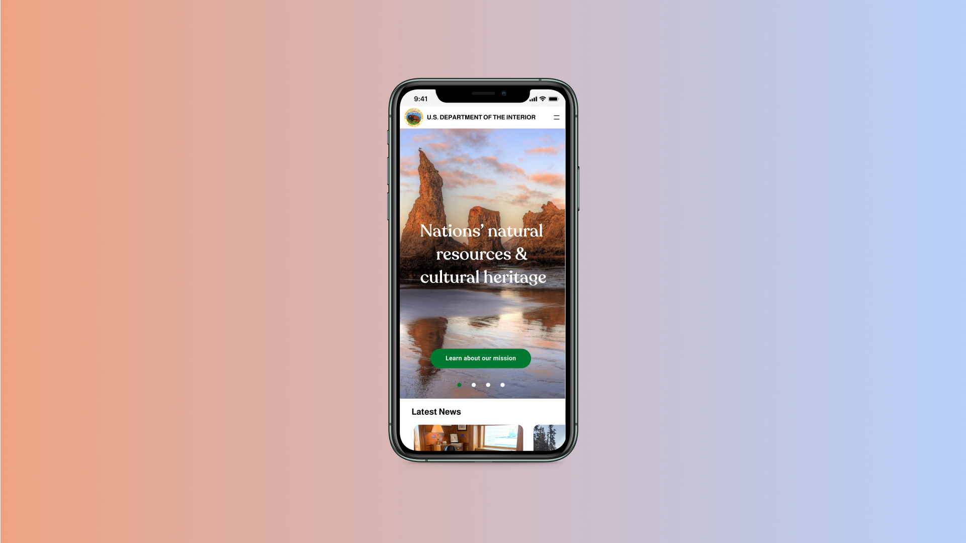
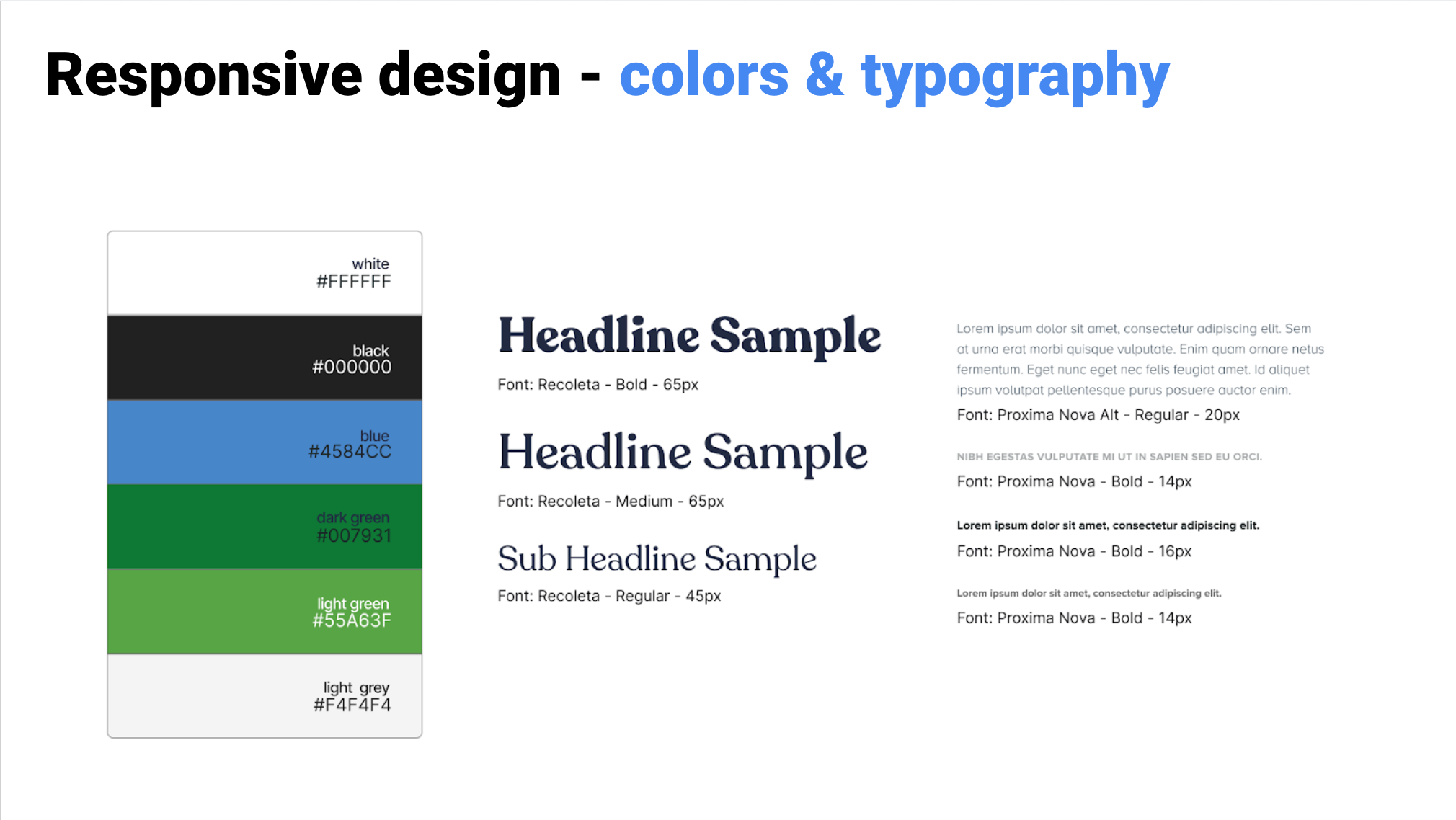
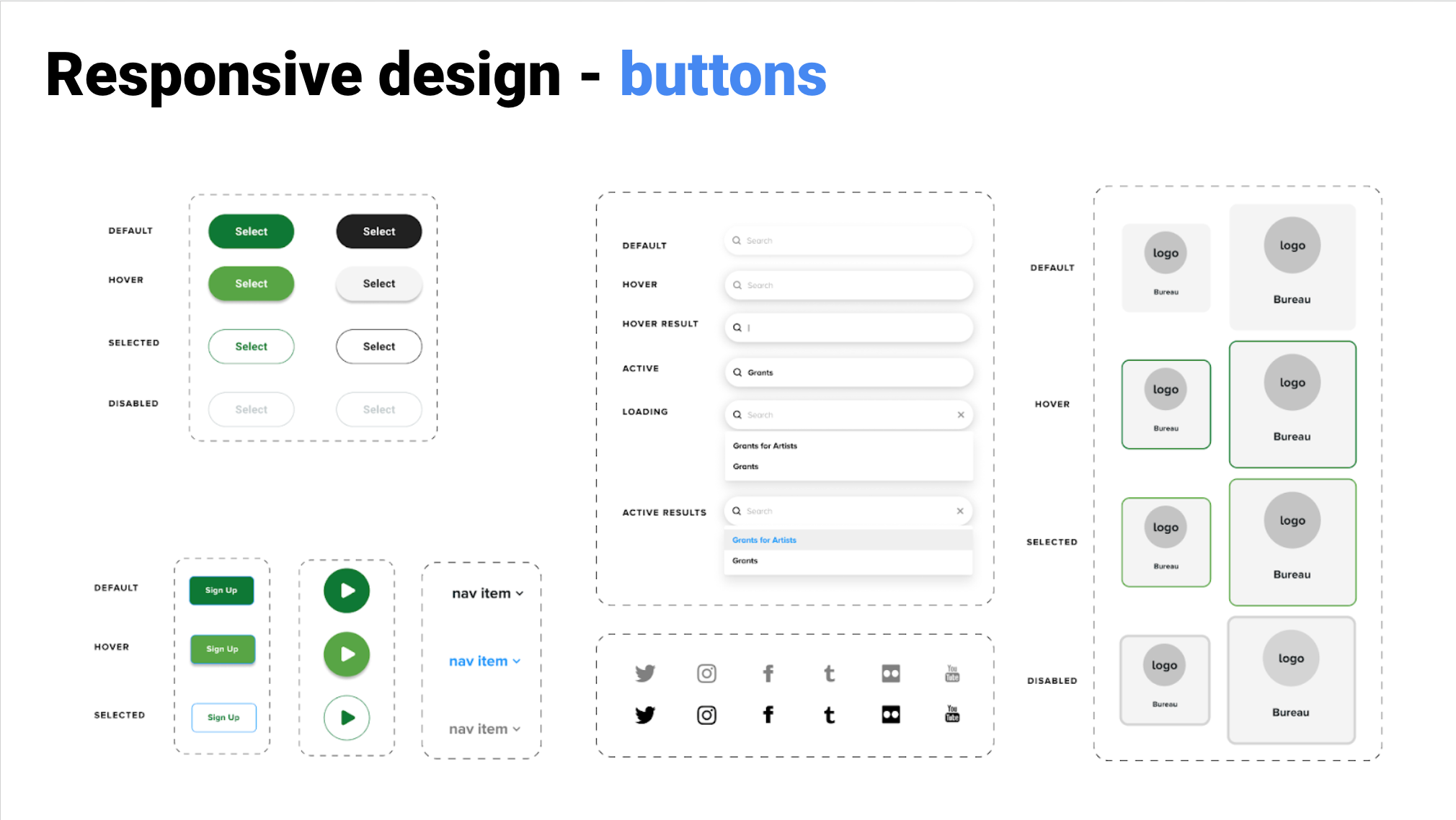
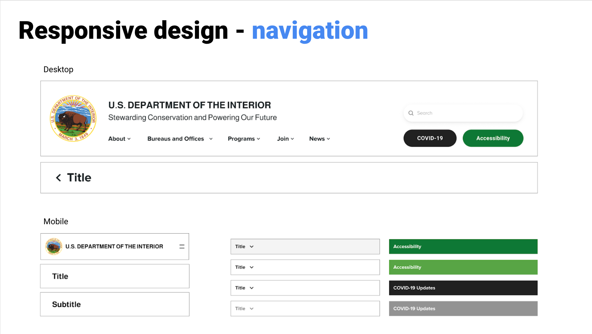
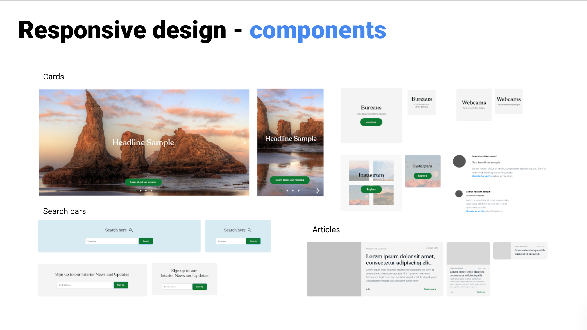
A responsive redesigned website for a U.S government department with a complex IA.
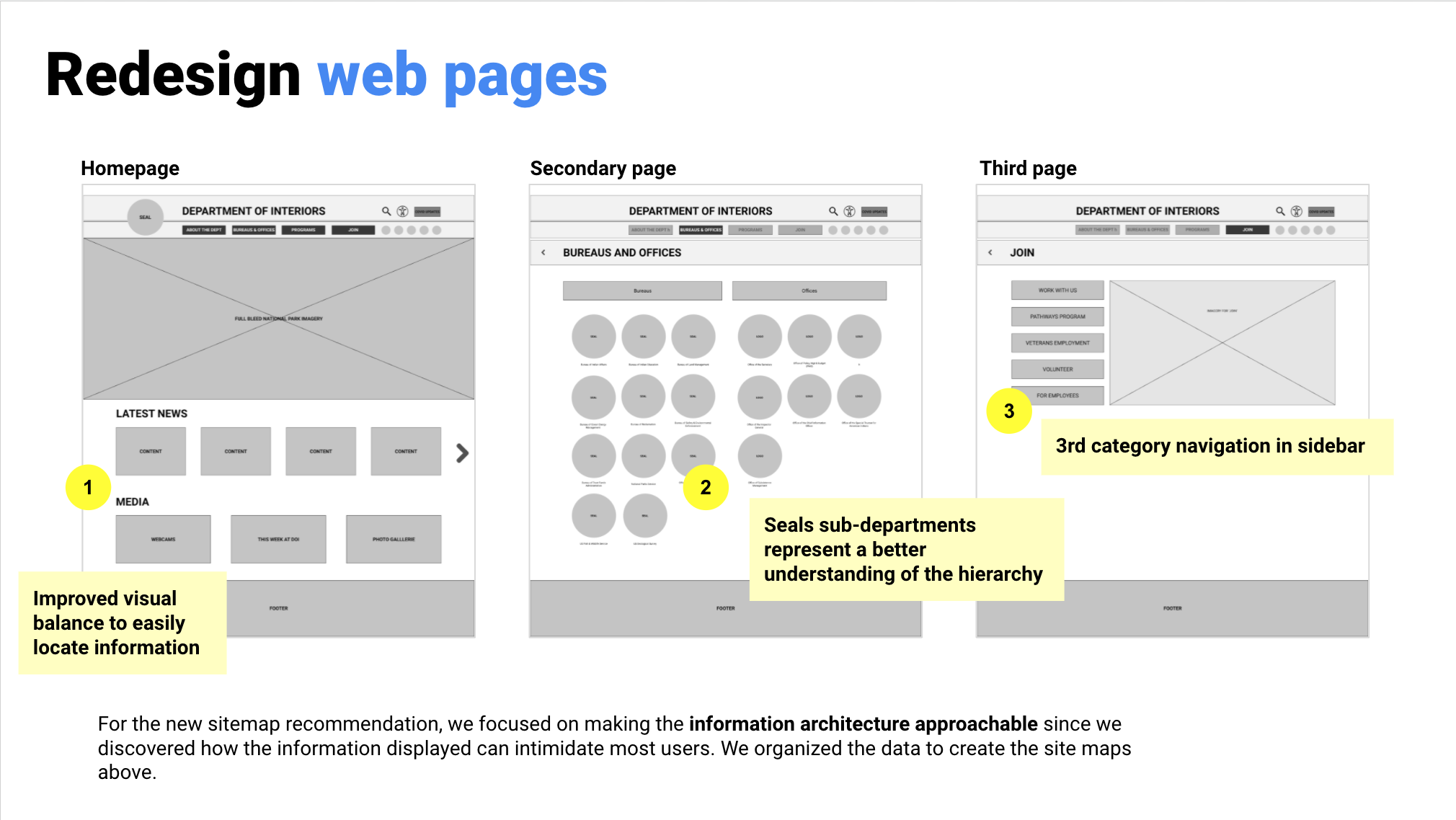
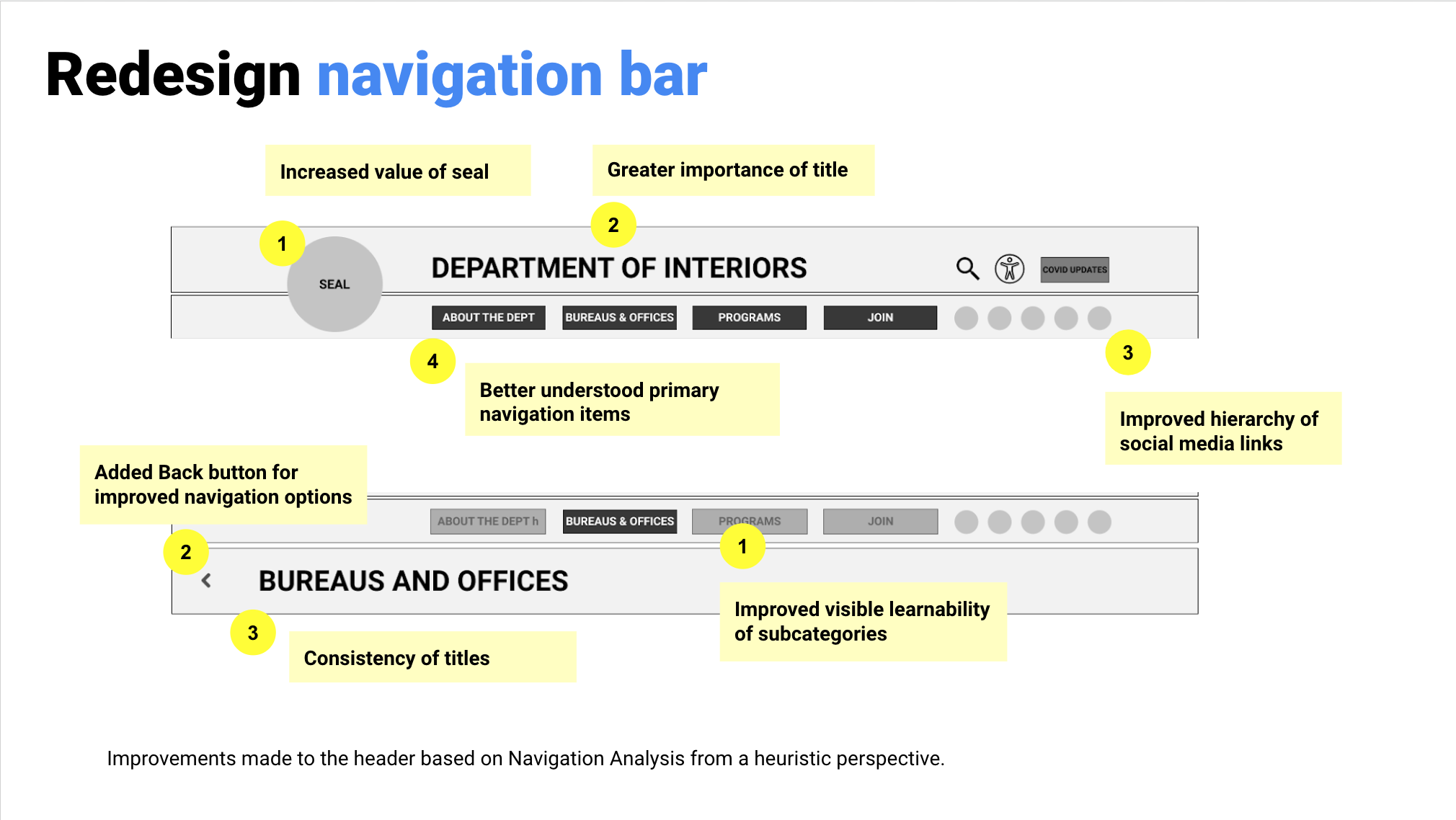
The problem: The U.S Department of the Interior website has a confusing navigation and hierarchy resulting in confused users and abandonment of the site.
Our solution: A redesigned responsive UI for desktop and mobile that clearly explains the complex substructure of the offices and bureaus, to find information efficiently.
UX/UI redesign case study
Tools: Figma
Role: Researcher, designer
Research & definition team: with Tay Abad & Lance Joseph
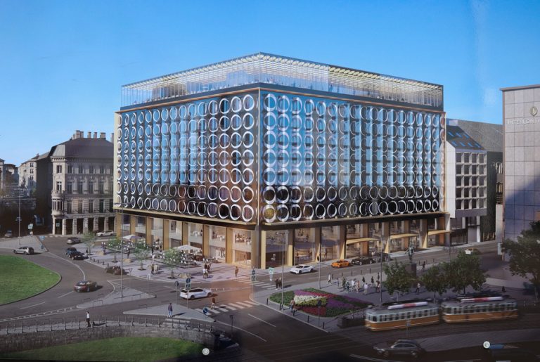
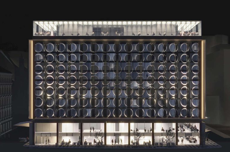
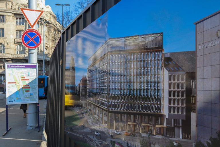
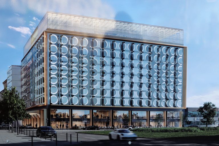
Sofitel Hotel Renovation in Budapest
Distinct interiors for a high-end renovation of Sofitel Hotel, right next to the chain bridge in Budapest in Hungary.
Interior design
Interior studies and layout drawing sets (not publically published)
Team of 10.
At Asymptote Architecture.
Project not publically published.
A design competition against the world’s leading Starchitects, for a national hockey arena & sports park proposal.
Architecture, Landscape design
Landscape design, visuals, and final presentation booklet.
Team of 12.
At Asymptote Architecture.
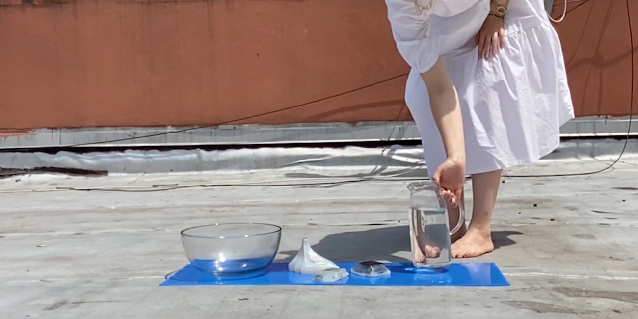
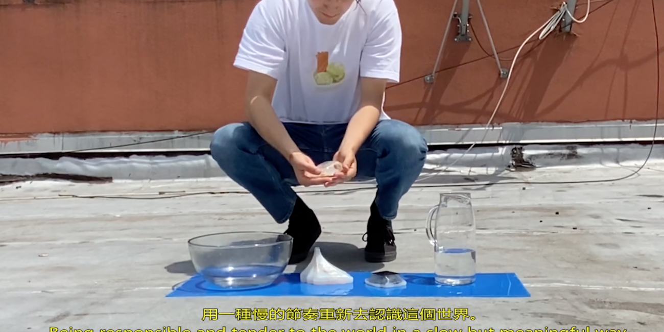
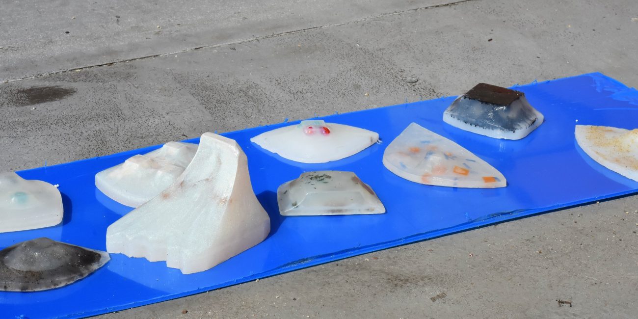
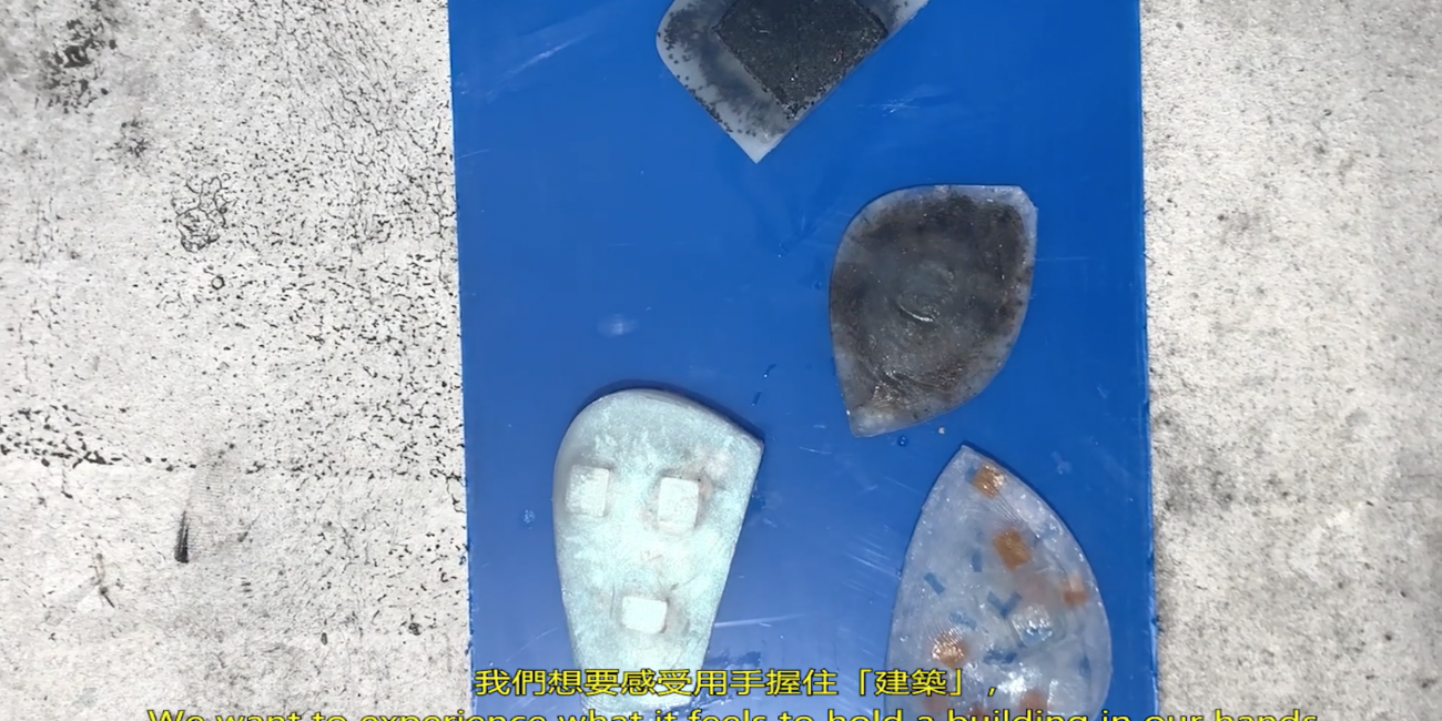
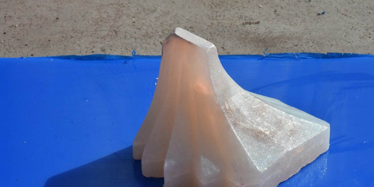
Architectural shaped utensils, a collection of soaps
SO–AP was created from SO–IL’s archive of model moulds.
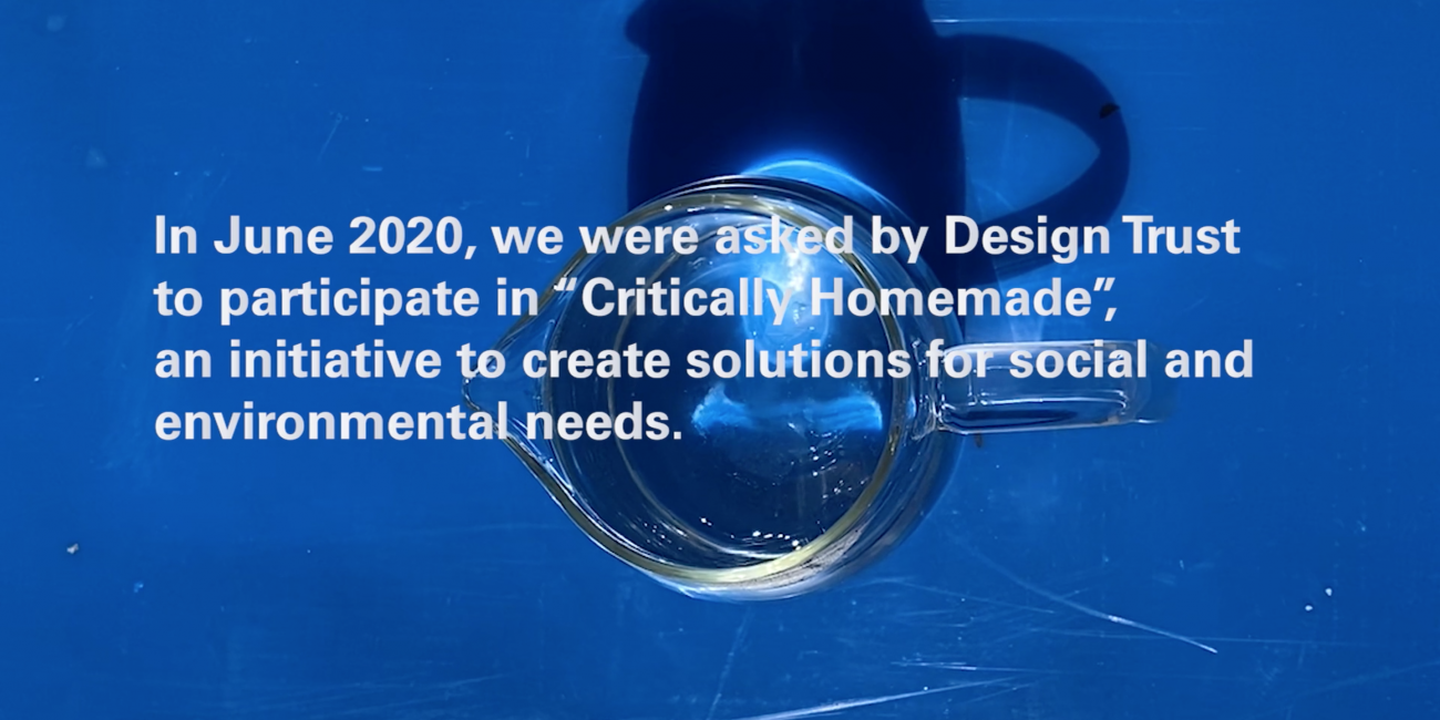
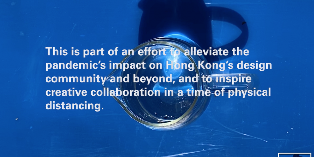
‘Critically Homemade’ prototypes designed during 2020’s first lockdown in New York City and showcased at the Design Trust’s exhibition in Hong Kong.
The SO–AP objects demonstrate the designers’ desire to repurpose their visions for the current needs of society – to protect individuals themselves, protect people they love, and also protect strangers that are loved by others. These soaps explore the experience of what it feels to hold a building in our hands, to use it every day intimately.
Design
Co-creation, product development and production.
Designed by: Jing Liu, Emma Silverblatt, Yuanjun Summer Liu and Astrid Steegmans, at SO–IL
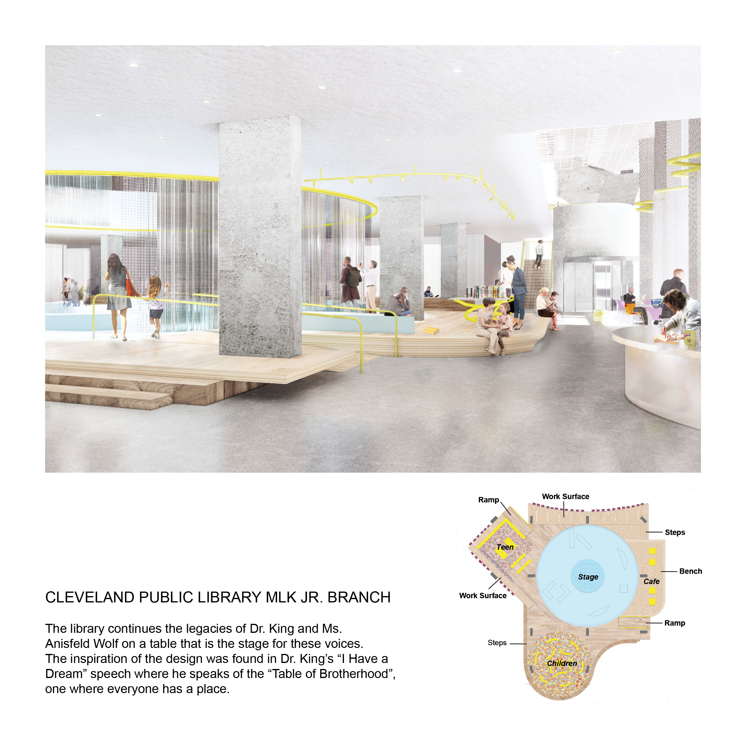
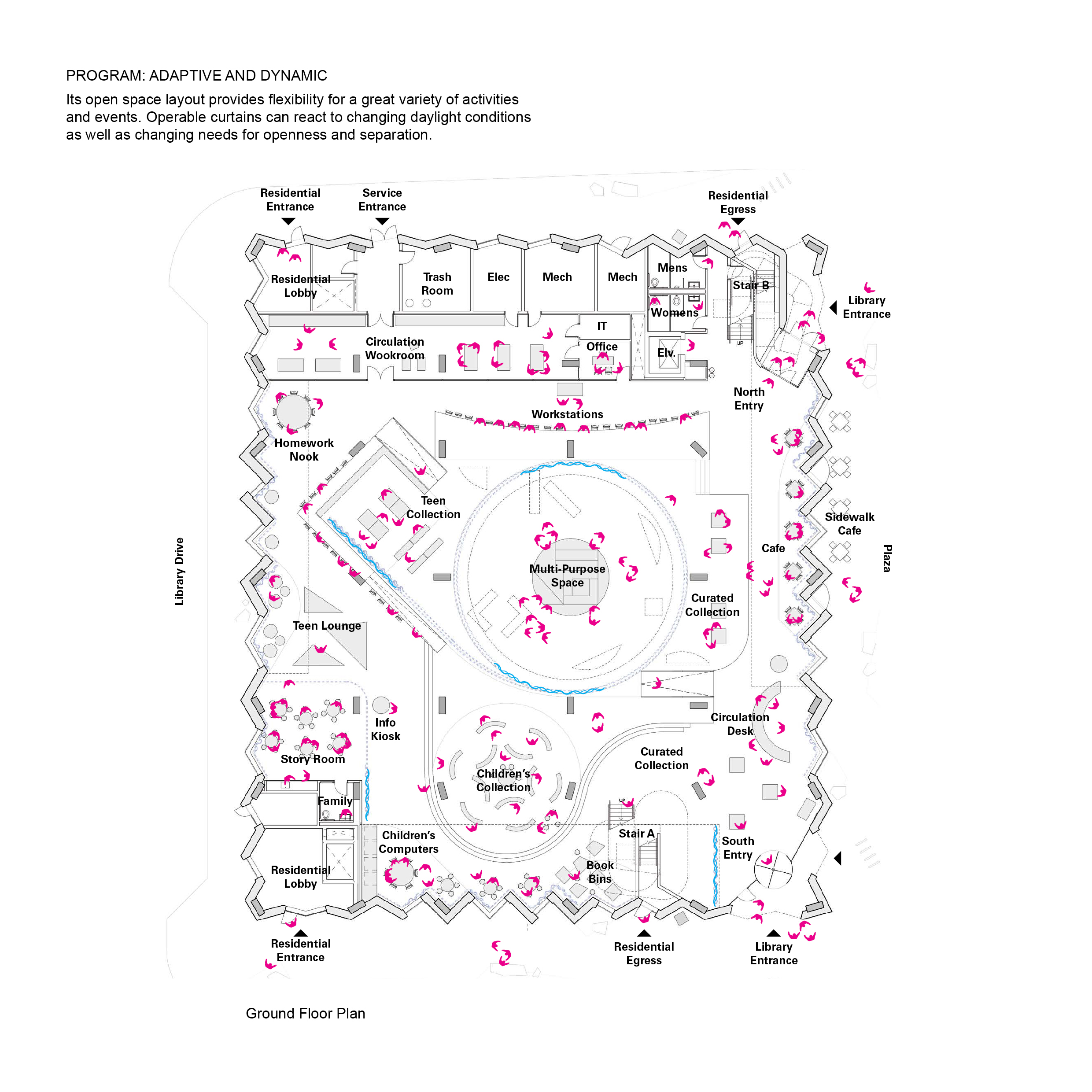
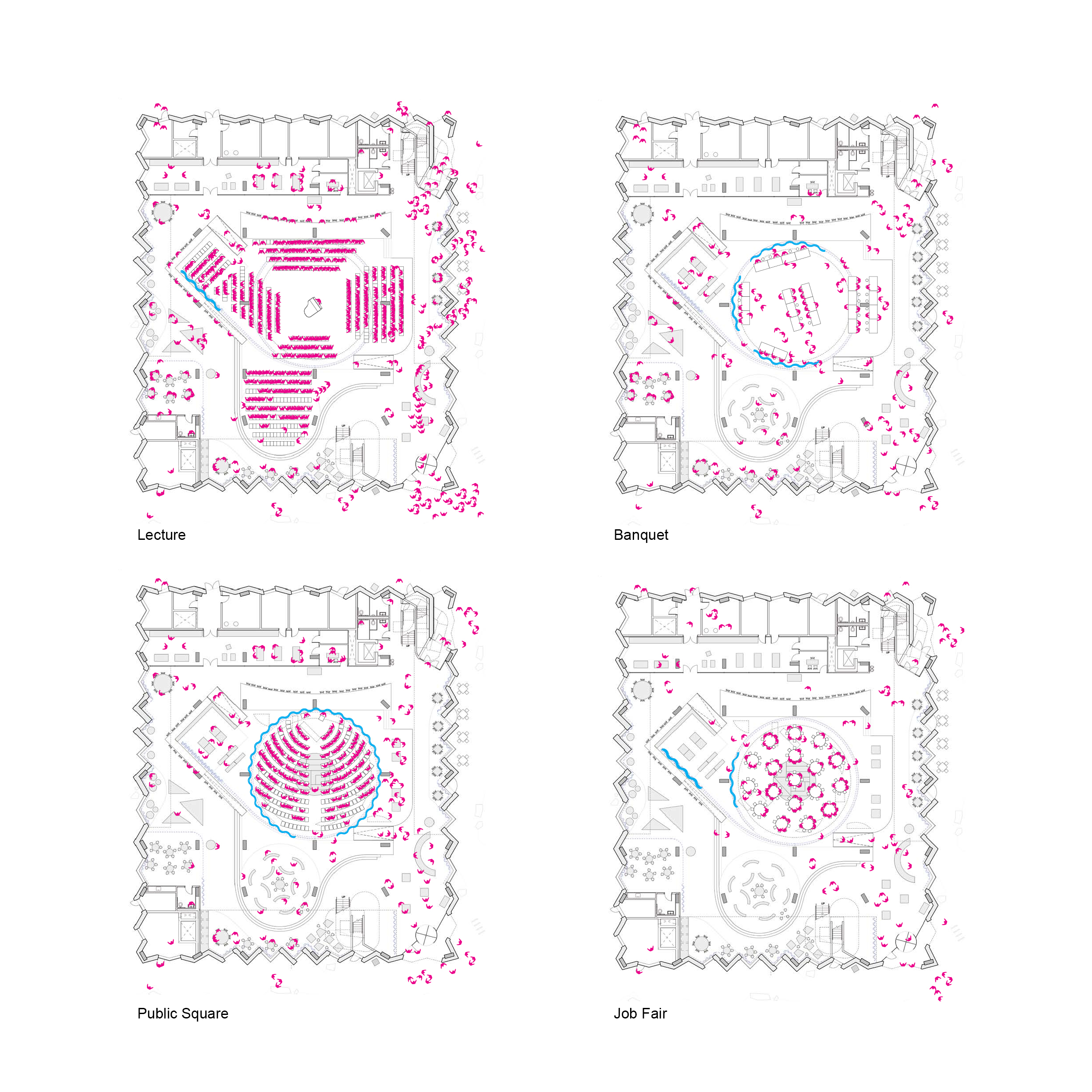
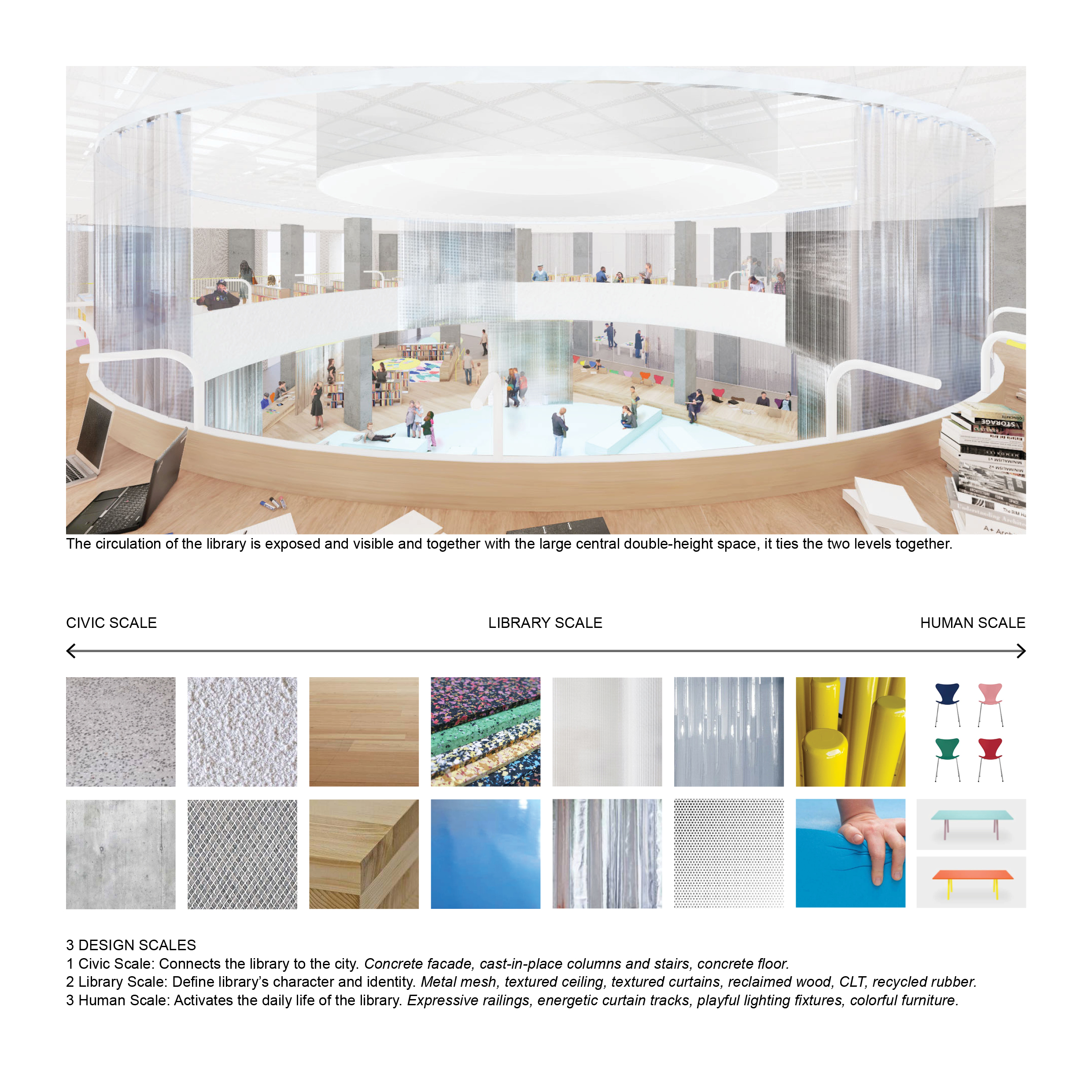
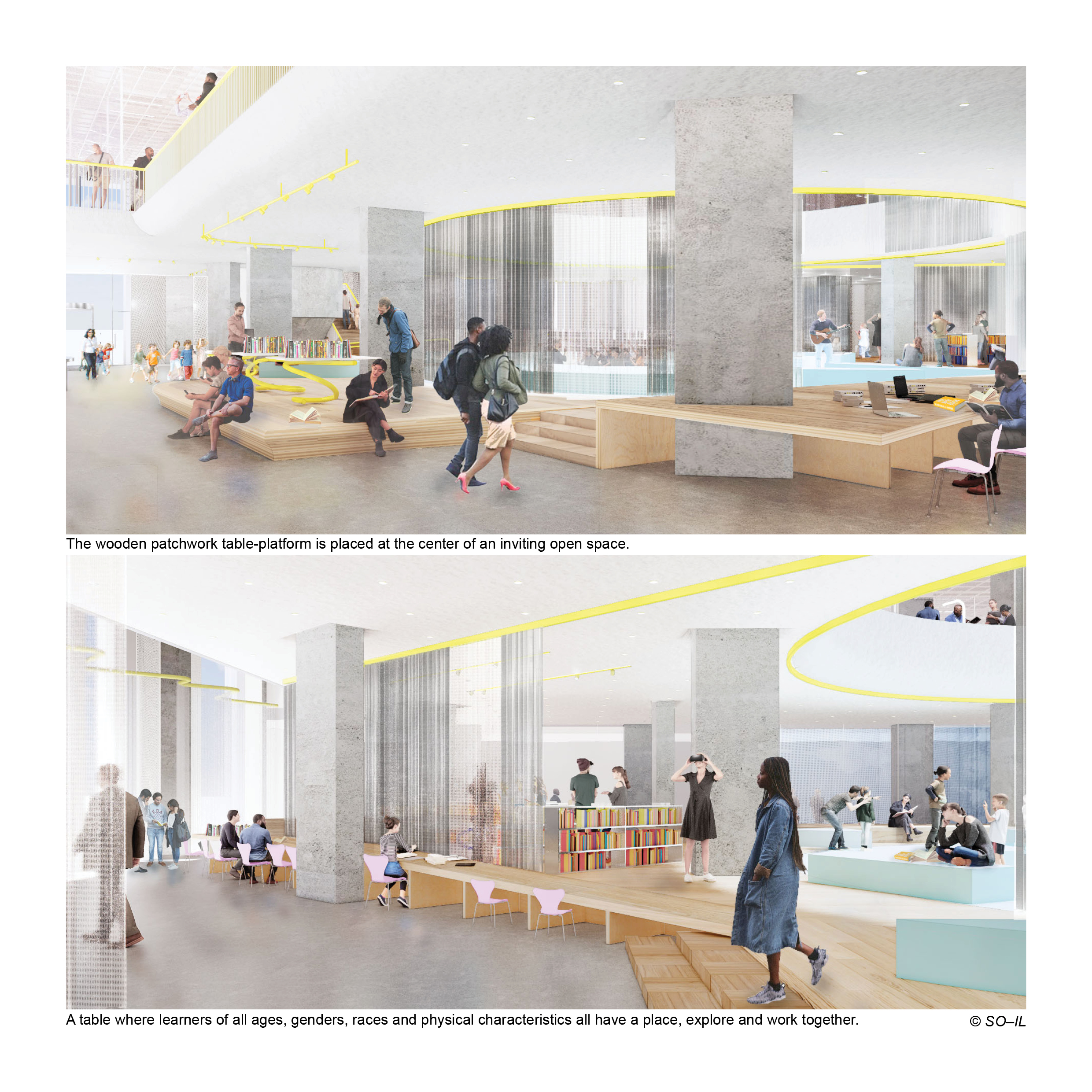
The library continues the legacies of Dr. King and Ms. Anisfield Wolf on a table that is the stage for these voices. The inspiration of the design was found in Dr. King’s “I Have a Dream” speech where he speaks of the “Table of Brotherhood”, one where everyone has a place.
Architecture, Interior
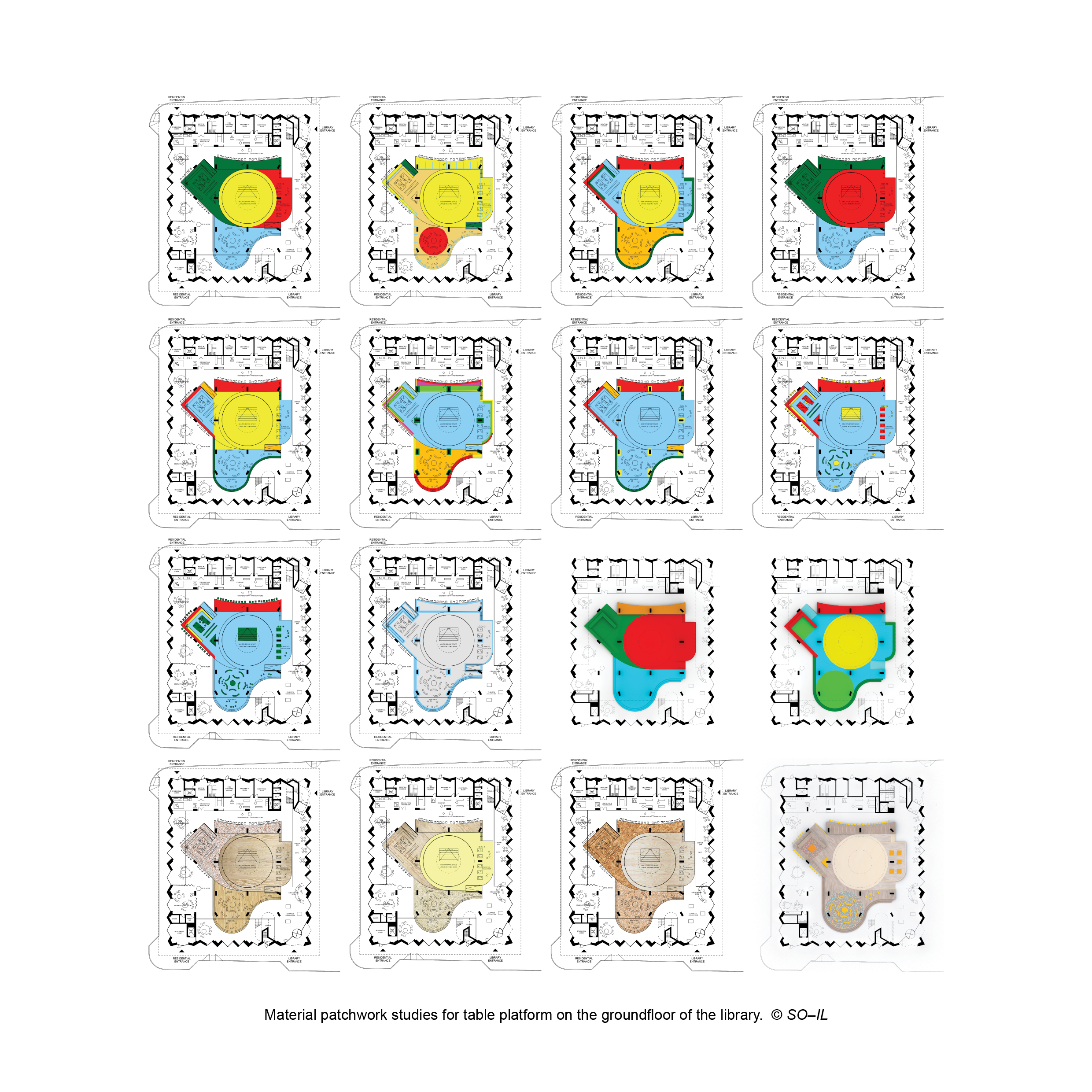
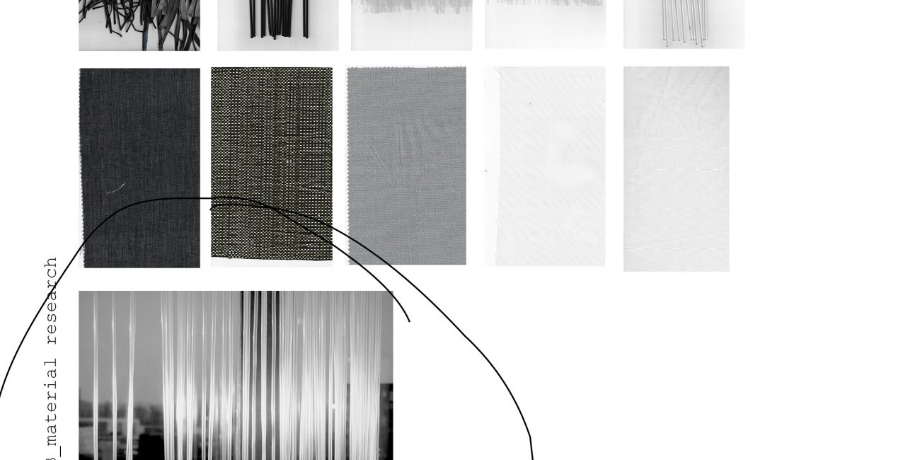
Layout and concept studies, material research, platform studies, interior consruction drawings.
At SO–IL in collaboration with JKURTZ.
2020-…, in process
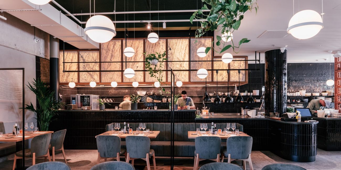
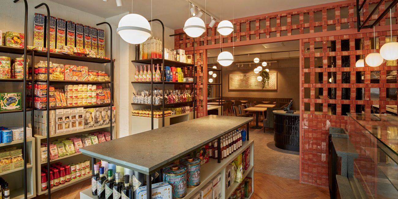
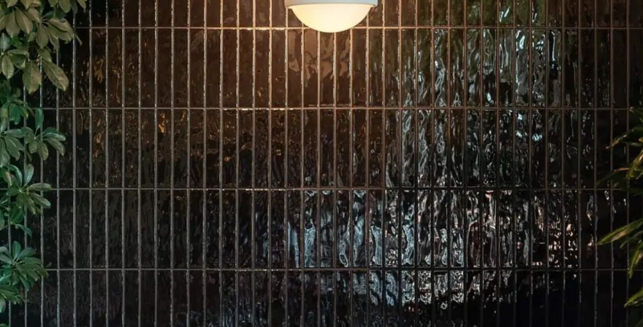
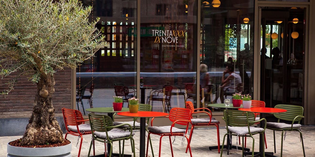
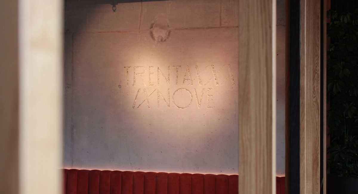
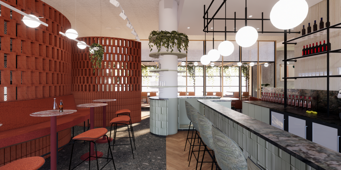
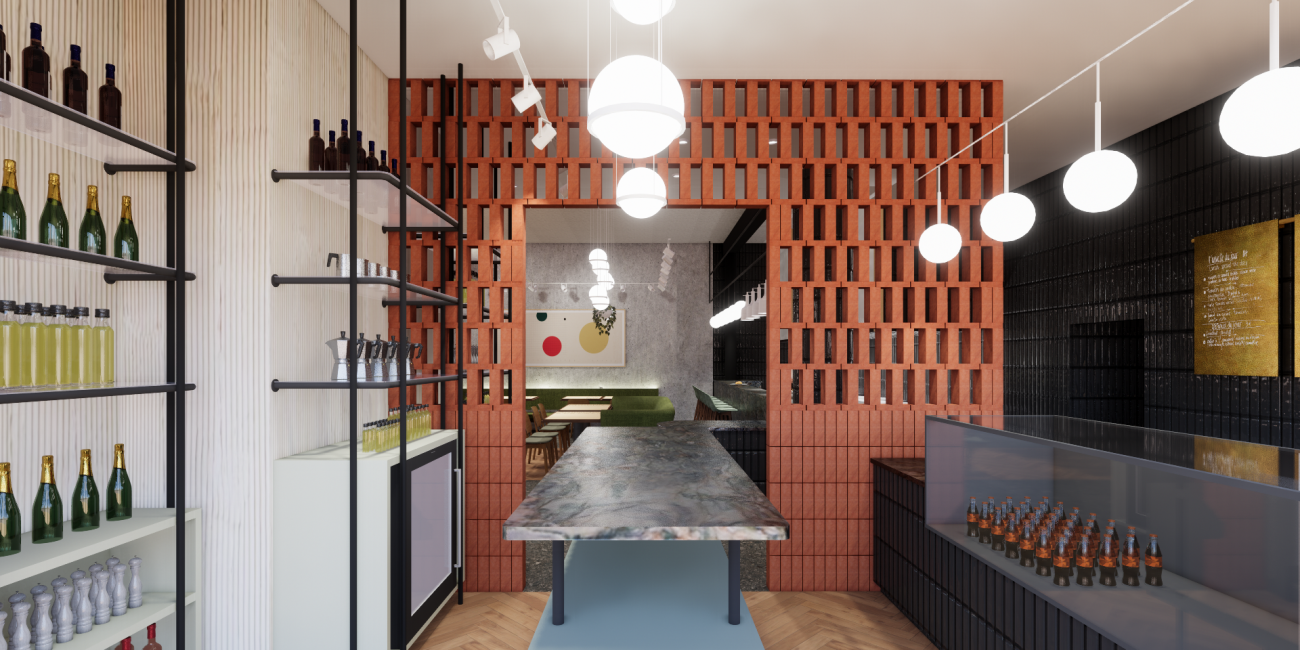
Trentanove
Limburg’s honored chef ‘Giovanni’ just opened a new Gastronomia Italiana in the city center of Hasselt, Belgium.
Design, Interior
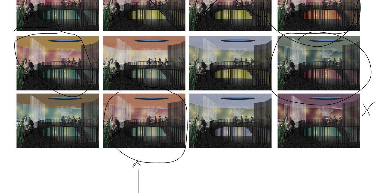
Material and color studies, furniture, renders.
At Creneau Int.
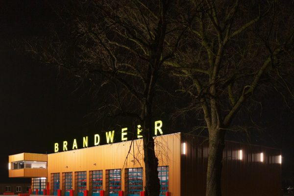
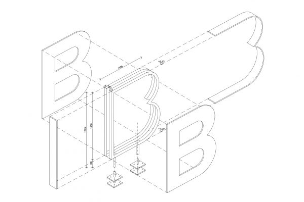
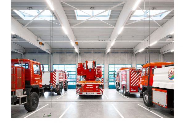
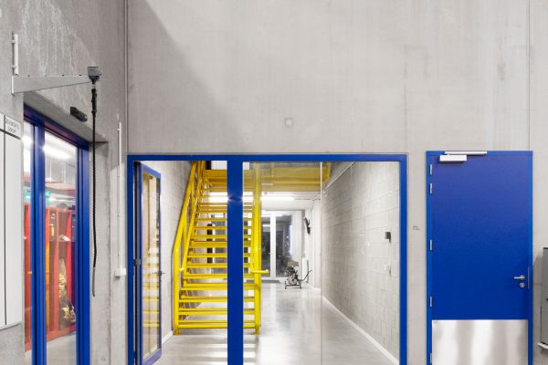
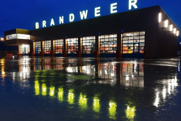
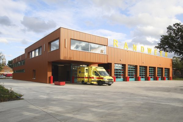
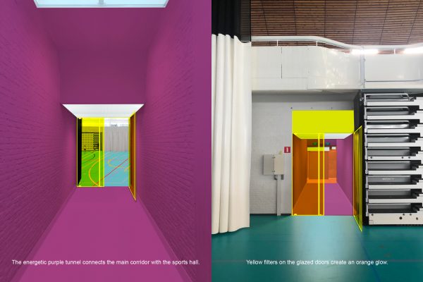
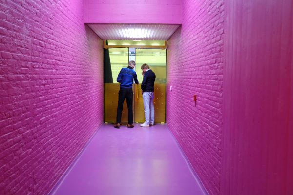
Fire Station Leopoldsburg
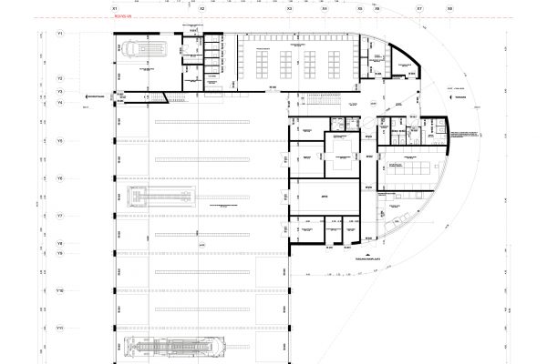
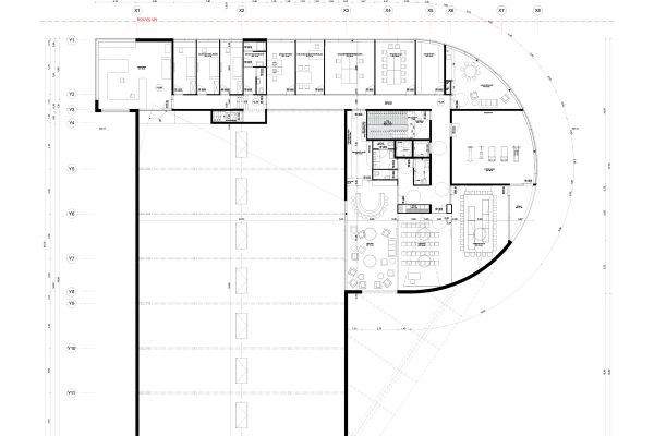
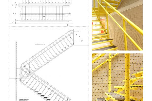
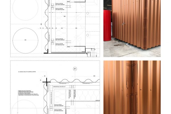
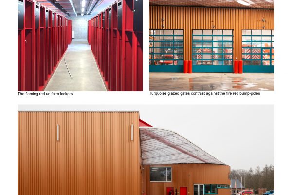
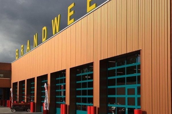
The new fire station in Leopoldsburg, Belgium, has a central depot with all the necessary needs cleverly organized to realize a fast pull-out in case of an emergency.
The energetic colors of the design reflect and support the willingness of the firemen and give these heroes the place on the map they deserve!
Architecture, Interior
Design and Build
Permission documents, interior layouts, material research and color studies, construction drawings.
At BEL Architecten in collaboration with Point Supreme and Bureau Bouwtechniek.
2017-2019, completed.
Images © Luca Beel
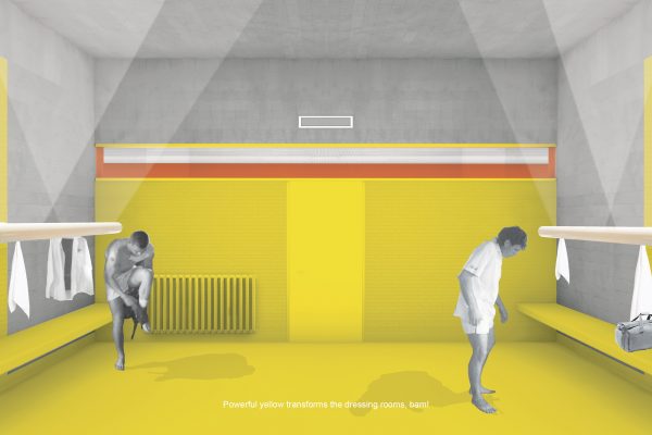
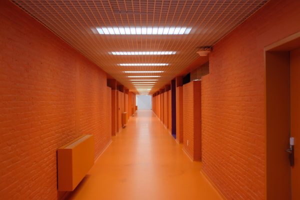
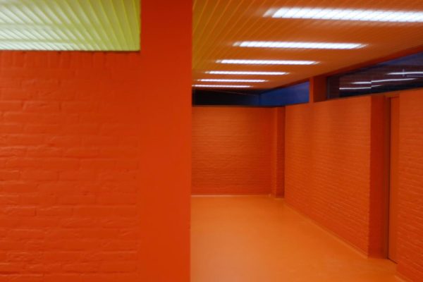
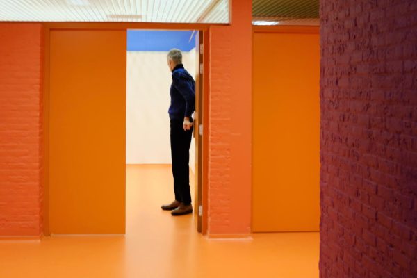
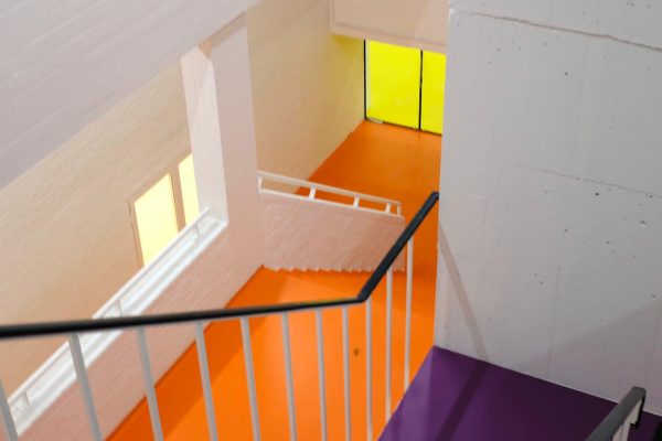
Interior renovation of a sports complex in Herentals, Belgium
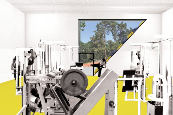
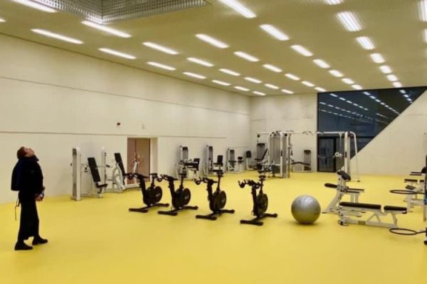
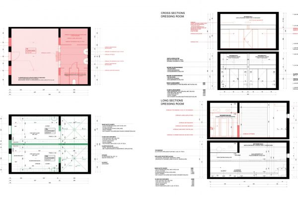
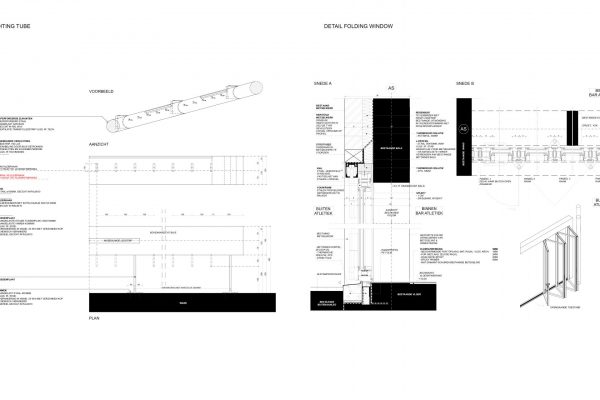
The renovation includes the dressing rooms, circulation spaces, and smaller sports halls such as two dojos and a power-training room. The didactic and energetic color choices resulted in an economic yet fresh medium to bring this senior sports complex from the ‘70 back alive and kicking! A custom-designed steel white tube serves as coat hangers and illumination elements.
Architecture, Interior
Color studies, furniture research, layout drawings, construction drawings
At BEL Architecten.
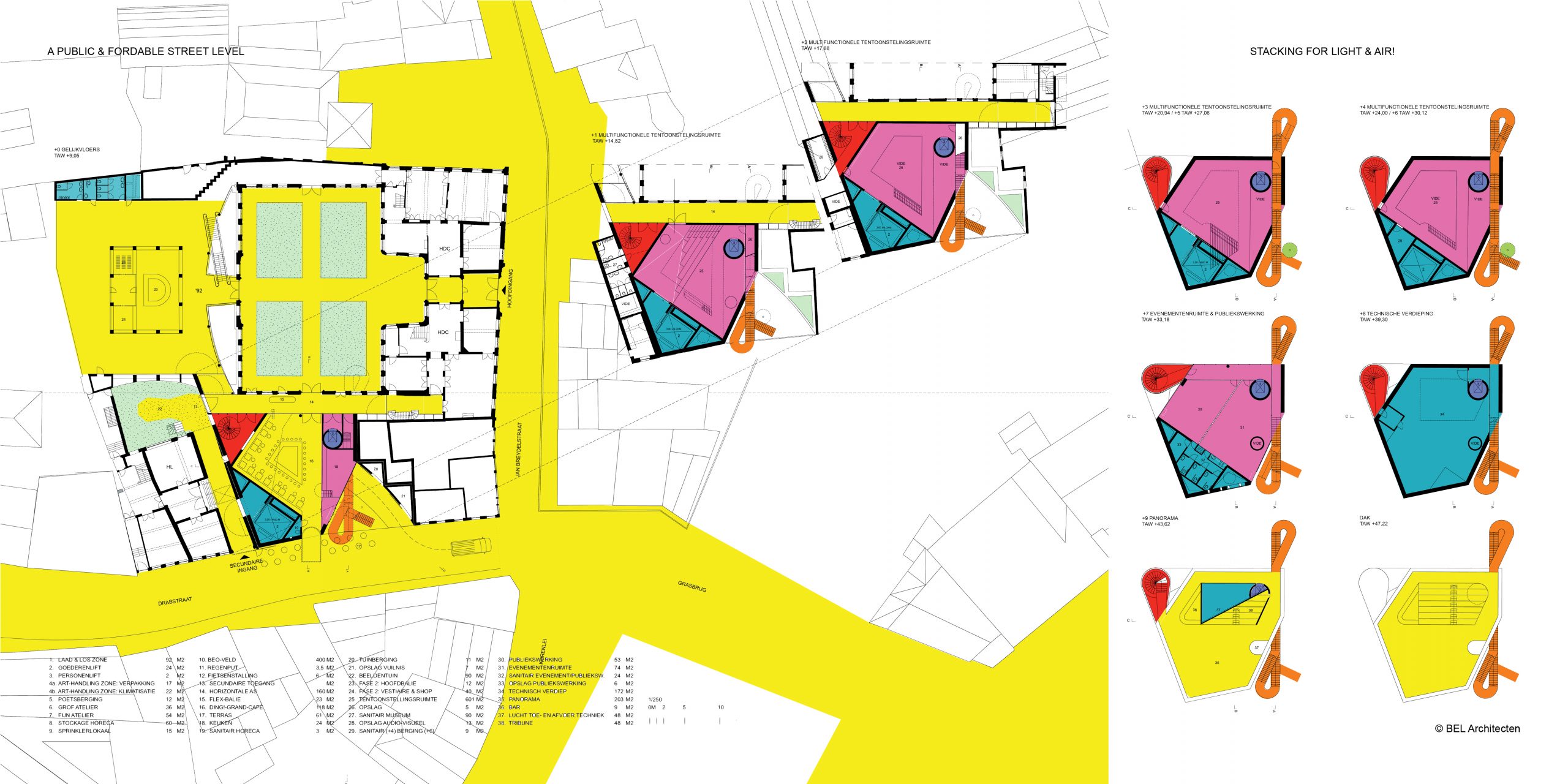
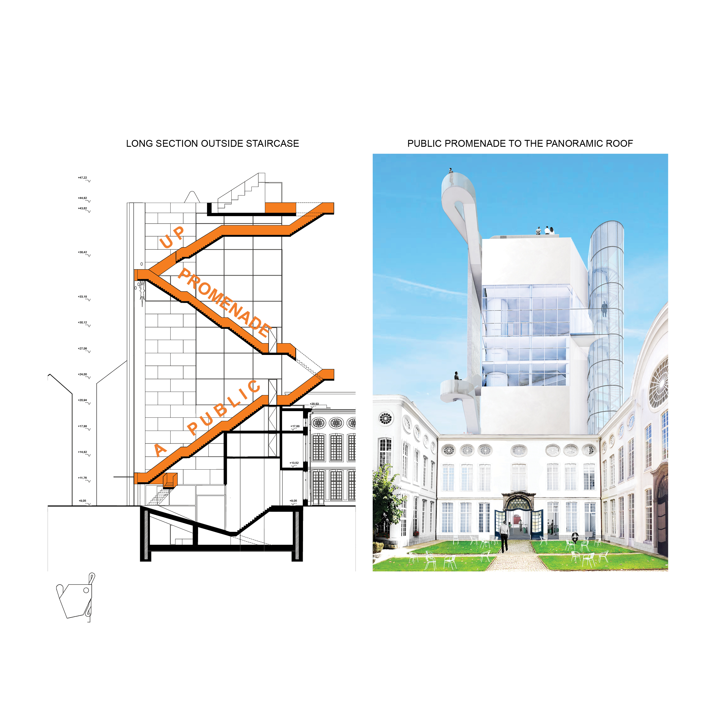
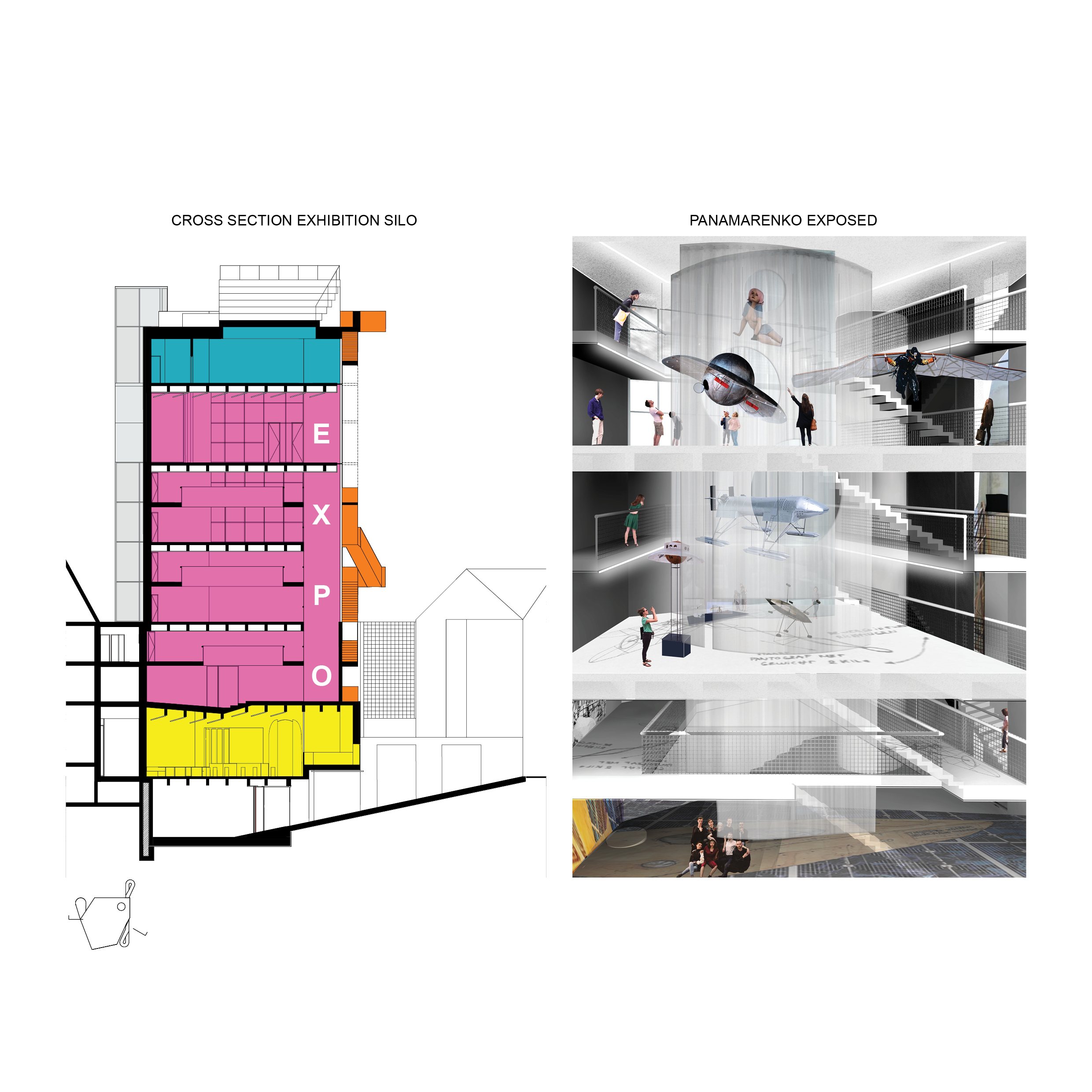
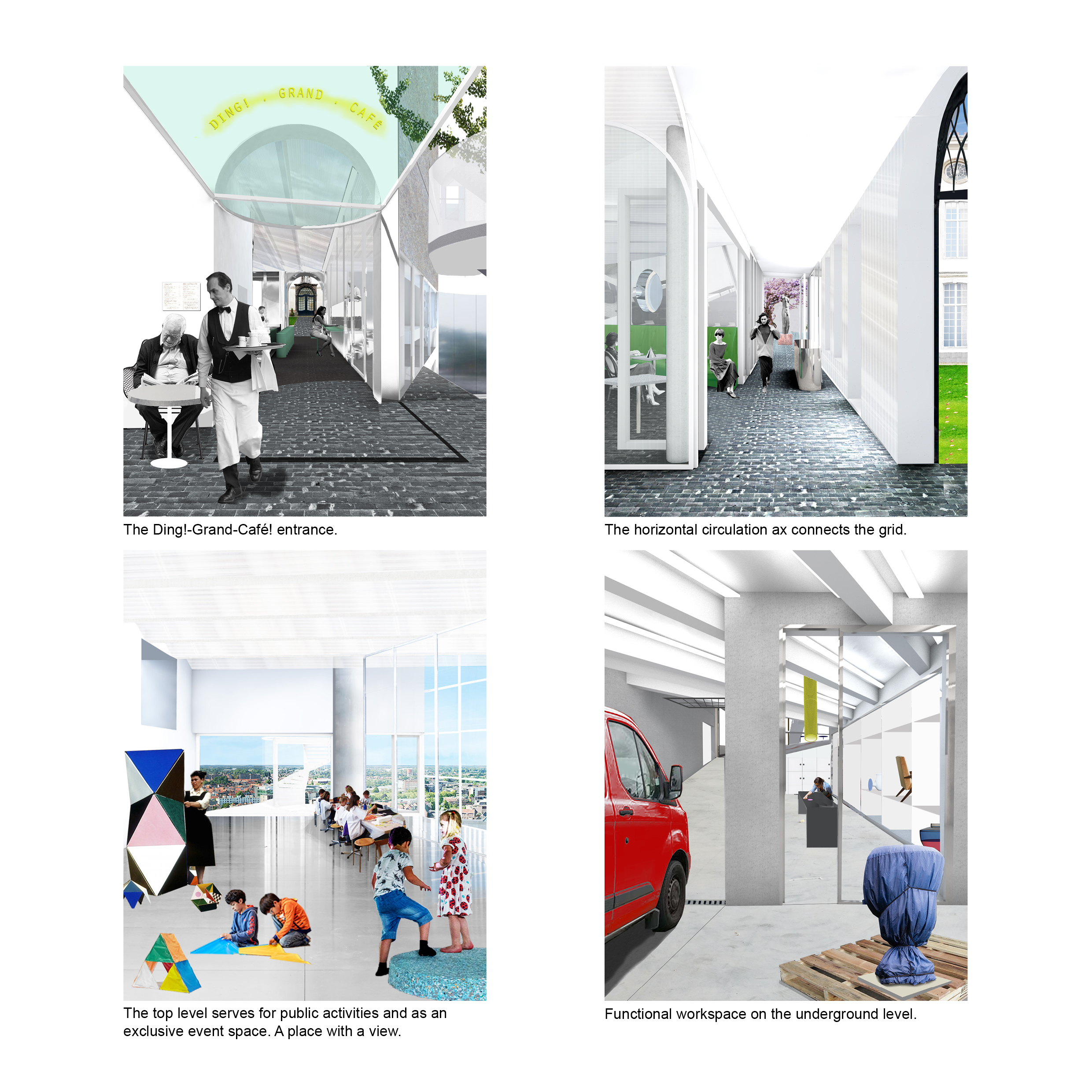
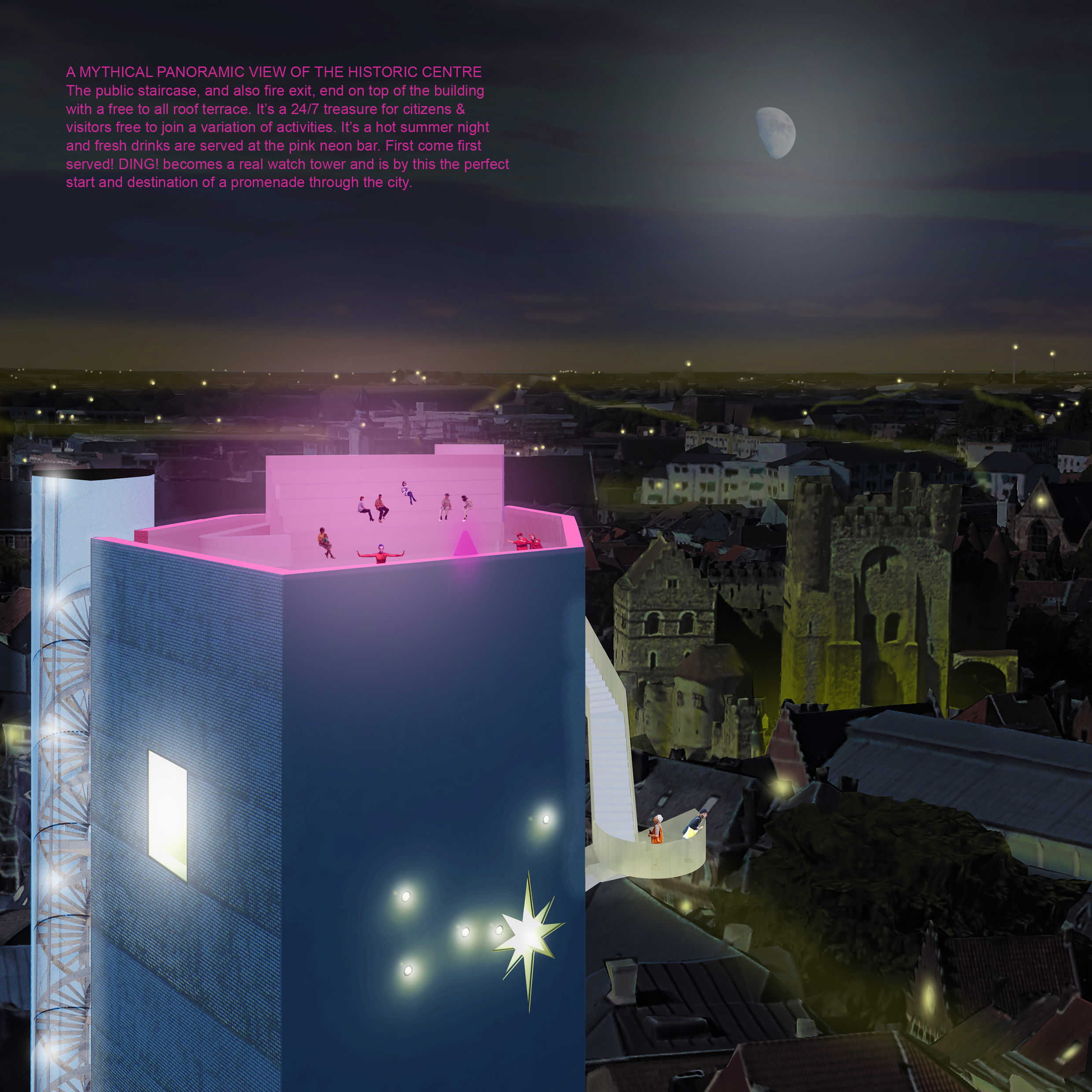
Design Museum Ghent Competition
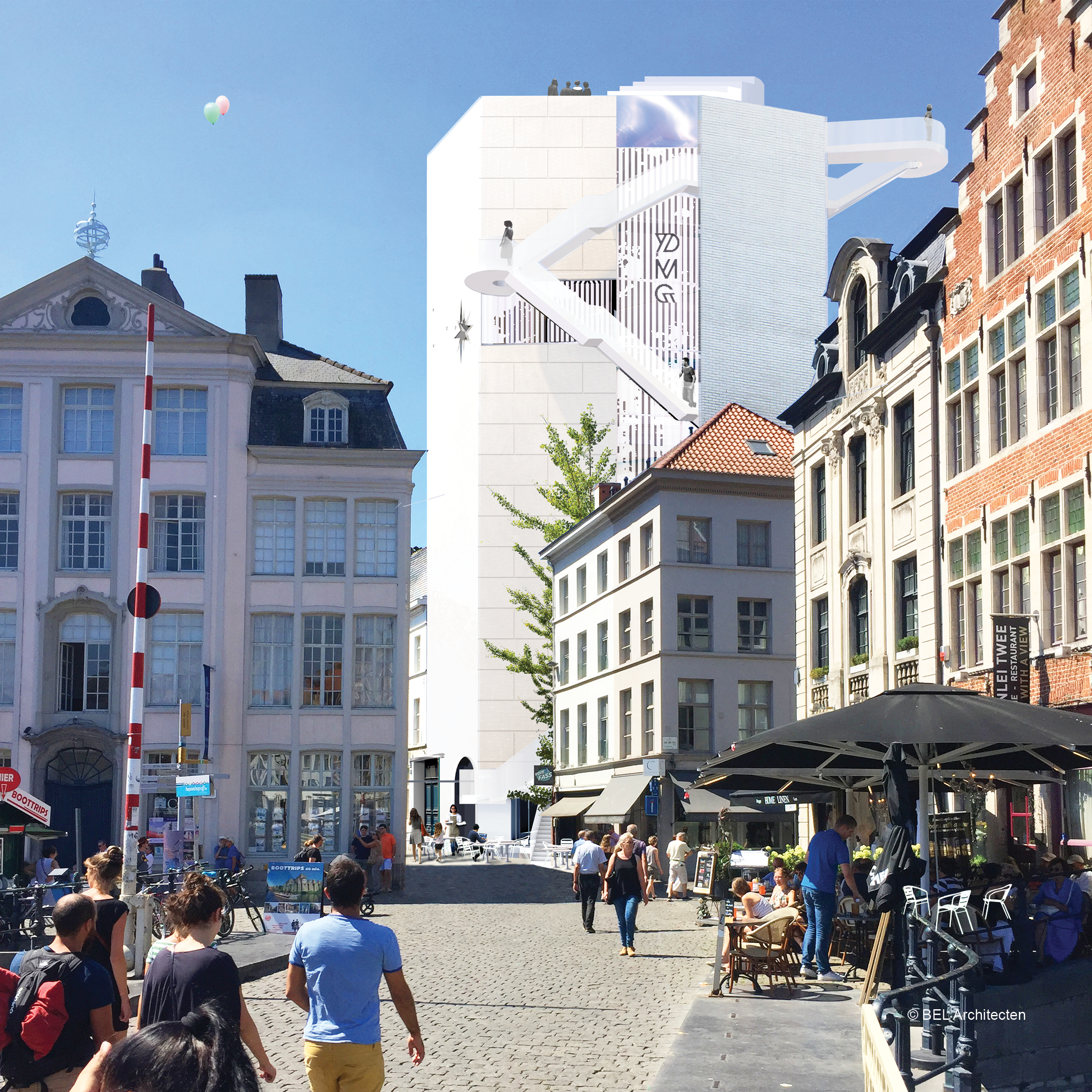
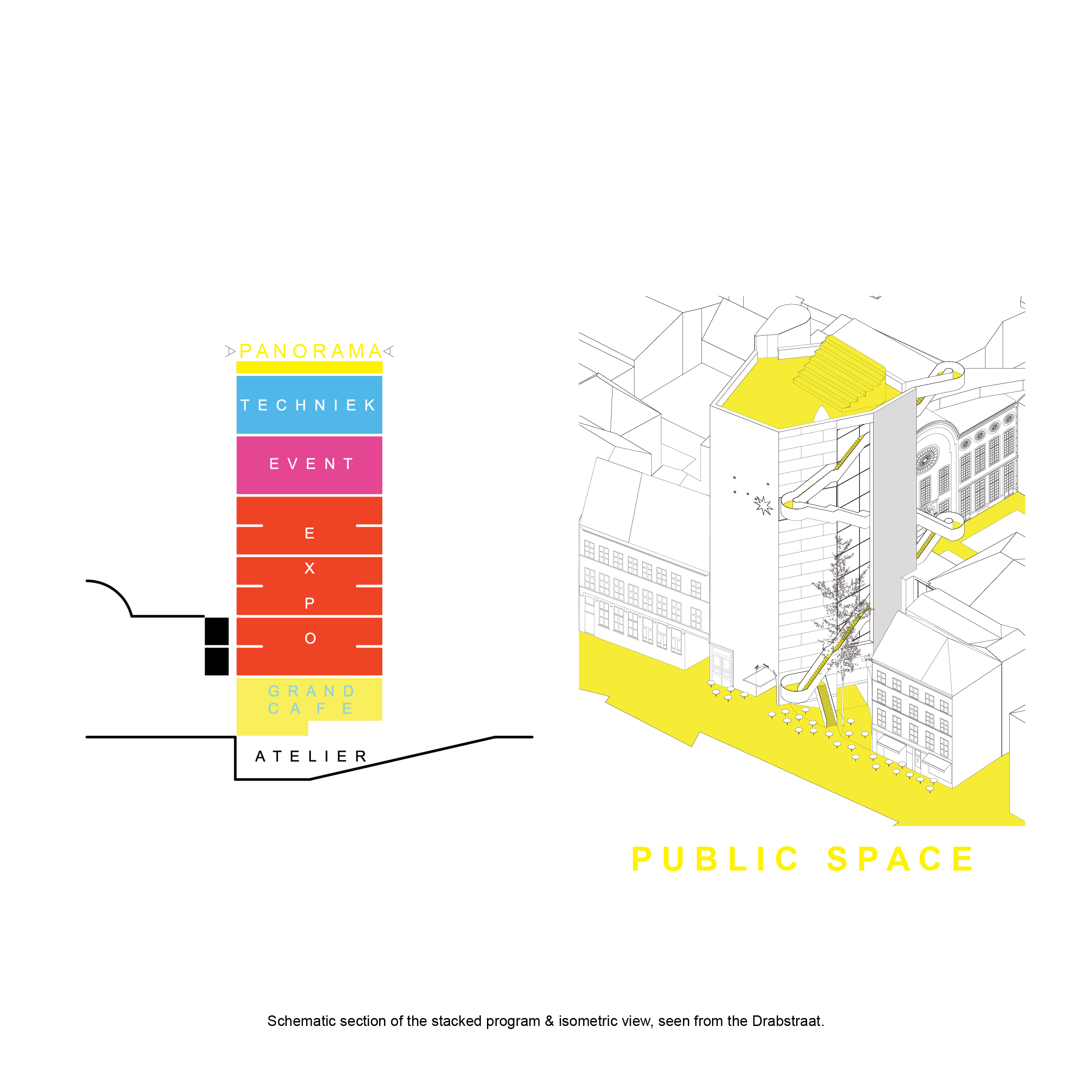
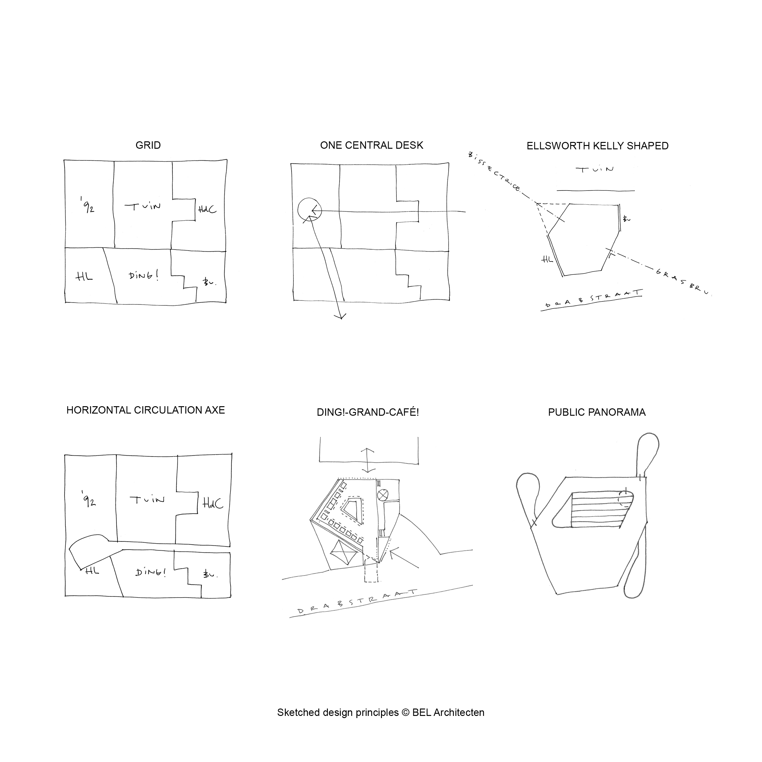
Complete study contract for the extension of the Design Museum in Ghent with a new wing in the Drabstraat. Implanted in an enclosed urban web with historical townhouses in the middle of the city center.
Architecture, Interior
Concept, design & model
At BEL Architecten, in collaboration with Inside Outside Petra Blaisse.
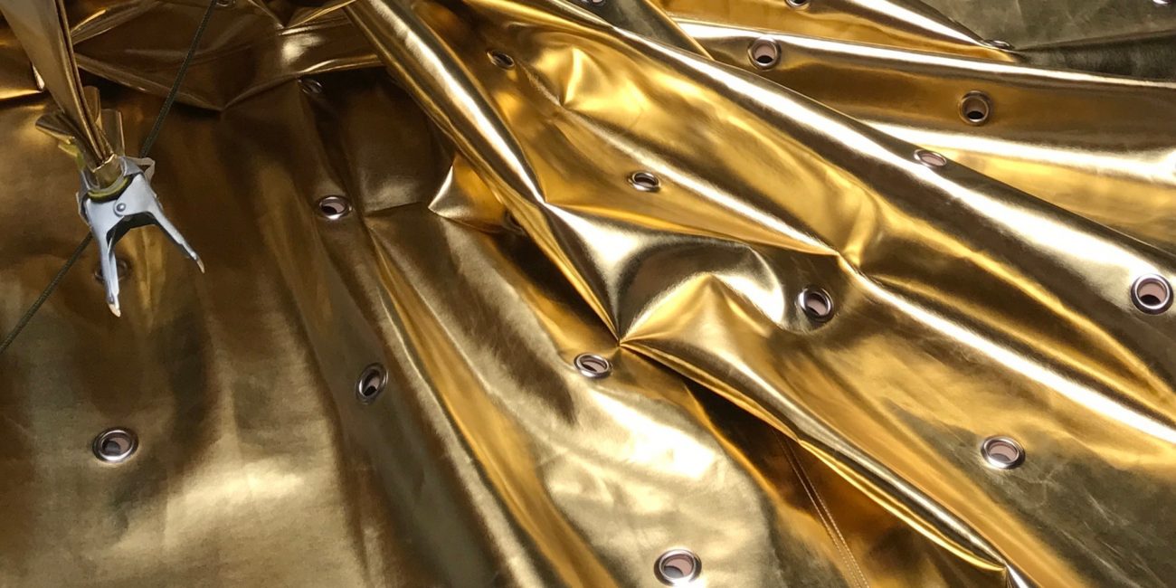
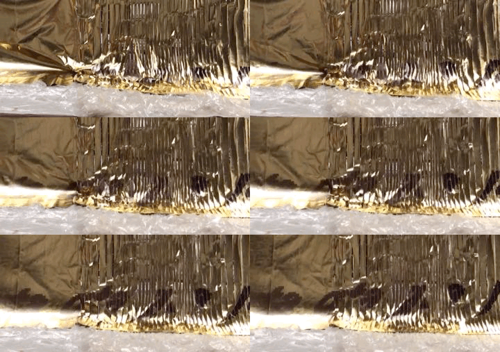
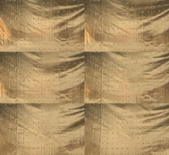
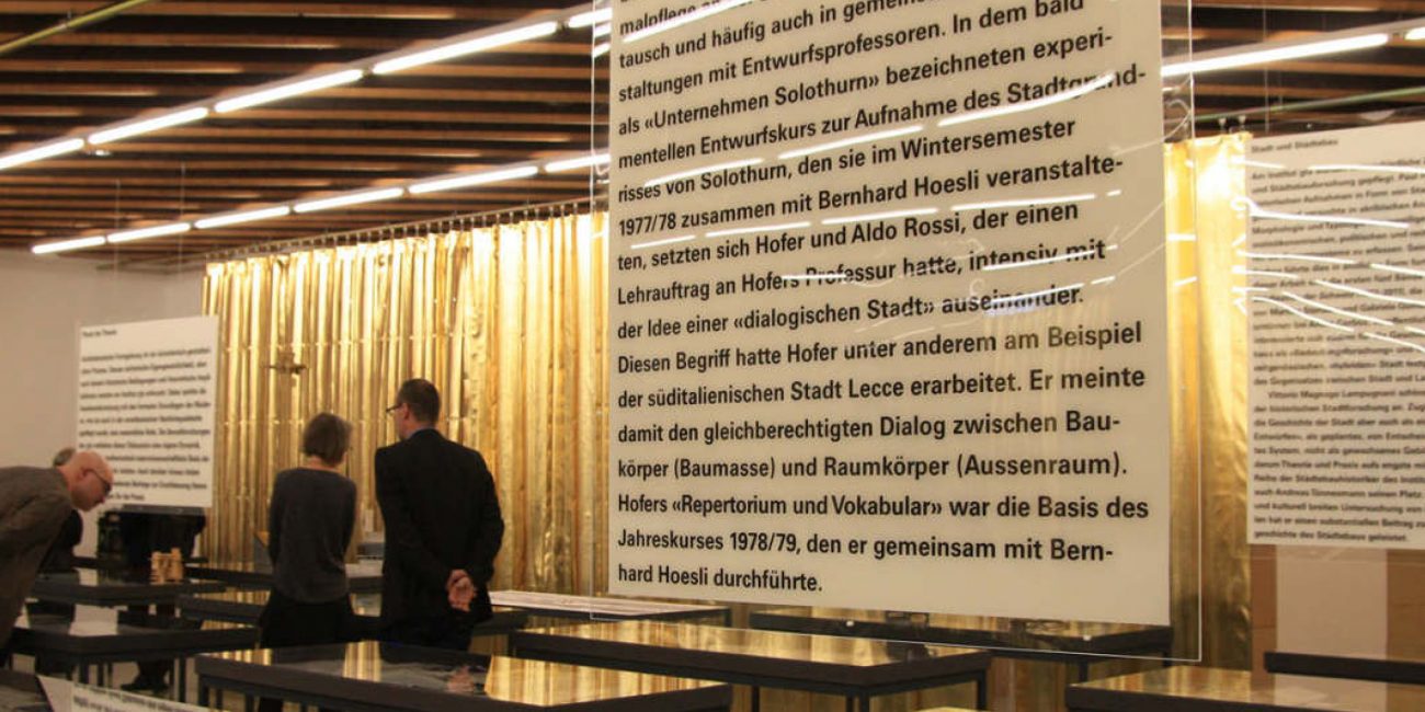
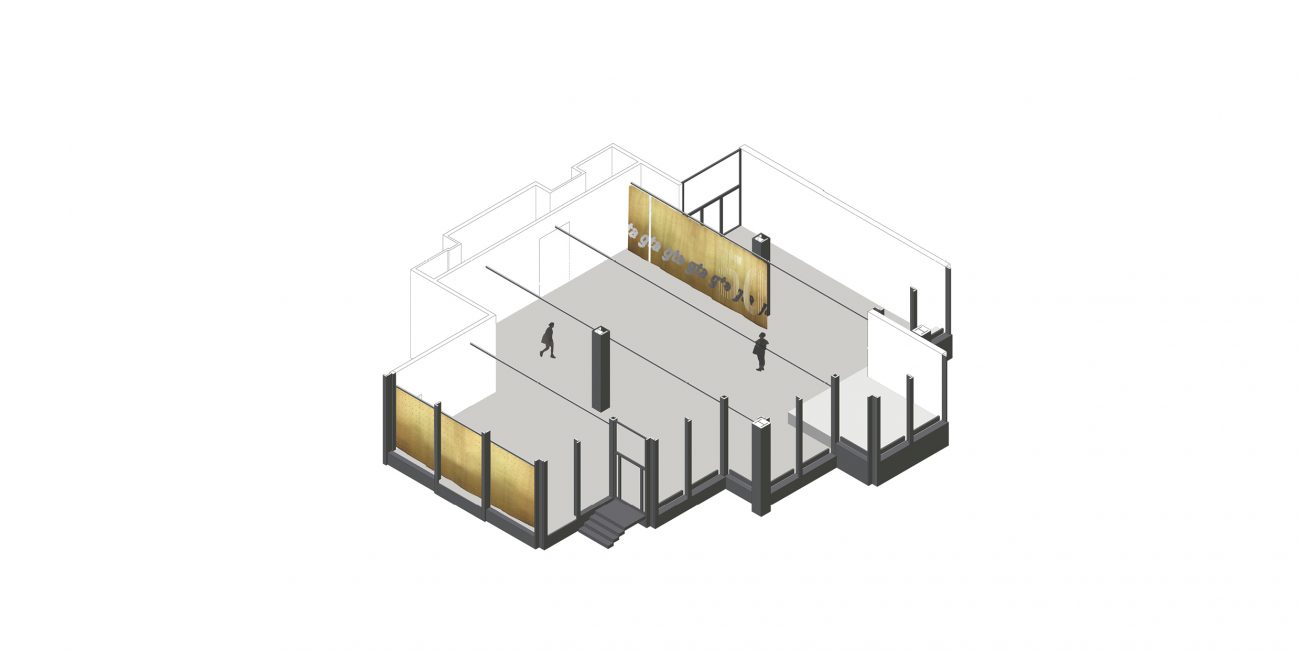
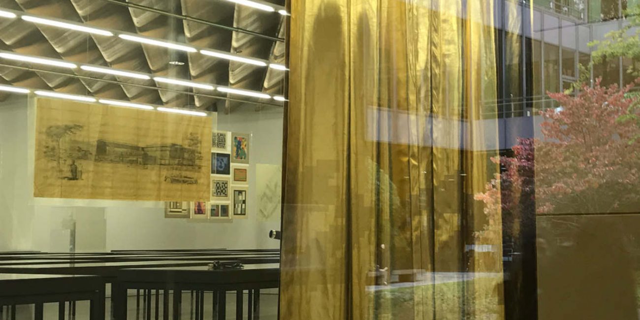
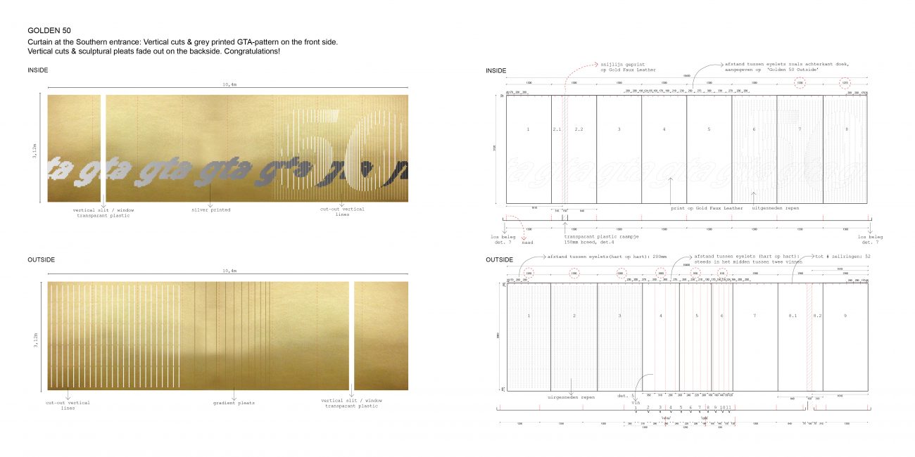
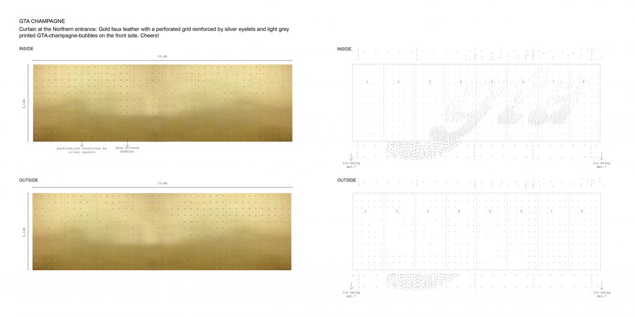
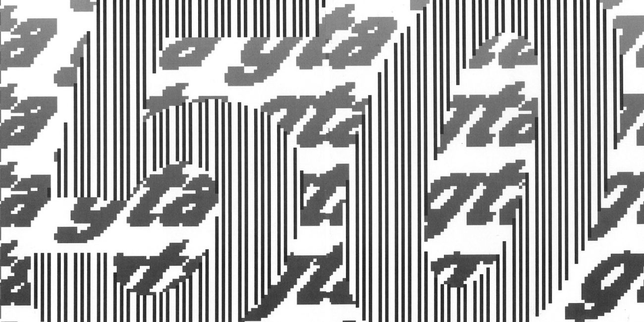
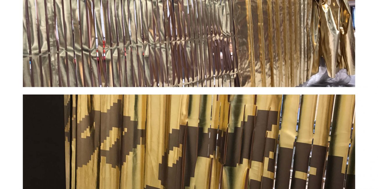
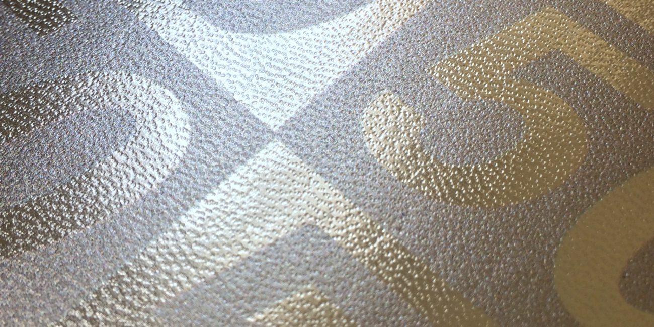
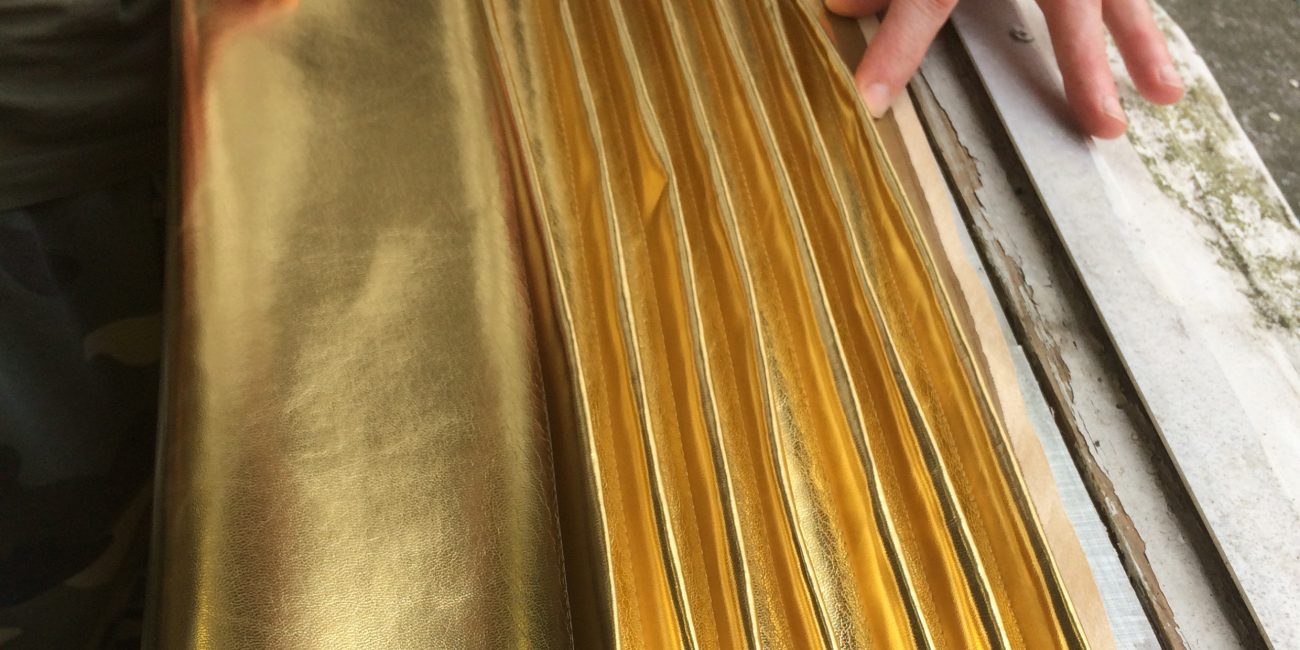
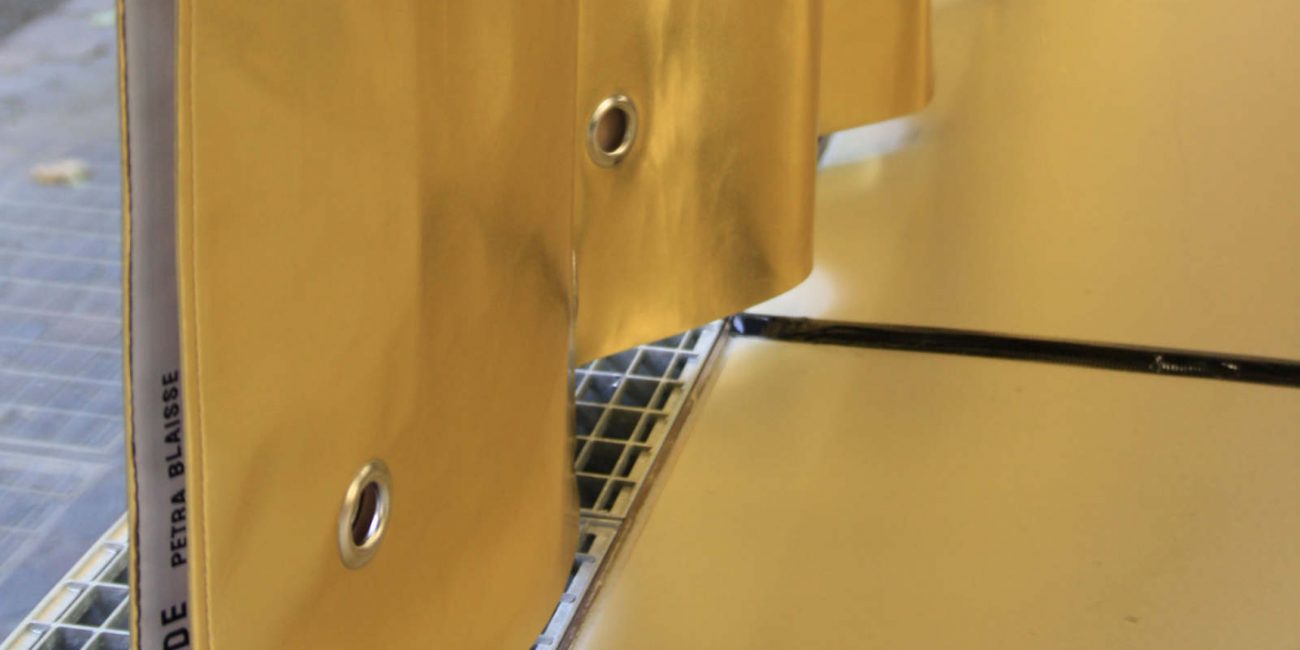
Two golden jubilee curtains
Designed and produced for the celebration of the 50th anniversary of the Insitute for History and Theory of Architecture or Geschichte und Theorie der Architektur, GTA in Zurich, Switzerland. Hurray!
Design, Interior
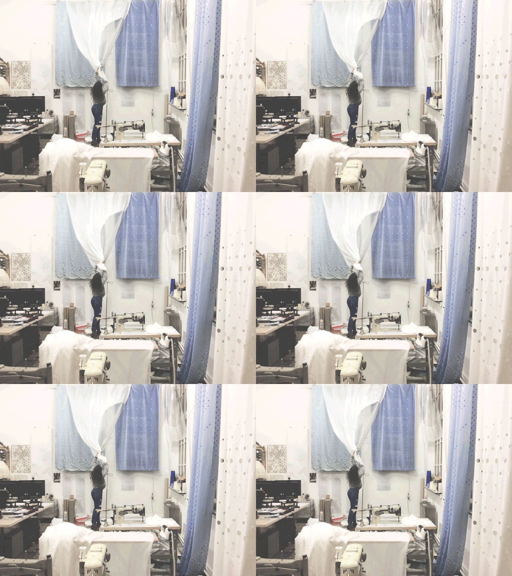
Concept design, material research, production drawings.
Completed in 2017.
At Inside Outside Petra Blaisse
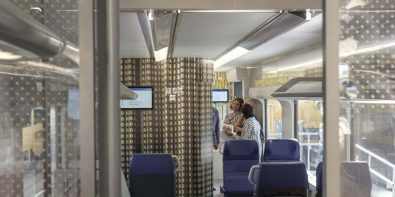
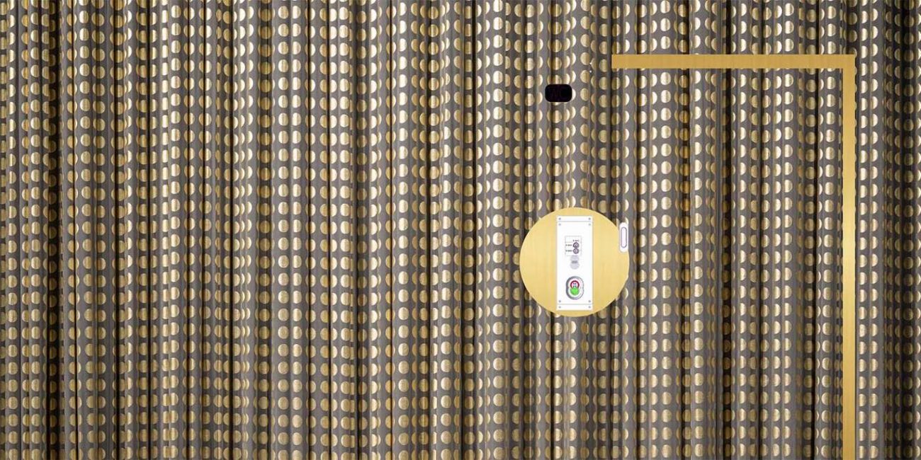
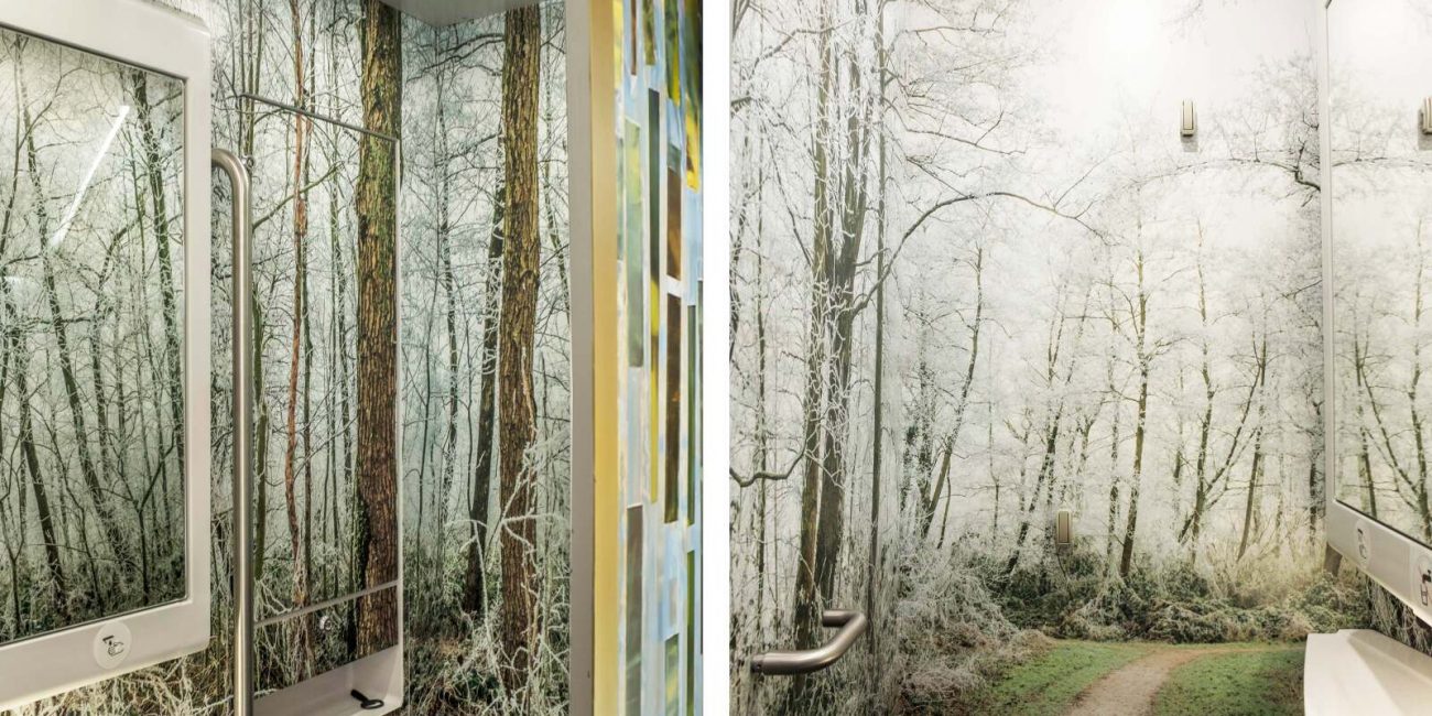
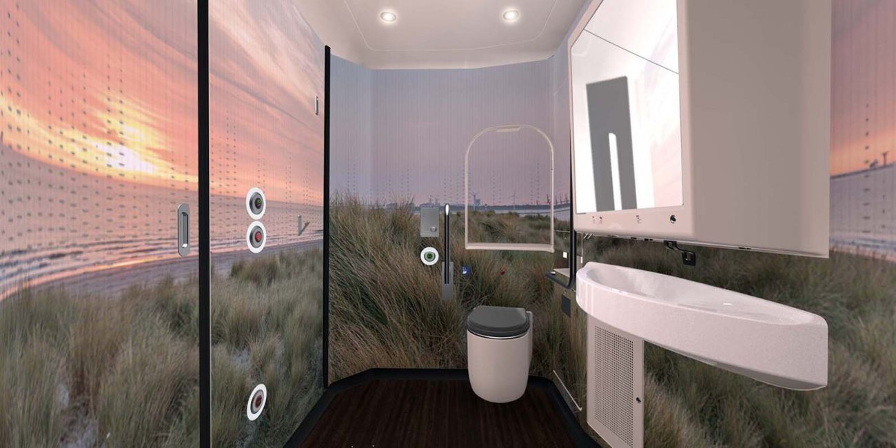
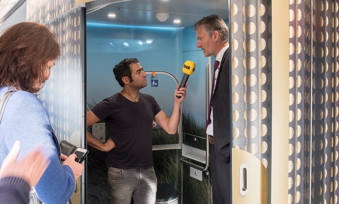
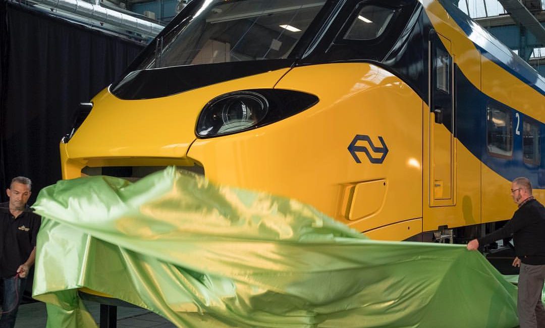
Art design of the New Intercity Trains: foil prints on walls of the train’s toilet.
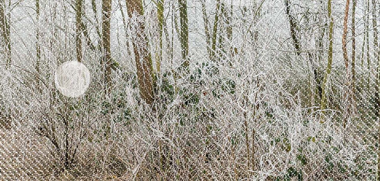
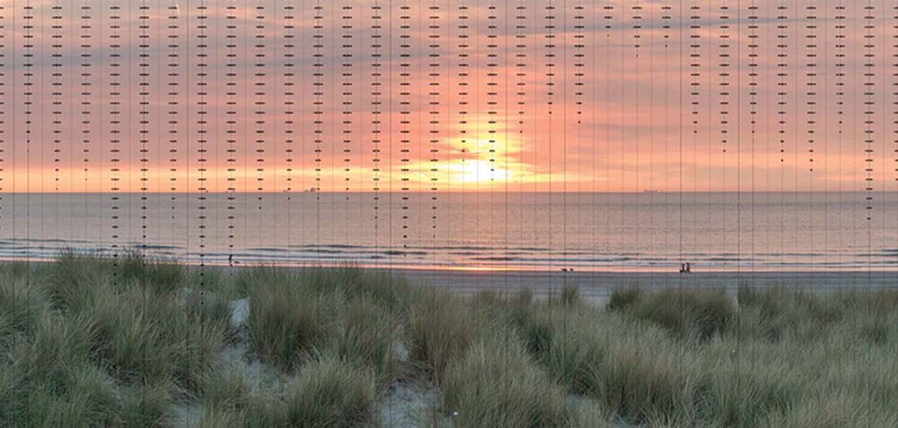
Upon entering the train, the toilets are immediately visible and form part of the entrance. They are striking surfaces coated with elegant curtain images that give a festive atmosphere to the hall. The soft voluminous and pleated curtains play with the toilet’s shape by transforming it or strengthening it. Once you enter the highlighted door you suddenly step into another world. The unexpected Dutch landscape image with a certain season’s climate catches the visitor by surprise. It adds a new dimension; sometimes you seem to float, sometimes the space appears optically much larger by the panorama with a far view, sometimes you feel very sheltered.’ – IO
Design, Interior
Design development and production documents.
In use since 2022.
© Inside Outside Petra Blaisse
Images © Frans Parthesius
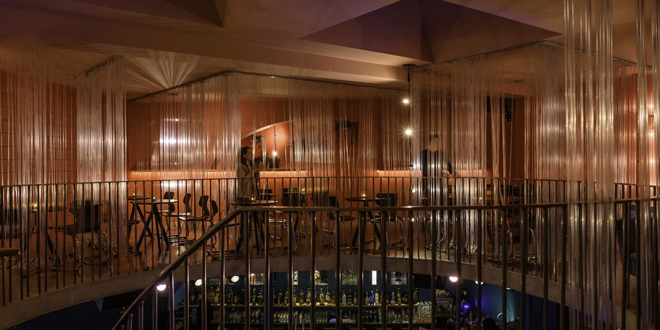
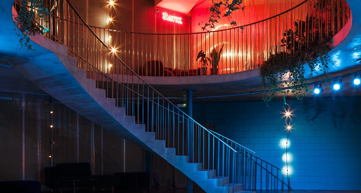
The interior renovation of a Cuban cigar & cocktail bar
Named after the one & only La Bodeguita Del Medio.
In Kortrijk, Belgium.
Design, Interior
Interior concept, material and color studies.
Developed at De Baes Architects.
Images © Frans Parthesius
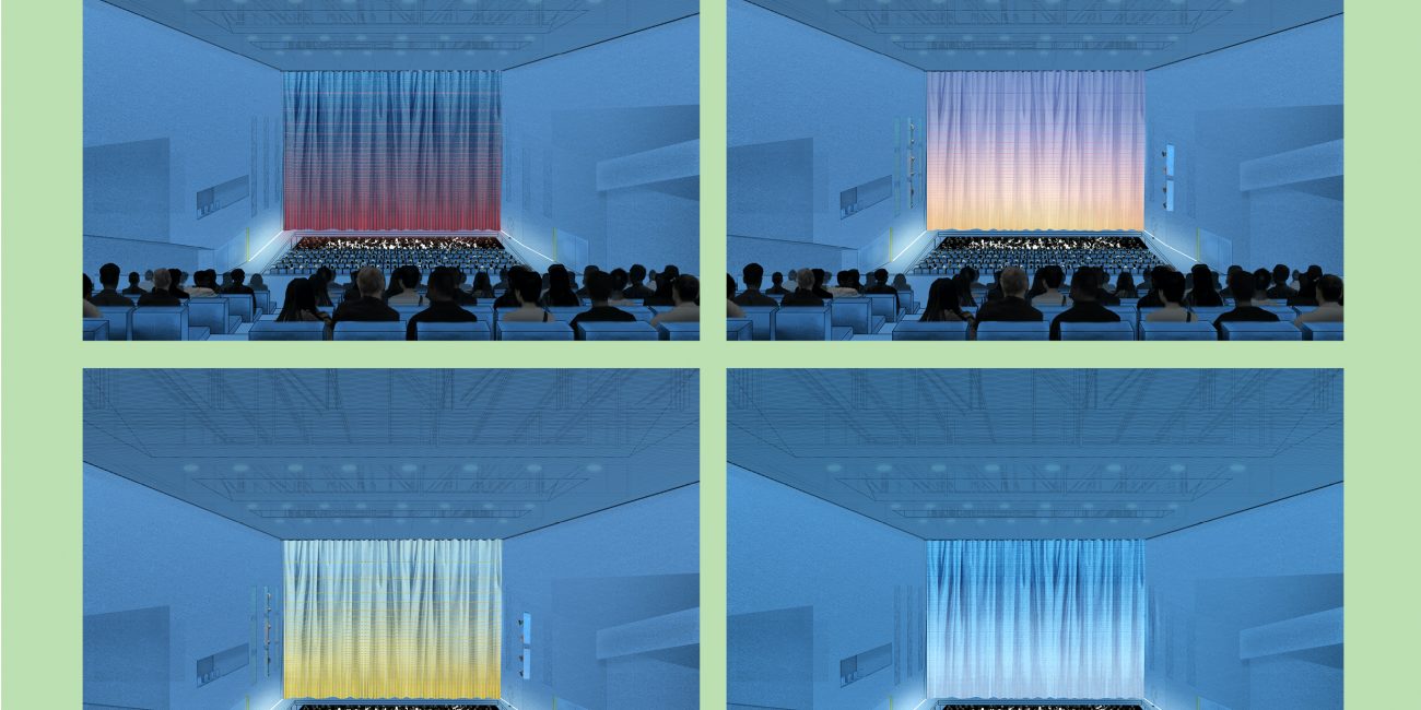
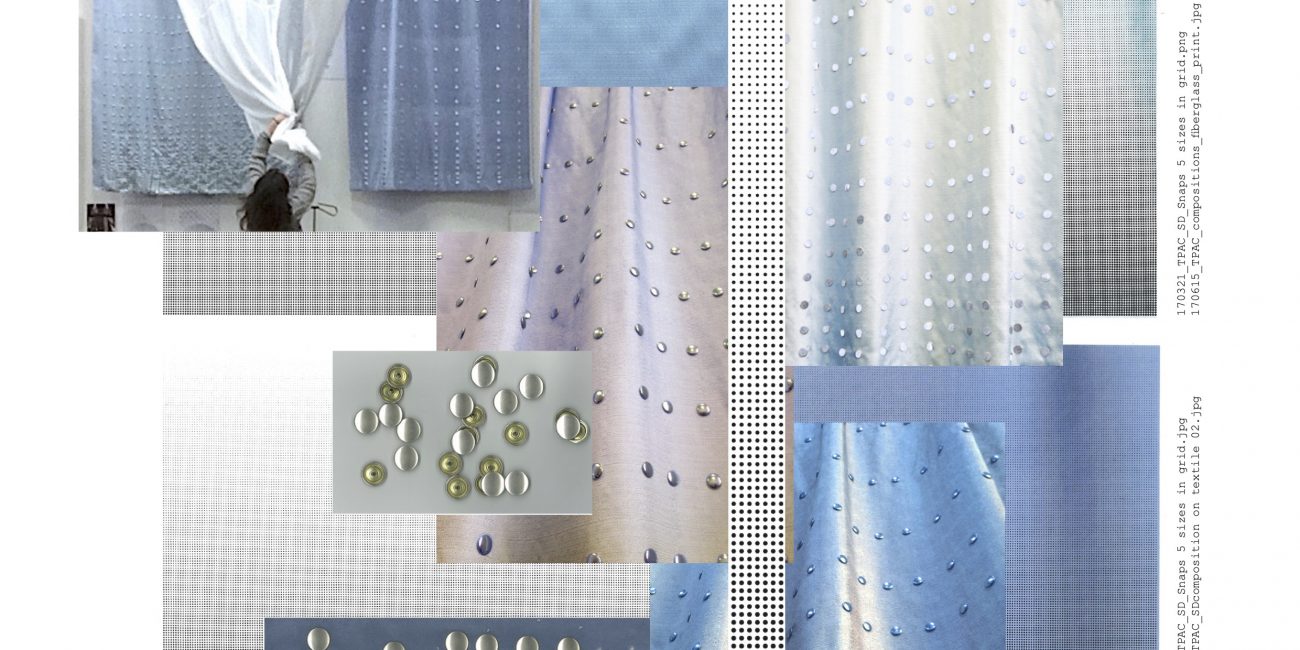
Stage Curtains samples and material studies.
For Taipei Performing Arts Center, TPAC by OMA in Taipei, Taiwan.
Design, Interior
Material research, mockups and visualization.
© Inside Outside Petra Blaisse
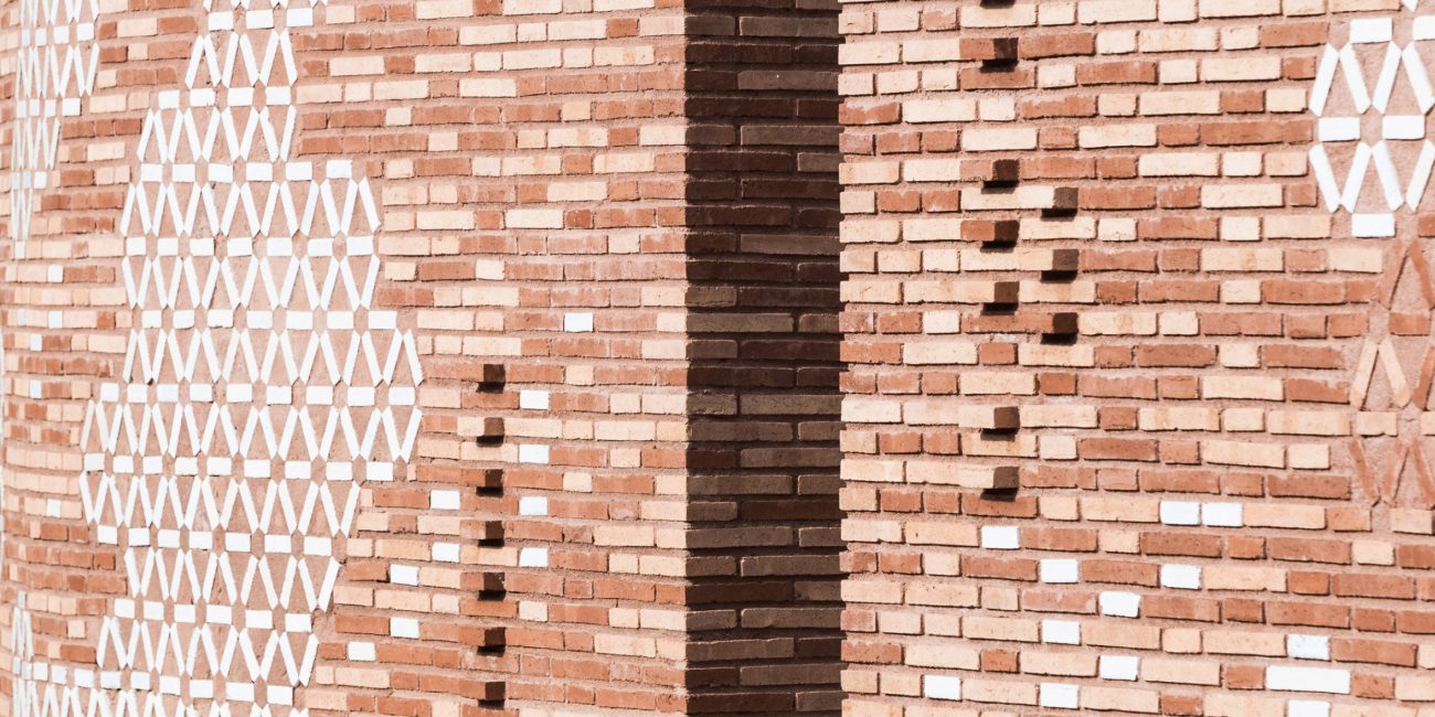
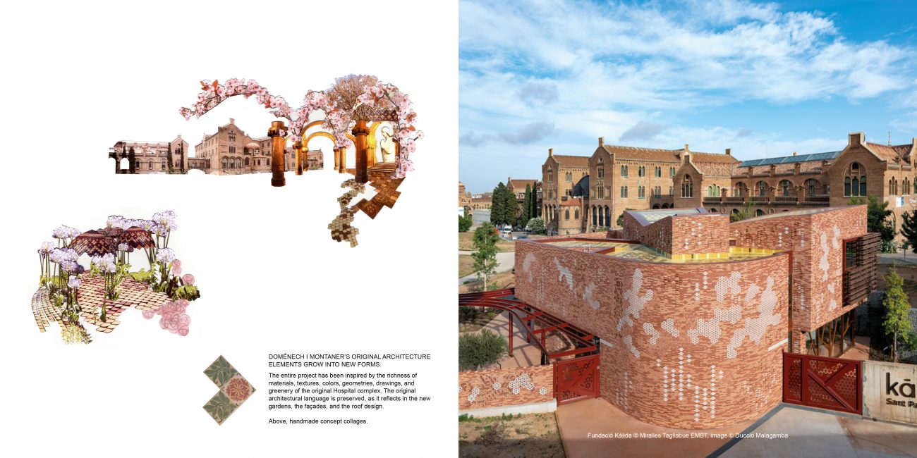
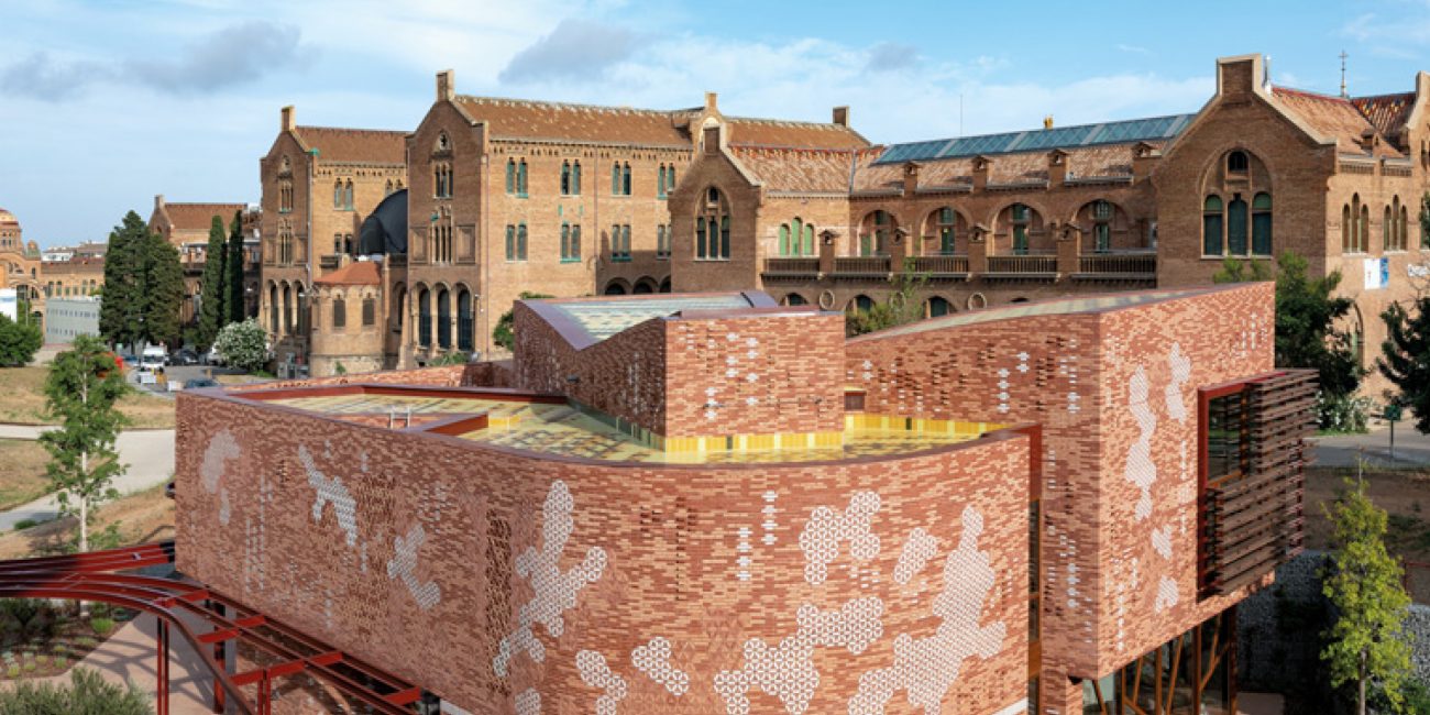
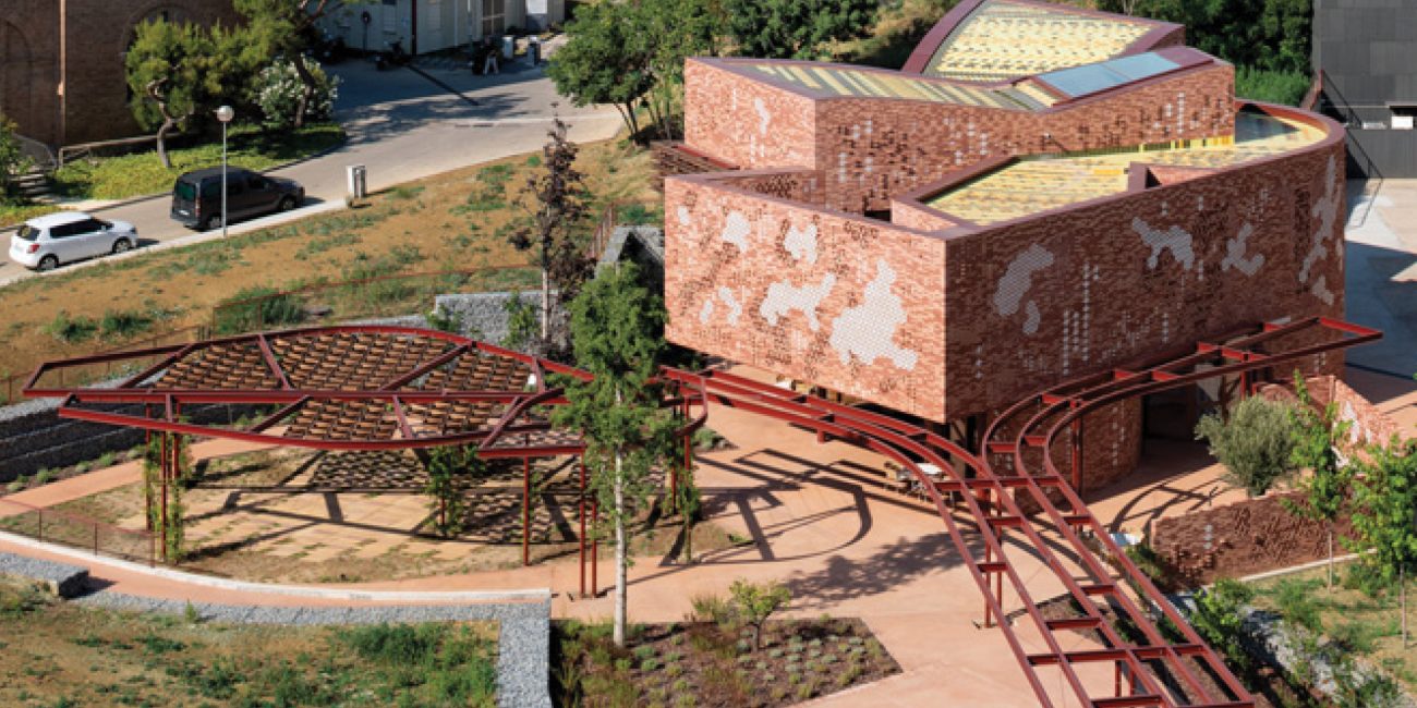
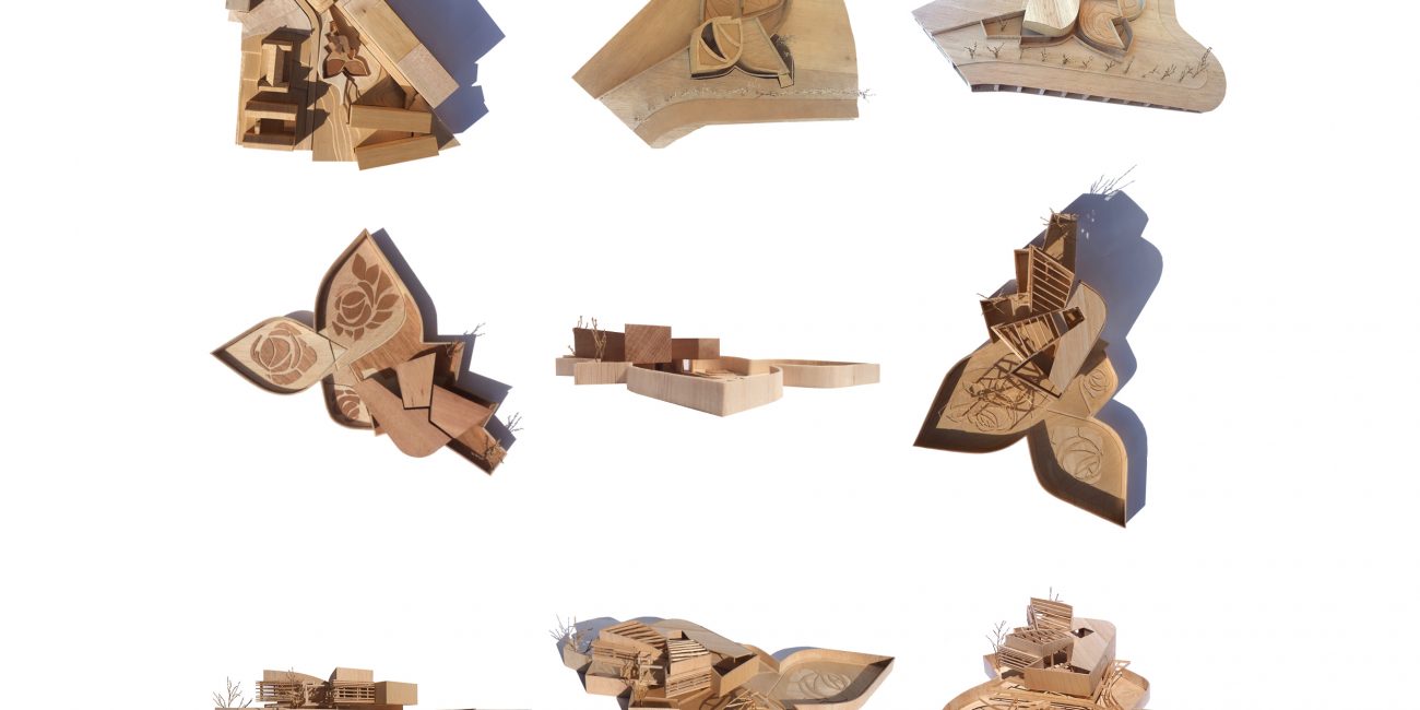
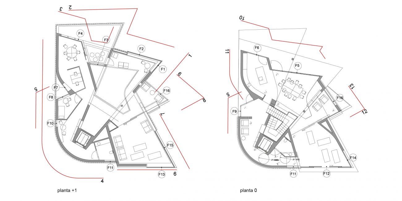
Domènech I Montaner’s original architecture elements grow into an new pavilion.
The Kálida Centre in Barcelona is a space of emotional, social, and practical support for cancer patients and the people around them.
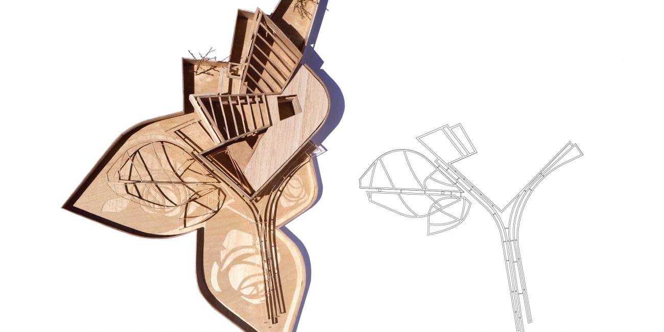
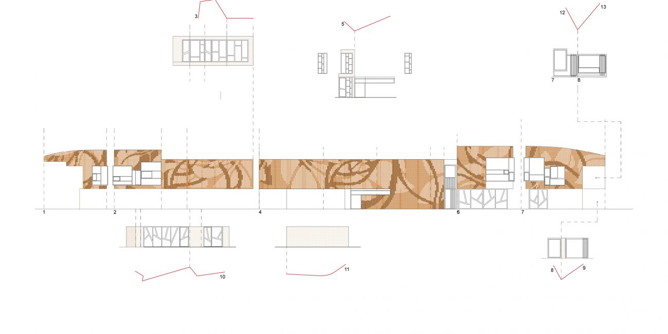
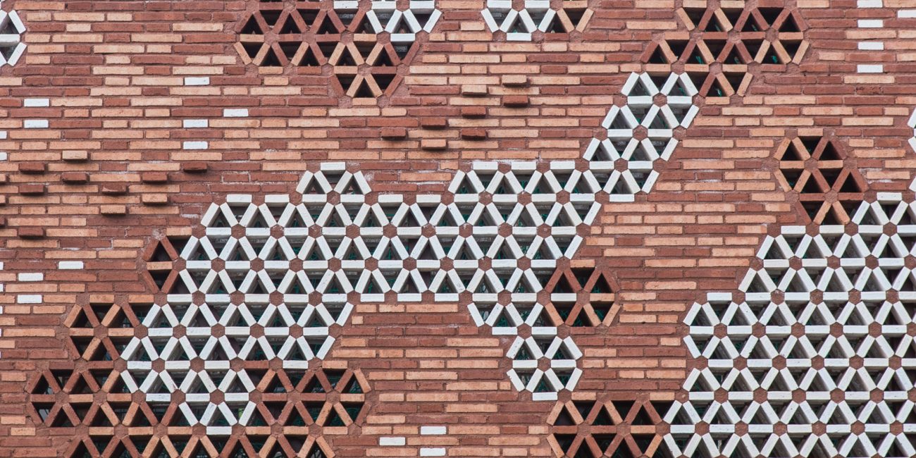
The entire project has been inspired by the richness of materials, textures, colors, geometries, drawings, and greenery of the original Hospital complex, Hospital de San Pau, by Domènech I Montaner. The original architectural language is preserved, as it reflects in the new gardens, the façades, and the roof design.
Architecture, Interior
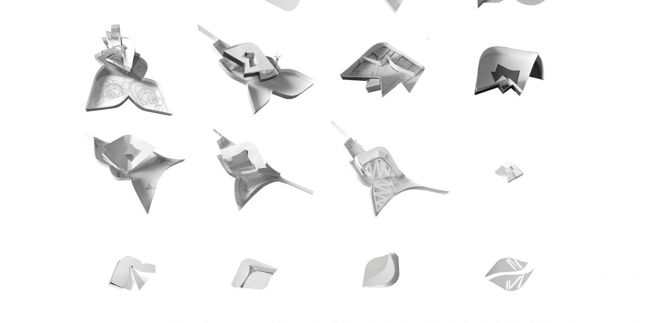
Volume studies, interior layout research, pergola design, facade pattern studies, paper and wooden study models.
At Enric Miralles Benedetta Tagliabue EMBT.
Team of 5.
Completed.
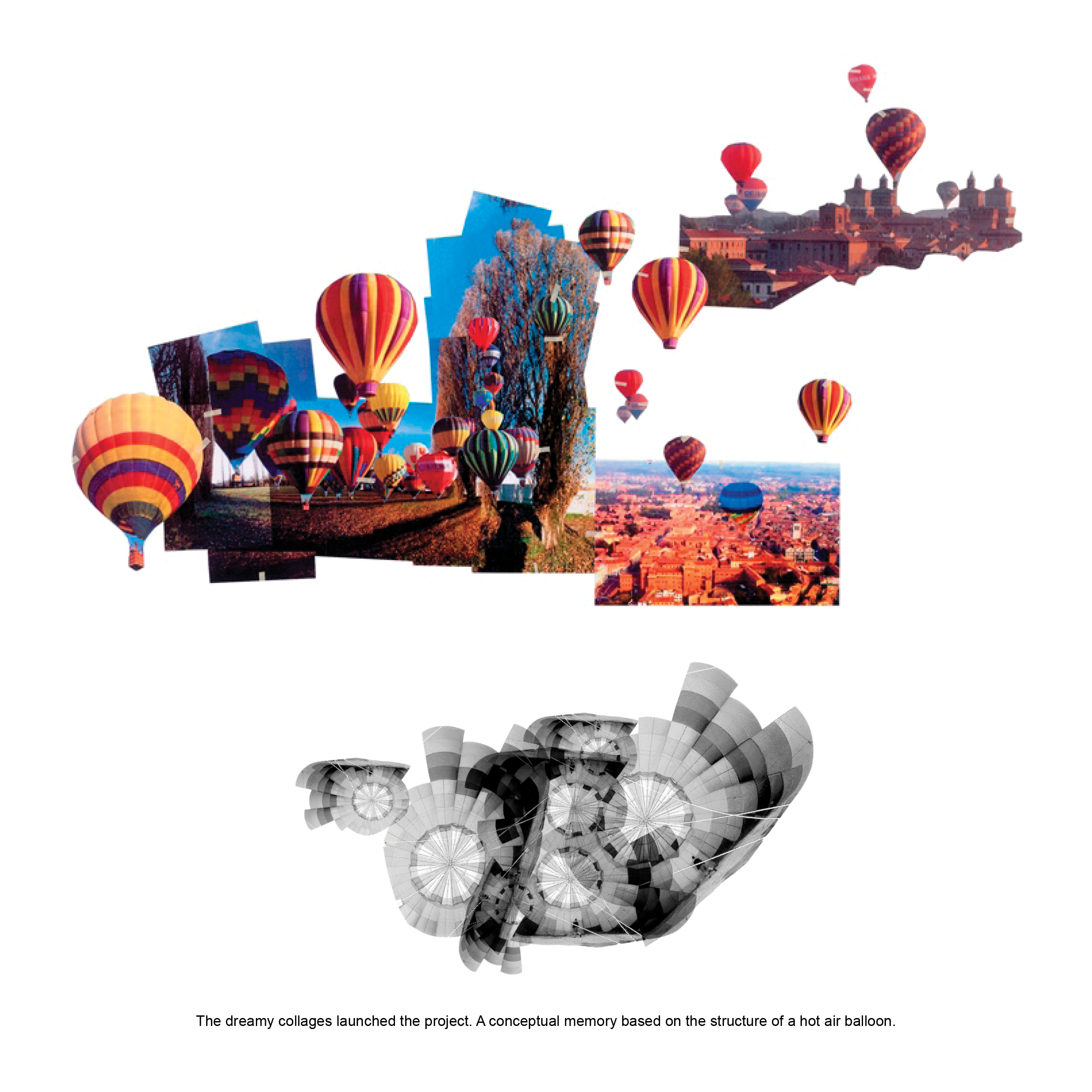
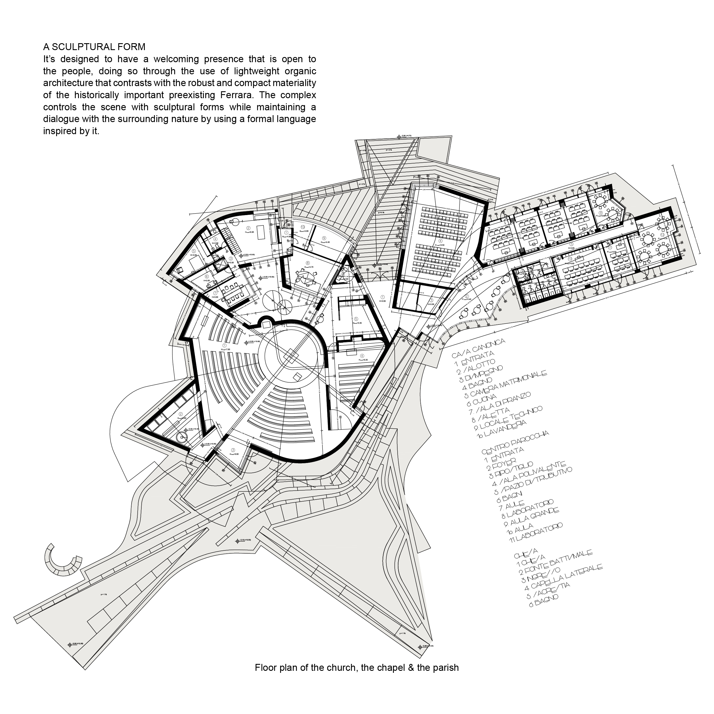
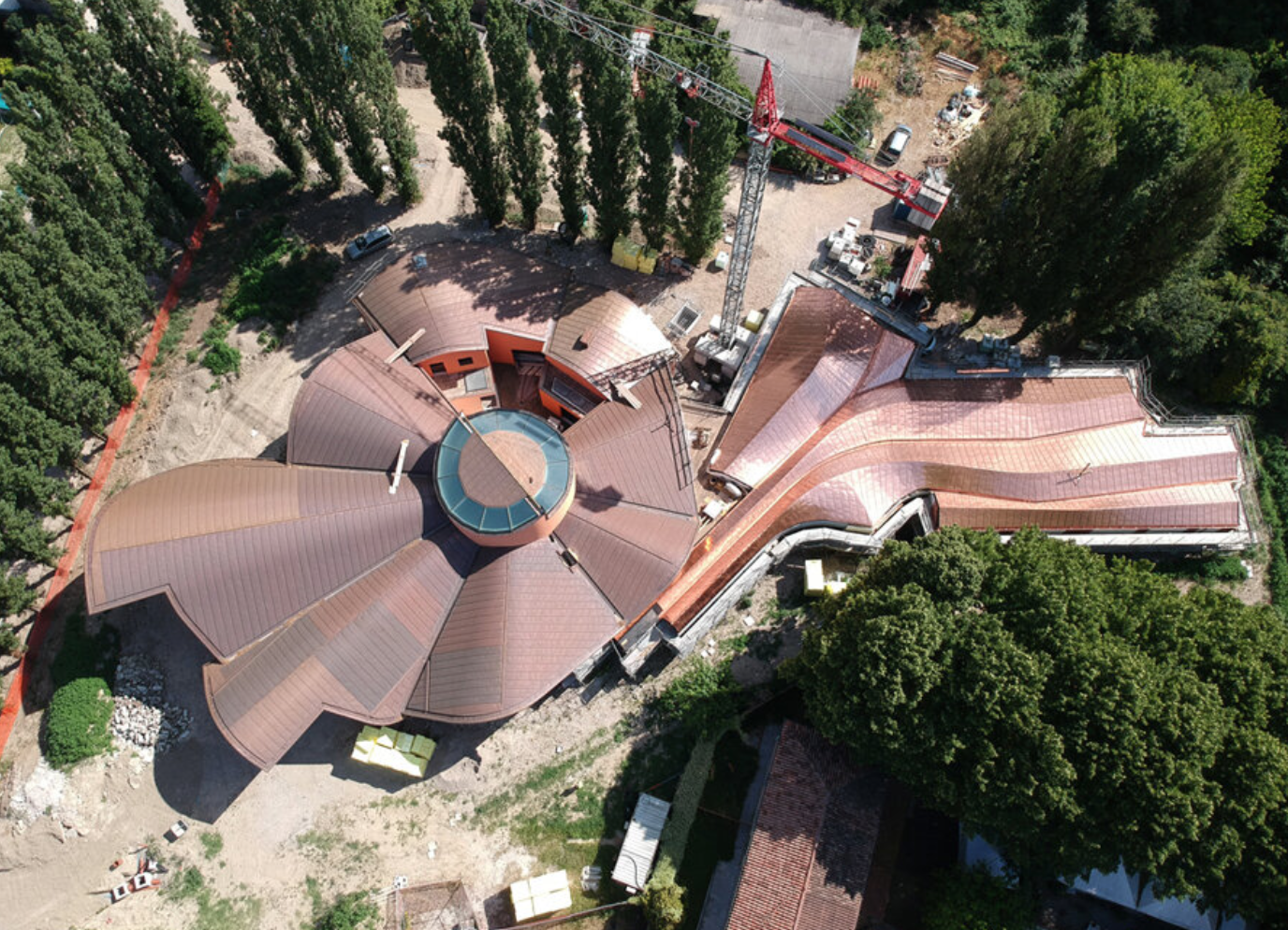
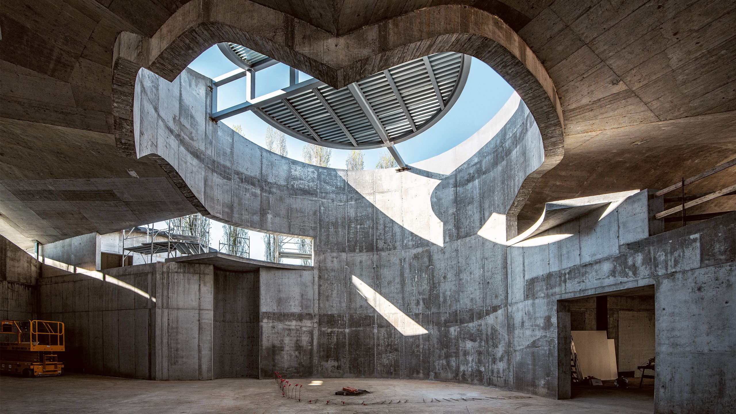
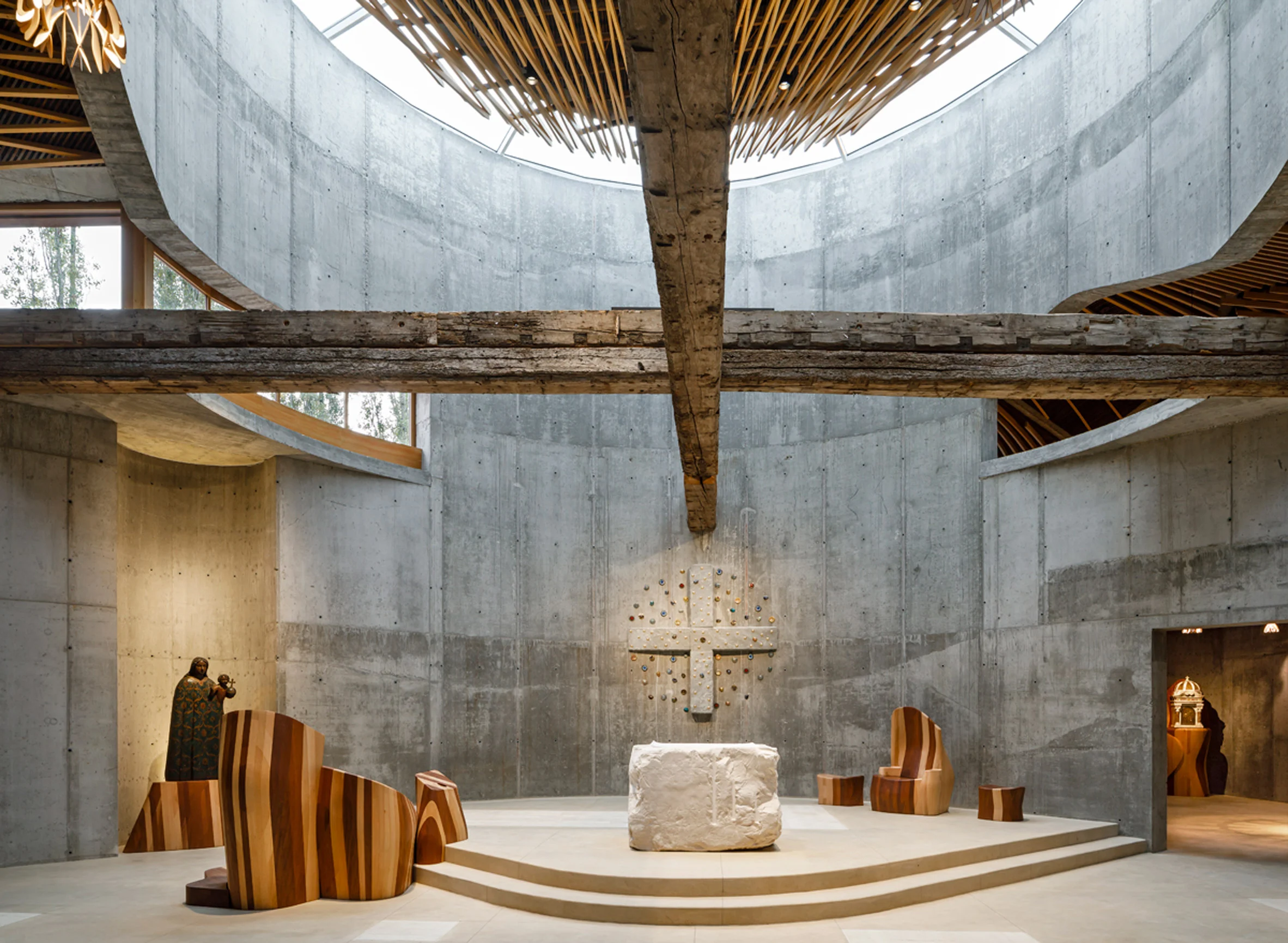
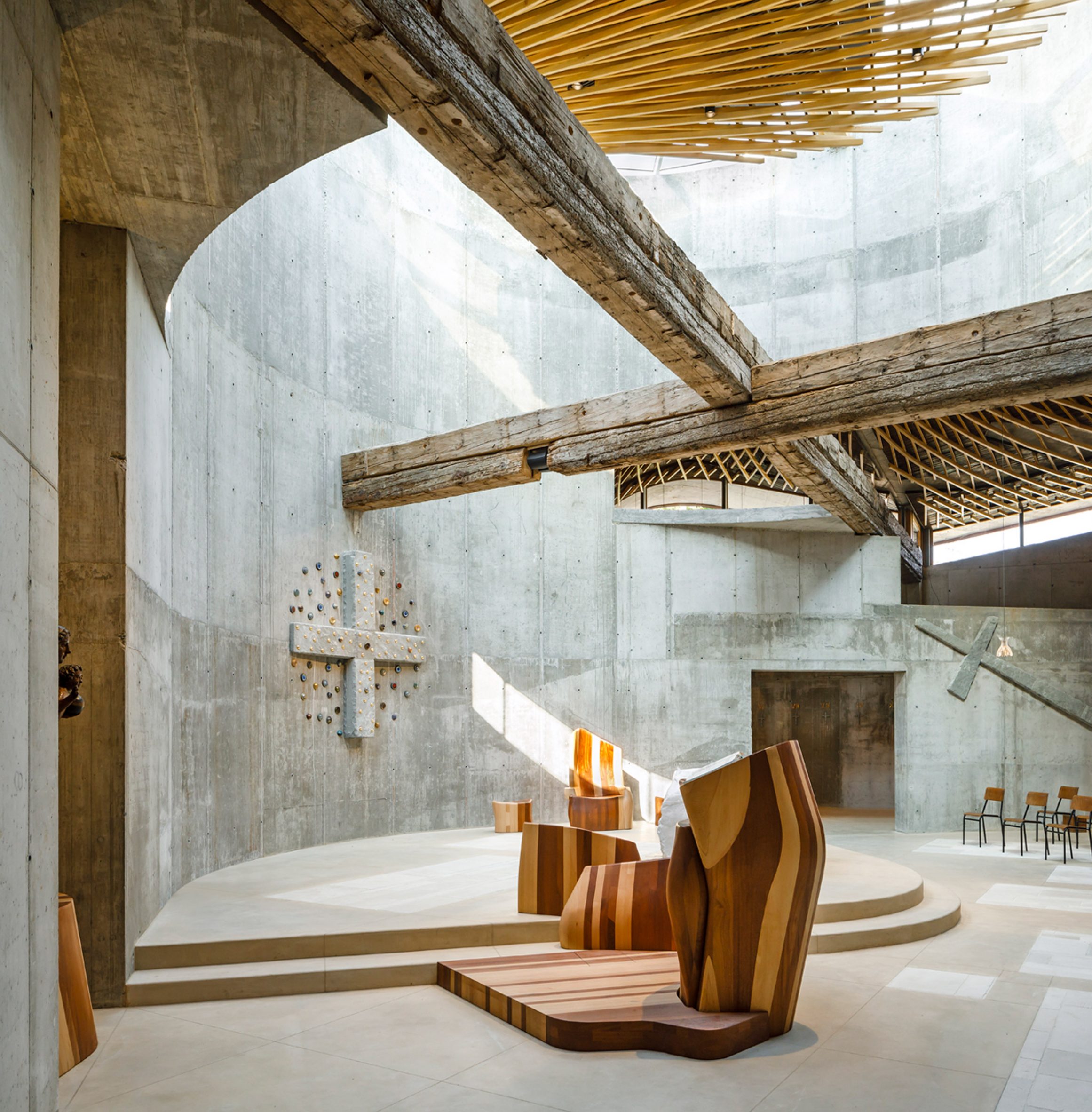
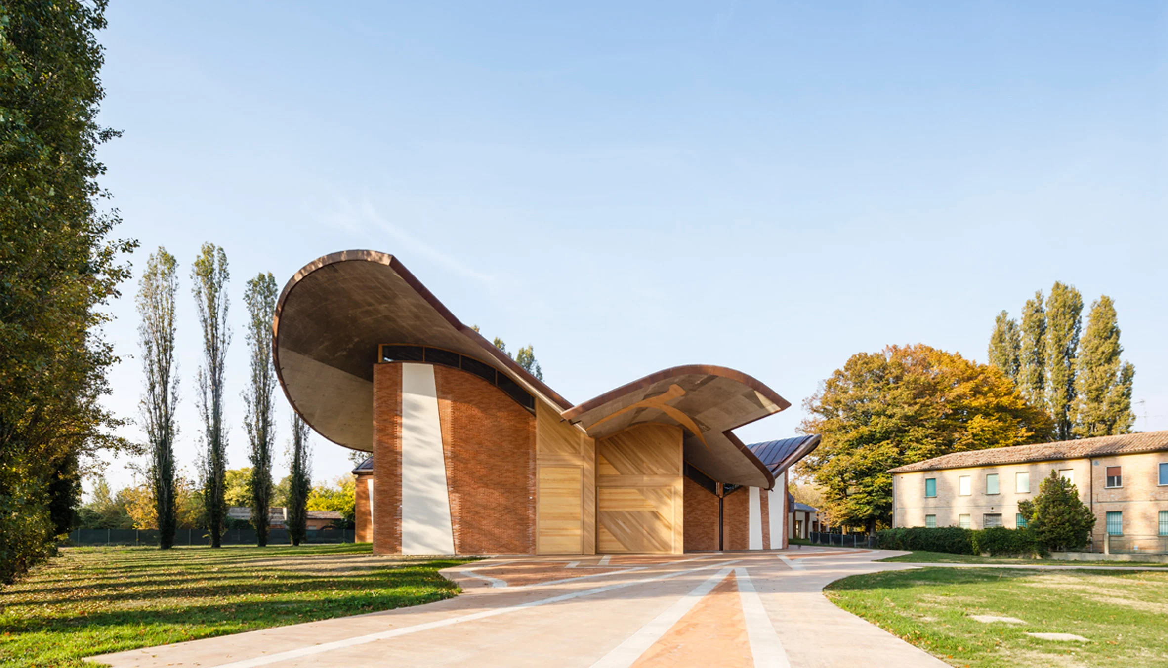
The complex of San Giacomo in Ferrara, Italy.
The new church is proposed as a catalyst for the area in which it is introduced; It creates an identity within the local community by promoting socialization, education, and interaction. It’s erected from its conceptual memory, based on the structure of a hot air balloon.
Architecture, Interior
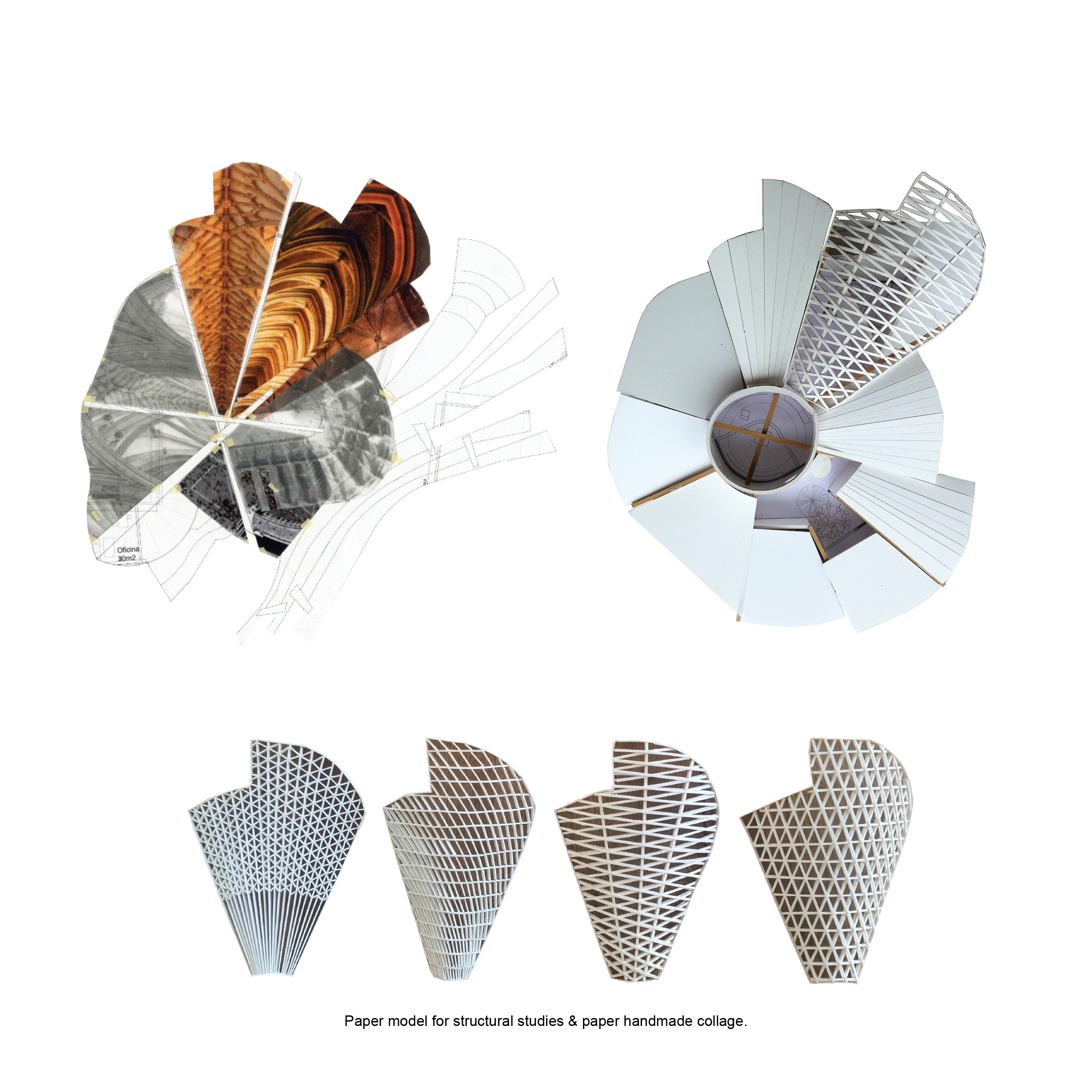
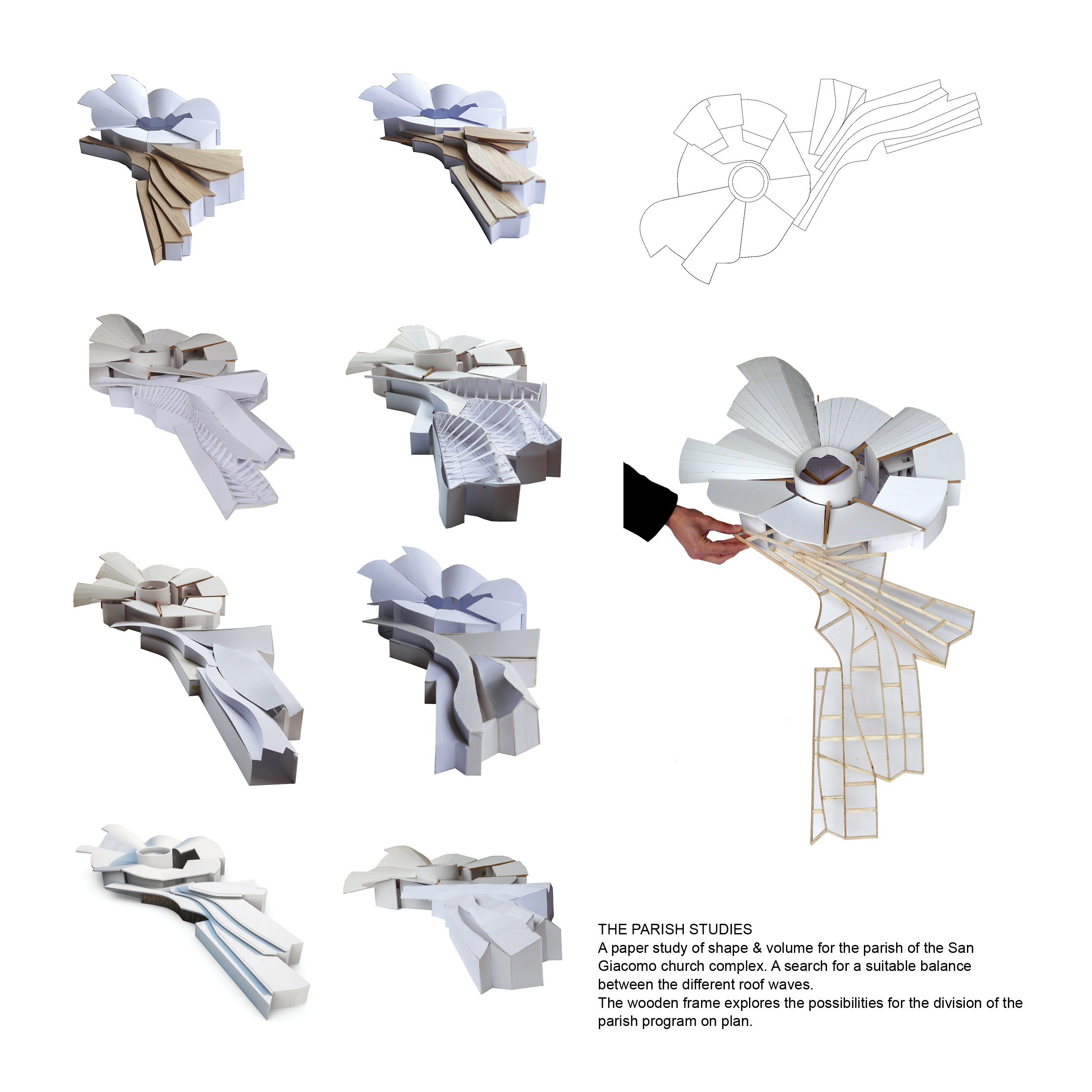
Concept design, permission documents, studies for the roof structure, paper and wooden study models.
Completed.
Images & Design Ⓒ Enric Miralles Benedetta Tagliabue EMBT.
ABC+ Skin
ABC stands for Arts Basics for Children.
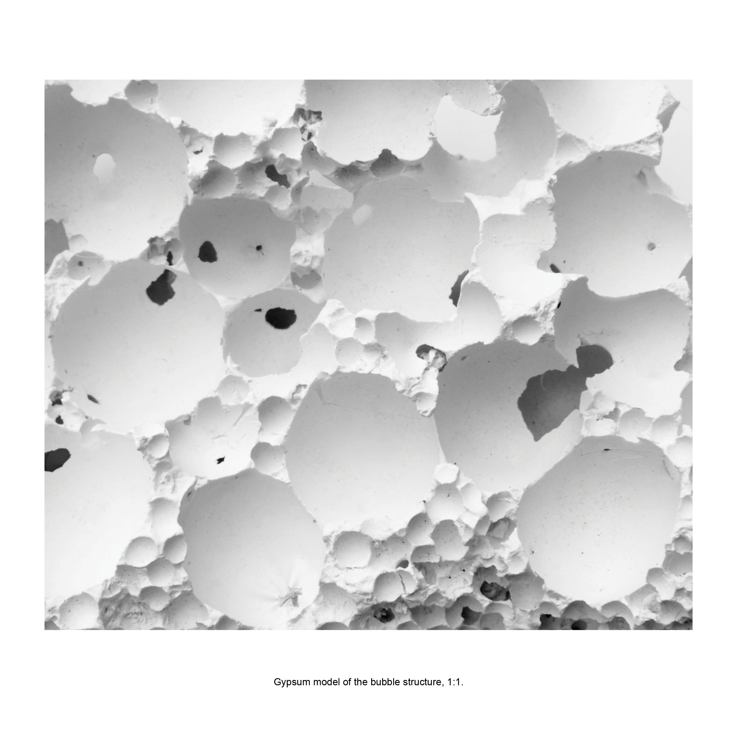
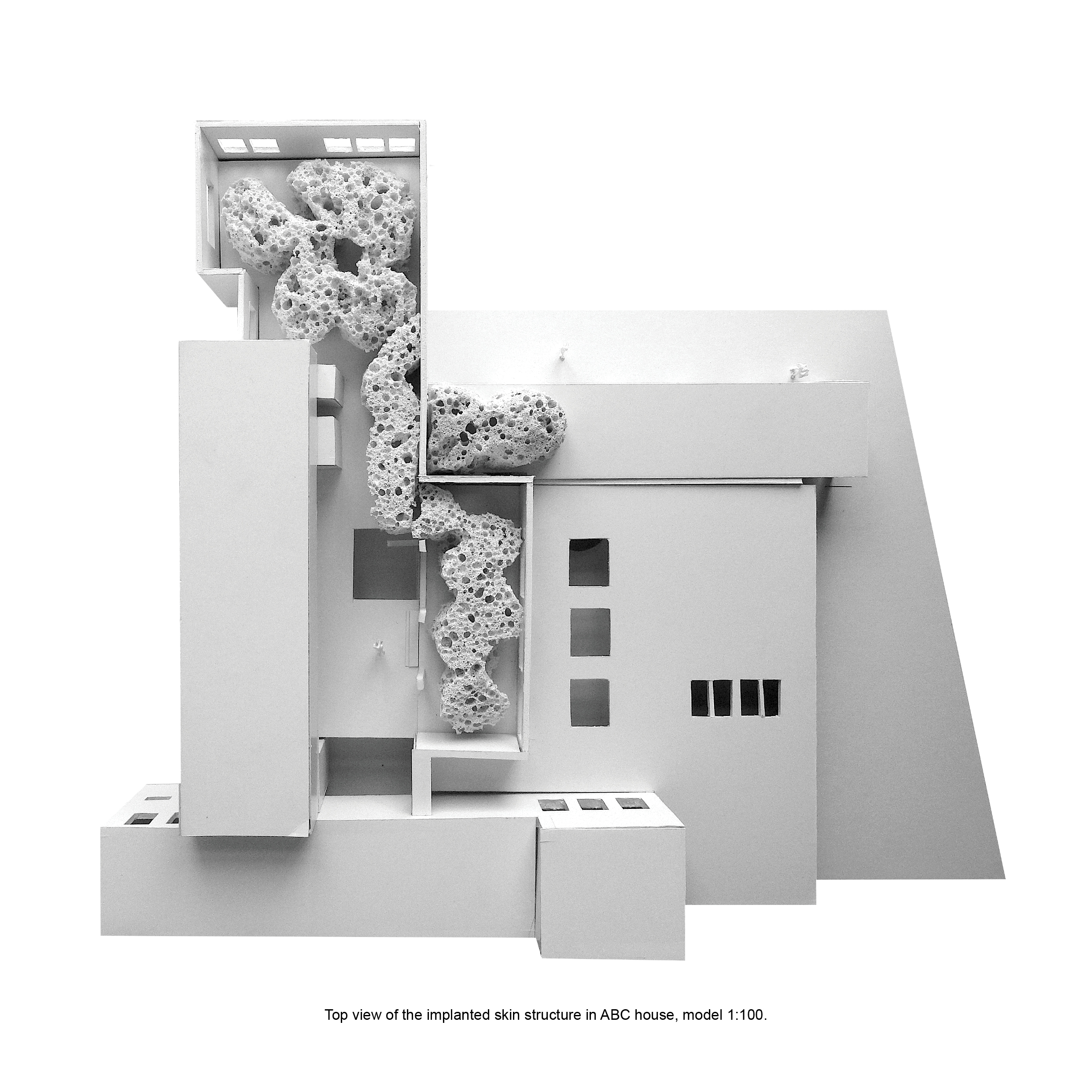
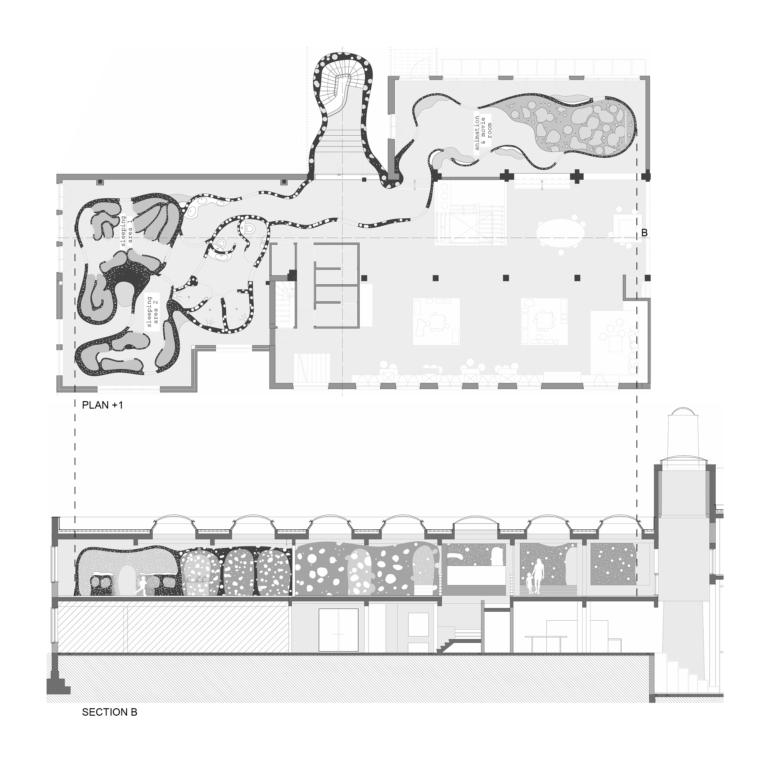
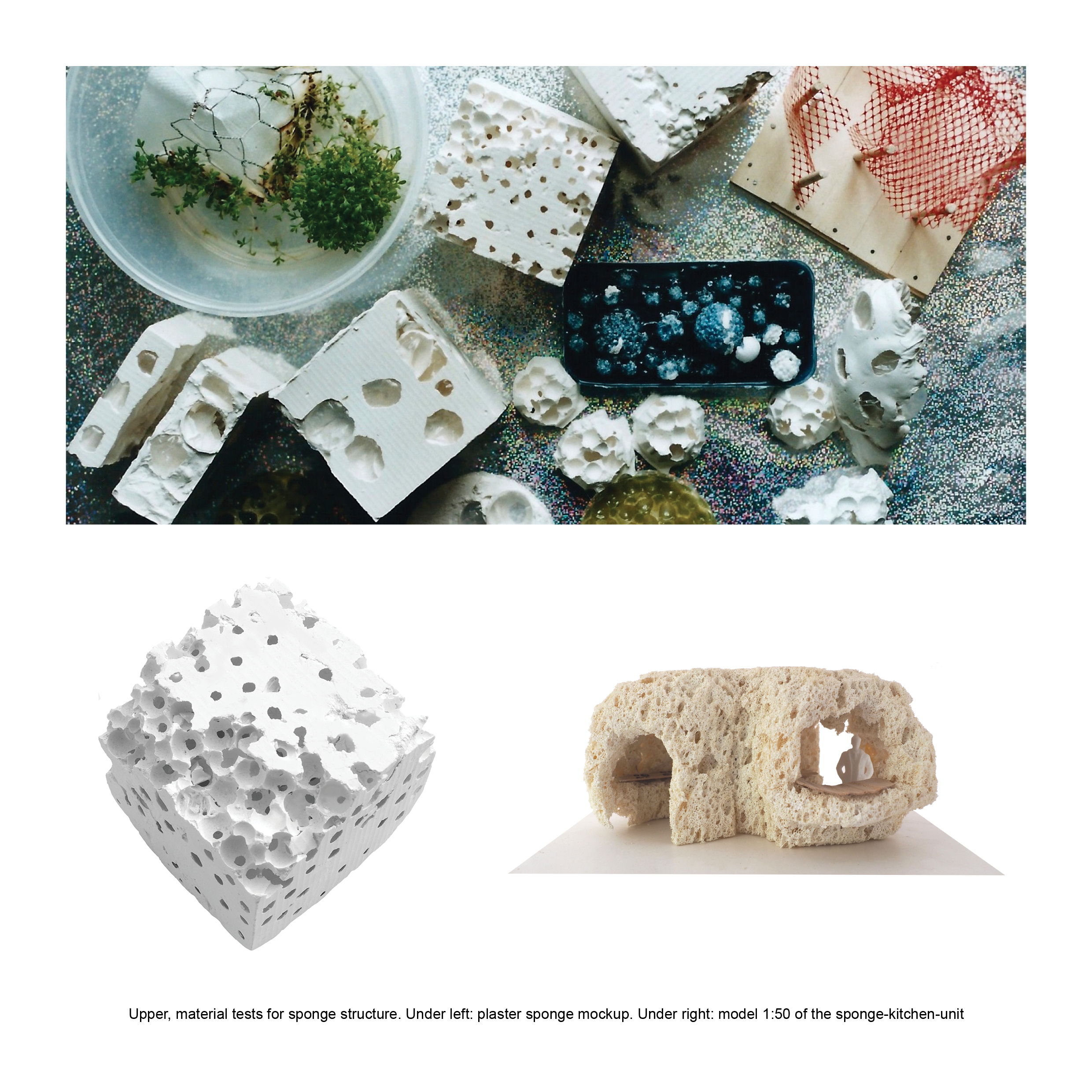
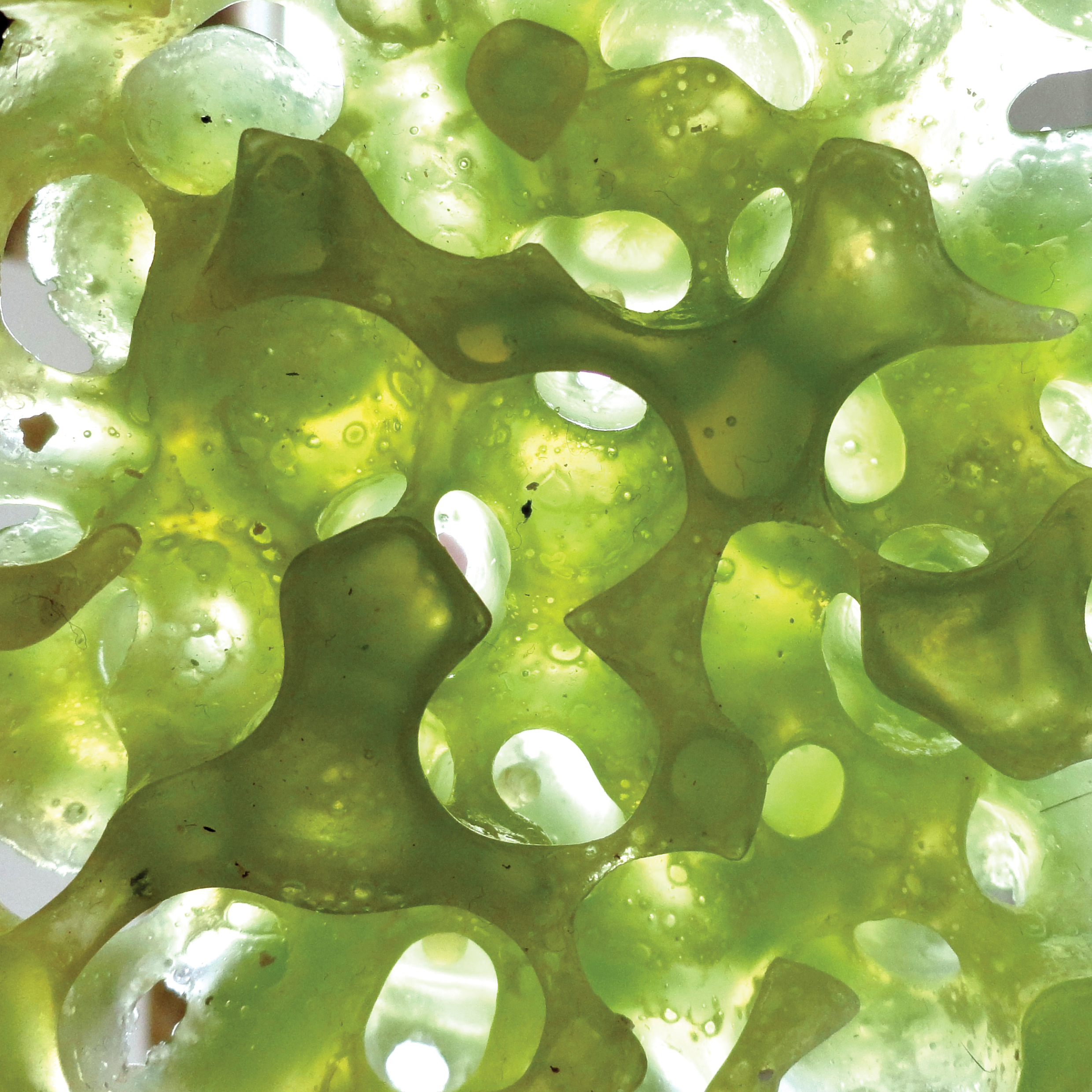
It is a multifunctional building in Brussels including a cinema, theatre, and ateliers. ABC invites families and schools to let children explore the aesthetic, economic and socio-political dimensions of design, science and art. ABC+ is an additional program, allowing small groups to stay overnight. It’s realized as an extra layer; a self-made skin developed through a process of material & form studies. The result is a sponge-like plaster structure.
Architecture, Interior
Material experimentation and development, gypsum and epoxy models, interior layout.
Work produced at KU Leuven, Luca School Of Arts.


Ecommerce website
k.eat is a Mexican company, offering natural food products and health programs.
Digital direction, UX/UI Design
Led the creation of a new ecommerce website, focused on a simplified site navigation & content structure, creating improved IA, templates, wireframes, and prototypes for intuitive UX.
Developed a product recommendation quiz to guide users toward tailored options, simplifying selection for k.eat’s extensive product range.
Directed content creation, copywriting, and imagery.
Managed the Dev team to translate designs into a fully functional Shopify e-commerce website.
In collaboration with Cuarto Negro, for ©k.eat
Landscape design for Torre Bahia
Coming soon.
Landscape design
With Paralelo Arquitectura, Mexico


Renewed website
Laguna Cyprien is a Mexican B-corp creative studio focused on creating everyday objects.
IA, Content Strategy, UX
An optimized Information Architecture, a conversion-driven content strategy, and implemented UX best practices, leading to improved user experience – based on thorough market and audience research.
© Laguna Cyprien
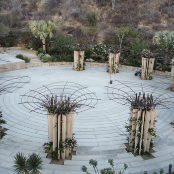
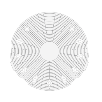
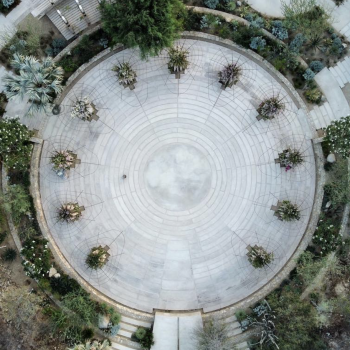
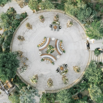
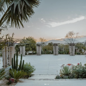
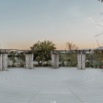
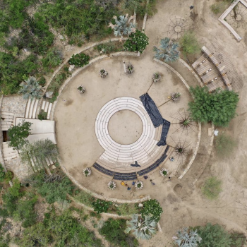
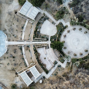
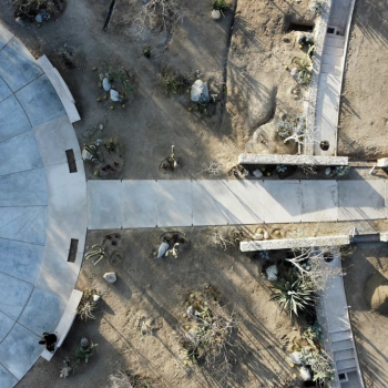
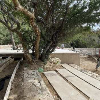
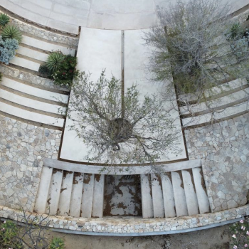
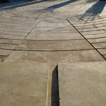
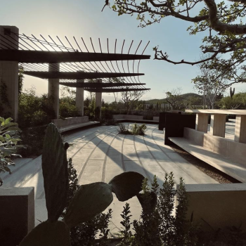
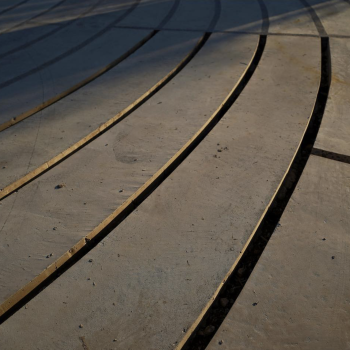
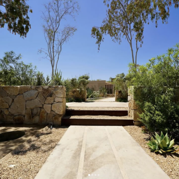
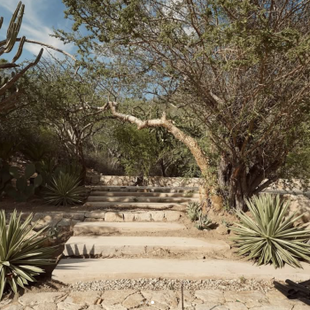
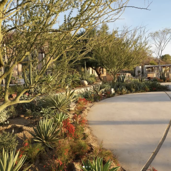
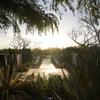
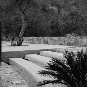
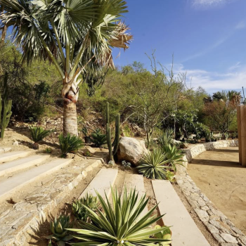
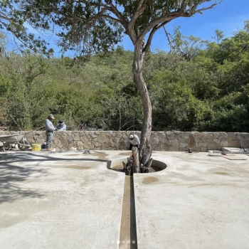
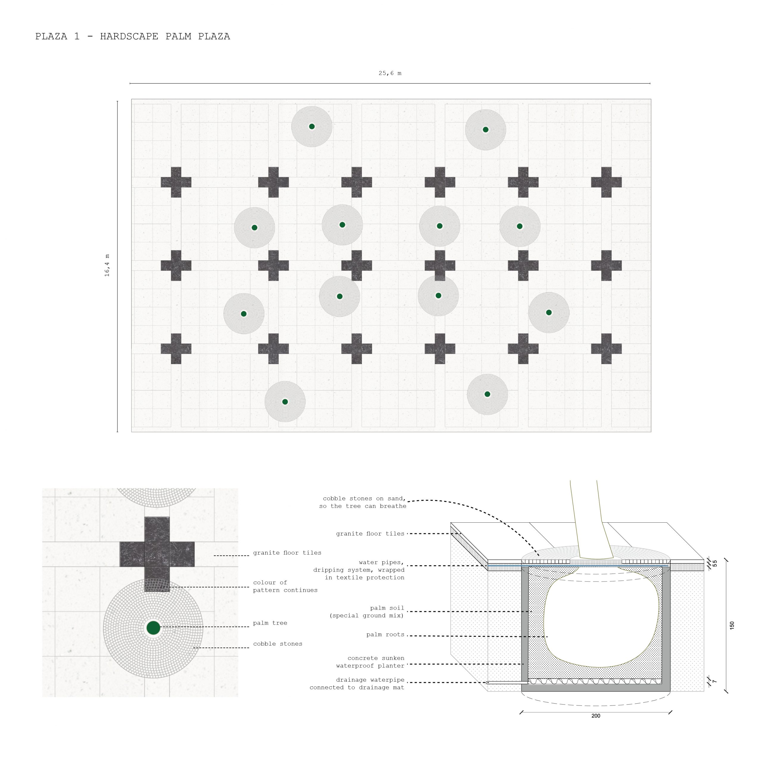
Pavement landscape design
Created studies and detailed drawings for all hardscape pavement at Acre Resort, San José del Cabo, Baja California, Mexico.
Architecture, Landscape
In collaboration with Dema Taller
All images © DEMA


Identity, Branding and Illustrations for Pan Dulce.
Pan Dulce is a surf bikini brand, named after the creator’s favorite wave in Costa Rica. Based in NYC, launch planned in spring 2024.
Logo, Identity, Branding, Illustrations, Creative direction
Crafted the logo and visual identity.
Hand-drawn typeface and developed a comprehensive style guide and provided branding graphics, illustrations,
Overarching creative direction, including pattern design and selection.
Curated themes capturing the essence of Pan Dulce, drawing inspiration from the carefree beach lifestyle, surf culture, and the vibrant tropical elements.
Pictures Pan Dulce ©

Restructured and redesigned website for The World Monument Fund.
The WMF is a nonprofit focused on conserving global monuments. Progressing from research and strategy to the ongoing UX phase, with completion slated for 2024.
Research, Strategy, IA
Content confidential.
Engaged in collaborative efforts with Base, a New York agency, to restructure and redesign the website for the WMF.
Advanced through extensive research, strategy, and the ongoing UX phase.
Anticipated delivery set for spring 2024.
For Base Design, NYC.


Visual identity and logo of Ether.
Ether is a Mexican and French Ayurvedic medicine brand. To be launched 2024.
Logo, Graphics
Hand-drawn logos and energy-infused blobs.
Developed and delivered a comprehensive style guide along with user-friendly Ai files, facilitating seamless branding implementation.
Pictures by Camille Cipriano


Graphic design for Climate Words.
A NYC non-profit creating an accessible database for effective climate communication, by building a climate lexicon and promoting climate literacy.
Graphic Design
Created visual communication assets primarily for Climate Words digital platforms, such as Instagram.
Maintained file templates for key graphic design types.
Coordinated information flow among internal working groups, including Social Media and Climate Books.
Maintained a unified brand voice.


Web and identity design for studio VISIT.
A unique identity and responsive website for a New York Landscape Design firm.
Identity, web design, UX
Developed logos and curated typography and color scheme to enhance brand identity.
Created a comprehensive style guide governing imagery and copy to maintain visual consistency.
Contributed strategically with visual direction through adept handling of design elements.
Web design and guided visual direction for both desktop and mobile including Figma protoype, while collaborating closely with a development team to finalize the website


Web design for Paralelo Arquitectura.
Website for a Mexican architecture studio, with completion scheduled for early 2024.
Web design, UX, art direction.
Web design and conducted content selection and editing as part of the project.
In close collaboration with a development team.
Planned completion targeted for the beginning of 2024.
Web development by Cuarto Negro.


Strategic brand definition, logo design, systematic packaging design, UX website, and a mid-fi prototype of the website with webshop.
Mamau Cacao is a Mexican start-up business offering a forgotten native super food, specialty cacao. The product comes in little cubes, packed in glass jars.
Brand Strategy, Identity, Packaging, UX, Website
Founded the visual presence of the brand and helped the start-up get started with a solid UX and IA foundation with a Plan of Action for their website with a webshop.
Organized constructive workshops with the team to define competent brand strategies, conducted research, designed the logo, a systematic packaging system, and a style guide, mapped user-friendly IA, created effective UX wireframes, and delivered a mid-fi prototype
tools: Figma, Adobe Ai, Ps, Id
role: Lead Designer
Pictures by Eusebio Balmori Vildosola and Moïs Roditi.
Special thanks to Izzy Aspeling-Jones
Open source color pallete library, with real colors from real places.
Discover, download, use, and enjoy real colors from real places.
Coming soon.
UX/UI, Design
UX/UI, Front End Dev,
Art, Photography
Portfolio website
A website to showcase personal work that will grow over time. Expandability and a neutral UI style are key in the design direction.
UX/UI Design
UX wireframes, complete UI design style guide and components.
Responsive prototypes for mobile and desktop.
From scratch-built an online prototype using HTML, CCS, Javascript, jQuery, and GitHub.
Tools: Figma, VS Code, Github, Elementor
Role: Designer, Solo project
Developped and built by Cuarto Negro
An interactive map to fight food security in New York City.
“The problem: The GetFoodNYC government site is difficult to navigate, inefficient, and suffers from a lack of accessibility and options for users.
Our solution: We provided a mobile app for New Yorkers who need to quickly find and navigate to free food distribution centers that can cater to their needs.”
UX/UI redesign case study
“Research and definition of persona, pain points and solutions.
Ideation and development of features for responsive interfaces.
Iterations on prototypes from low to high fidelity, based on test results.”
Tools: Figma, VS Code
Role: Researcher, designer
Team of 3: with Mai Hirose & Johnathan Lerman
An interactive map and business directory for a local nonprofit that promotes a district.
“The challange: Visitors of website need an easy way to obtain information about a local business or service because an efficient way to browse the district, will increase the public interest and support business growth
Our solution: A redesign that brings the district to life, online. An interactive map and an improved directory to locate a business effectively.”
UX/UI redesign case study
Research, interviewing stakeholders, usability testing, new IA, lo-fi UX wireframe development, ideation, definition, new UI style guide, components, final interactive map design, Hi-fi prototyping, and user testing.
Tools: Figma
Role: Researcher, designer
Solo project
A responsive redesigned website for a U.S government department with a complex IA.
The problem: The U.S Department of the Interior website has a confusing navigation and hierarchy resulting in confused users and abandonment of the site.
Our solution: A redesigned responsive UI for desktop and mobile that clearly explains the complex substructure of the offices and bureaus, to find information efficiently.
UX/UI redesign case study
Tools: Figma
Role: Researcher, designer
Research & definition team: with Tay Abad & Lance Joseph


Sofitel Hotel Renovation in Budapest
Distinct interiors for a high-end renovation of Sofitel Hotel, right next to the chain bridge in Budapest in Hungary.
Interior design
Interior studies and layout drawing sets (not publically published)
Team of 10.
At Asymptote Architecture.
Project not publically published.
A design competition against the world’s leading Starchitects, for a national hockey arena & sports park proposal.
Architecture, Landscape design
Landscape design, visuals, and final presentation booklet.
Team of 12.
At Asymptote Architecture.
Architectural shaped utensils, a collection of soaps
SO–AP was created from SO–IL’s archive of model moulds.
‘Critically Homemade’ prototypes designed during 2020’s first lockdown in New York City and showcased at the Design Trust’s exhibition in Hong Kong.
The SO–AP objects demonstrate the designers’ desire to repurpose their visions for the current needs of society – to protect individuals themselves, protect people they love, and also protect strangers that are loved by others. These soaps explore the experience of what it feels to hold a building in our hands, to use it every day intimately.
Design
Co-creation, product development and production.
Designed by: Jing Liu, Emma Silverblatt, Yuanjun Summer Liu and Astrid Steegmans, at SO–IL
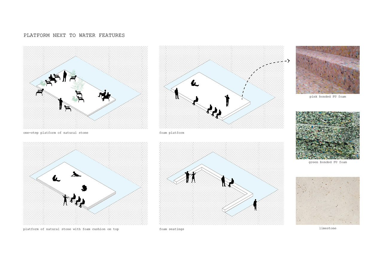
The library continues the legacies of Dr. King and Ms. Anisfield Wolf on a table that is the stage for these voices. The inspiration of the design was found in Dr. King’s “I Have a Dream” speech where he speaks of the “Table of Brotherhood”, one where everyone has a place.
Architecture, Interior
Layout and concept studies, material research, platform studies, interior consruction drawings.
At SO–IL in collaboration with JKURTZ.
2020-…, in process
Trentanove
Limburg’s honored chef ‘Giovanni’ just opened a new Gastronomia Italiana in the city center of Hasselt, Belgium.
Design, Interior
Material and color studies, furniture, renders.
At Creneau Int.
Fire Station Leopoldsburg
The new fire station in Leopoldsburg, Belgium, has a central depot with all the necessary needs cleverly organized to realize a fast pull-out in case of an emergency.
The energetic colors of the design reflect and support the willingness of the firemen and give these heroes the place on the map they deserve!
Architecture, Interior
Design and Build
Permission documents, interior layouts, material research and color studies, construction drawings.
At BEL Architecten in collaboration with Point Supreme and Bureau Bouwtechniek.
2017-2019, completed.
Images © Luca Beel
Interior renovation of a sports complex in Herentals, Belgium
The renovation includes the dressing rooms, circulation spaces, and smaller sports halls such as two dojos and a power-training room. The didactic and energetic color choices resulted in an economic yet fresh medium to bring this senior sports complex from the ‘70 back alive and kicking! A custom-designed steel white tube serves as coat hangers and illumination elements.
Architecture, Interior
Color studies, furniture research, layout drawings, construction drawings
At BEL Architecten.
Design Museum Ghent Competition
Complete study contract for the extension of the Design Museum in Ghent with a new wing in the Drabstraat. Implanted in an enclosed urban web with historical townhouses in the middle of the city center.
Architecture, Interior
Concept, design & model
At BEL Architecten, in collaboration with Inside Outside Petra Blaisse.
Two golden jubilee curtains
Designed and produced for the celebration of the 50th anniversary of the Insitute for History and Theory of Architecture or Geschichte und Theorie der Architektur, GTA in Zurich, Switzerland. Hurray!
Design, Interior
Concept design, material research, production drawings.
Completed in 2017.
At Inside Outside Petra Blaisse
Art design of the New Intercity Trains: foil prints on walls of the train’s toilet.
Upon entering the train, the toilets are immediately visible and form part of the entrance. They are striking surfaces coated with elegant curtain images that give a festive atmosphere to the hall. The soft voluminous and pleated curtains play with the toilet’s shape by transforming it or strengthening it. Once you enter the highlighted door you suddenly step into another world. The unexpected Dutch landscape image with a certain season’s climate catches the visitor by surprise. It adds a new dimension; sometimes you seem to float, sometimes the space appears optically much larger by the panorama with a far view, sometimes you feel very sheltered.’ – IO
Design, Interior
Design development and production documents.
In use since 2022.
© Inside Outside Petra Blaisse
Images © Frans Parthesius
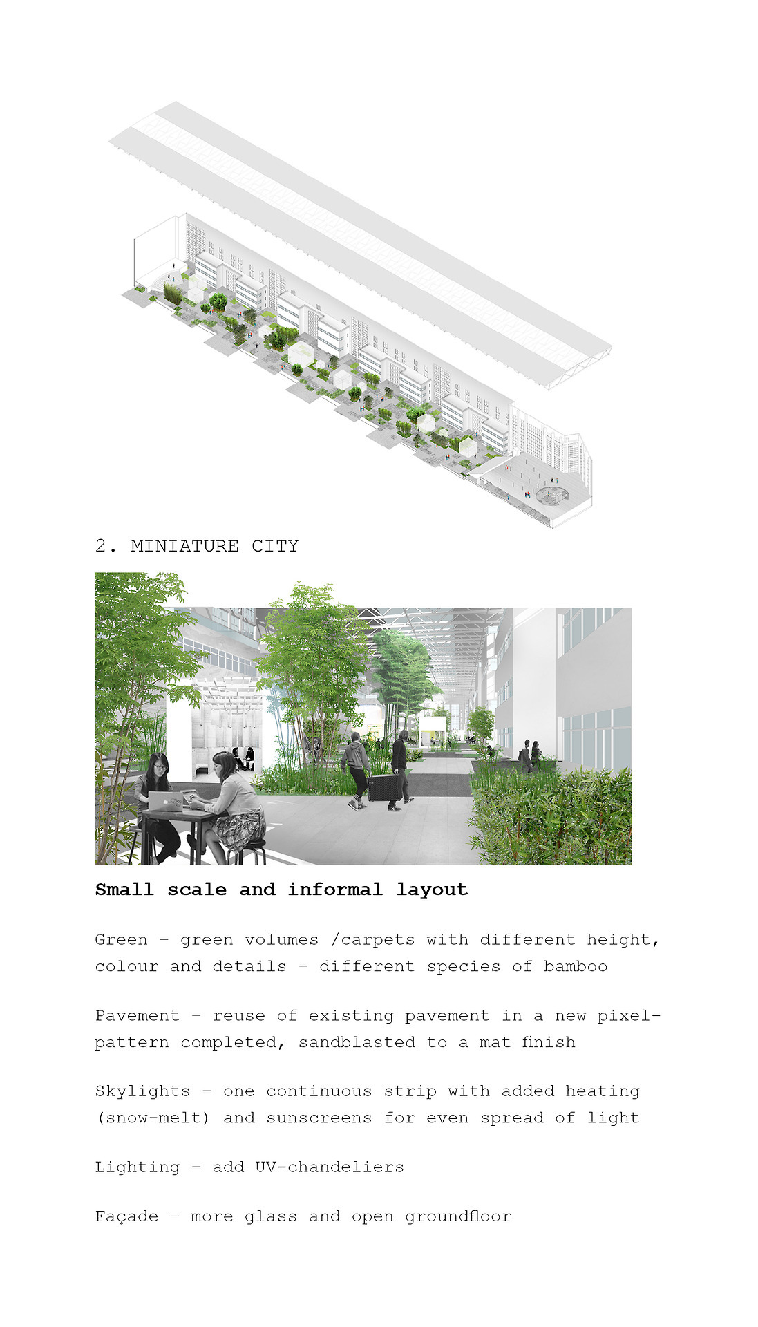
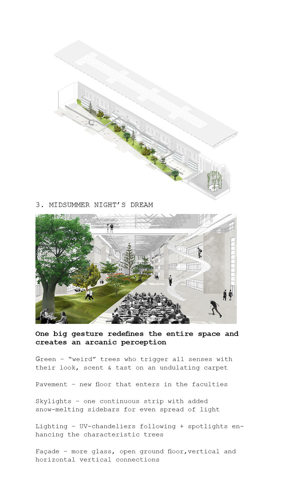
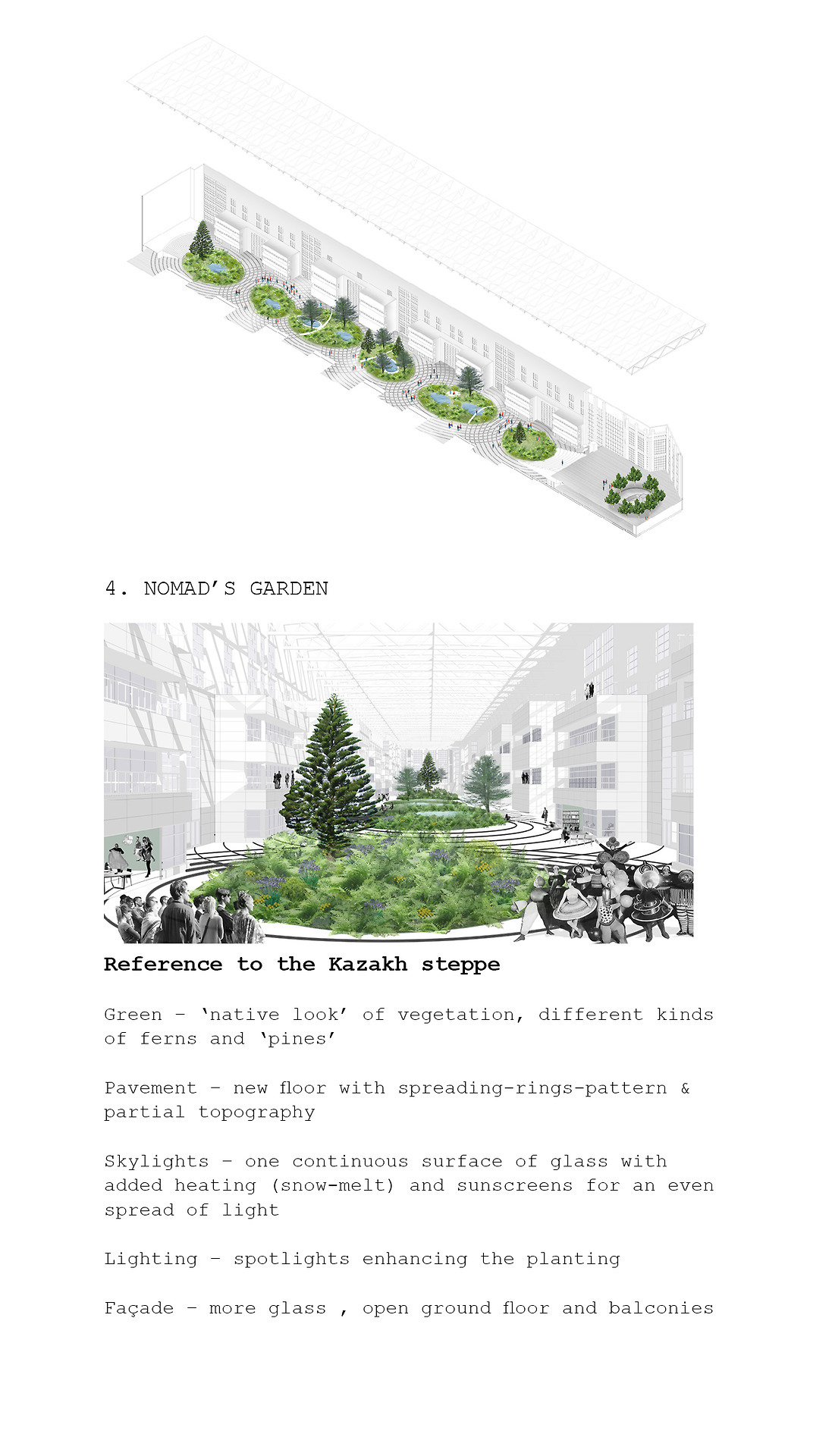
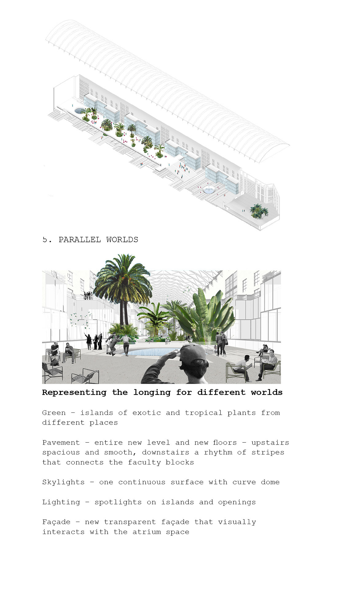
NUA
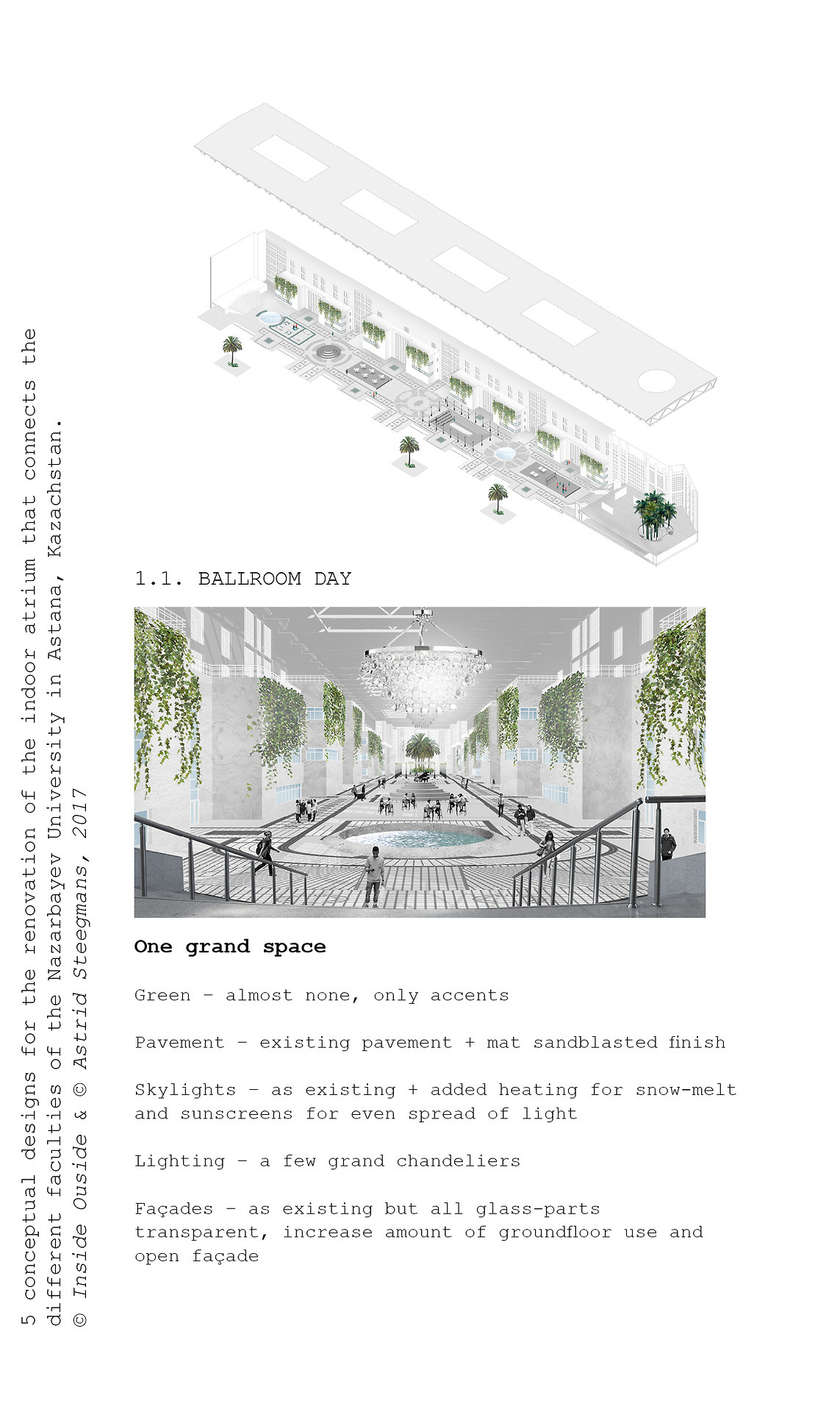
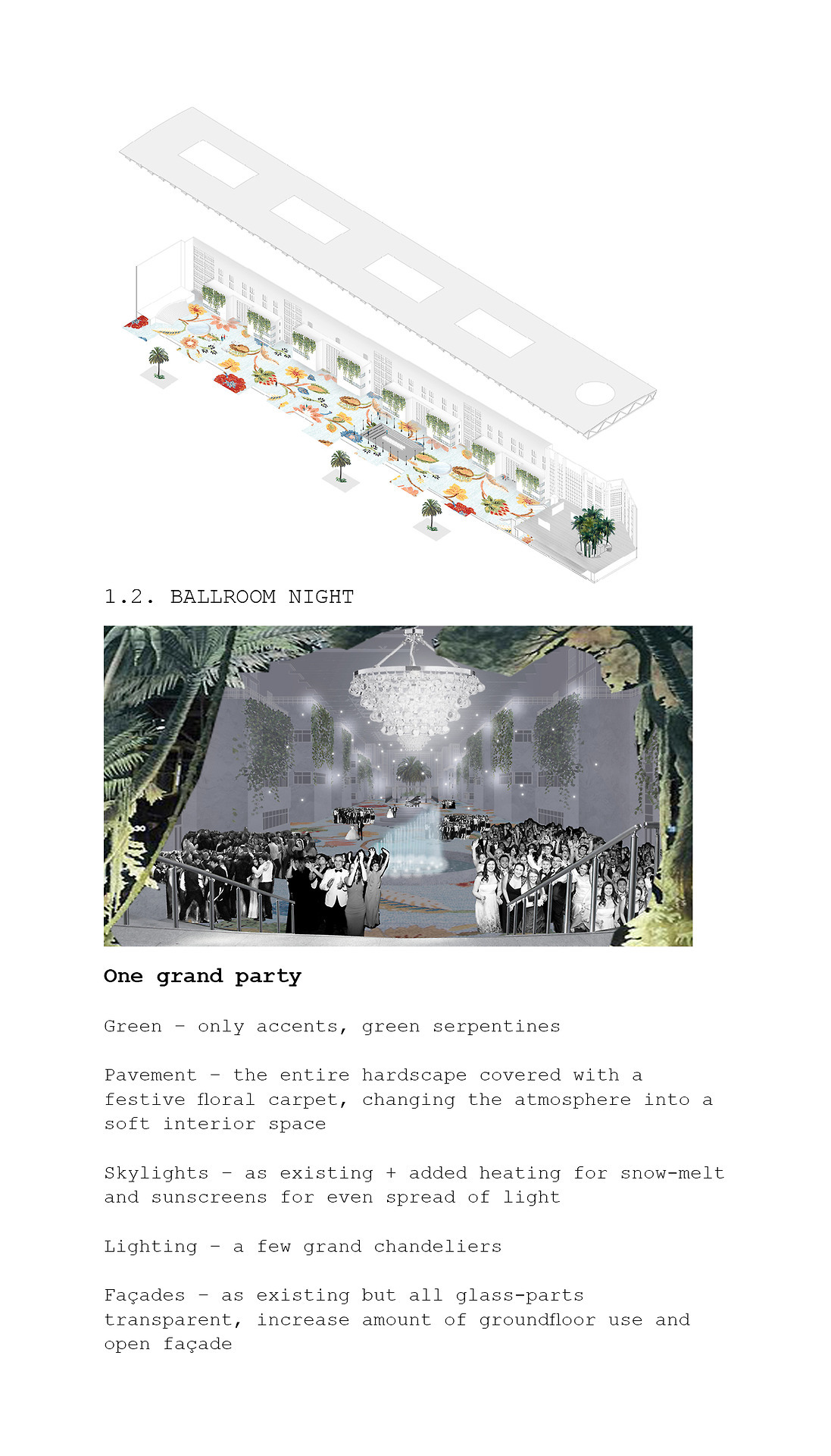
5 conceptual designs for the renovation of the indoor atrium that connects different faculties of the Nazerbayev University in Astana, Kazachstan.
Design, Interior Landscaping
© Inside Outside Petra Blaisse
The interior renovation of a Cuban cigar & cocktail bar
Named after the one & only La Bodeguita Del Medio.
In Kortrijk, Belgium.
Design, Interior
Interior concept, material and color studies.
Developed at De Baes Architects.
Images © Frans Parthesius
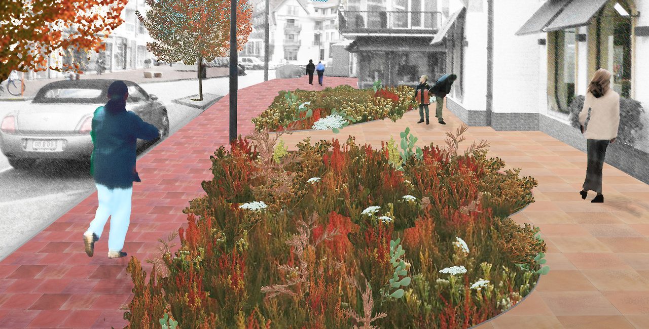
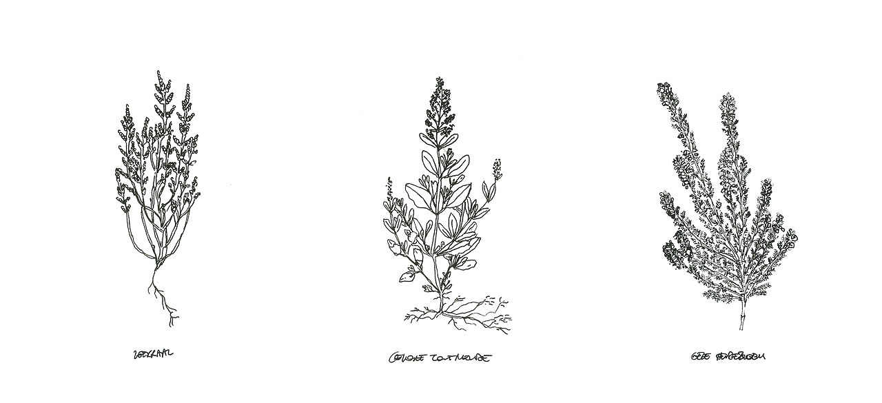
Landscape proposal with native vegetation from the local Flemish-Dutch dune scenery
Knokke-Heist is a municipality on the Flander’s Nort Sea coastline. Originally, the marshy area was mostly settled by shepherds and fishermen, now known as a nature reserve called The Zwin. It is famous for its large variety of salt-resistant flora, such as sea lavender. This cityscape design proposal reintroduces native vegetation back into the urban sidewalks of Belgium’s best-known and most affluent seaside resort.
Design, Landscaping
Concept, vegetation research, visualization.
Stage Curtains samples and material studies.
For Taipei Performing Arts Center, TPAC by OMA in Taipei, Taiwan.
Design, Interior
Material research, mockups and visualization.
© Inside Outside Petra Blaisse
Domènech I Montaner’s original architecture elements grow into an new pavilion.
The Kálida Centre in Barcelona is a space of emotional, social, and practical support for cancer patients and the people around them.
The entire project has been inspired by the richness of materials, textures, colors, geometries, drawings, and greenery of the original Hospital complex, Hospital de San Pau, by Domènech I Montaner. The original architectural language is preserved, as it reflects in the new gardens, the façades, and the roof design.
Architecture, Interior
Volume studies, interior layout research, pergola design, facade pattern studies, paper and wooden study models.
At Enric Miralles Benedetta Tagliabue EMBT.
Team of 5.
Completed.
The complex of San Giacomo in Ferrara, Italy.
The new church is proposed as a catalyst for the area in which it is introduced; It creates an identity within the local community by promoting socialization, education, and interaction. It’s erected from its conceptual memory, based on the structure of a hot air balloon.
Architecture, Interior
Concept design, permission documents, studies for the roof structure, paper and wooden study models.
Completed.
Images & Design Ⓒ Enric Miralles Benedetta Tagliabue EMBT.
ABC+ Skin
ABC stands for Arts Basics for Children.
It is a multifunctional building in Brussels including a cinema, theatre, and ateliers. ABC invites families and schools to let children explore the aesthetic, economic and socio-political dimensions of design, science and art. ABC+ is an additional program, allowing small groups to stay overnight. It’s realized as an extra layer; a self-made skin developed through a process of material & form studies. The result is a sponge-like plaster structure.
Architecture, Interior
Material experimentation and development, gypsum and epoxy models, interior layout.
Work produced at KU Leuven, Luca School Of Arts.
A storage object made from recycled laminate.
This storage object was the result of an experimentation workshop with Tefor, the first plastic laminate obtained from recycled manufacturing wastes.
It is suitable for various uses, both inside and outside. Place it in the bedroom, living room, kitchen or even to the bathroom or the balcony.
Design
Material experimentation and development, art direction.
Designed and developed in collaboration with Marianne Bergs. At KU Leuven, Luca School Of Arts.

